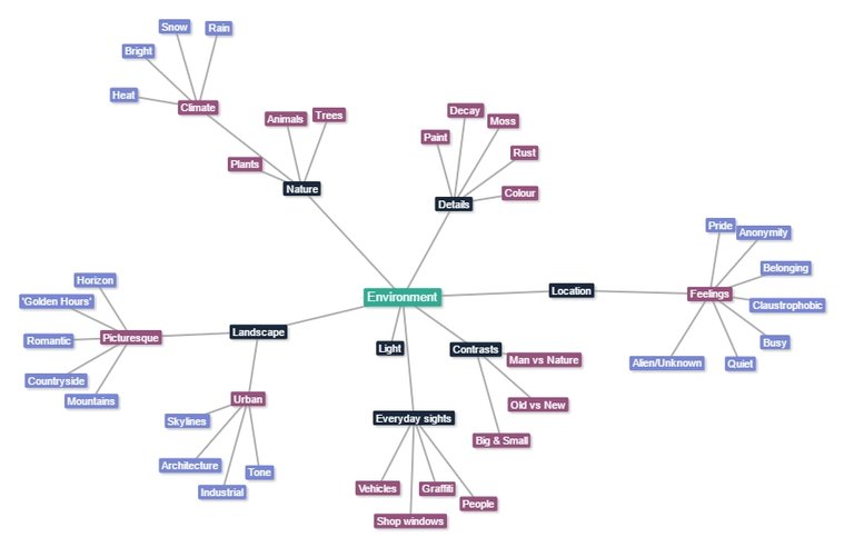
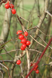
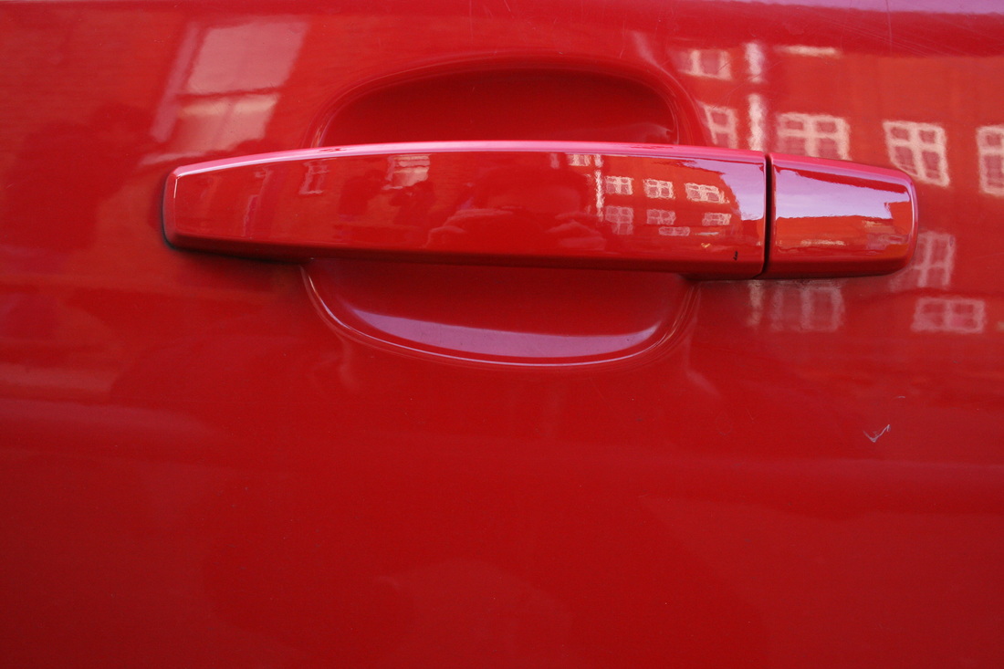
environment
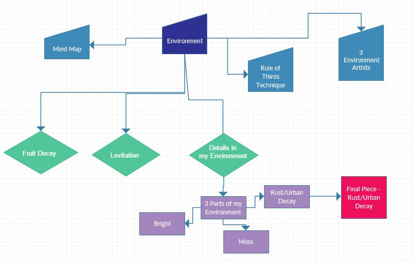
mind map
environment Photographers
Guy Tal |
Charles Sheeler |
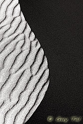
In the 'Edge of Night' (right) there are very visible contrasts - between light and dark and between the textures of smooth and ridged. In each side itself, there are contradictions: the surface of the light side is coarse and ridged while the dark side's surface is fine and smooth. This is unusual as darker colours have connotations with being wrong and evil, so less perfect and polished. Nevertheless, the picture and its contours, while simple, are very aesthetically pleasing.
|
|
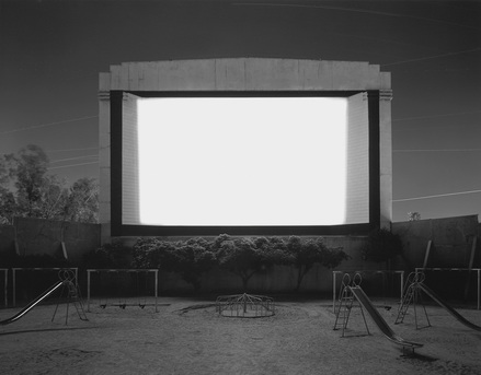
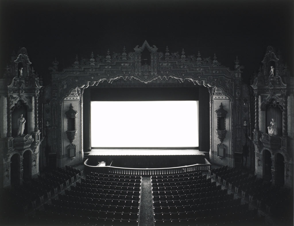
Hiroshi Sugimoto
|
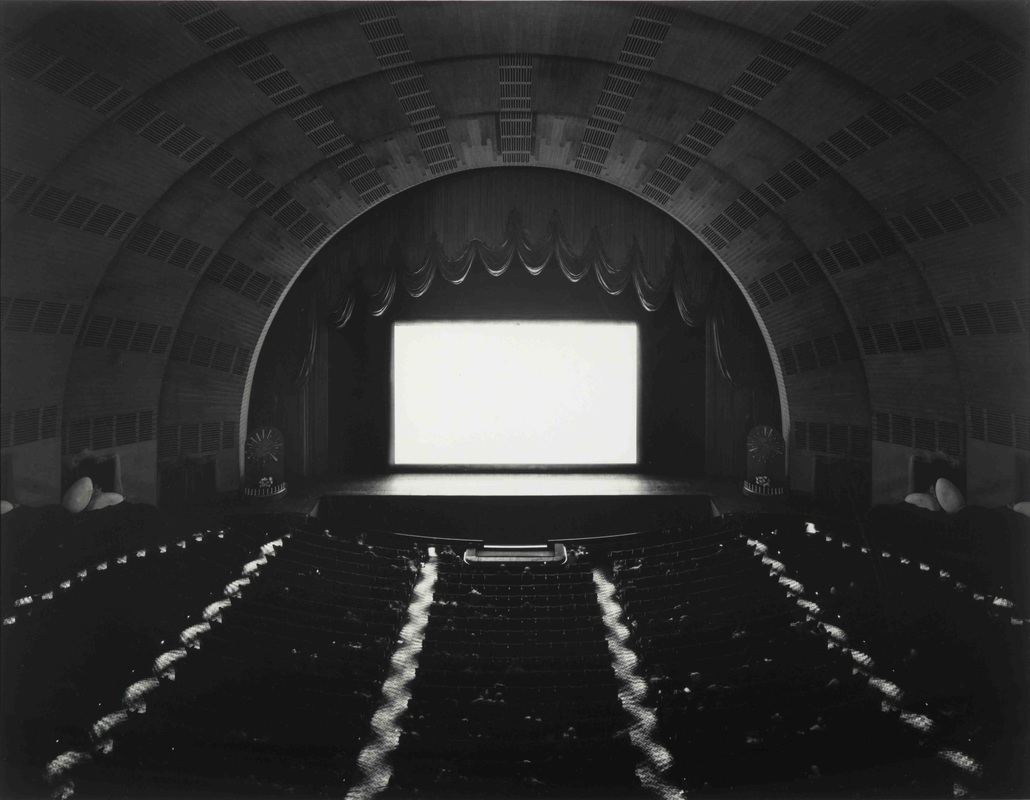
These monochrome images are incredibly majestic and peaceful. The concept of an empty theater is starkly original and the fact that they are empty leaves a odd and discontented feeling - the images are incredibly evocative. Sugimoto said the inspiration for the photo was that if you capture a whole film in a single shot, you will only get a shining screen. For the duration of the film, he would keep the shutter open and then shut it as the film ended. In the image on the top left, he has included nature which really contrasts with the modern and man-made look of the other images. The bright cinema screen only adds to to the discontented and chilling nature of the images and it also gives a supernatural element.
|
Rule of thirds
before
before
|
after
after
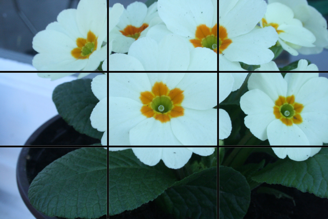
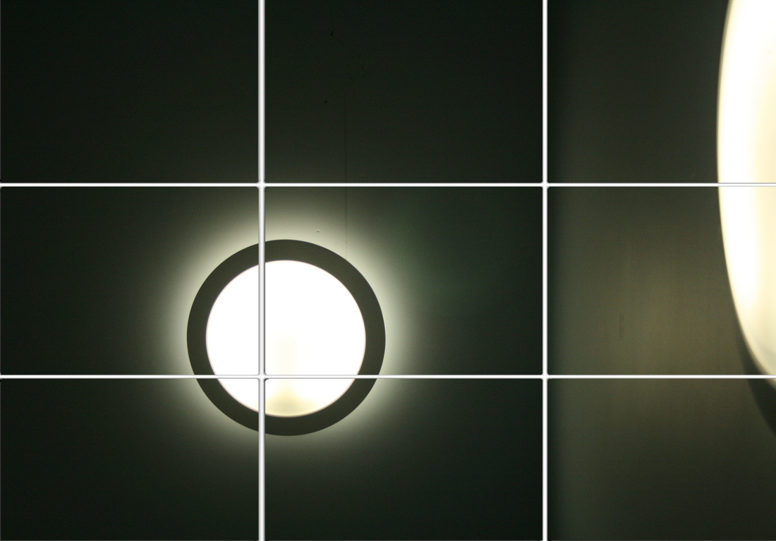
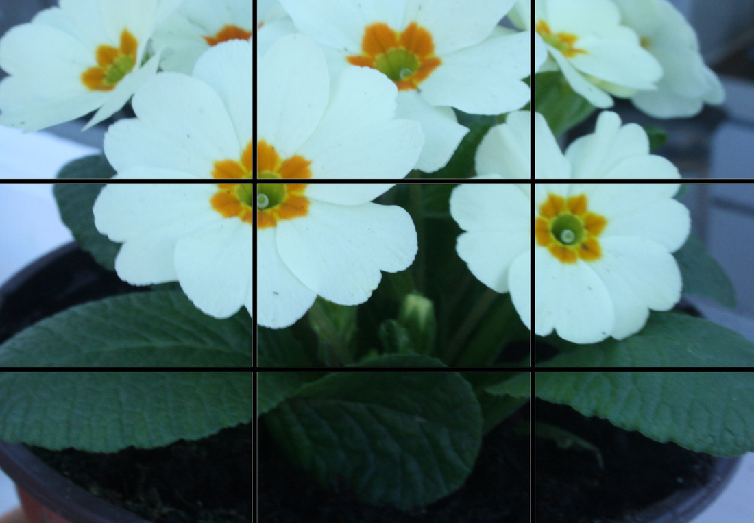
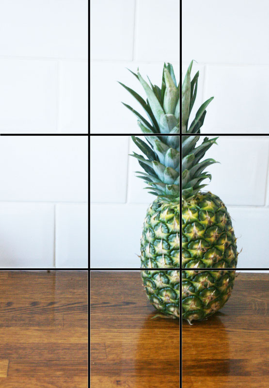
The 'rule of thirds' is a technique applied by imagining a grid on your image (some cameras have a feature where the grid appears), and aligning the points of interest (e.g. a car, animal or person) on the intersections of the lines. It also improves the image if the contours in the picture (e.g. the horizon, or the ground) with the lines on the grid. This technique varies the perspective of the viewer and the angles within the image. I put grids on the photos to show the improvements when I retook the image while imagining the grid.
|
exhibition visit
William eggleston
'Portraits' at the national portrait gallery, summer 2016
William Eggleston was born in 1939 in the small town of Sumner, Mississippi. The settings of most of his photos, around Memphis, Tennessee and Mississippi, are relatively near where he grew up - so the environment he shot in would be comfortable for him. Eggleston is seen as a master of photography, not just portraiture, and is revered around the world.
The exhibition, consisting of exactly 100 photos, was in the National Portrait Gallery. His title for the series was 'Portraits'; a very ordinary title, to say the least. However, that's what Eggleston's all about - amazing photos, but of ordinary people, in ordinary locations, doing ordinary things (e.g. pushing trolleys, sitting on a sofa, talking, smoking a cigarette). For instance, look at the lady's hand in the fourth image in the slideshow. The blur shows how she has been caught off guard, in the middle of an action, perhaps re positioning herself. This gives a sense of realism and purity; his images feel just so profound and stay lodged in the memory long after you leave the exhibition.
Eggleston took the images mainly in the 1960s and 70s, and there are several from the 90s. There is a clear progression for the viewer. He started only shooting in black and white, and in many of images there is a glare of light (natural and artificial), which creates an ethereal effect. Around 1965 he was encouraged by other artists to use colour photography. The colour gives a lot more life to the pictures; however, I'm not sure if the colour images are better as both methods have a lot going for them.
Many critics and viewers associate the ideas of humanity, identity, memory and experience with his portraits. I certainly agree that his pictures are a kind of study of humanity and what makes up people, however maybe we aren't meant to look that deeply into them. What I think is great is how Eggleston is very blunt and unpretentious - he is strongly against symbolic interpretations of his works. However, in the fourth image, it's hard not to see the lady and the chain as being somehow connected.
For the 'Nightclub Portraits' section of the series, Eggleston travelled around with a 5x7" view camera and a portable light set. In many of these images, the subjects are frozen awkwardly in talking. They are unaware and the image is very spontaneous. Mostly, Eggleston photographed strangers, but the fifth one in the slideshow is of his partner. Her upset, defeated gaze is so intimate, and I think she is probably angry with Eggleston himself (who decides to pick up his camera and shoot). Again, the photo is so spontaneous.
In the 1970s, Eggleston mostly printed on Polaroid print or pigment print. Later on, he was one of the first photographers to use the dye transfer process for printing. In the process, you would take three negatives out of the original image - red, yellow and blue. Then, you would print them separately onto transfer films before laying them perfectly onto each other in to produce the final image. Dye transfer offers really rich colours and tones, sense of depth, and a huge range of brightness.
Overall, I think my favourite image is the eighth one in the slideshow. The symmetry, and patterns, and colours (like the yellow flowers against the dull leaves), and lighting, are just breathtaking. For me, I feel so drawn into the image it's like I'm there, in the moment.
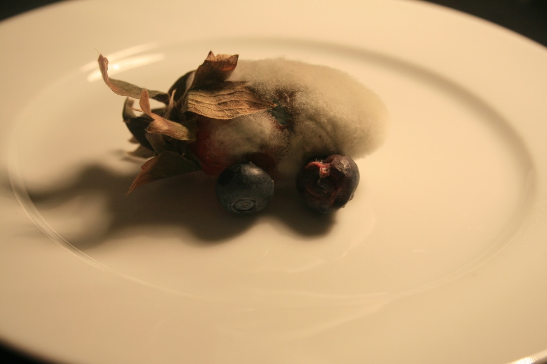
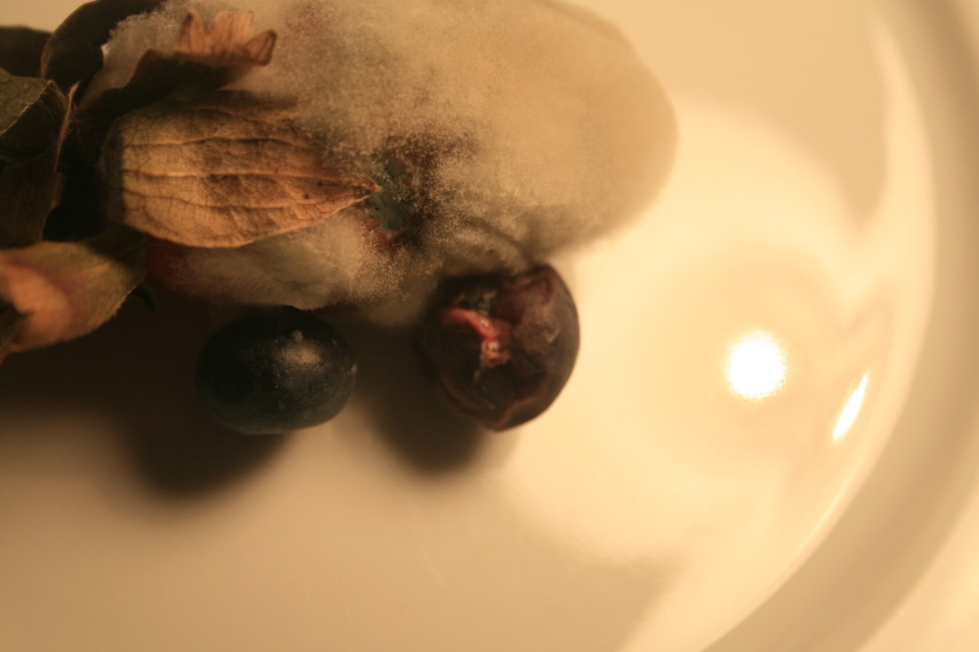
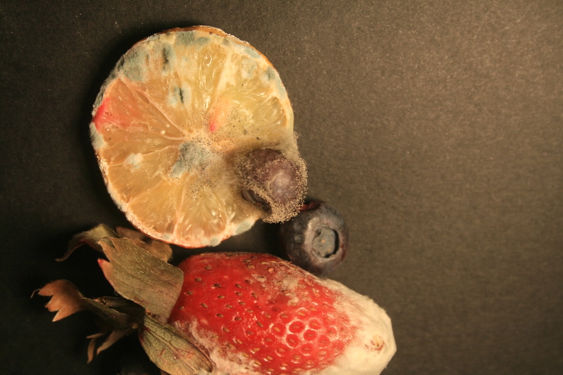
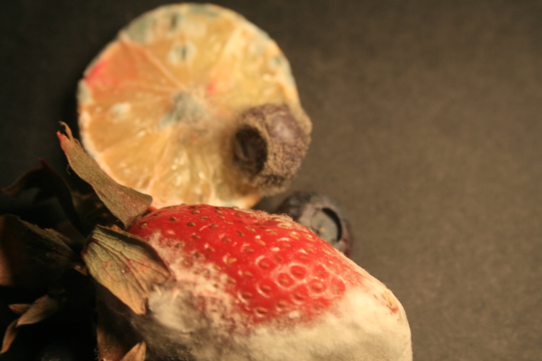
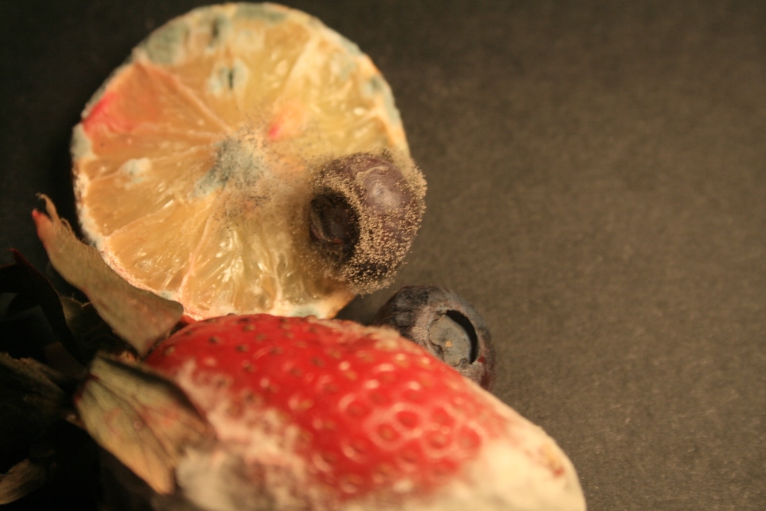
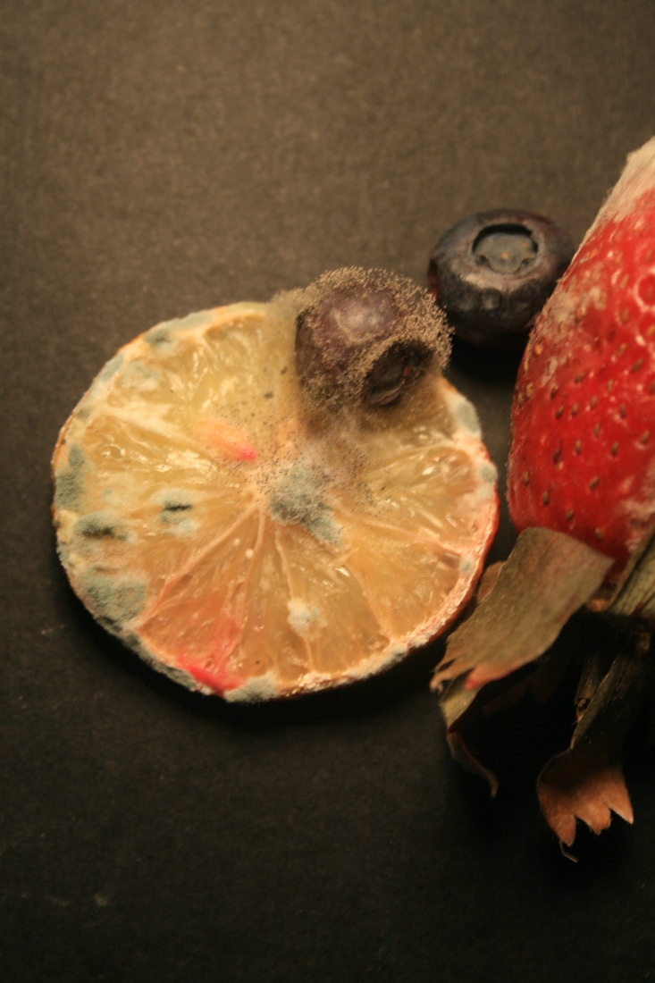
fruit decay
In this project, I explored the force of natural decay on fruit as a result of environmental conditions; you can really see how fruit can be completely modified and distorted, almost destroyed by the decay.
klaus Pichler
|
|
|
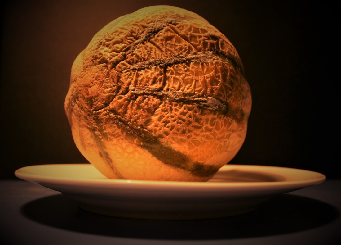
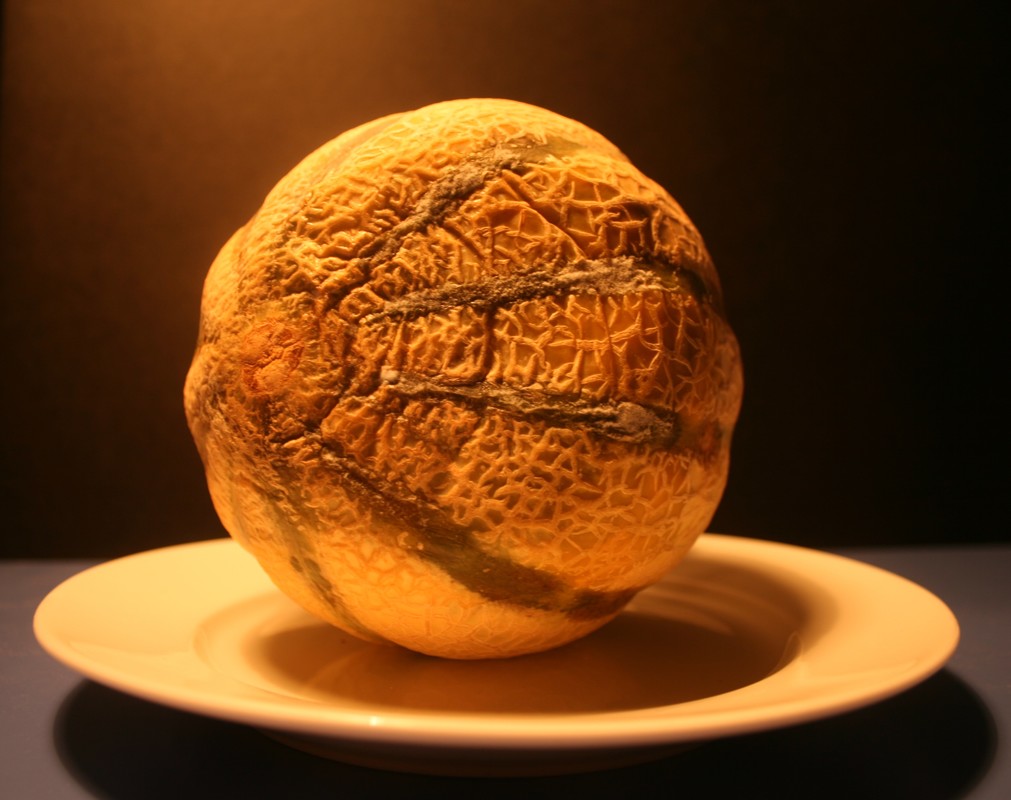
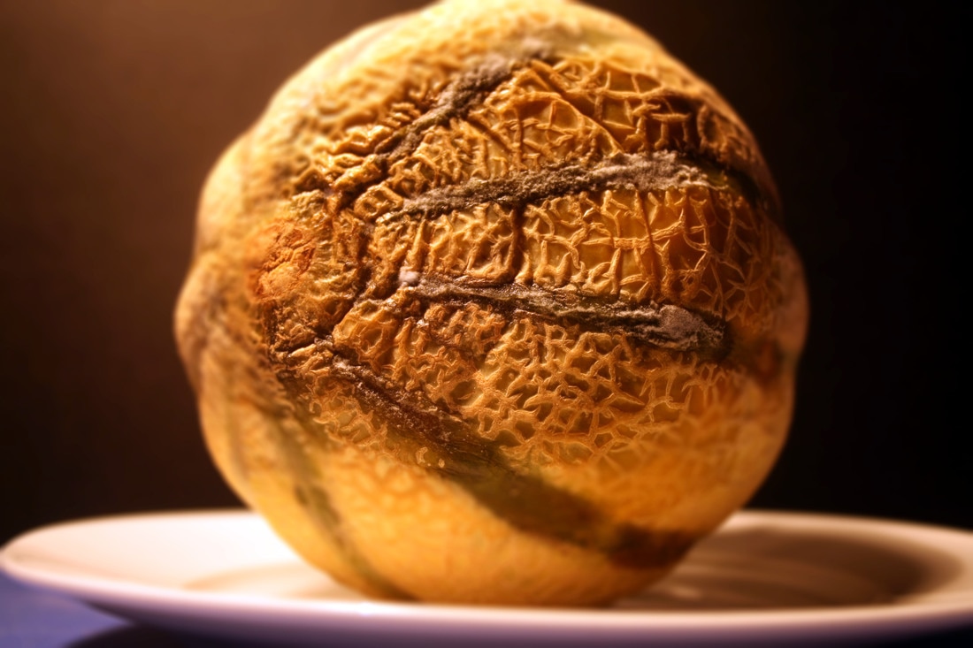
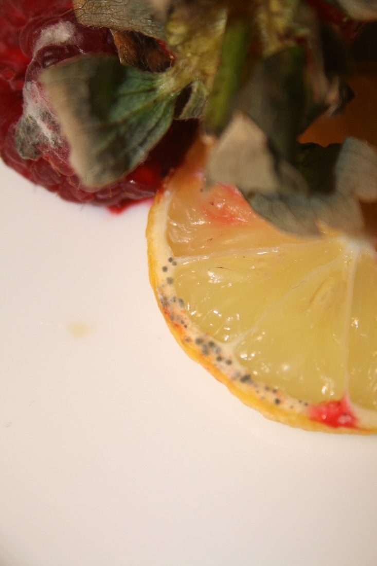
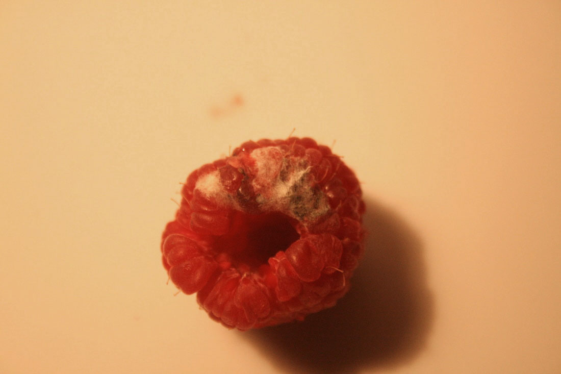
Rotting food is in a weird way both disgusting and kind of mesmerising. In order to raise awareness of the fact that one third of the world's food goes to waste (according to a 2011 UN study), Austrian photographer Klaus Pichler created images of decaying food in elaborate and surprising ways. Particularly in the West, consumers throw away food that is perfectly edible and don't stop to think if they are buying unnecessarily or not using food as leftovers to save. I'm not sure how effective Klaus Pichler's point is, by photographing inedible food, but he says that the photos should "provoke you to think about your own consumer behaviour". To emphasise his message, all the photos in the series 'One Third' were originally accompanied by the food's production methods, where it came from and its carbon footprint. Maybe if we see the effort that went into producing these foods, we would see how selfish it is to waste them.
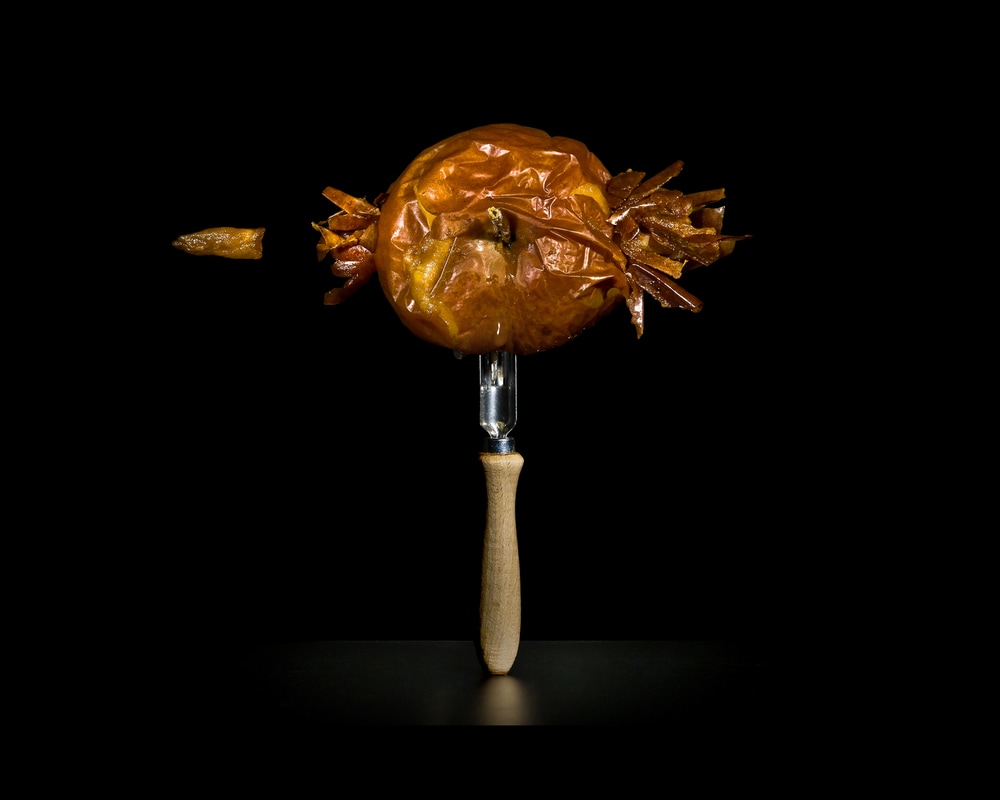
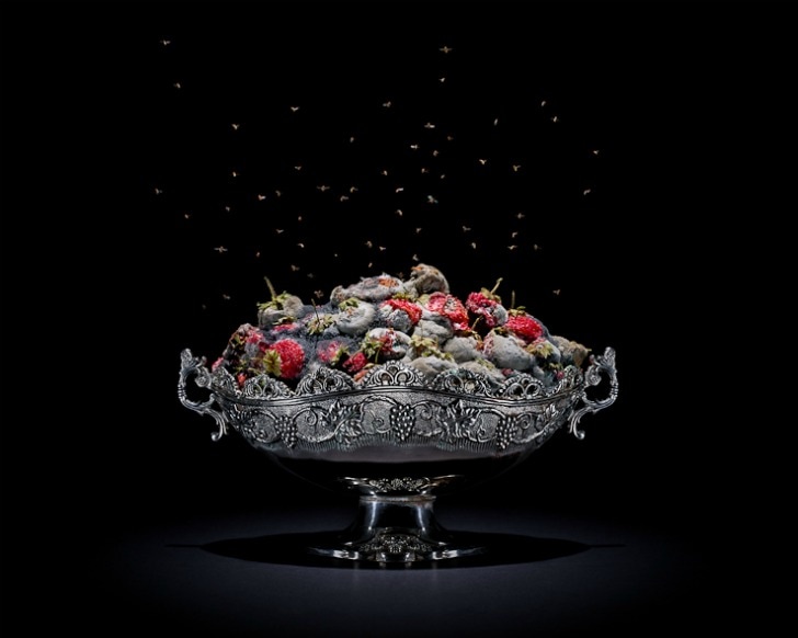
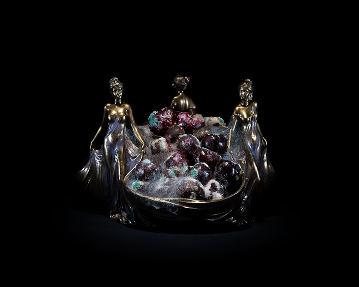
Furthermore, there is a very original tone to the images. What I mean is that in the photo on the left, for example, Pichler is recreating the famous 'Bullet through Apple' high shutter-speed photograph by Harold Edgerton. This is a very humorous and clever idea and makes the rotting apple much more eye-catching and interesting. However, again, I'm not sure how strong this is in relation to Pichler's message about food waste. Nonetheless, I think the contrast between the sickening rotting food and luxurious ornamental bowls in the other two images is fantastic. It ties the images back to the idea of what we value. We might see the gold and silver bowls as something to treasure but foods that could feed people and cost money are so easily discarded.
Furthermore, there is a very original tone to the images. What I mean is that in the photo on the left, for example, Pichler is recreating the famous 'Bullet through Apple' high shutter-speed photograph by Harold Edgerton. This is a very humorous and clever idea and makes the rotting apple much more eye-catching and interesting. However, again, I'm not sure how strong this is in relation to Pichler's message about food waste. Nonetheless, I think the contrast between the sickening rotting food and luxurious ornamental bowls in the other two images is fantastic. It ties the images back to the idea of what we value. We might see the gold and silver bowls as something to treasure but foods that could feed people and cost money are so easily discarded.
artist and me
klaus Pichler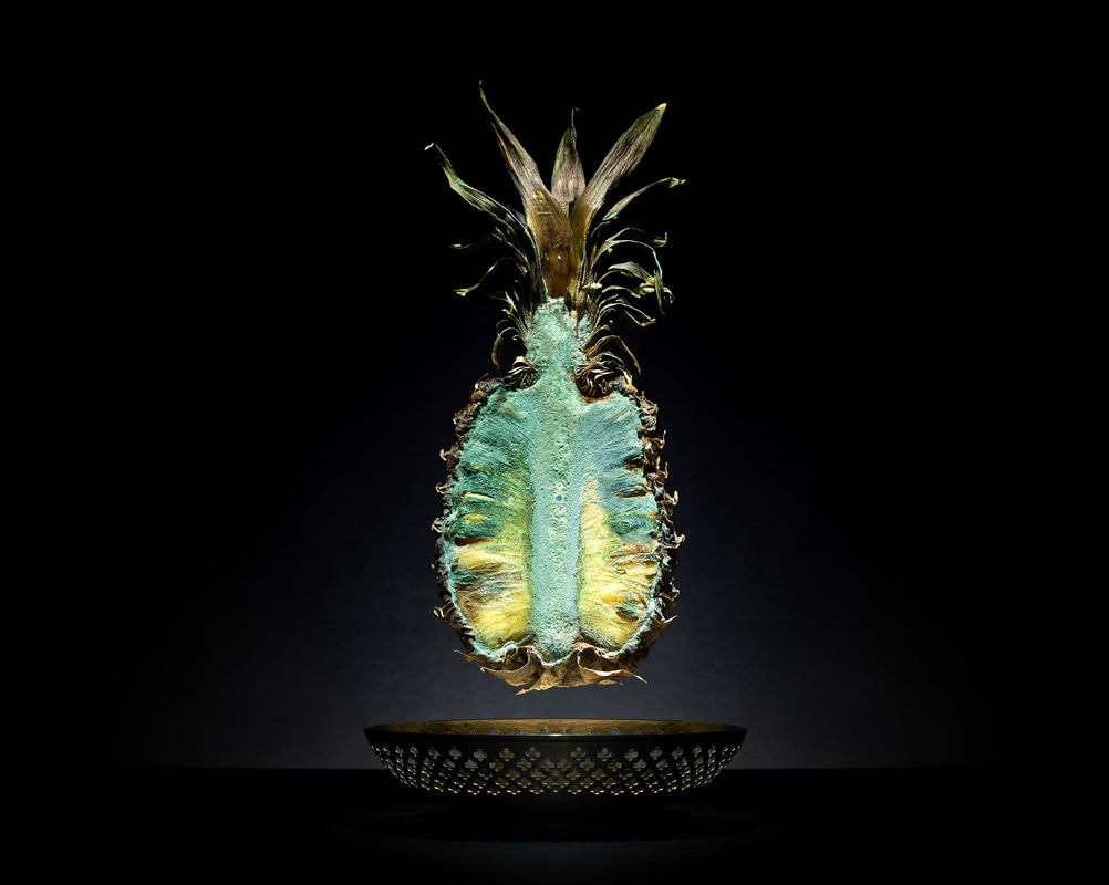
|
me
|
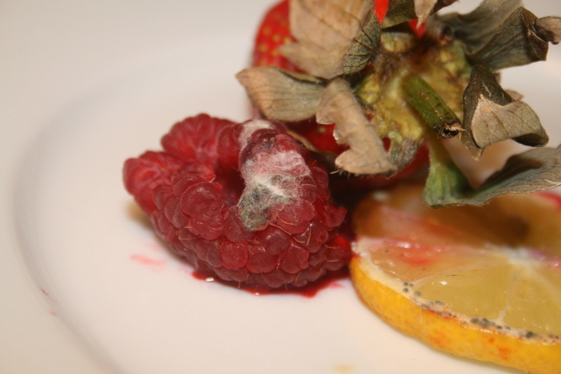
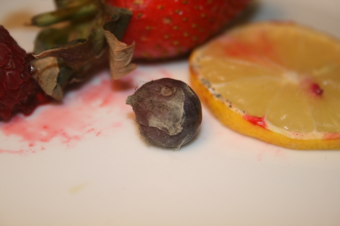
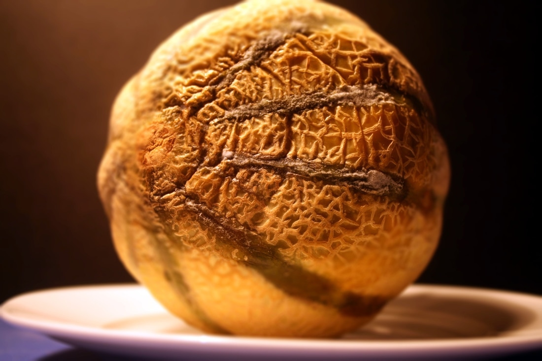
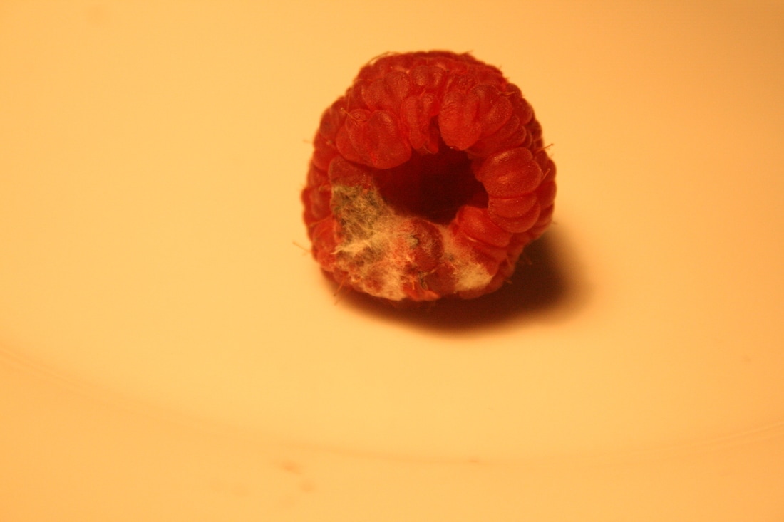
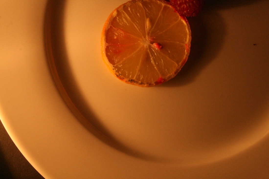
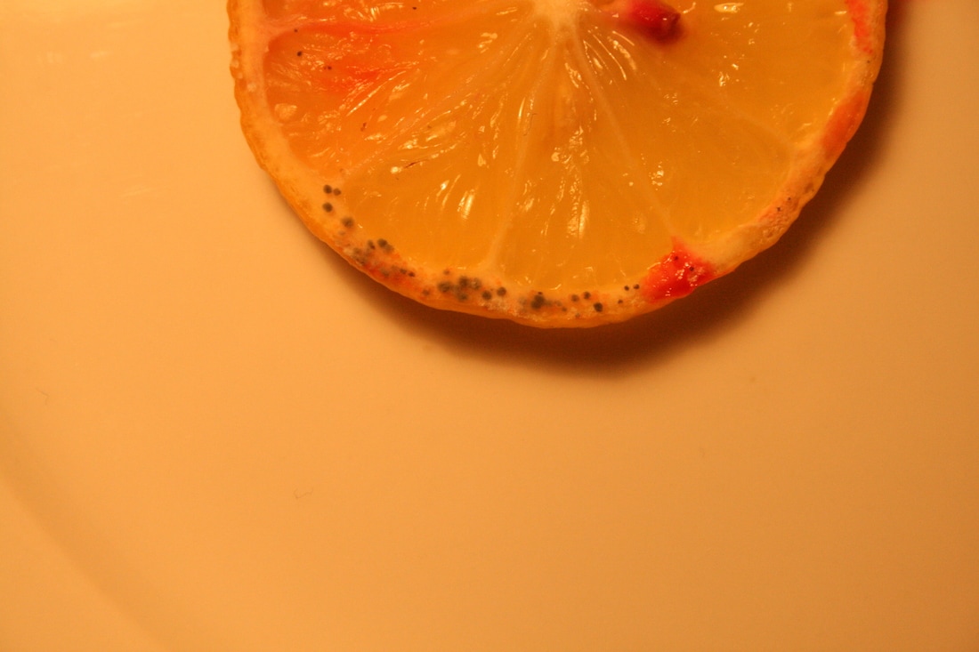
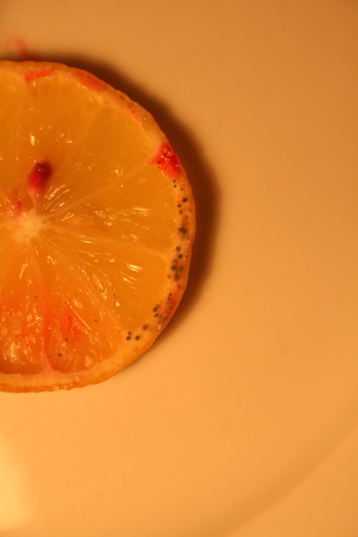
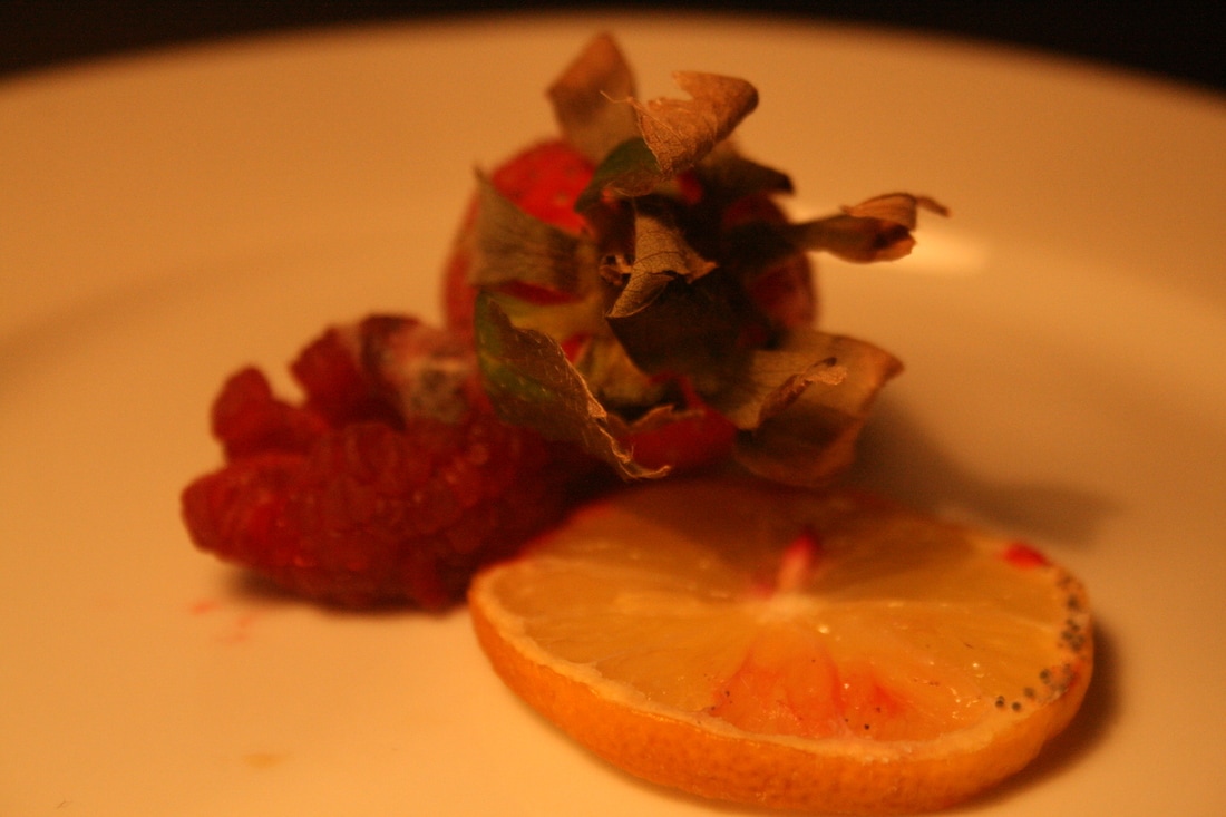
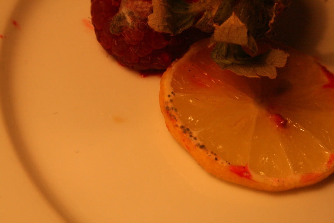
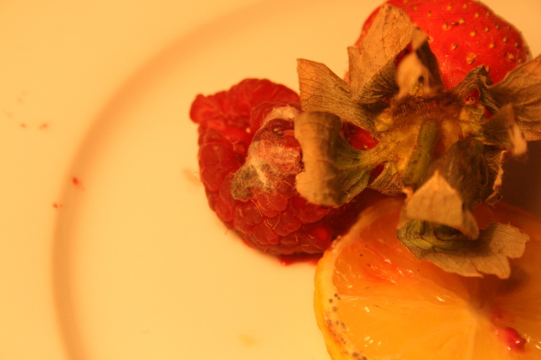
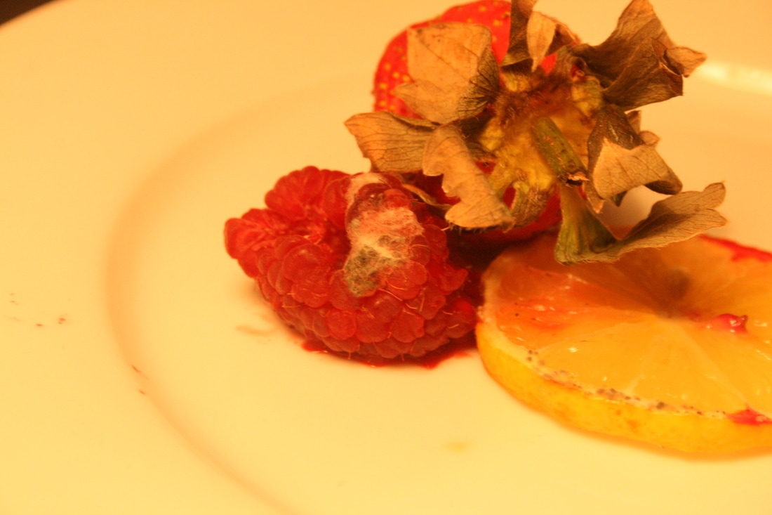
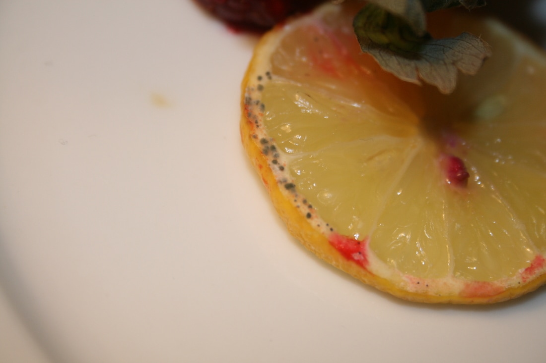
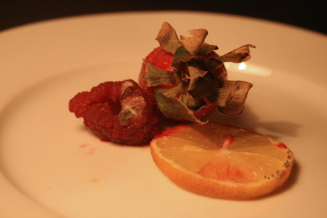
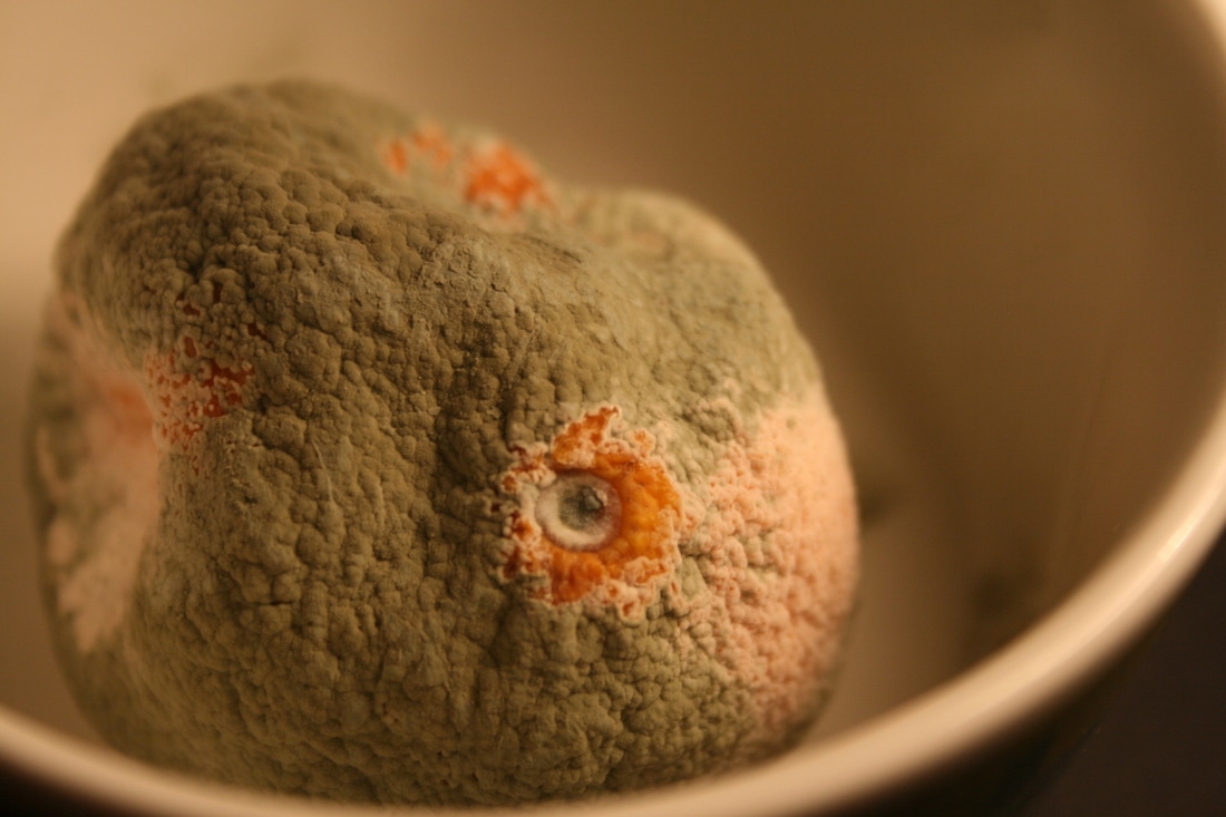
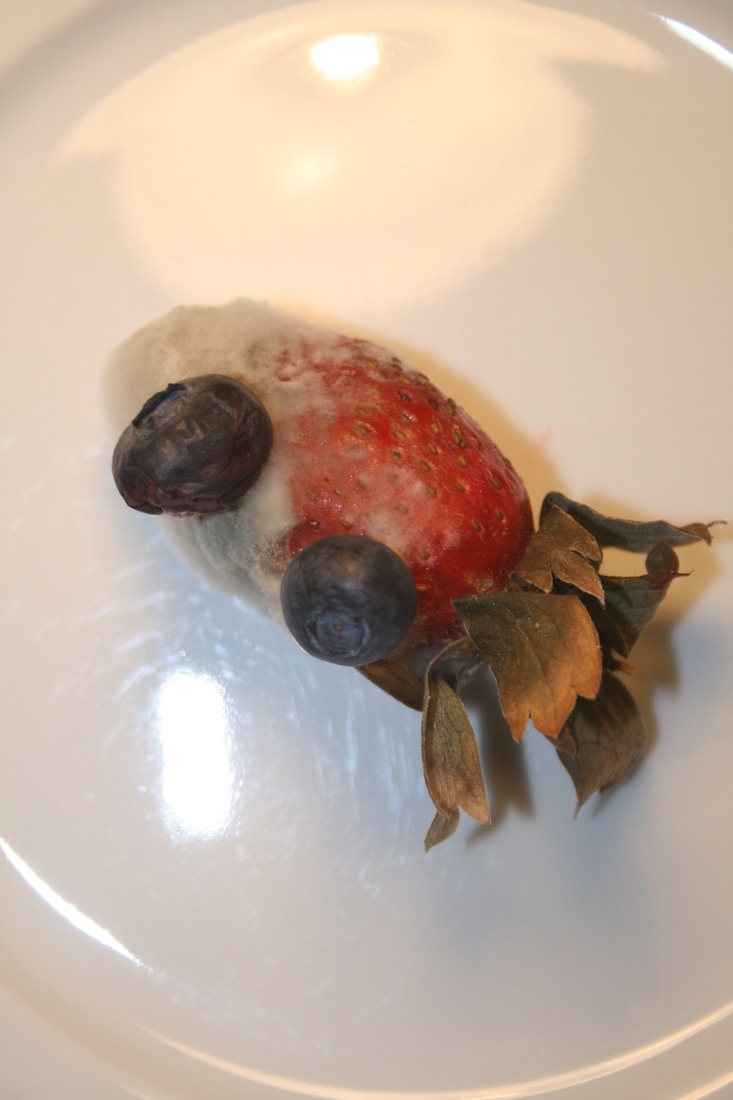
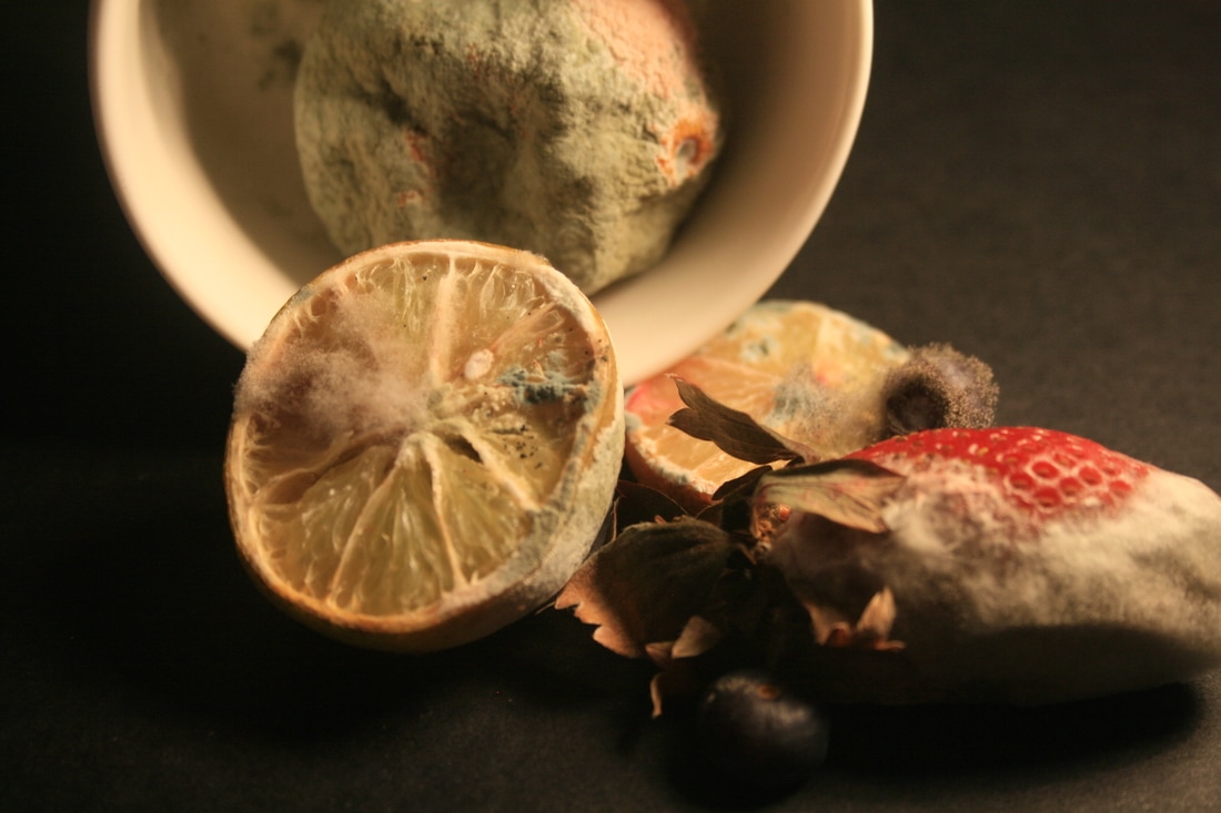
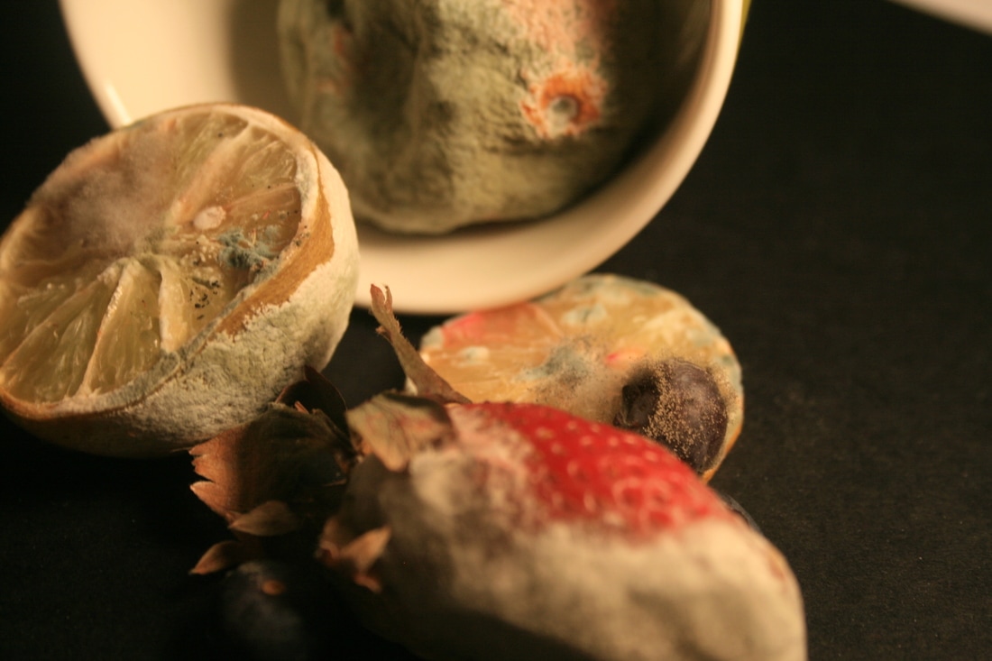
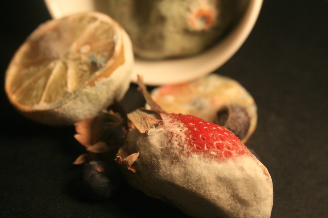
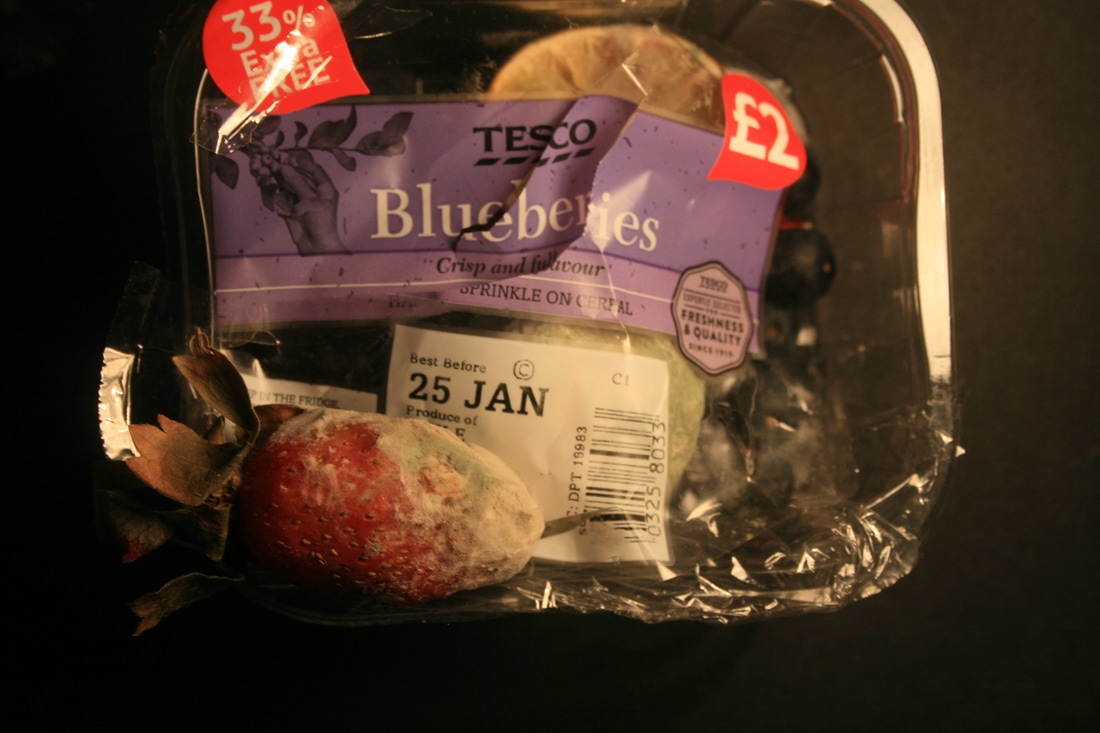
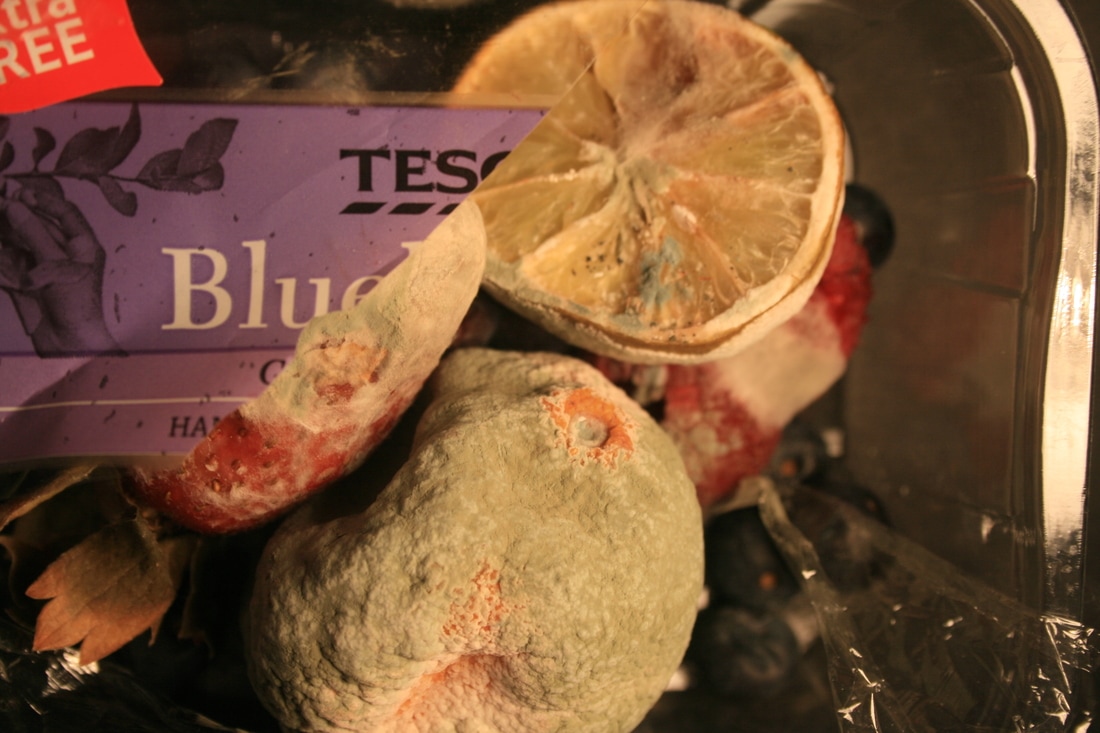
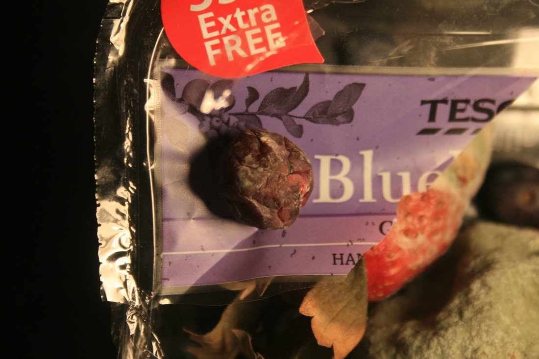
Similarly to advertising photography methods, Pichler uses tricks like invisible string and tape. This means that he can create the very majestic effect of the pineapple suspended in the air, like it's been captured in time. Instead, I left my fruit resting on the work surface, and shot from above.
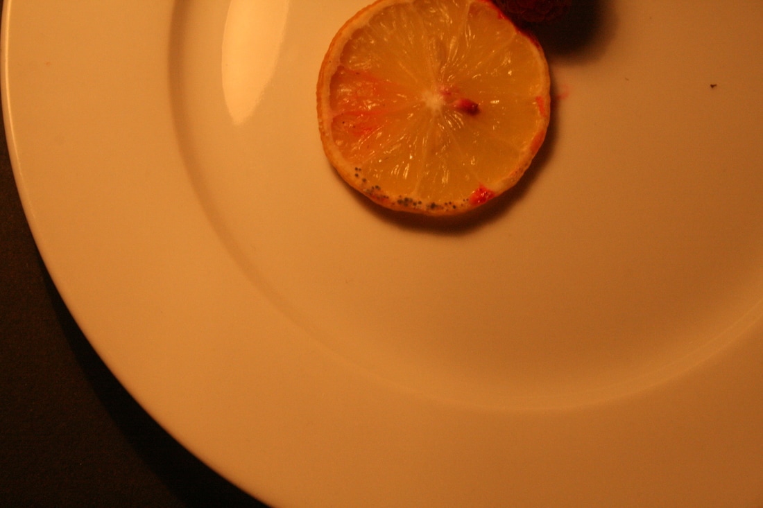
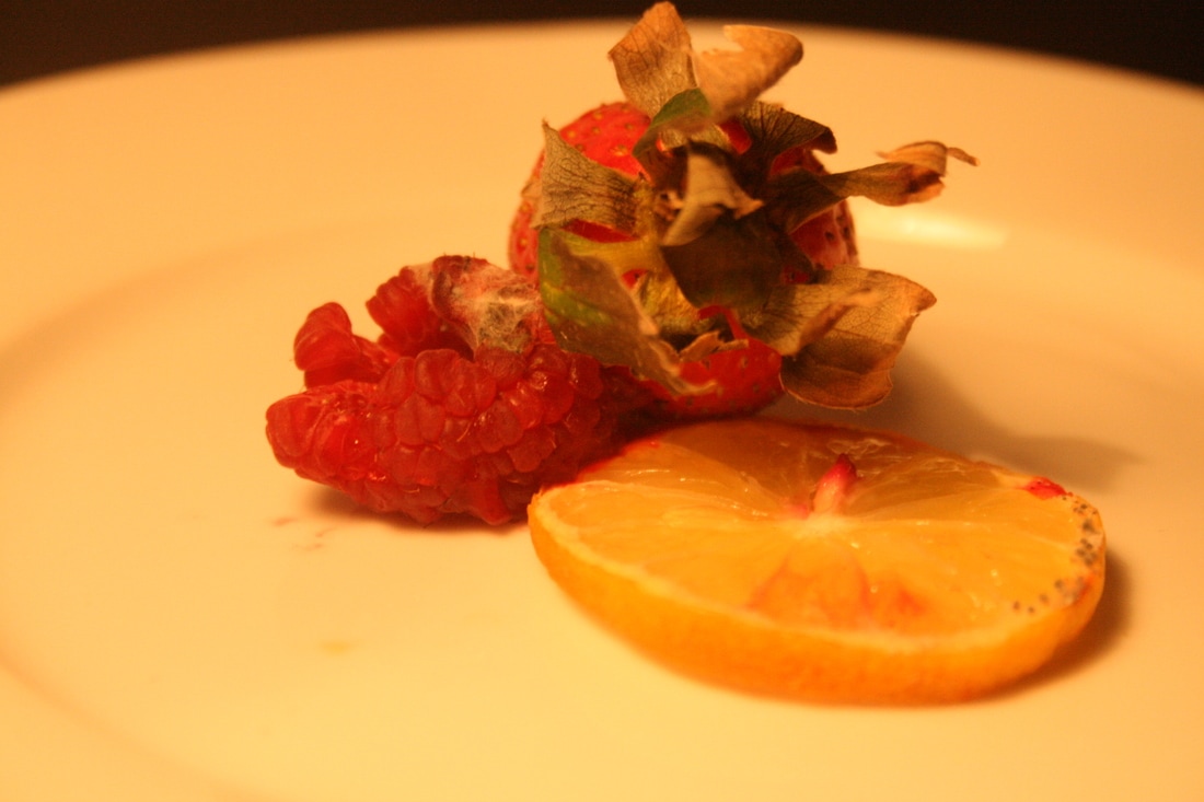
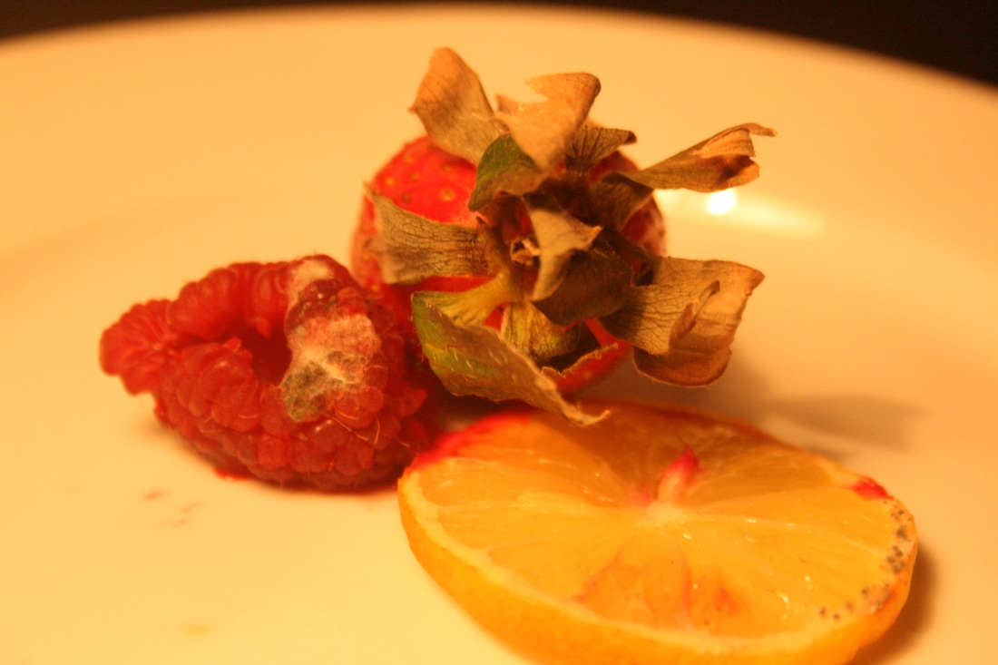
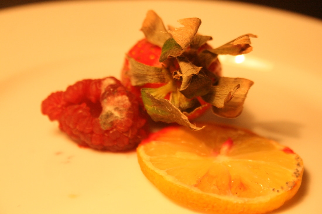
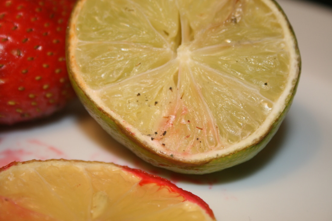
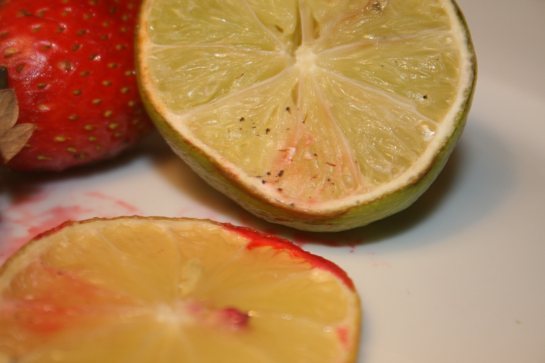
However, both Pichler and I naturally left the fruit to decompose, from bacteria left over on it. Pichler uses very dramatic lighting in all of his photos in the series against a black background which brings out the bold, vibrant turquoise and yellow colours. Similarly, I used one lamp to create dramatic lighting and I shot against a black piece of card. This created strong colours in the vivid red strawberry, yellow lemon and pastel green lime. However, I think it may have been better if I positioned the lamp at the bottom of the frame and had a wider-angle lens which may have created more dramatic lighting with stronger colours.
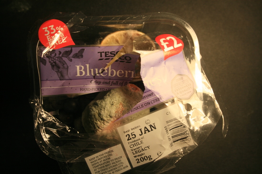
Also, I took inspiration from the idea that Pichler labelled all of his images with the where the fruit came from, how it was made etc. and I positioned the fruit inside an old fruit packet. Also, in some of the images in my second response I included the sell-by date, the weight, and where the fruit came from on the packet. This reminds the viewer that the goods we buy will have been manufactured, transported and bought and we shouldn't waste that effort.
However, both Pichler and I naturally left the fruit to decompose, from bacteria left over on it. Pichler uses very dramatic lighting in all of his photos in the series against a black background which brings out the bold, vibrant turquoise and yellow colours. Similarly, I used one lamp to create dramatic lighting and I shot against a black piece of card. This created strong colours in the vivid red strawberry, yellow lemon and pastel green lime. However, I think it may have been better if I positioned the lamp at the bottom of the frame and had a wider-angle lens which may have created more dramatic lighting with stronger colours.
Also, I took inspiration from the idea that Pichler labelled all of his images with the where the fruit came from, how it was made etc. and I positioned the fruit inside an old fruit packet. Also, in some of the images in my second response I included the sell-by date, the weight, and where the fruit came from on the packet. This reminds the viewer that the goods we buy will have been manufactured, transported and bought and we shouldn't waste that effort.
my response
|
|
|
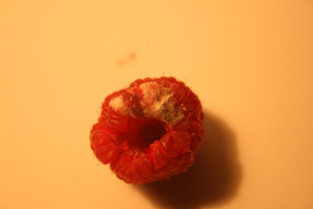


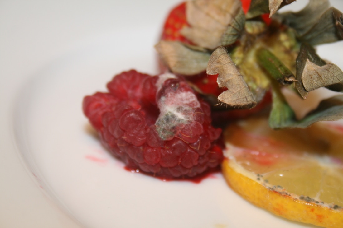


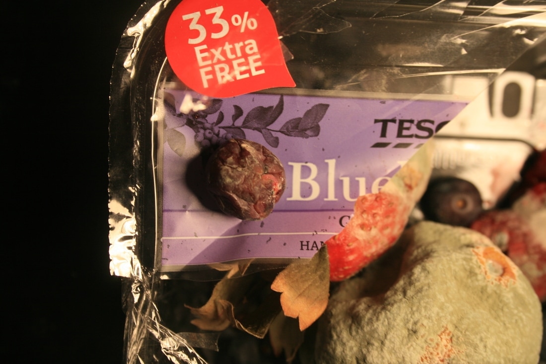
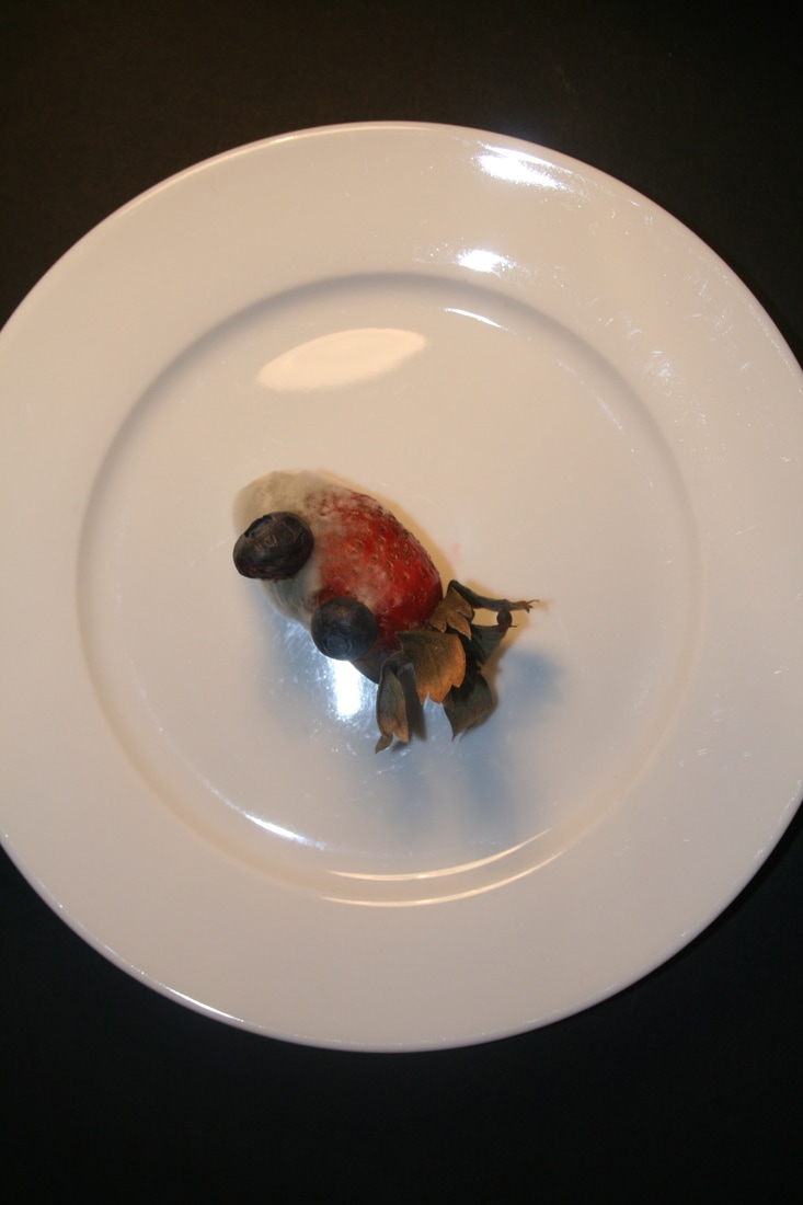
EBI: I shot under tungsten lighting for this response, as it was in my house. I partially amended this by applying a 'cooling filter' in Photoshop and also shooting with the flash on my camera.
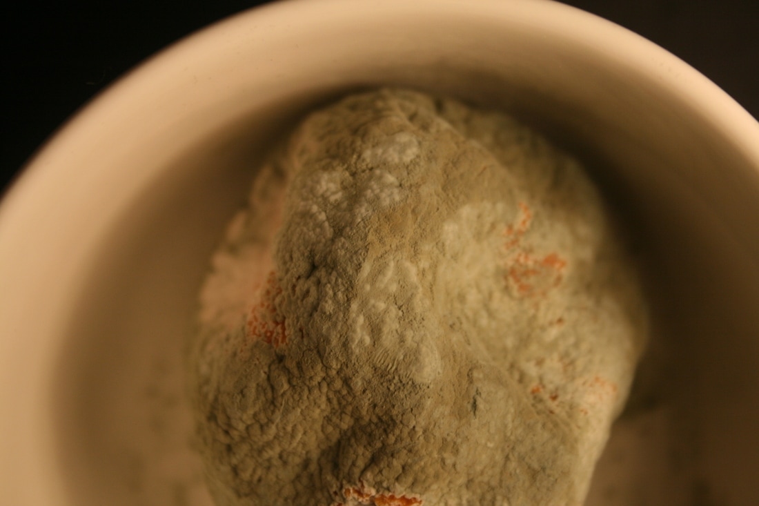
WWW: Using the 'macro setting' on my camera and a very low depth of field gave me really sharp detail on some of the images (especially the 5th row) which really brought the mould to foreground.
WWW: Using the 'macro setting' on my camera and a very low depth of field gave me really sharp detail on some of the images (especially the 5th row) which really brought the mould to foreground.
second response

|

|
|

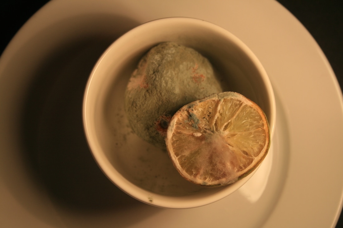
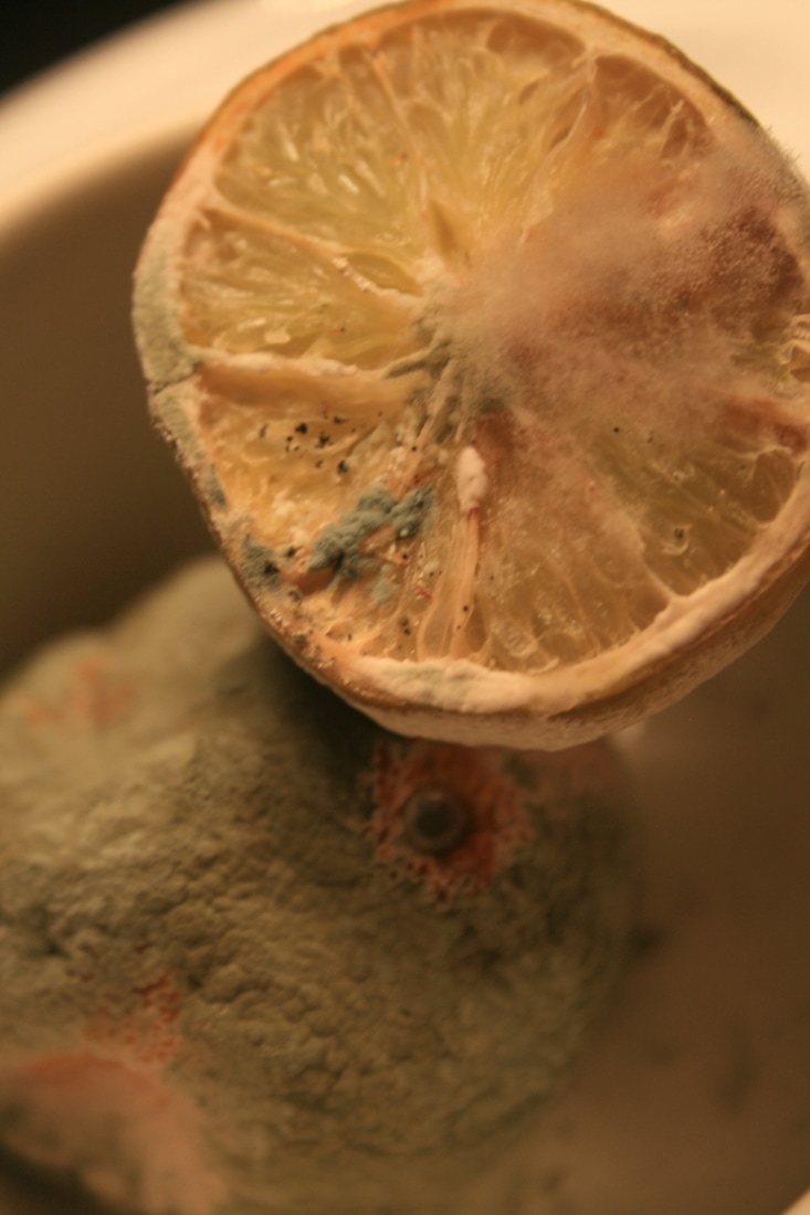
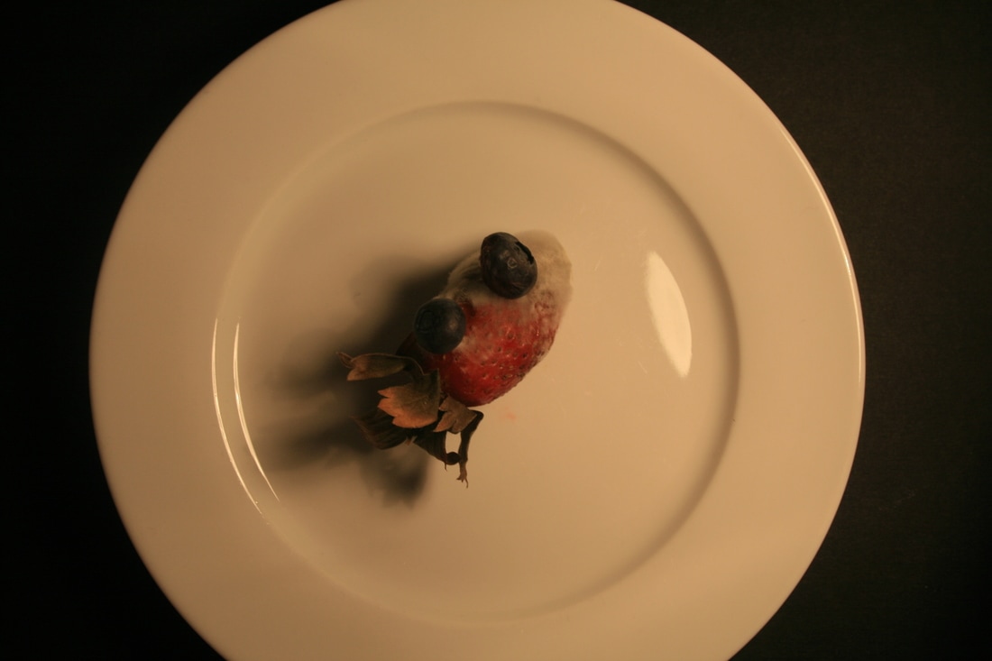

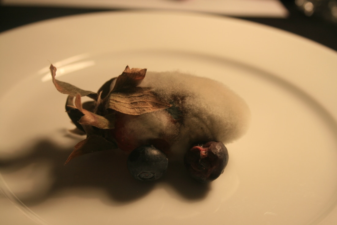

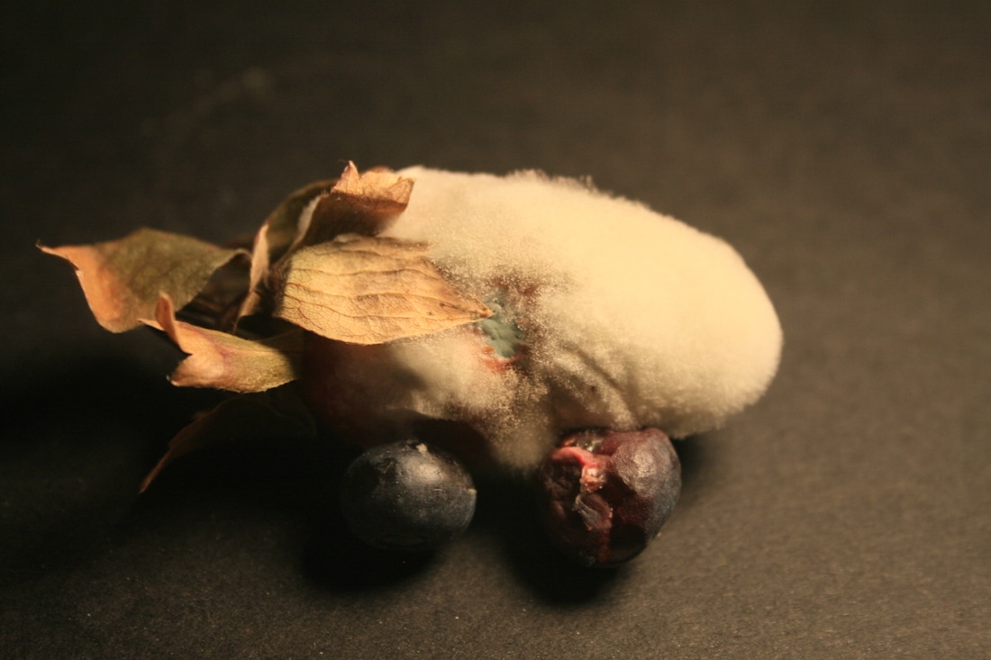

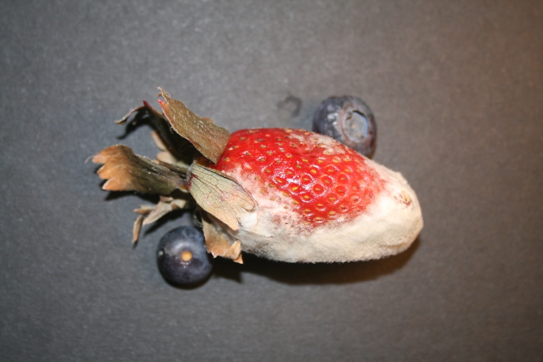


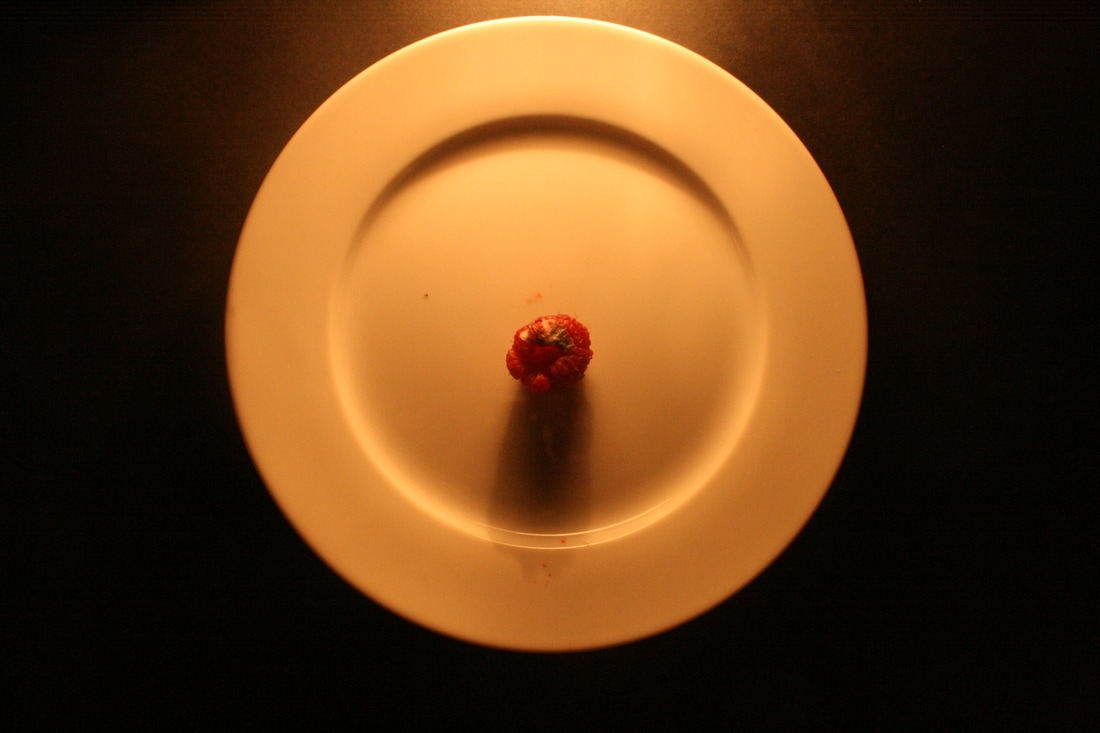
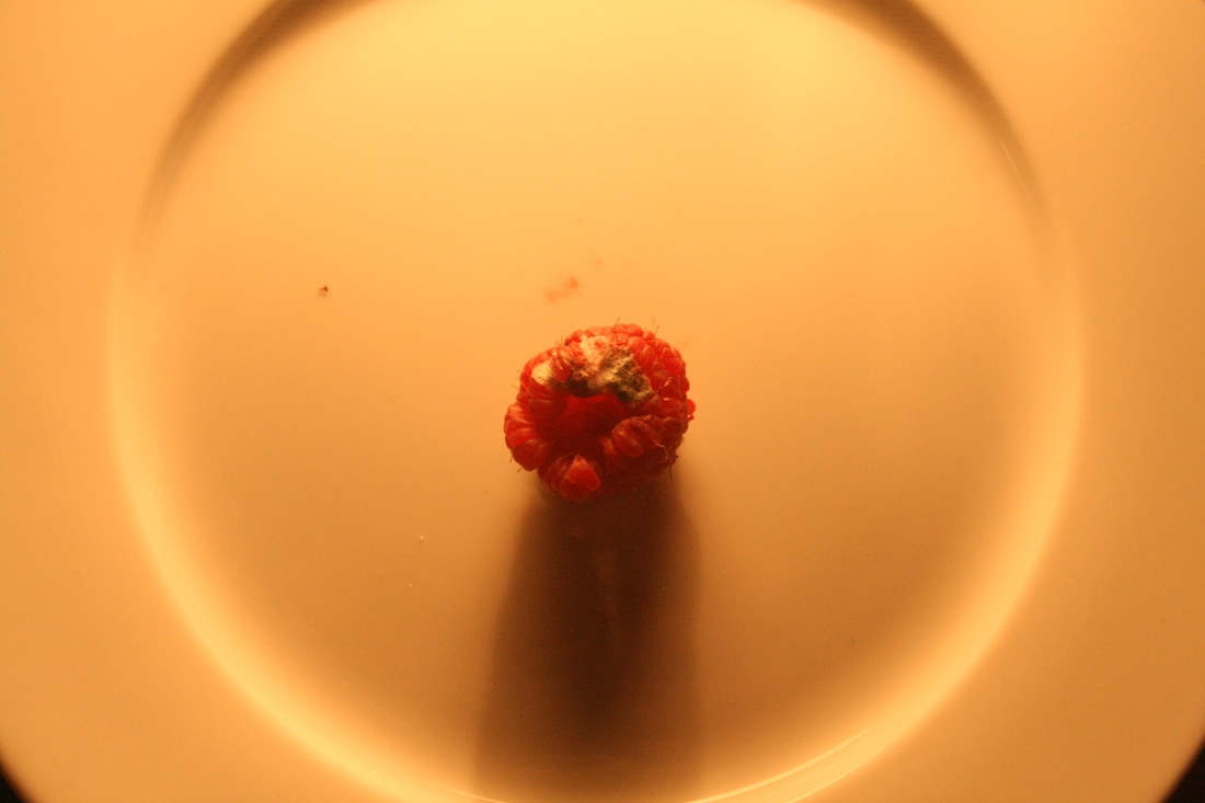
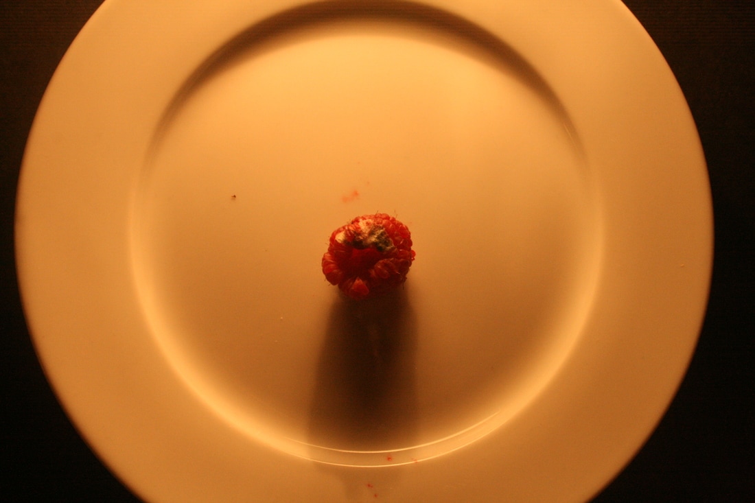
WWW: I lighted my images much better in this response, not shooting under tungsten lighting by using different lights and also I used the flash setting.
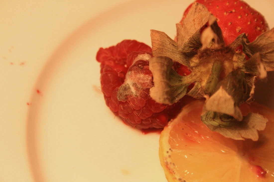
EBI: I shouldn't have included the outline of the plate in the images in the second row and I should have framed them better to give less negative space.
EBI: I shouldn't have included the outline of the plate in the images in the second row and I should have framed them better to give less negative space.
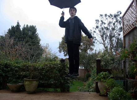
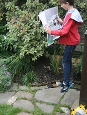
Levitiation
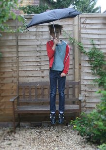
In this section, I was interested in seeing how I could photograph something completely strange and unexpected in my environment. I experimented in levitation photography in a few locations, using props to convey that the subject was in the action of doing something completely ordinary, that you would see in an everyday environment - reading a newspaper or holding an umbrella. Finally, I tried to imitate Yowayowa's style by taking a photo of myself standing on a chair outside. Like the previous photos, I was holding a variety of props. I then used Photoshop to remove the chair (I selected the chair > edit > fill > content-aware) to give the impression I was completely in the state of levitating. This was easier and more effective as I didn't have to capture the picture just after I (or the model) jumped.
My response

|
|
|

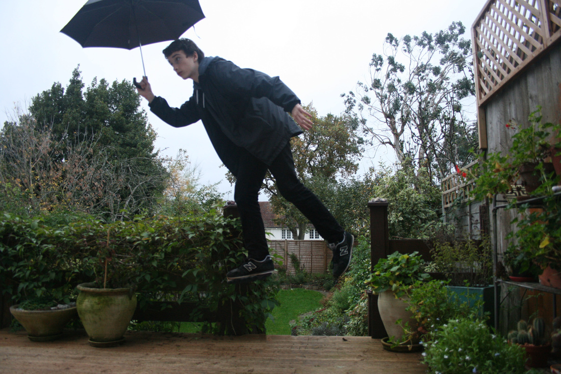
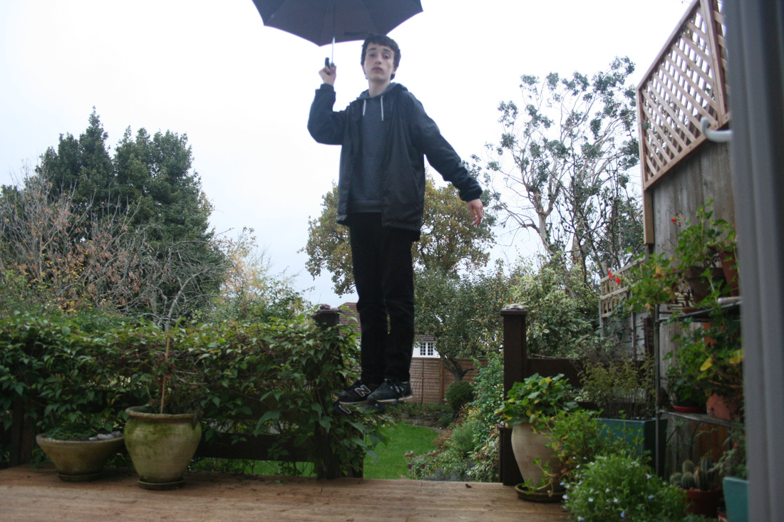
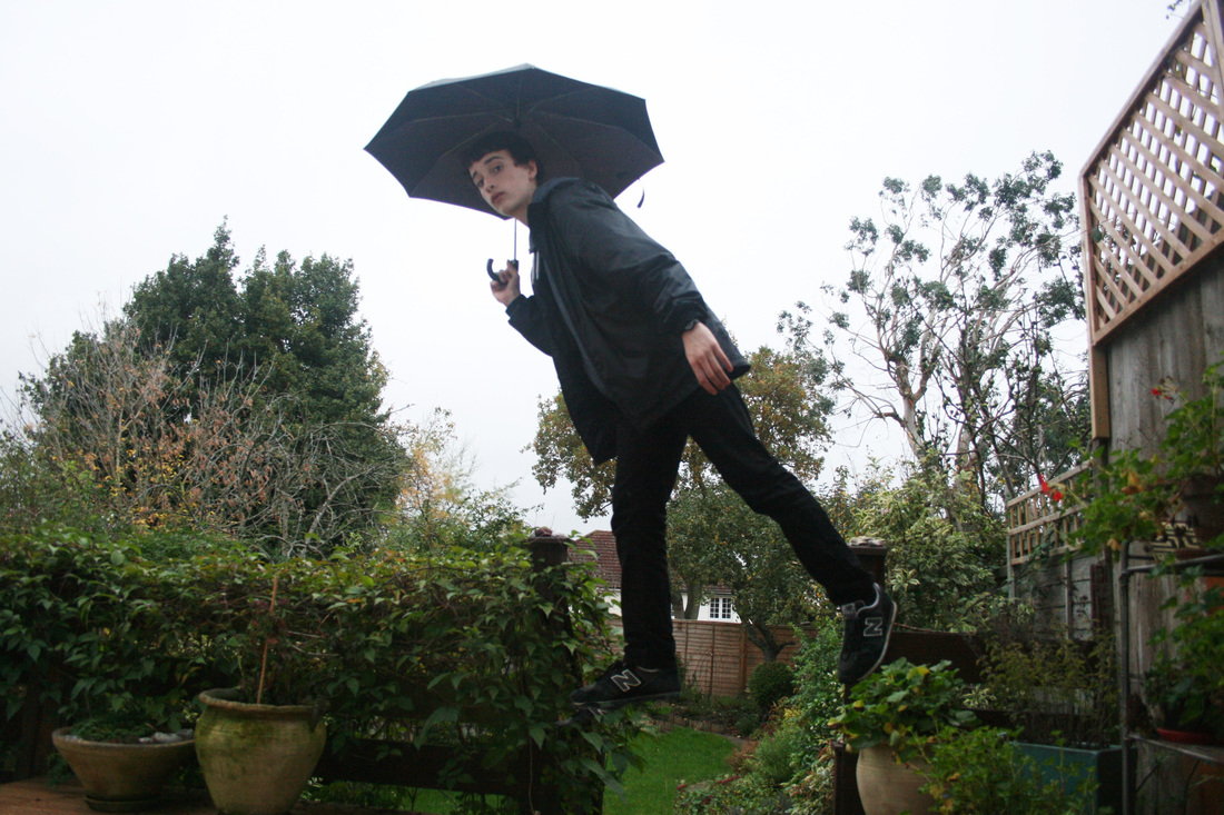
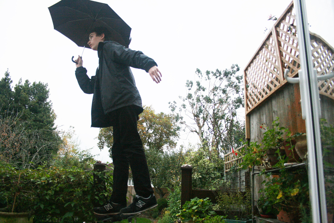
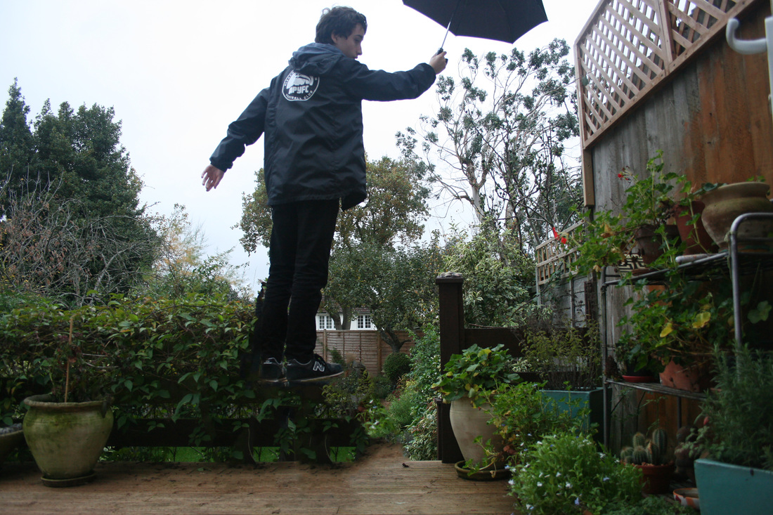

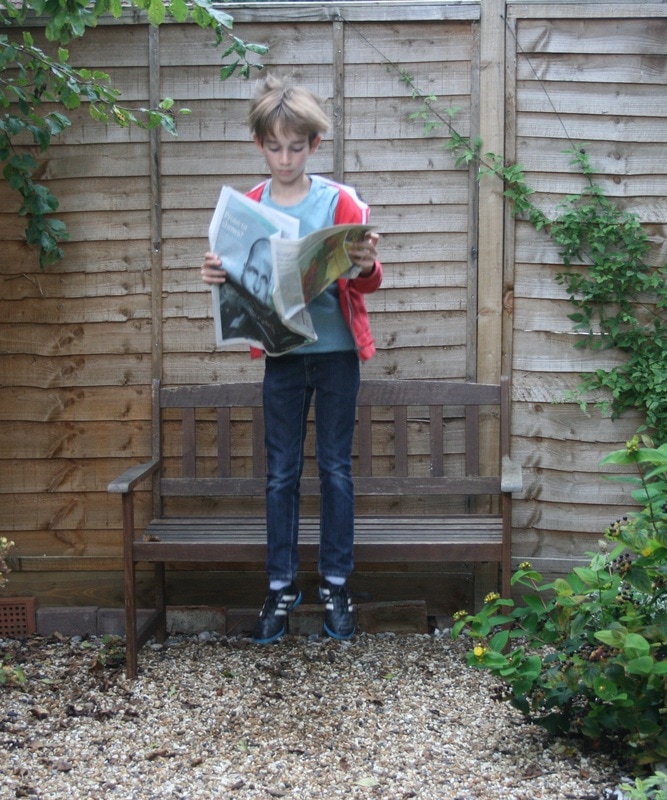
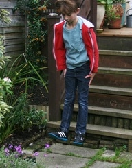
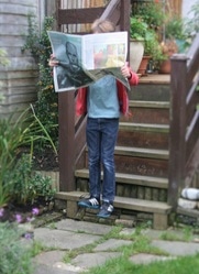
WWW: The way the props worked with the model. I wanted the props to have a more important role than the first response to create a sense of normality to the actions of the model. Secondly, standing on a chair and editing it out in the top set of photos was very effective as it gave a very clear sense of levitation and meant my shots could be taken with more composure than action shots
EBI: The execution - particularly with the shots in the bottom set of the model levitating I felt that the feet weren't far enough off the ground to give a complete feel of being airborne.
EBI: The execution - particularly with the shots in the bottom set of the model levitating I felt that the feet weren't far enough off the ground to give a complete feel of being airborne.
Yowayowa
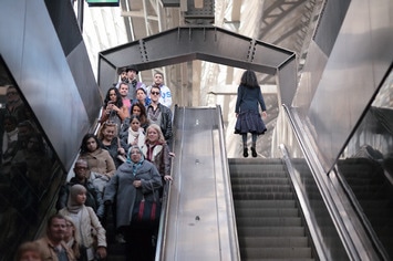
In her photos, Yowayowa, a Japanese photographer (real name Natsumi Hayashi), uses the idea of levitation to capture moments of action and movement that makes the pictures really original. The stillness and peacefulness of her photos contrast to the drama and blur that you would often find in images of commuters or city sights. The picture above is particularly interesting because of the complete contrast between the two escalators - one is busy and full of oblivious commuters while the other is empty and looks frozen in time.
(referring to the photos on the right) I took inspiration from the stillness and nonchalance that Yowayowa creates in my response. Furthermore, I like the idea that the subject of all of her photos is always normal and it is their action which is interesting. That's why I held a plain umbrella and wore dark clothes; it should be the 'supernatural' effect of levitation that should be the point of interest, not myself. |
Artist comparison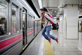

|
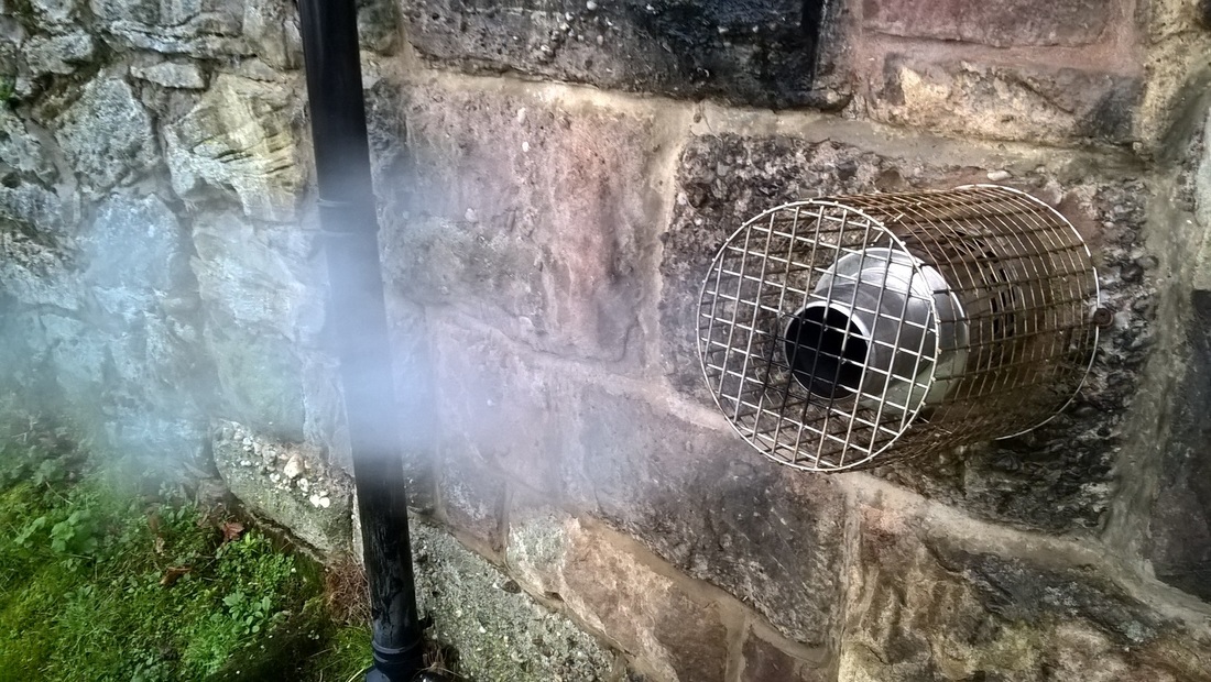
Details in my environment
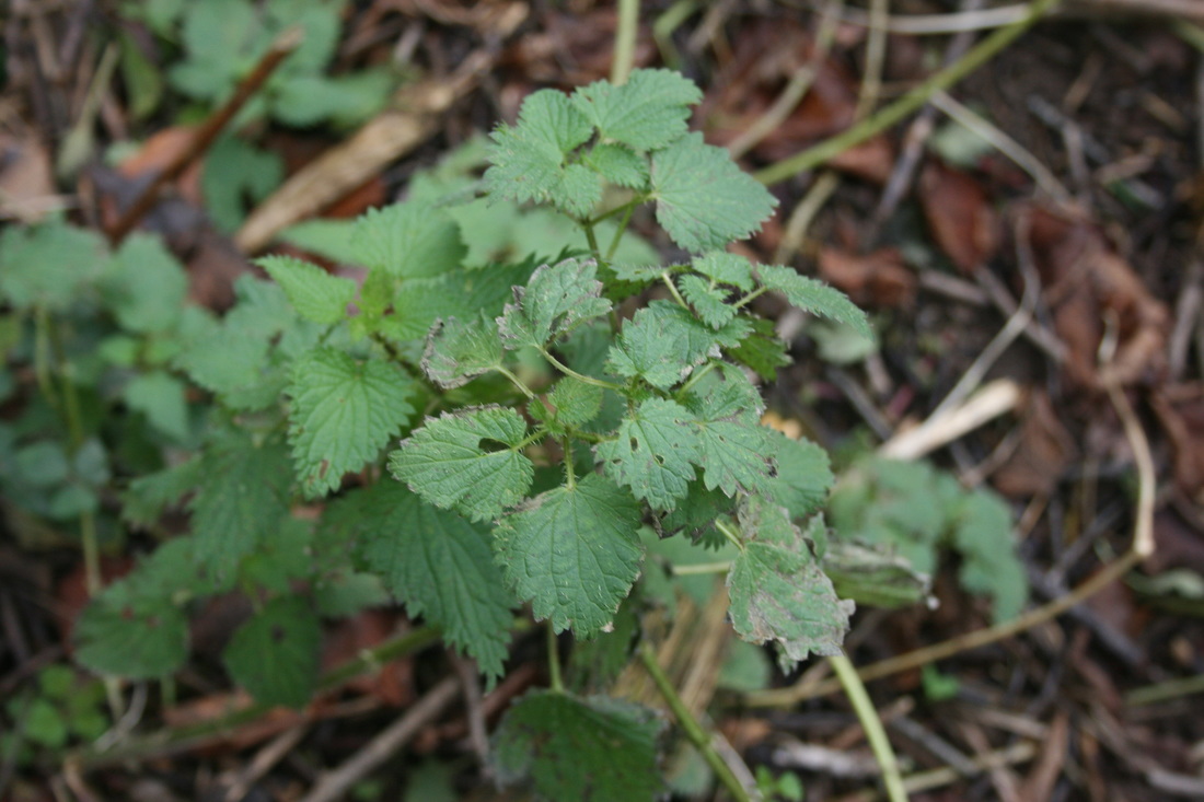
As I went on holiday to the countryside in Wales, I wanted to do this task in a different location to normal. This meant that I had to change perception of an environment around me and think creatively about the details in the environment and how they can be percieved. It was also more challenging than the urban environment I am used to, as the bigger picture and scenery is very striking and you wouldn't think to be looking for the details you wouldn't usually notice.
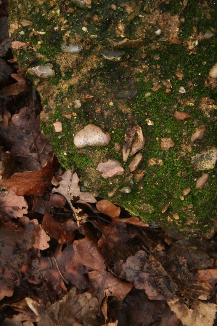
I have plotted the photos on a map according to where I took them. This gives a sense of scale but also where these details that I noticed are in relation to each other. The photos have been put into three categories - good (green), brown (ugly), and bad (red).
I have plotted the photos on a map according to where I took them. This gives a sense of scale but also where these details that I noticed are in relation to each other. The photos have been put into three categories - good (green), brown (ugly), and bad (red).
|
first location:
|
second location:
|
|
|
|
You can see the pictures more clearly here:
BAD:


GOOD:


UGLY:

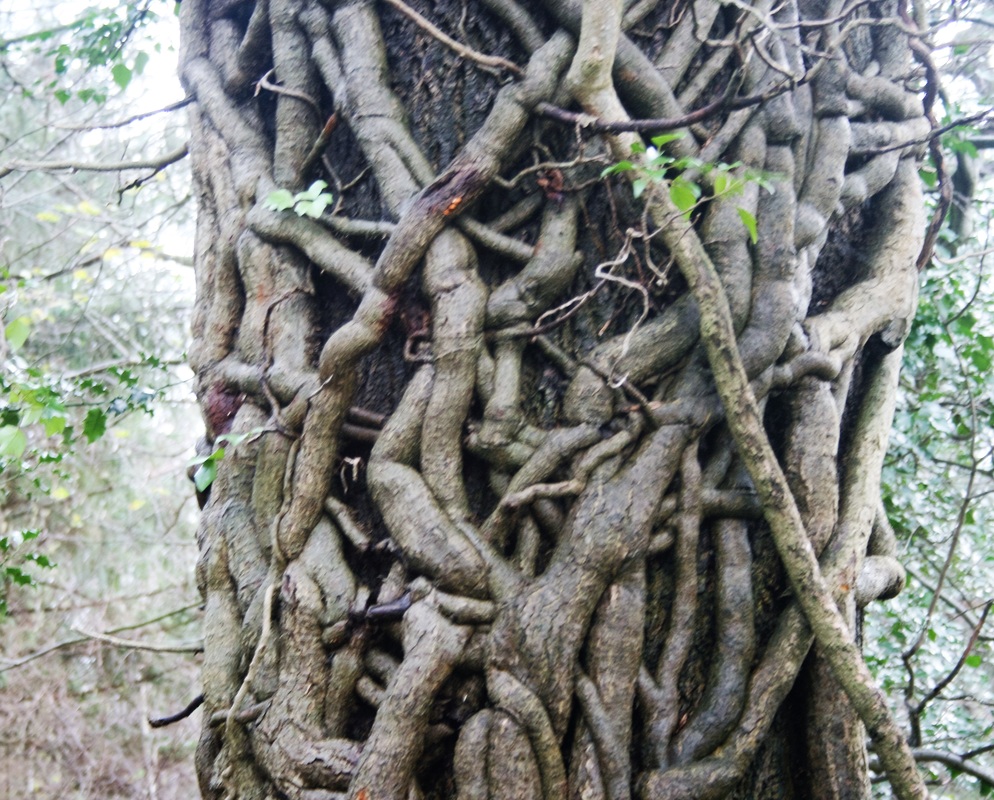
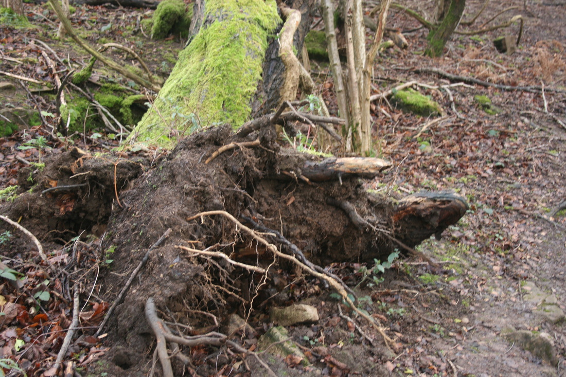
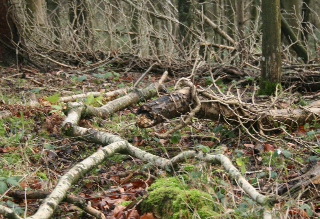
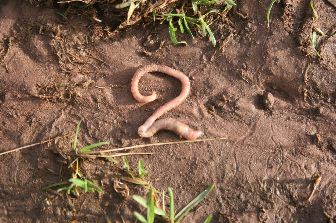
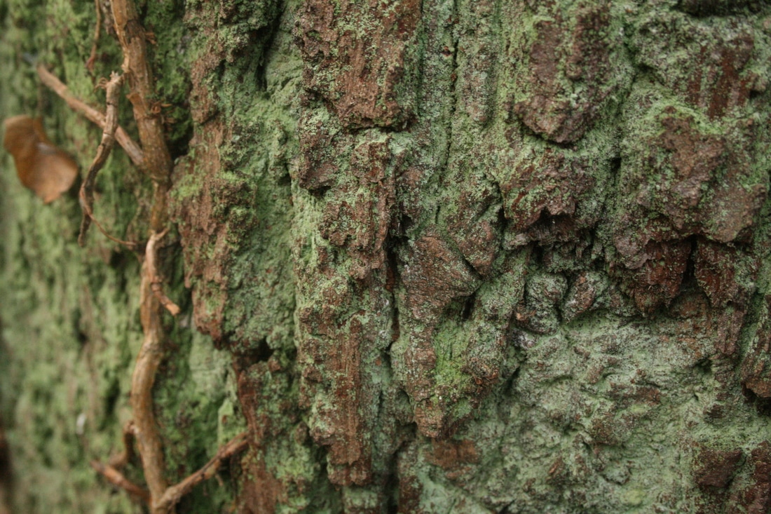
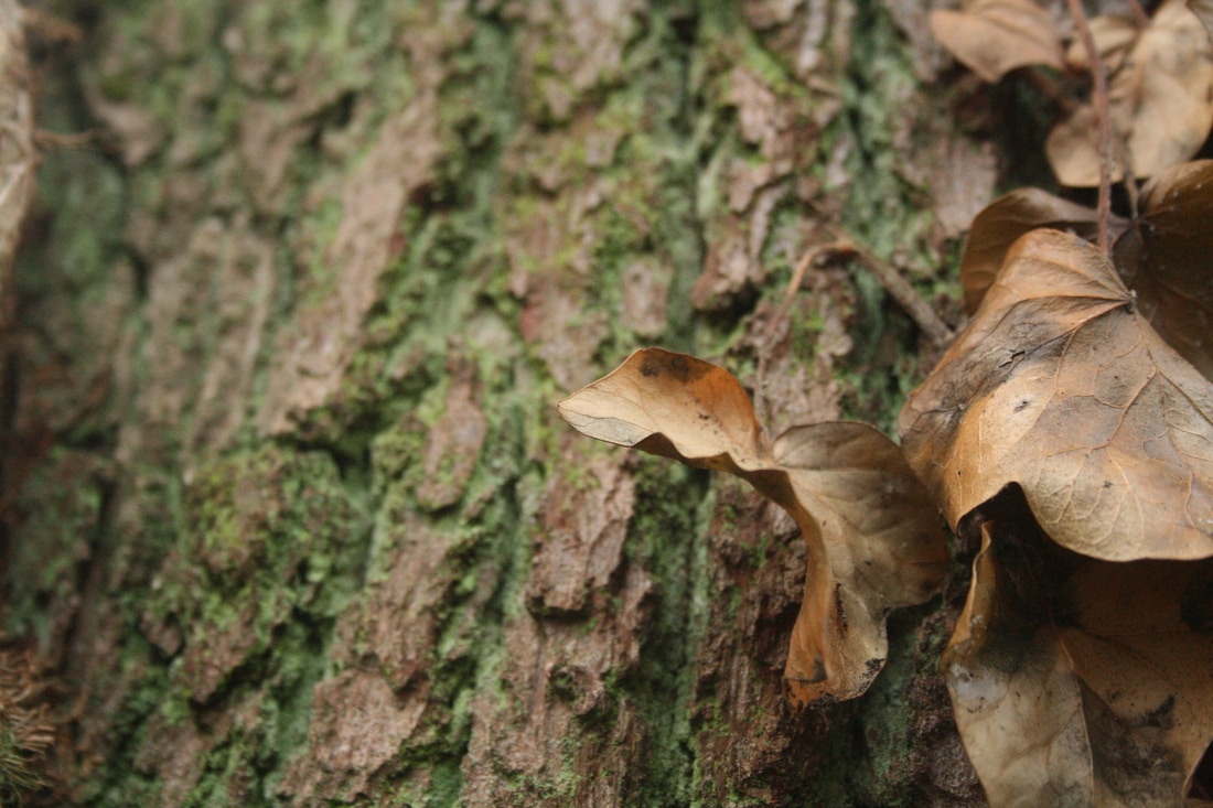
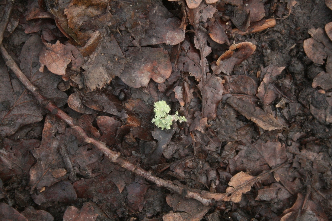
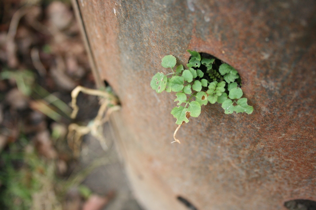
WWW: I really thought outside the box when I was thinking of ideas, like 'distraction' for bad. This means there's a lot of variety between the images. The angles some of the photos are well-chosen - in the image of the spider in 'good', the spider is very central in the middle of his web. This shows that he is the creator of the web, and in his environment, he has a lot of power. Furthermore, in the photo of the tree just above, composing the image from behind means that the effect of the uprooting is really brought to the fore and accentuated.
EBI: The settings and times could have been more contrasting, meaning I could experiment with more techniques. For example, nearly all of the photos were taken mid-morning/mid-afternoon; if I had taken photos at early in the morning or at sunset, I could have had experimented with lighting and shadows. Or, if I had taken the photos at night or in the evening, I could use longer exposures to create interesting effects, like blur to convey movement or light painting to outline the objects.
EBI: The settings and times could have been more contrasting, meaning I could experiment with more techniques. For example, nearly all of the photos were taken mid-morning/mid-afternoon; if I had taken photos at early in the morning or at sunset, I could have had experimented with lighting and shadows. Or, if I had taken the photos at night or in the evening, I could use longer exposures to create interesting effects, like blur to convey movement or light painting to outline the objects.
Artist comparison - richard wentworth
Richard Wentworth takes photos of interesting close-up details in our environment. When I did this project and the following one, I tried to take inspiration from his work. Here, you can see the similarities between my responses and his work.
|
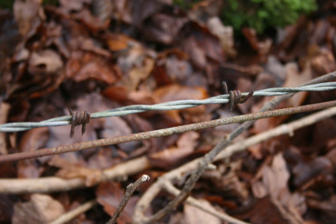
This photo of a footprint by Richard Wentworth is powerful in my eyes because of the idea of something so ugly and plain being permanently imprinted is very striking. Furthermore, the fact that the main footprint is upside-down is strange and disquieting. The smoothness and clean curves contrast greatly to the print above it. The one above is the 'right way up', yet ridged and broken. In my photo, I tried to create this idea of contrast by having an imprint of a foot cutting in to the mud close to the fresh grass growing out of the ground.
|
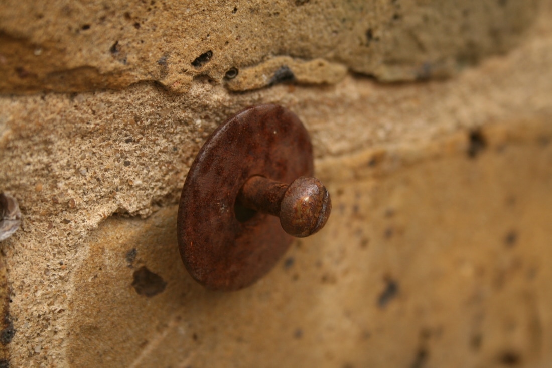
wentworth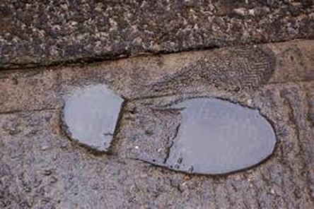
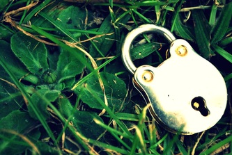
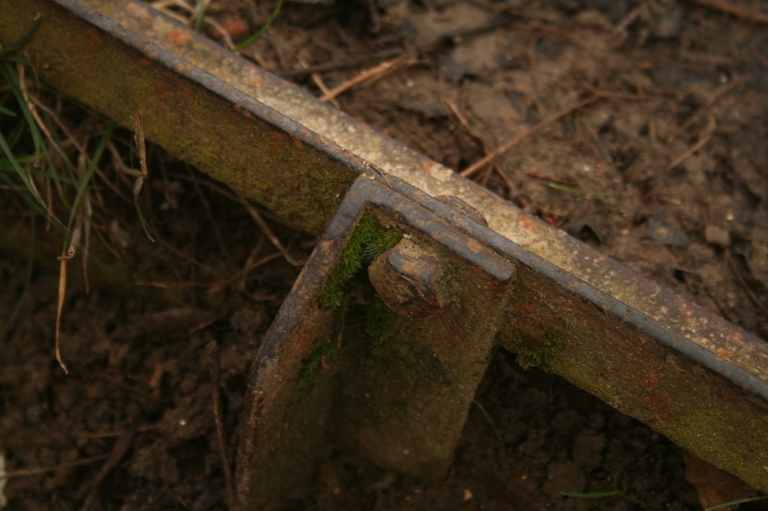
Wentworth emulates the idea of nature against the man-made in his photo of a lock on a bed of grass. The sheen and precision of the lock against the rich, majestic grass is stunning and makes the photo particularly eye-catching. I took inspiration from his photo by capturing a chain on the ground.
|
me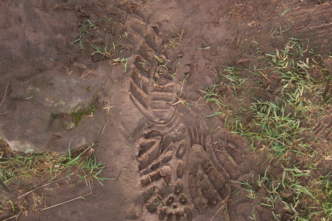
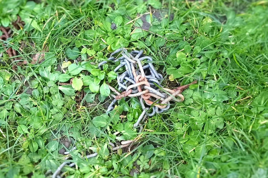
However, it was hard to replicate the balance of colours because the grass was too bright so to bring the metal to the fore I added an effect which put it in better focus. I also feel like I could have taken the photo at a more interesting angle to focus on the rust on the chain or counter the aesthetics of the grass by making the photo 'off balance', like Wentworth does in a sense.
|
Nine Favourite Photos
I then chose my nine favourite photos from the first project and attributed a word to them that I felt best described each photo.
Twisted

Rust

Web
Moss
|
Distraction

Vibrant

Relic
|

Bright

Uprooted
|
3 parts of my environment
Next, I chose my three favourite photos and developed one or two sets of images on each idea.

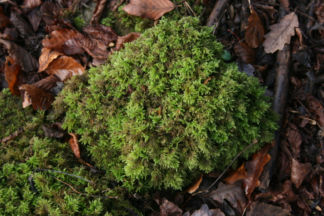
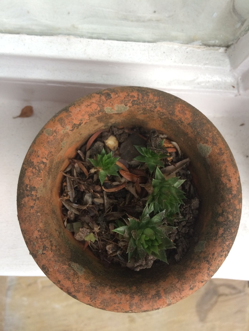
Moss
|
Bright
|
Rusted
|
Bright
|
|
|
|
|
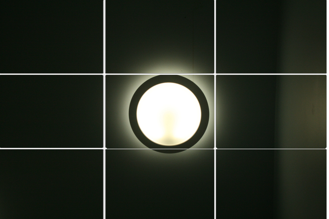
second response - bright lamps
click on the images to enlarge them

|
|

|


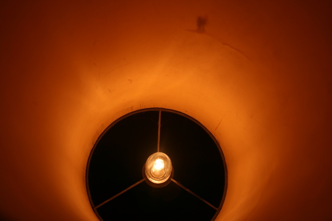
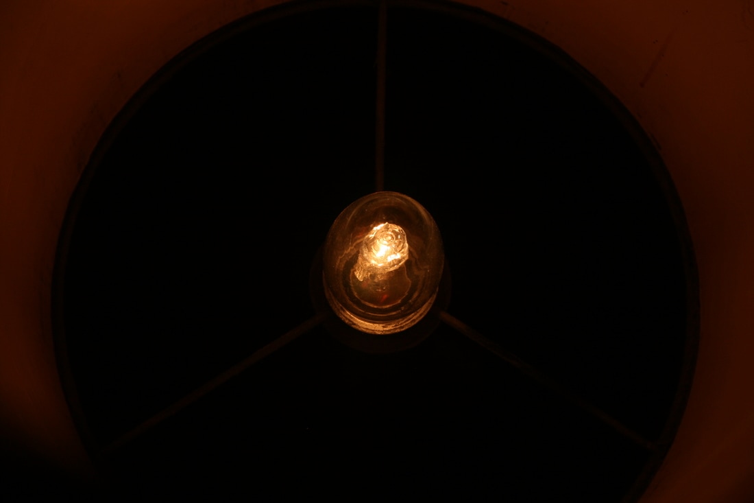
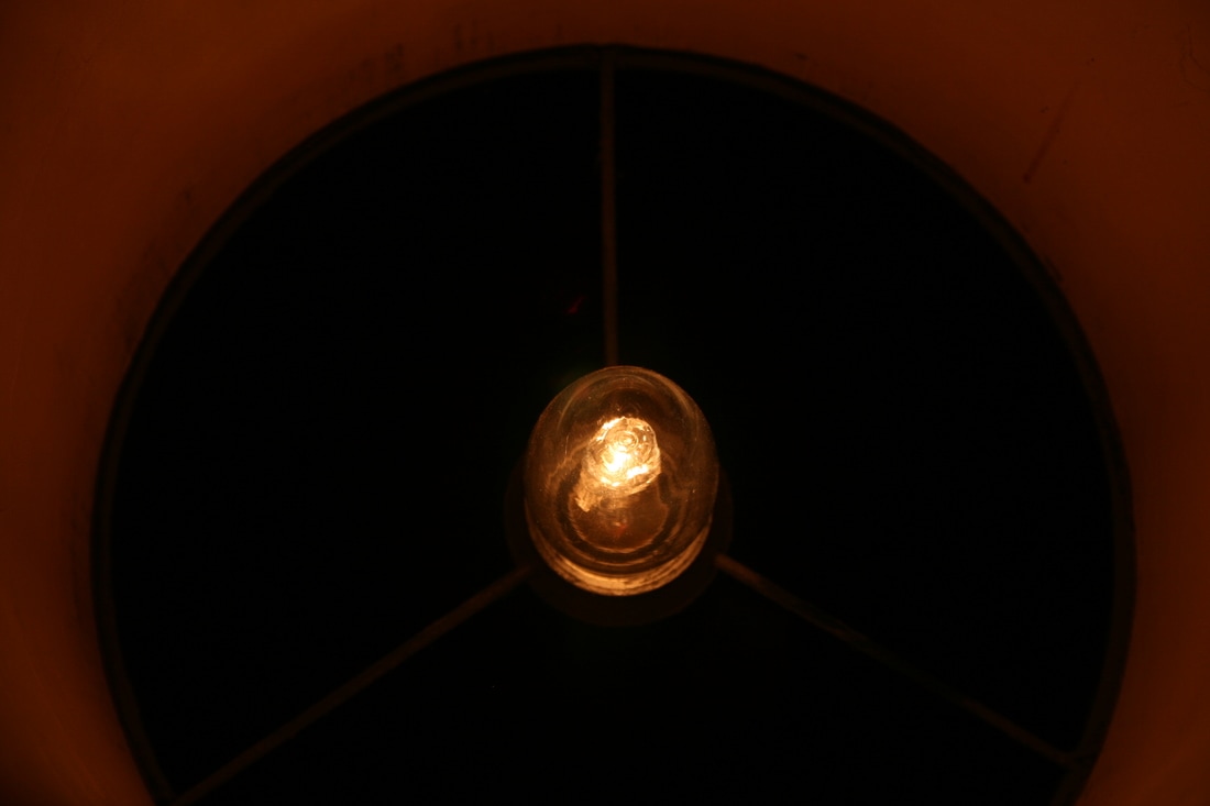
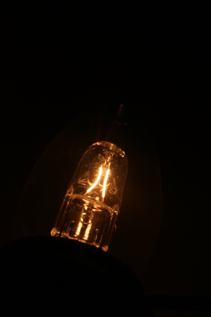
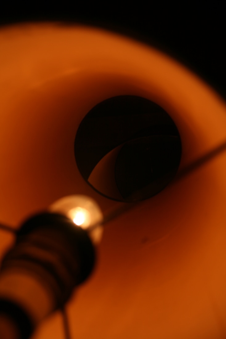
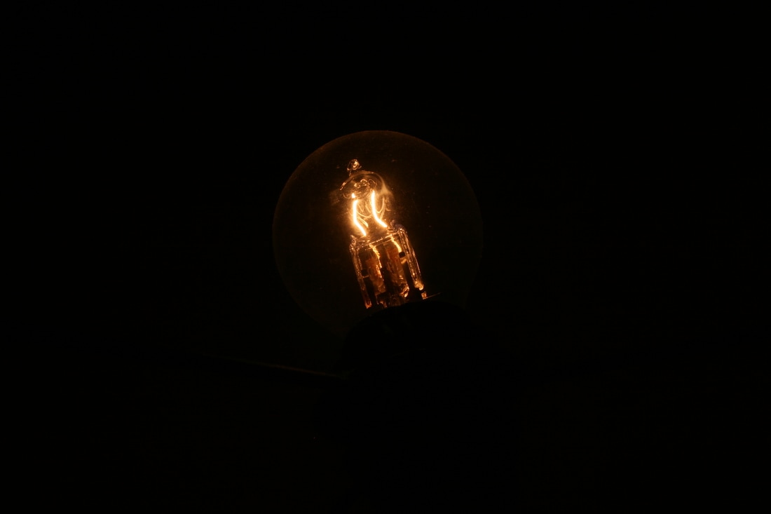

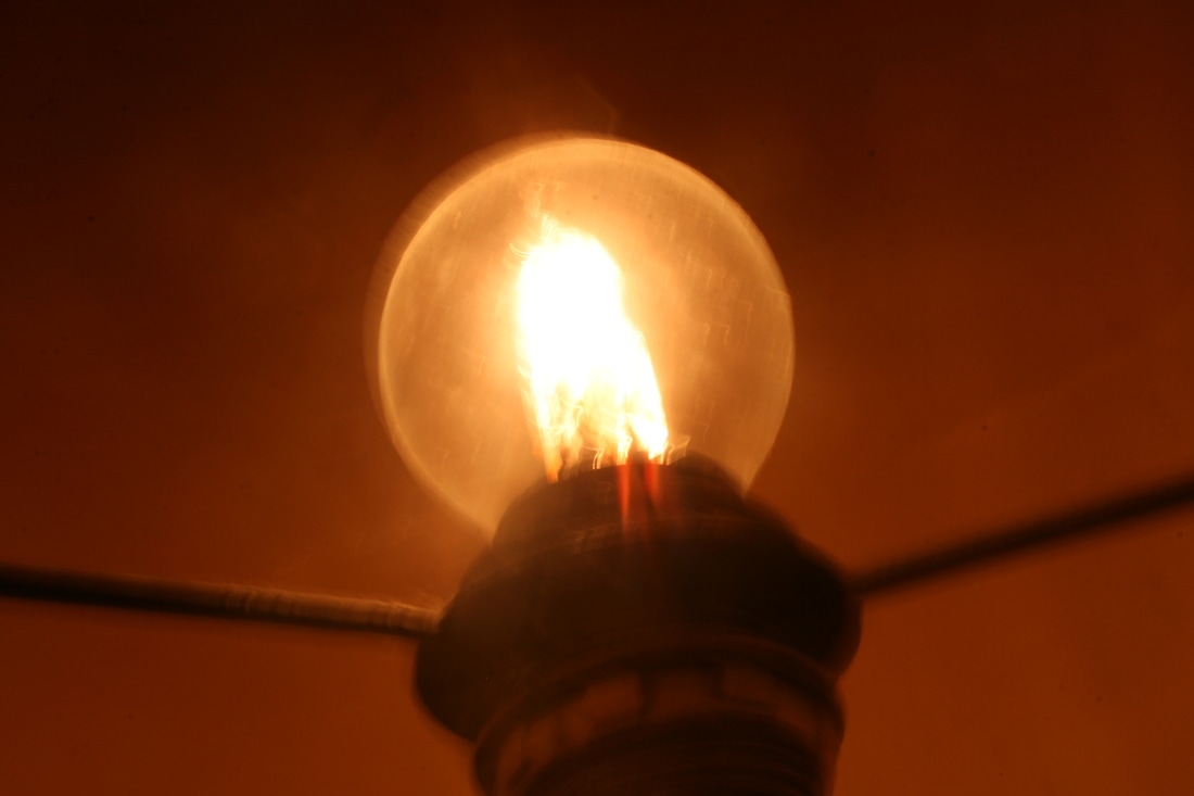
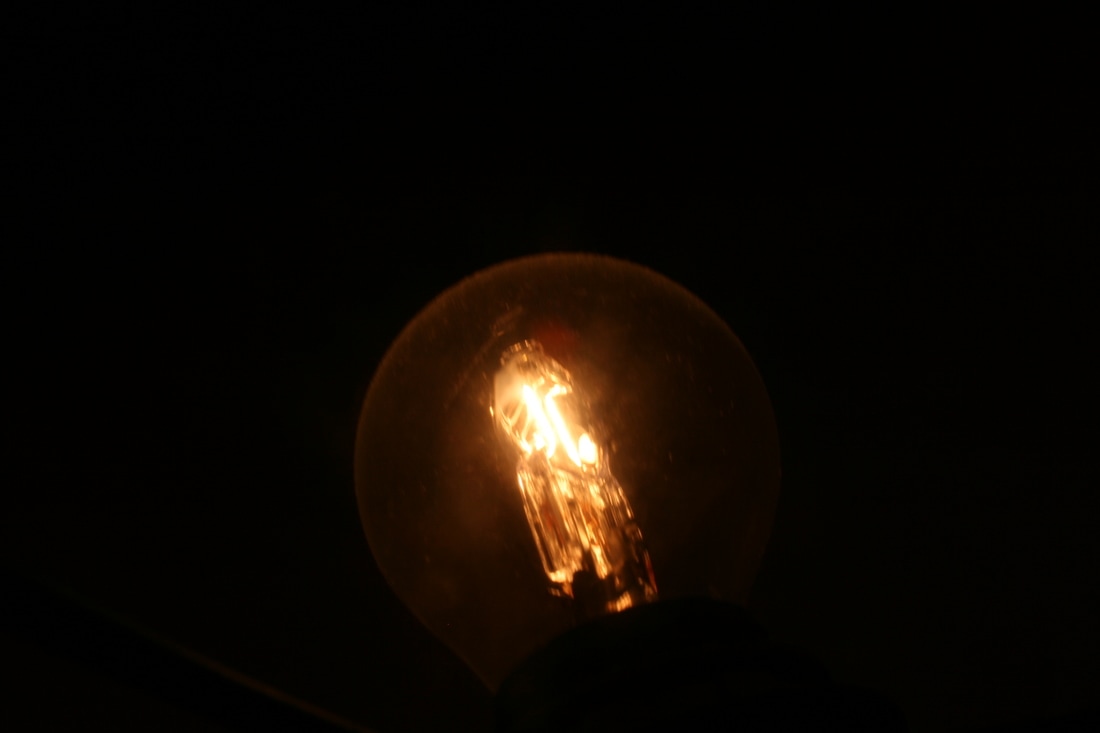

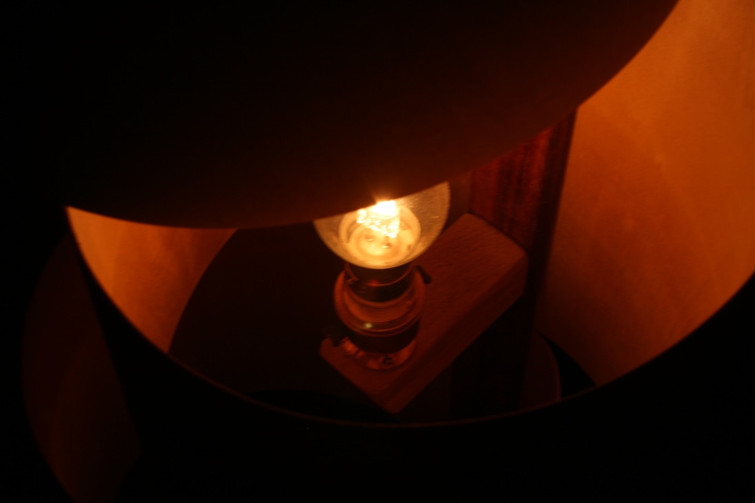
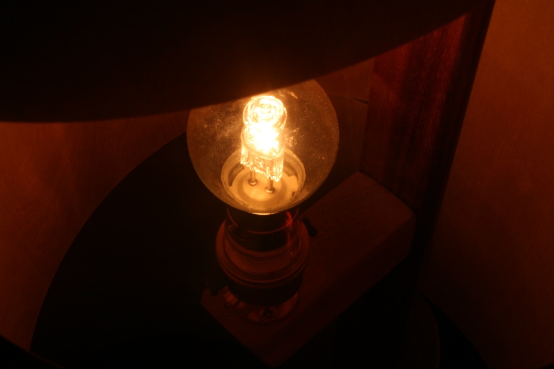
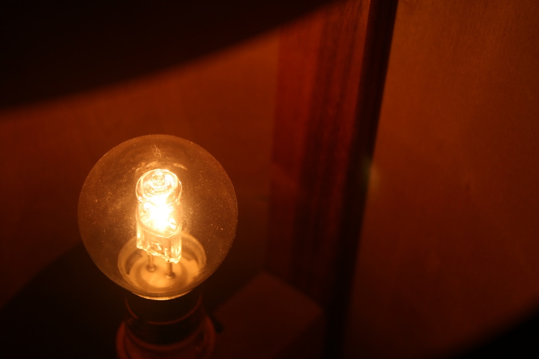


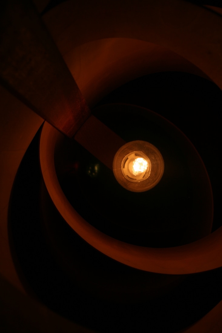


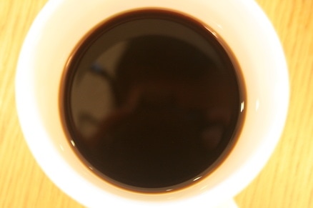
WWW: Many people perceive 'bright' as shining, bold colours or a white glare. Some of the photos are inspired from that perception. However, I really confounded the idea of what is 'bright' by using contrast in the composition of many of the images. For instance, in the image of the coffee (in the 1st response) the main part of the image is a rich brown colour and yet the photo is so effective because it is the darkness that empowers the white mug.
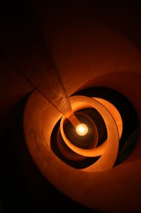
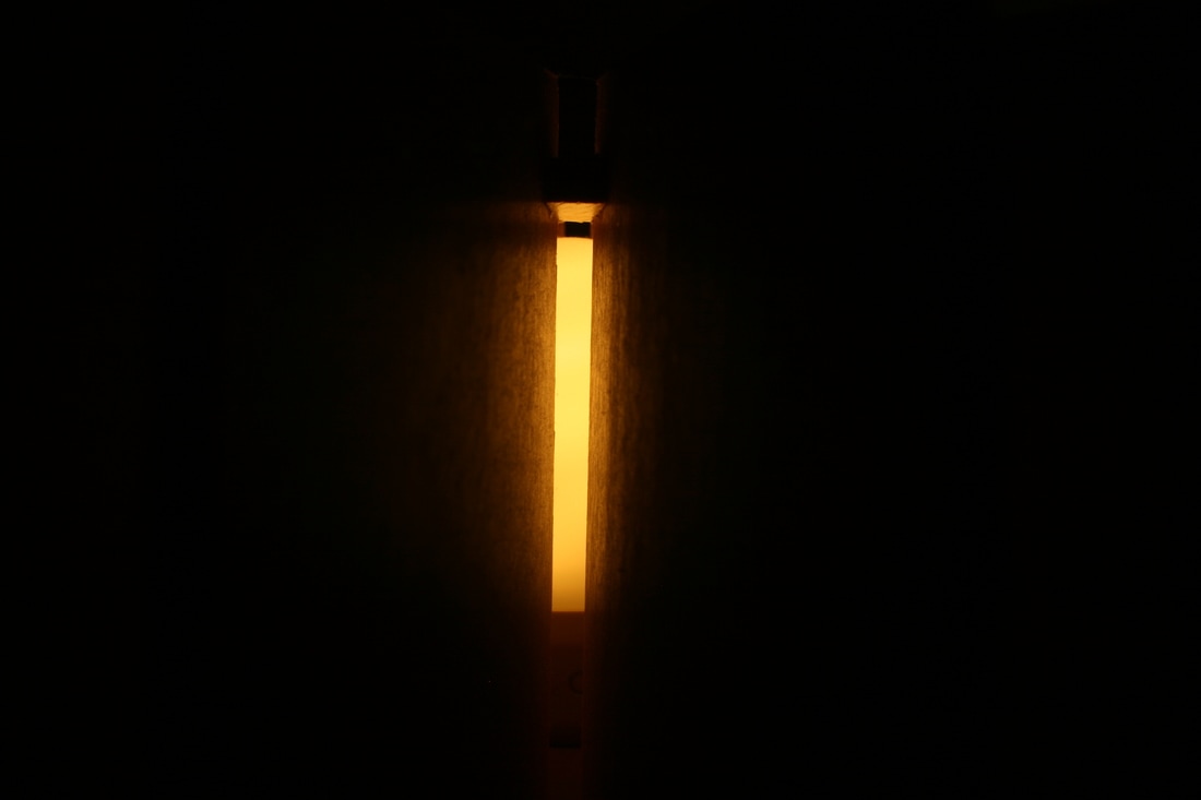
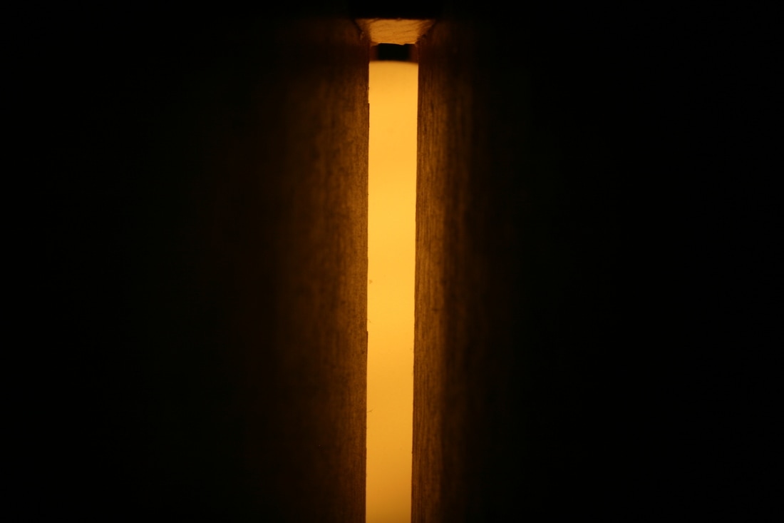
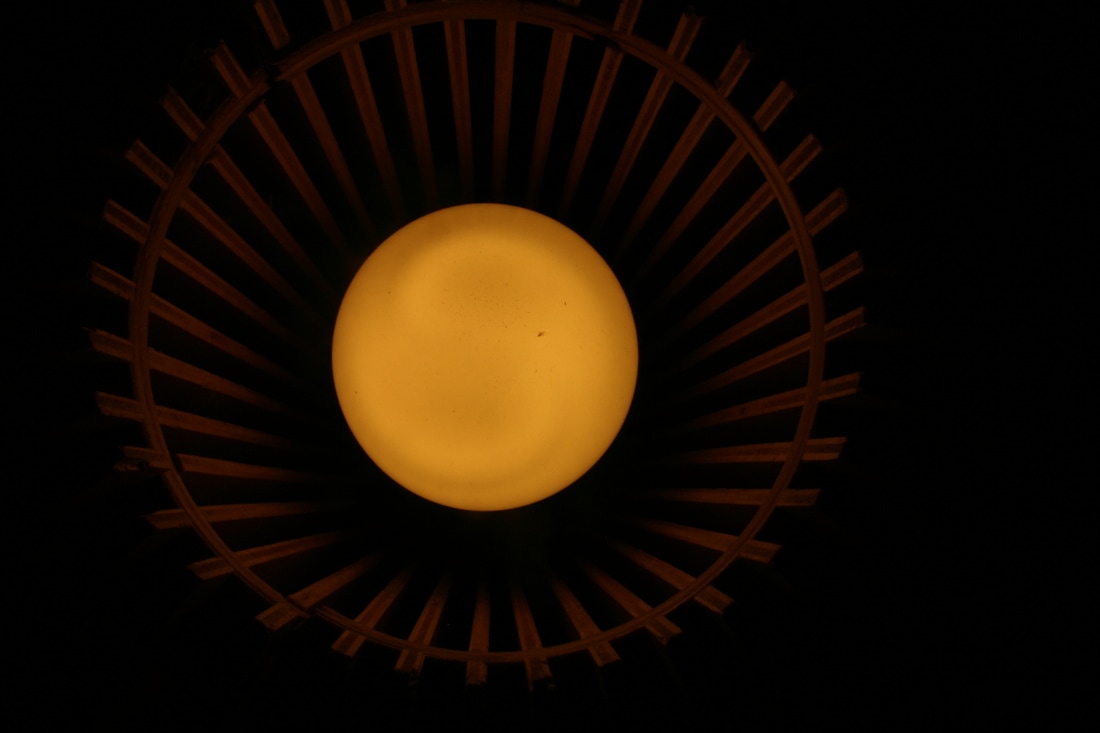
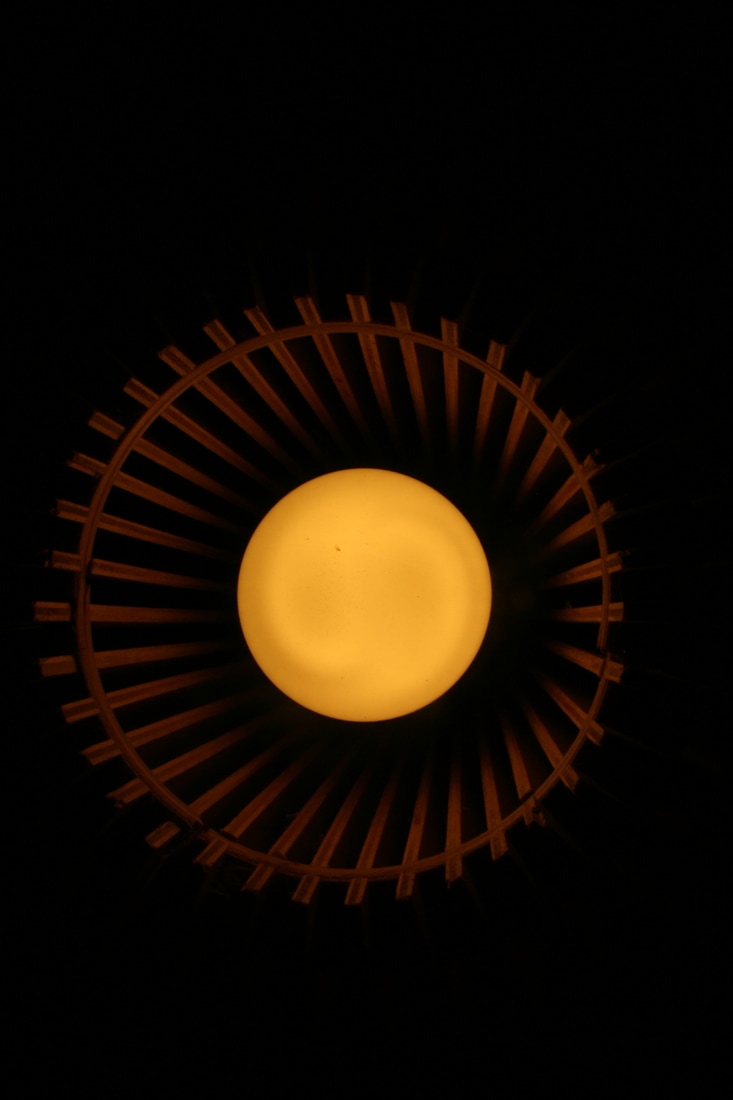
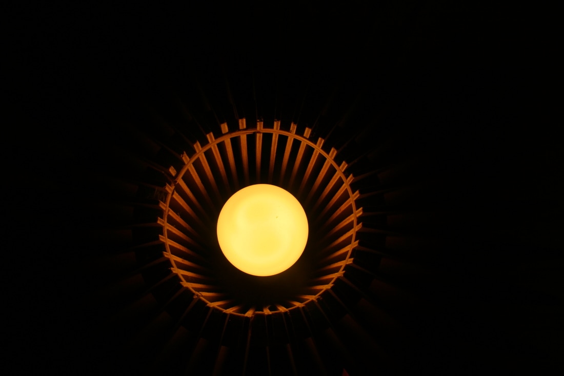
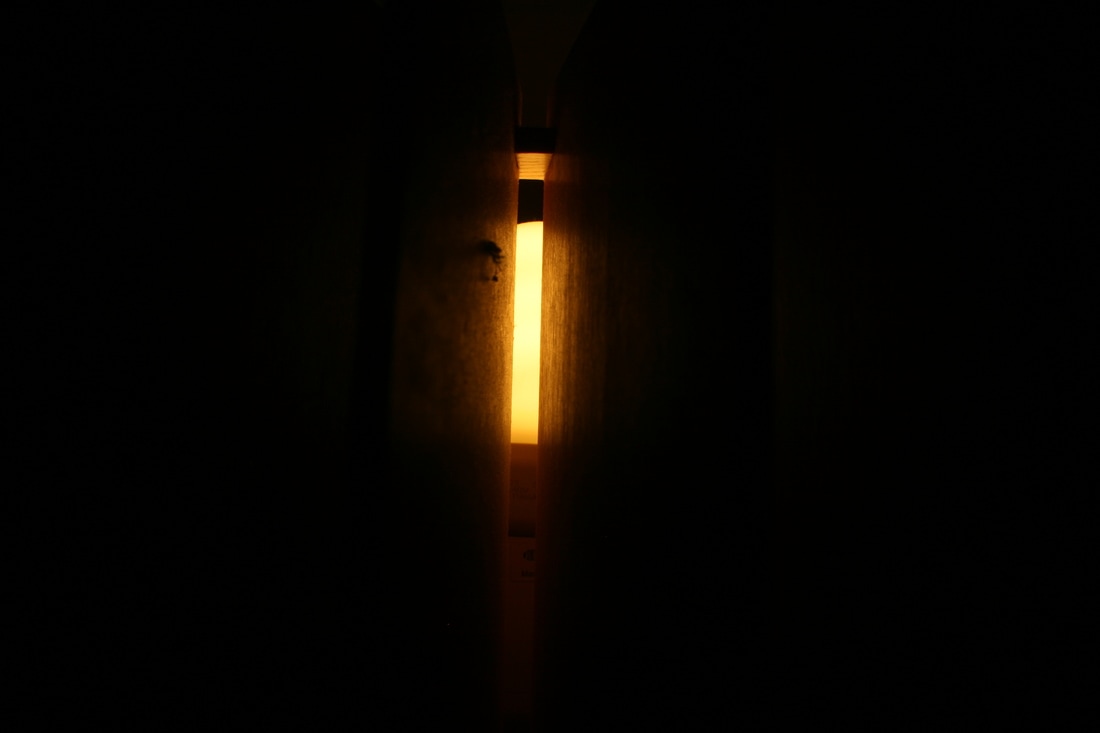
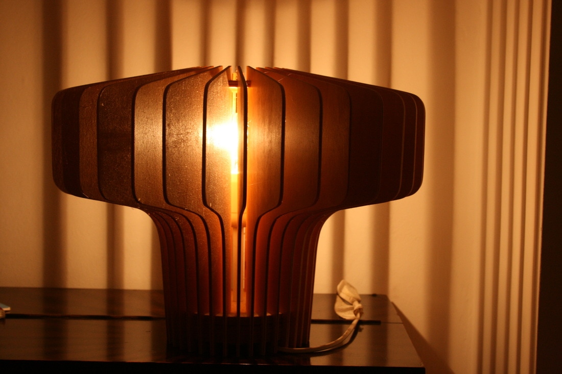
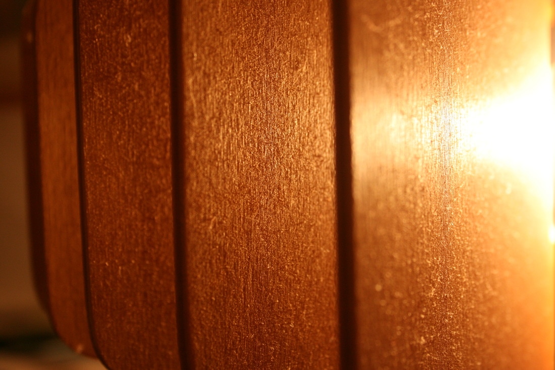
EBI: I like the idea of photographing lamps in the second response as a source of light and brightness, however for some of the images I feel like they weren't bright enough. For example, in the first enlargement I like the detail I got of the inside of the bulb but I'm not sure if the viewer is left with an overall sense of brightness. Similarly with the images of the single rectangular part of the lamp.
EBI: I like the idea of photographing lamps in the second response as a source of light and brightness, however for some of the images I feel like they weren't bright enough. For example, in the first enlargement I like the detail I got of the inside of the bulb but I'm not sure if the viewer is left with an overall sense of brightness. Similarly with the images of the single rectangular part of the lamp.
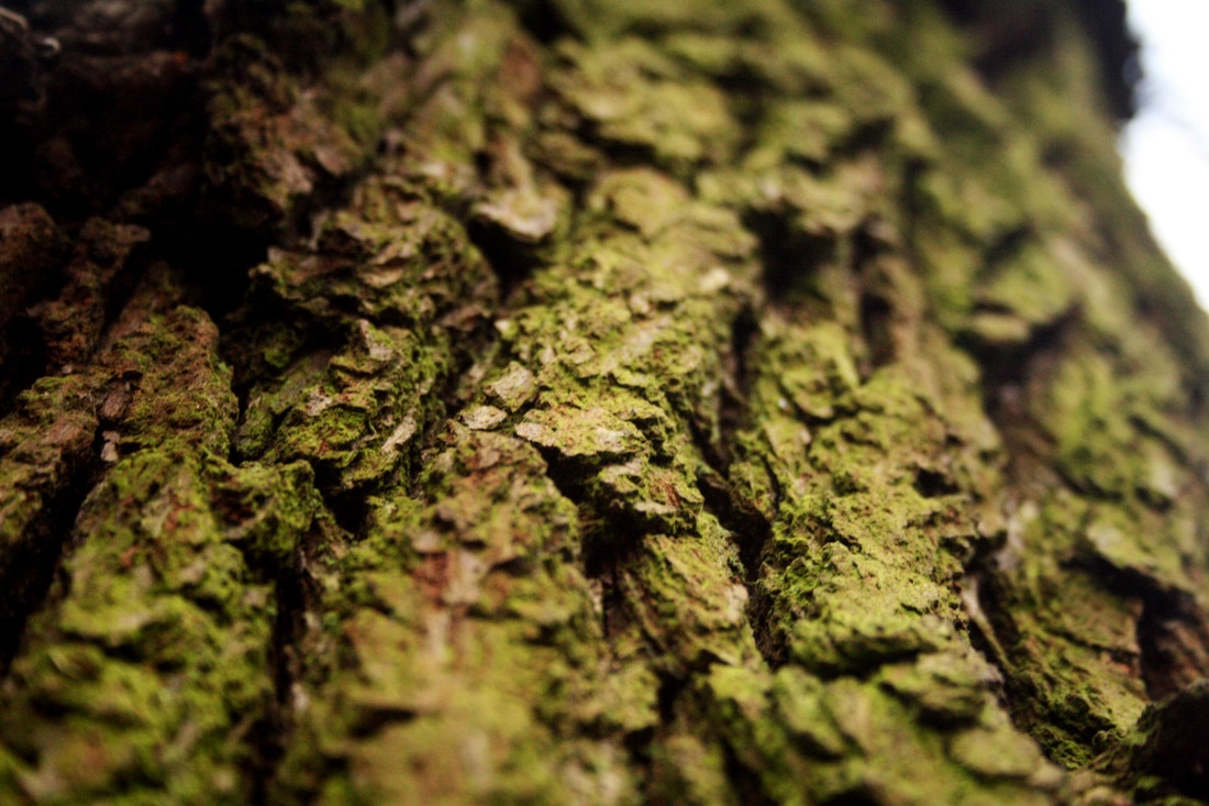
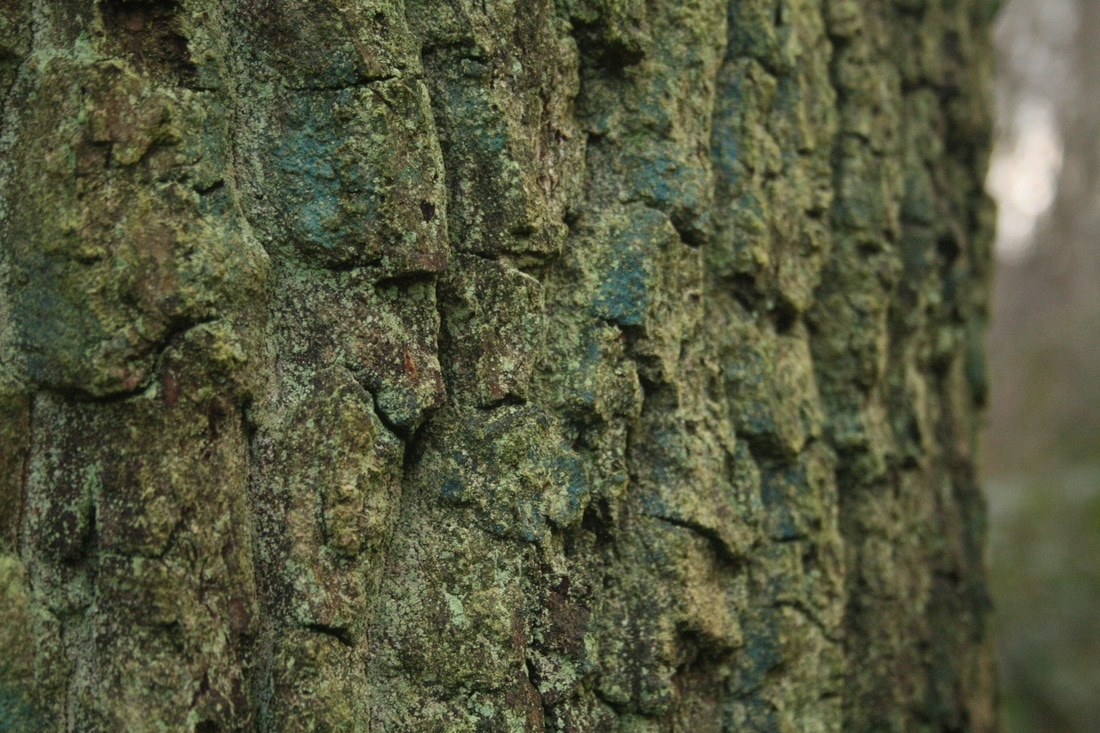
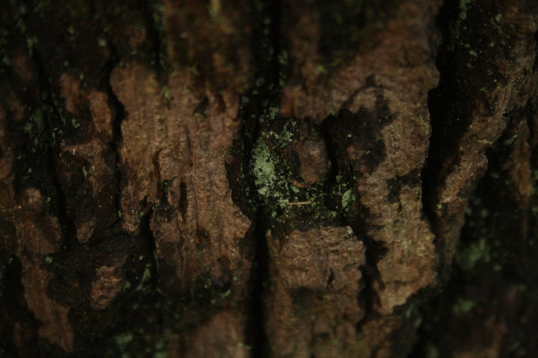
MOSS
|

|
|
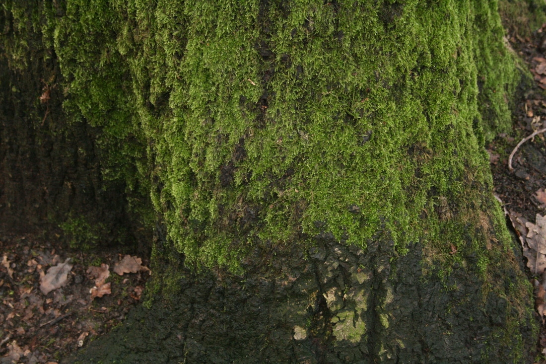
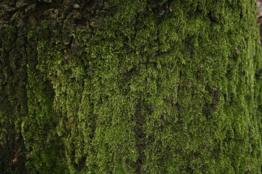
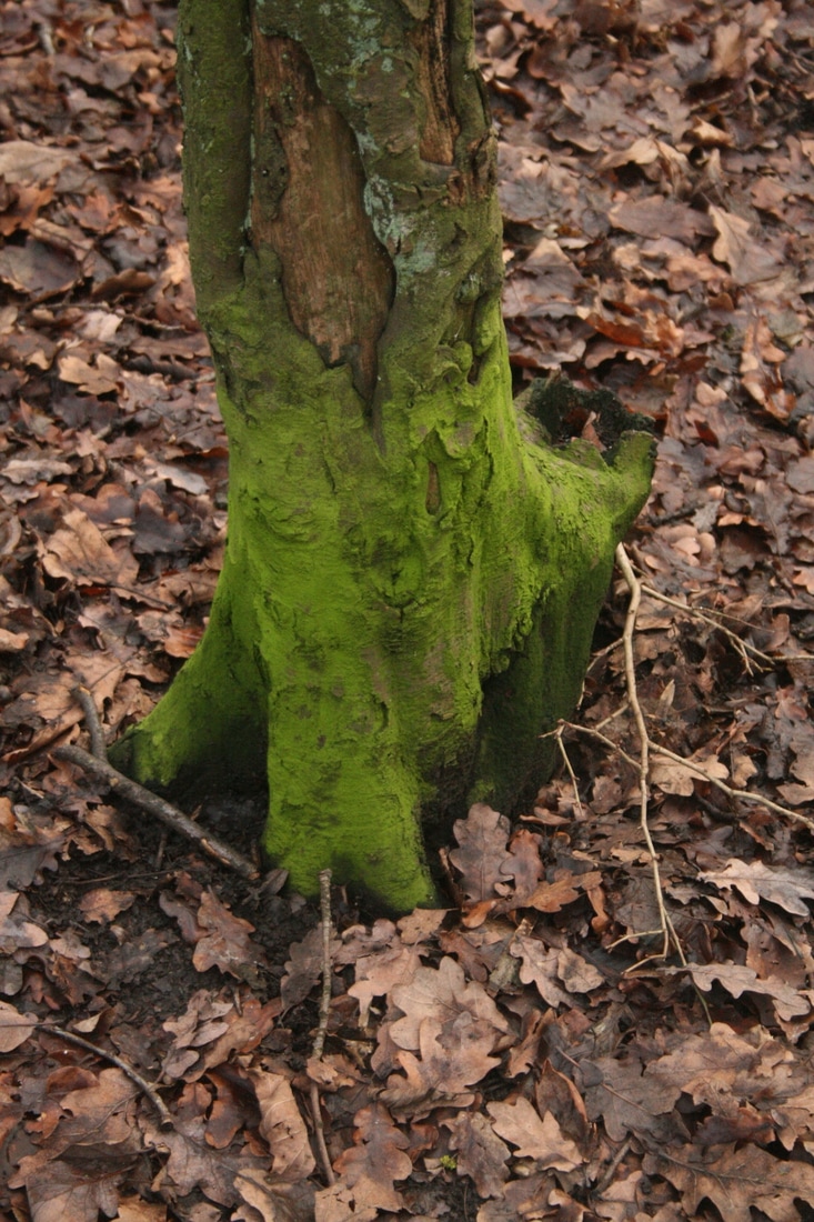
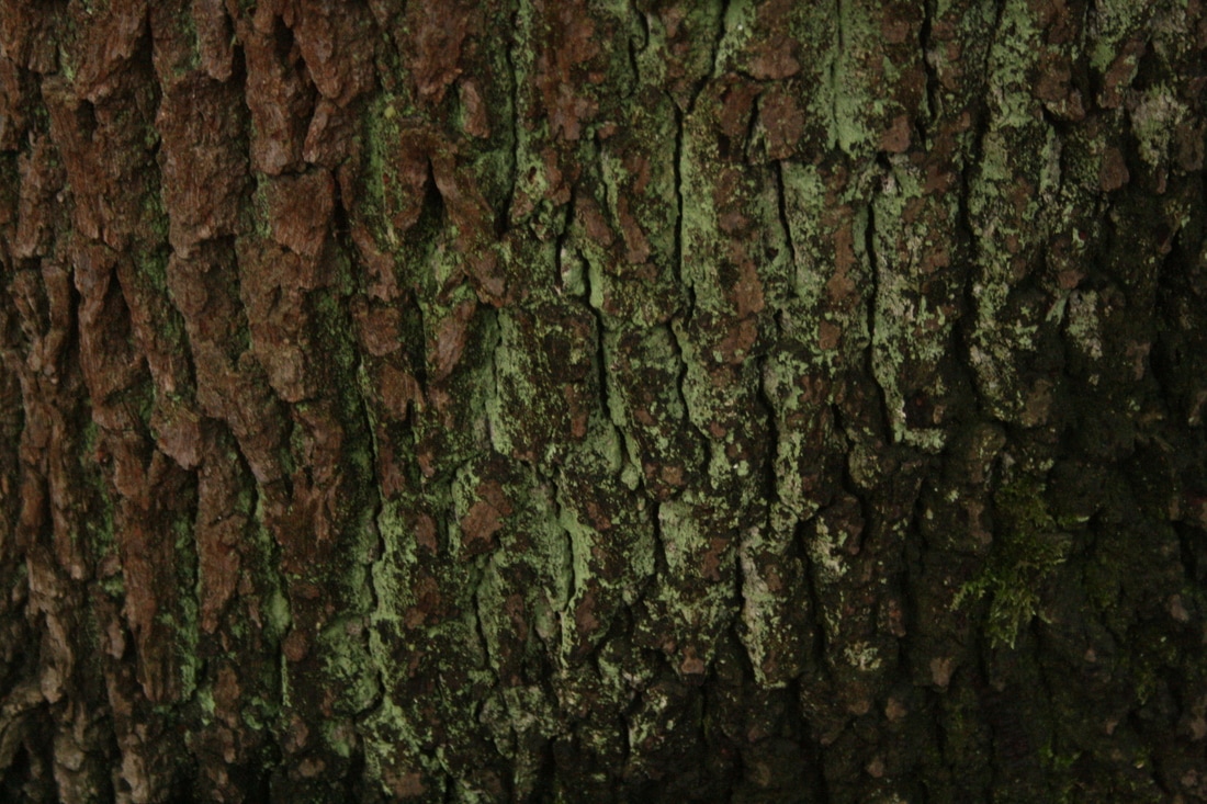
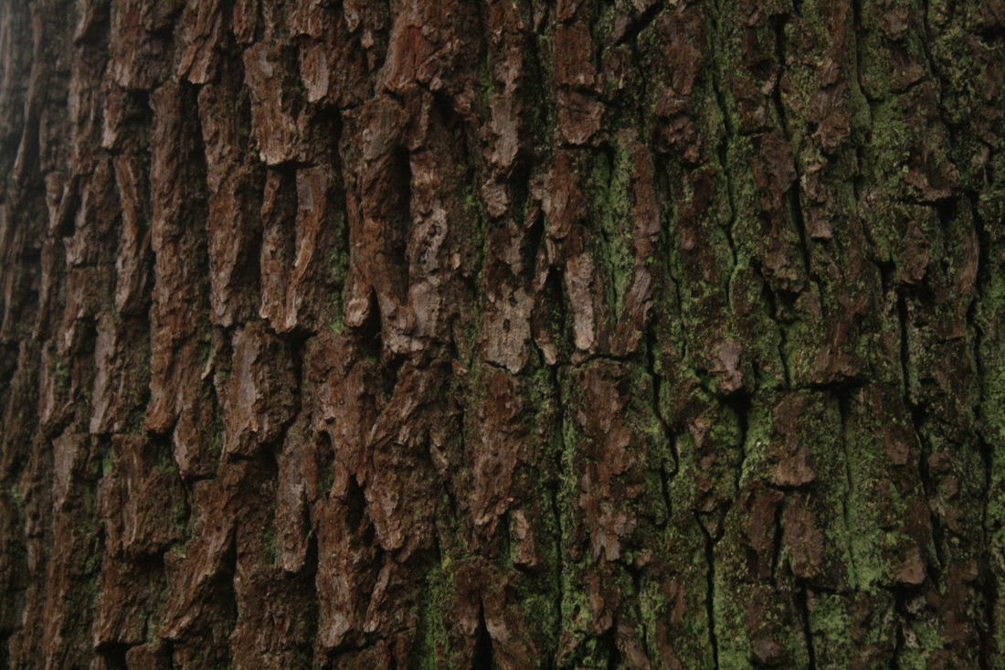
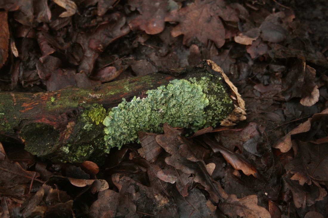
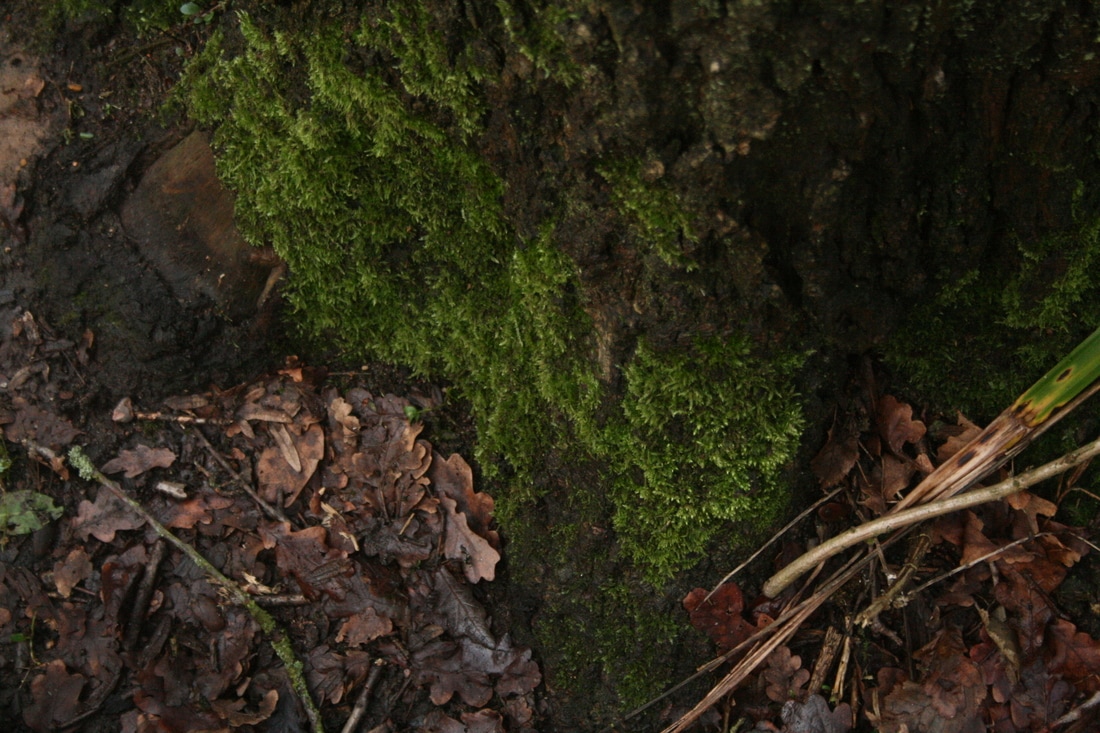


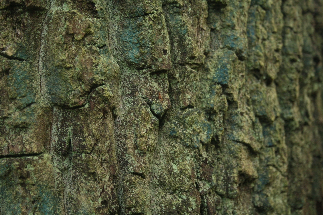

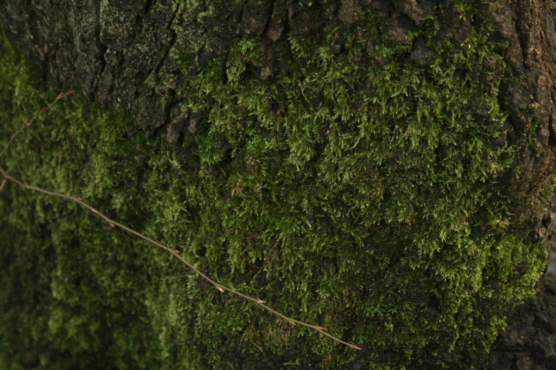
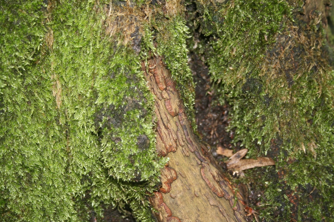


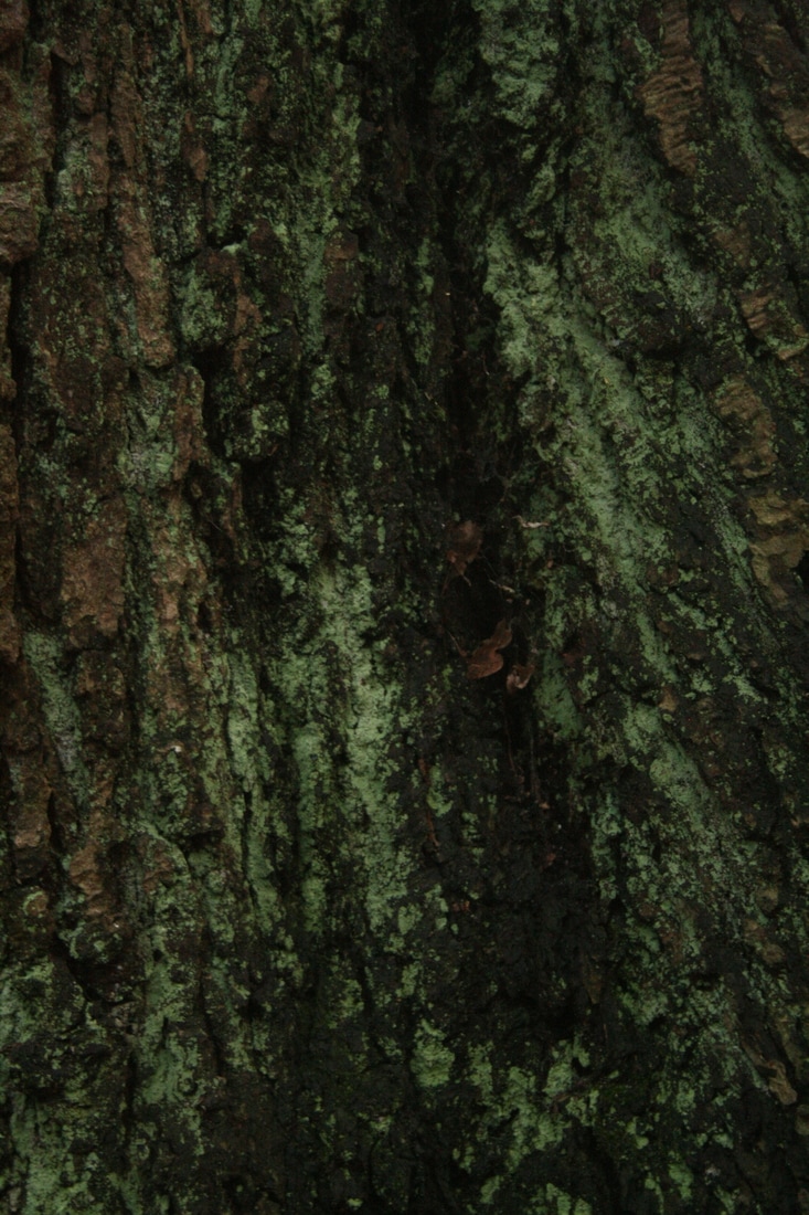
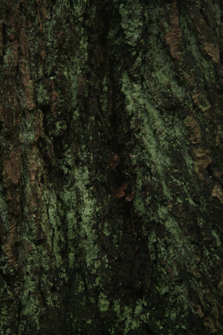
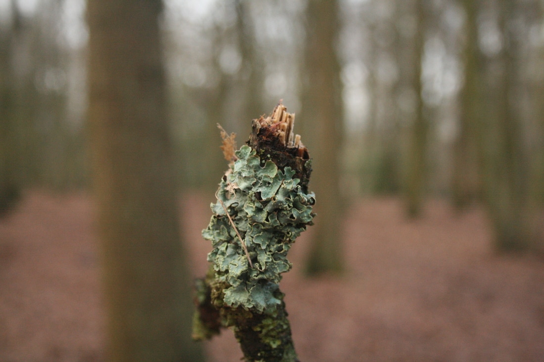


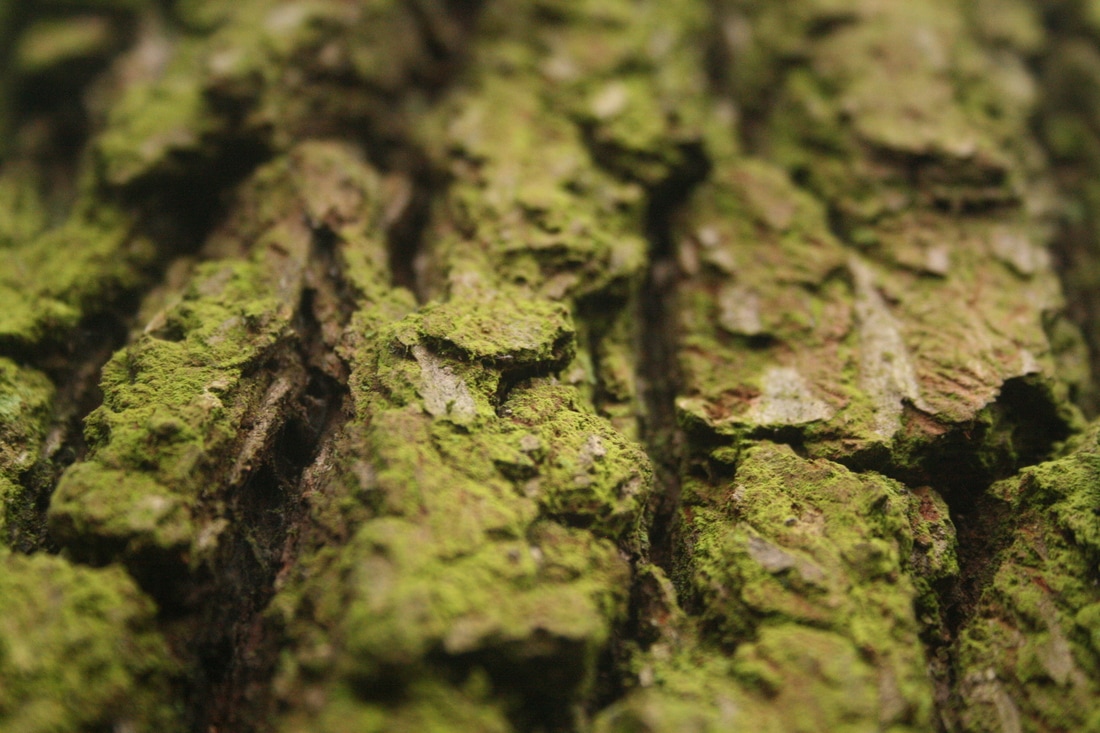
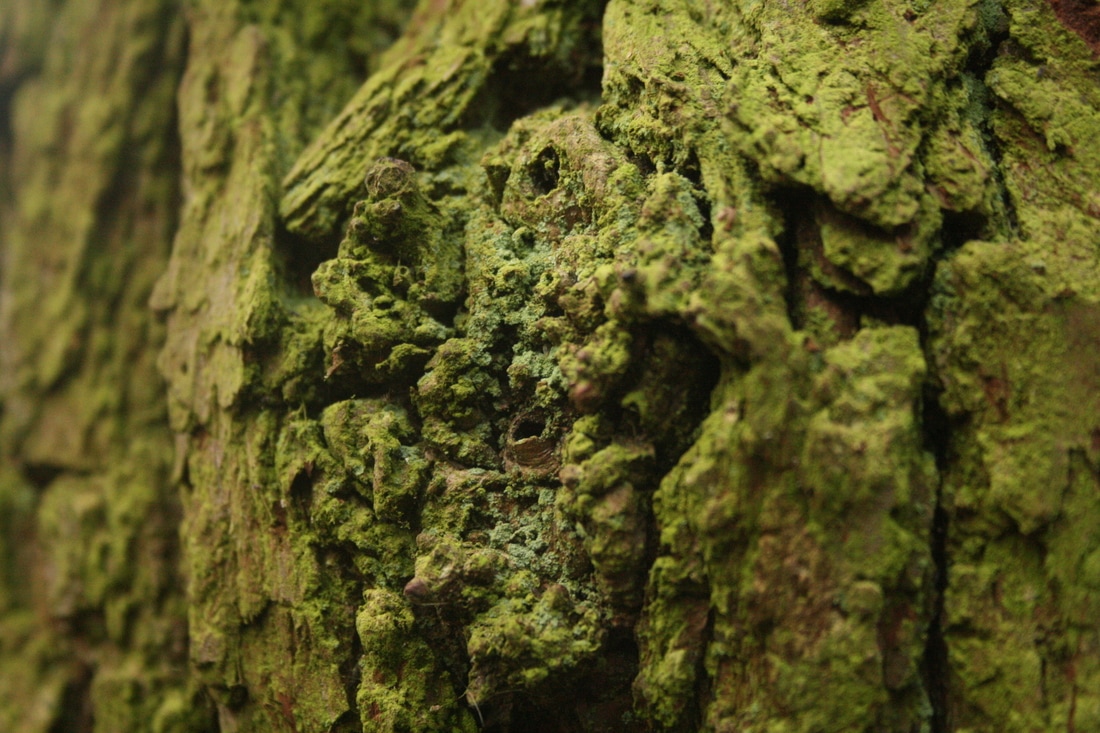
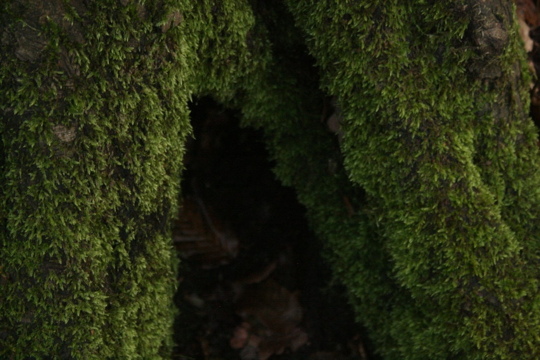

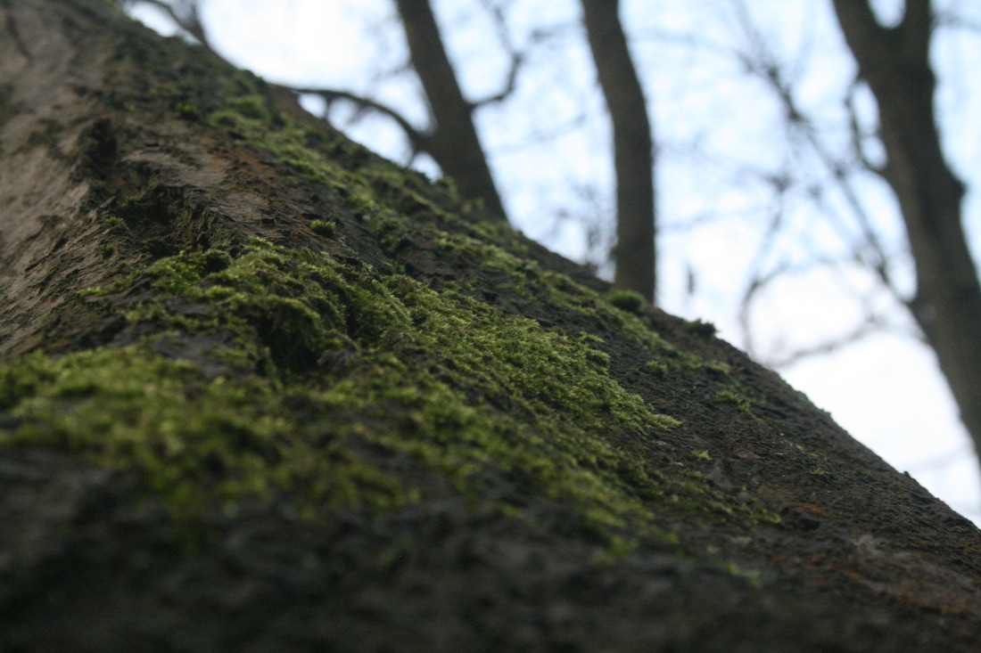

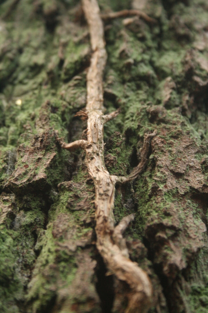
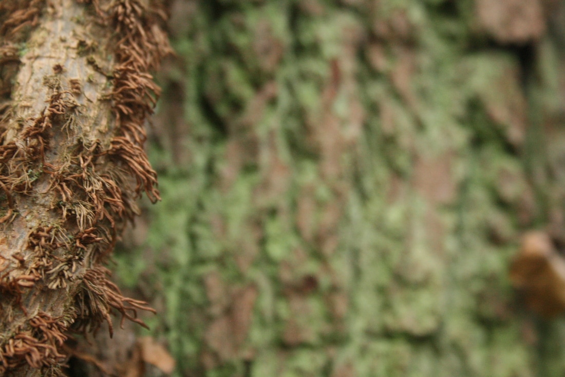
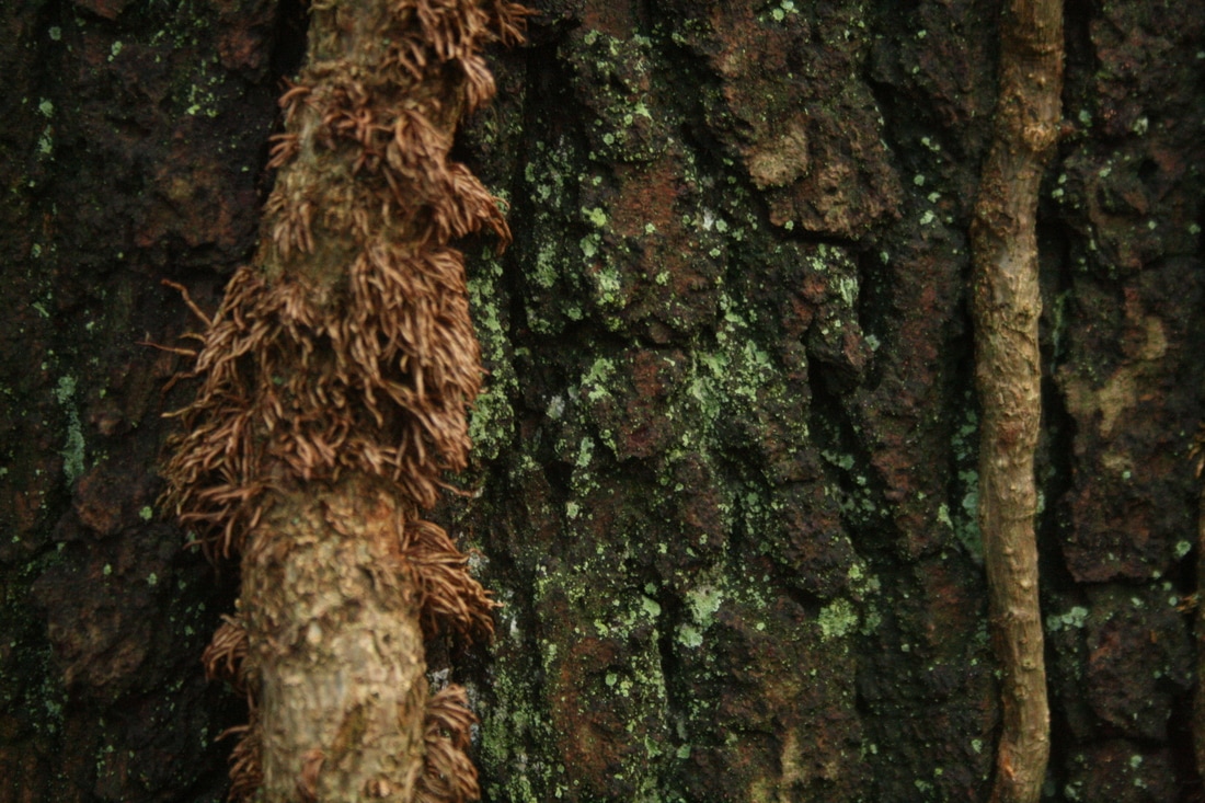


WWW: I like the variety in textures I created, particularly with the different layers of bark on trees. For example in the 4th row, 6th across image the cracked surface is really brought to the fore, but there are also small holes in the bark and the smoother blue moss. Also, a different texture is the last image, where the red paint and white moss look really sandpapery and rough.
EBI: In the first two images in the third row, I used the 'macro' setting in my camera. This tries to capture the detail of a small object and uses the flash. I thought it would be good to use as the moss needed to be photographed close-up. However, the flash just gives an unnatural effect and I don't see any improvement in capturing the detail in the moss.
EBI: In the first two images in the third row, I used the 'macro' setting in my camera. This tries to capture the detail of a small object and uses the flash. I thought it would be good to use as the moss needed to be photographed close-up. However, the flash just gives an unnatural effect and I don't see any improvement in capturing the detail in the moss.
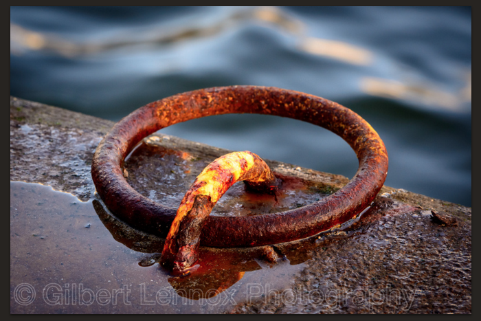
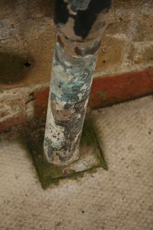
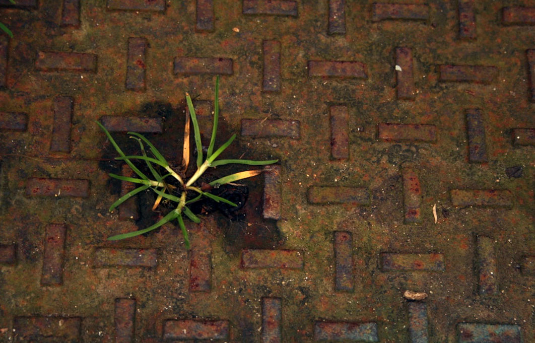
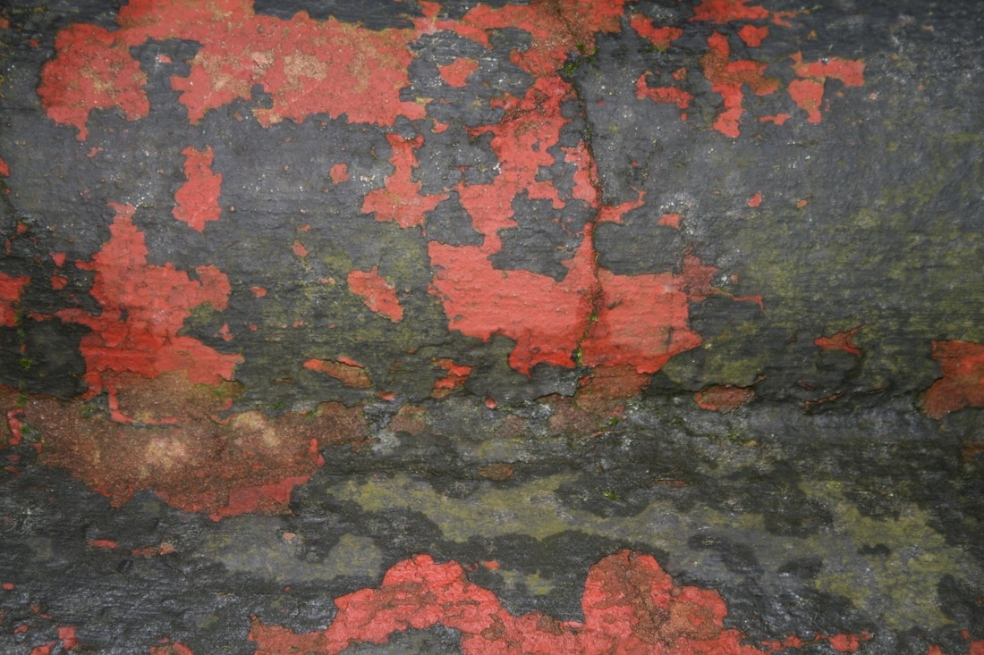
urban Rust/decay
gilbert lennox
|
|
|
my response
|
|
|
|

|
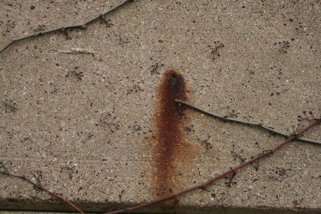


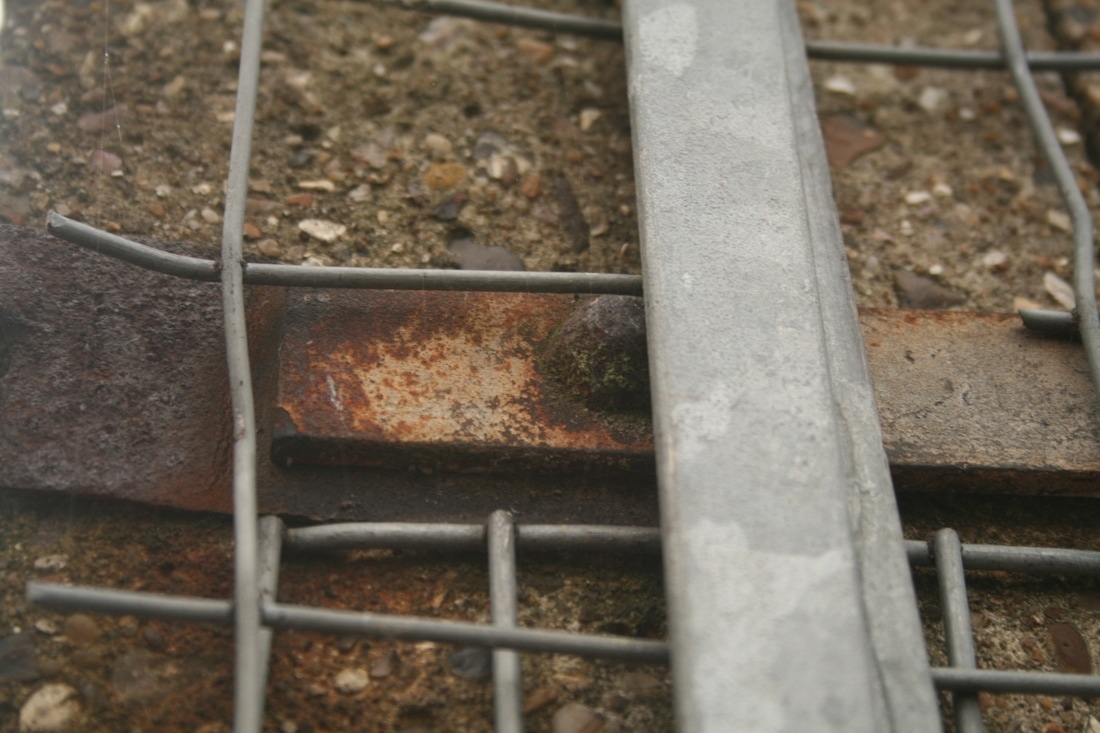

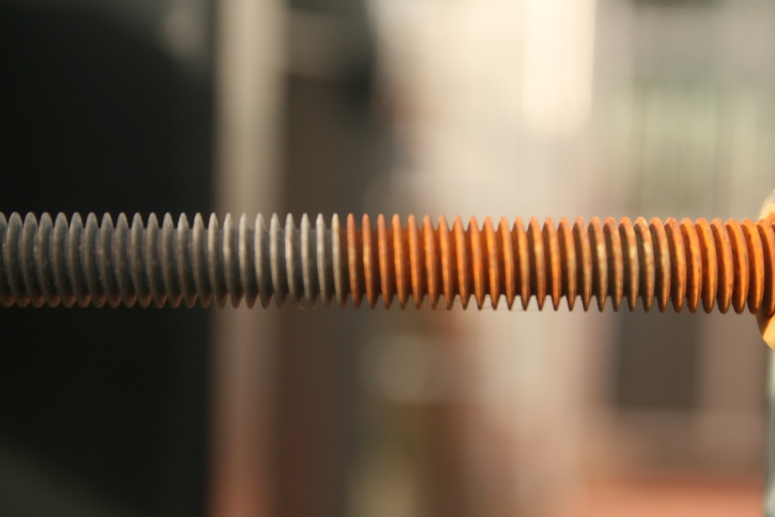
WWW: There isn't a big depth of field to the most effective photos; this means that the detail and composition of the rust is in the foreground. This is particularly visible in the top 2 photos, where the colour and texture of the rust is really clear. I also like how I incorporated nature to contrast the rust, like in the central enlargement in the group of 3; the fresh green petals really stand out against the rough brown rust.
EBI: I think there isn't enough going on in some of the images. Some of them (e.g. first three images in 3rd row) are lacking anything for the viewer to focus on and remember. This could be contrast, colour, texture, framing...
EBI: I think there isn't enough going on in some of the images. Some of them (e.g. first three images in 3rd row) are lacking anything for the viewer to focus on and remember. This could be contrast, colour, texture, framing...
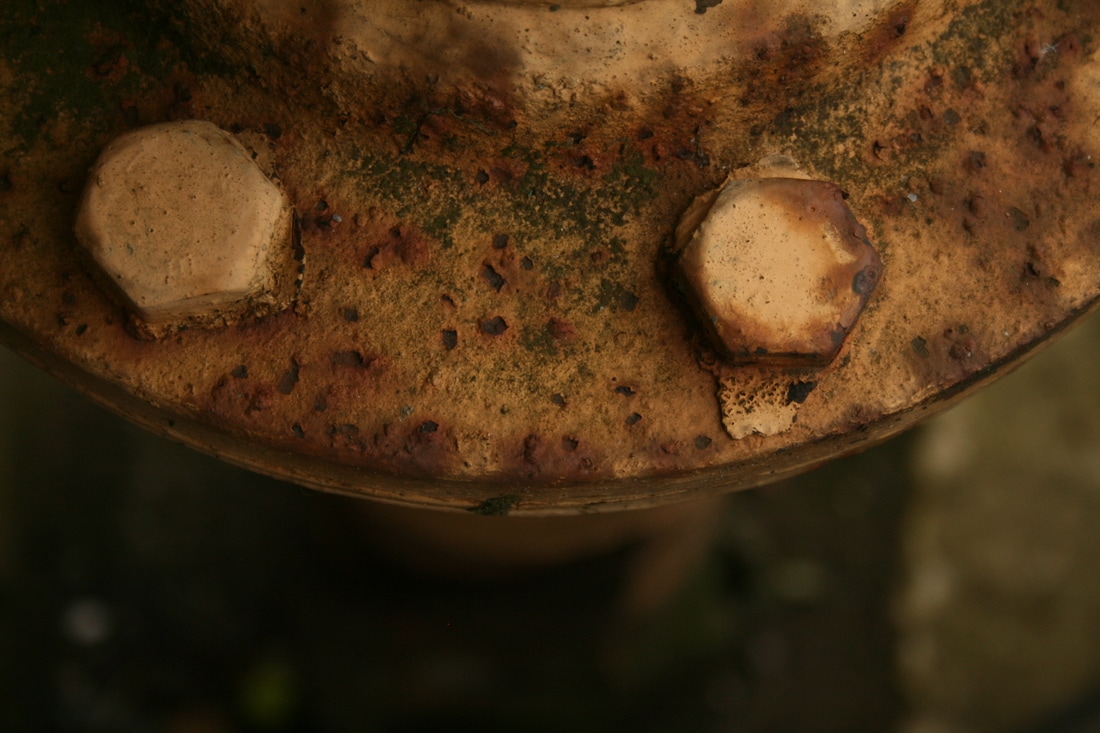
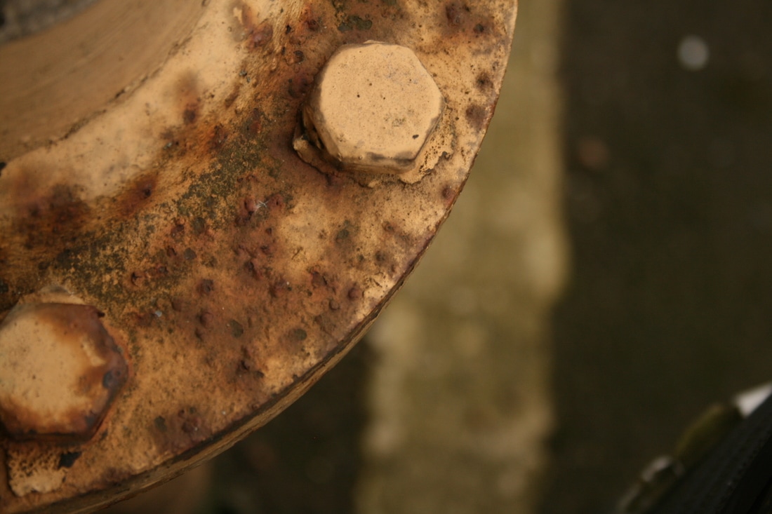
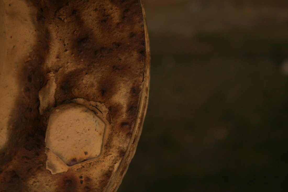
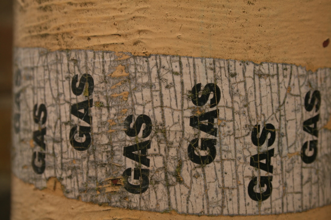
final piece
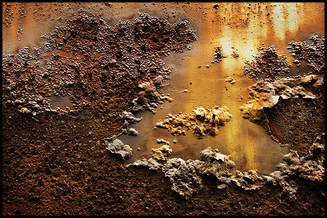
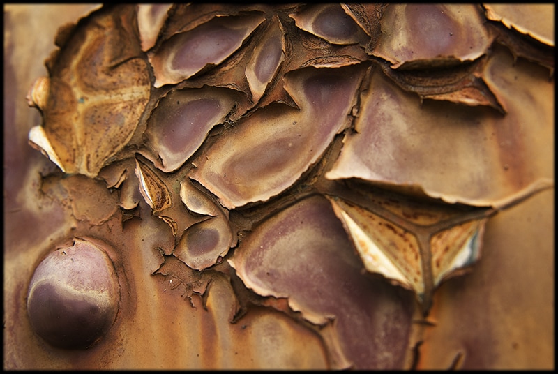
colin winterbottom
|
|
|
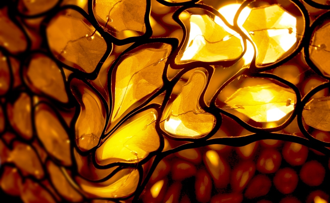
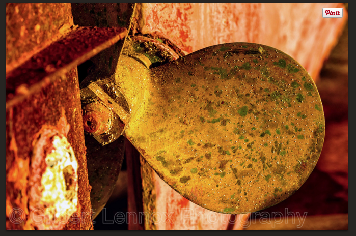
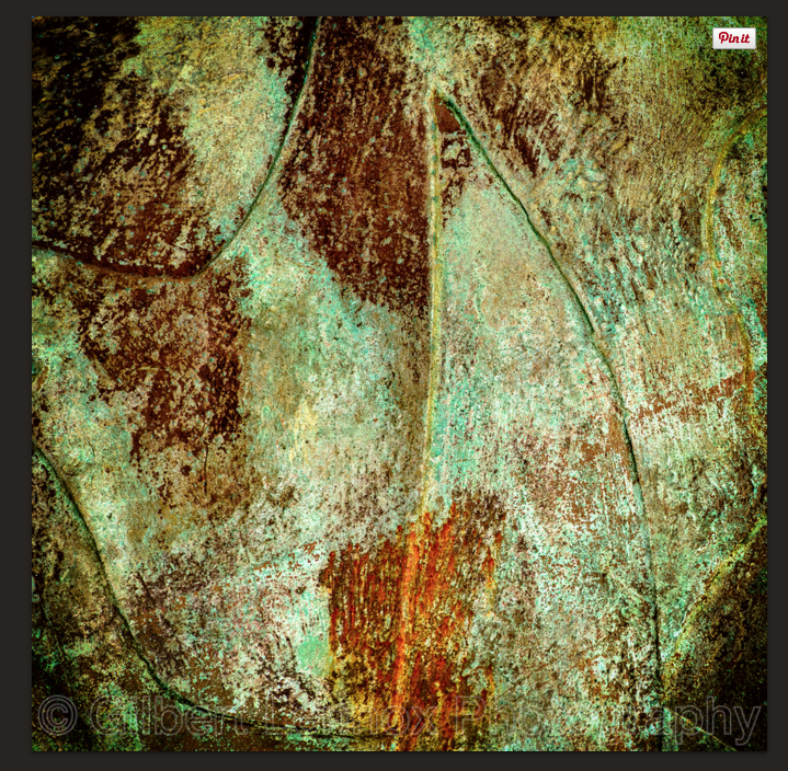
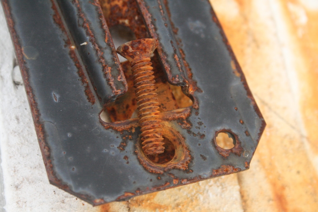
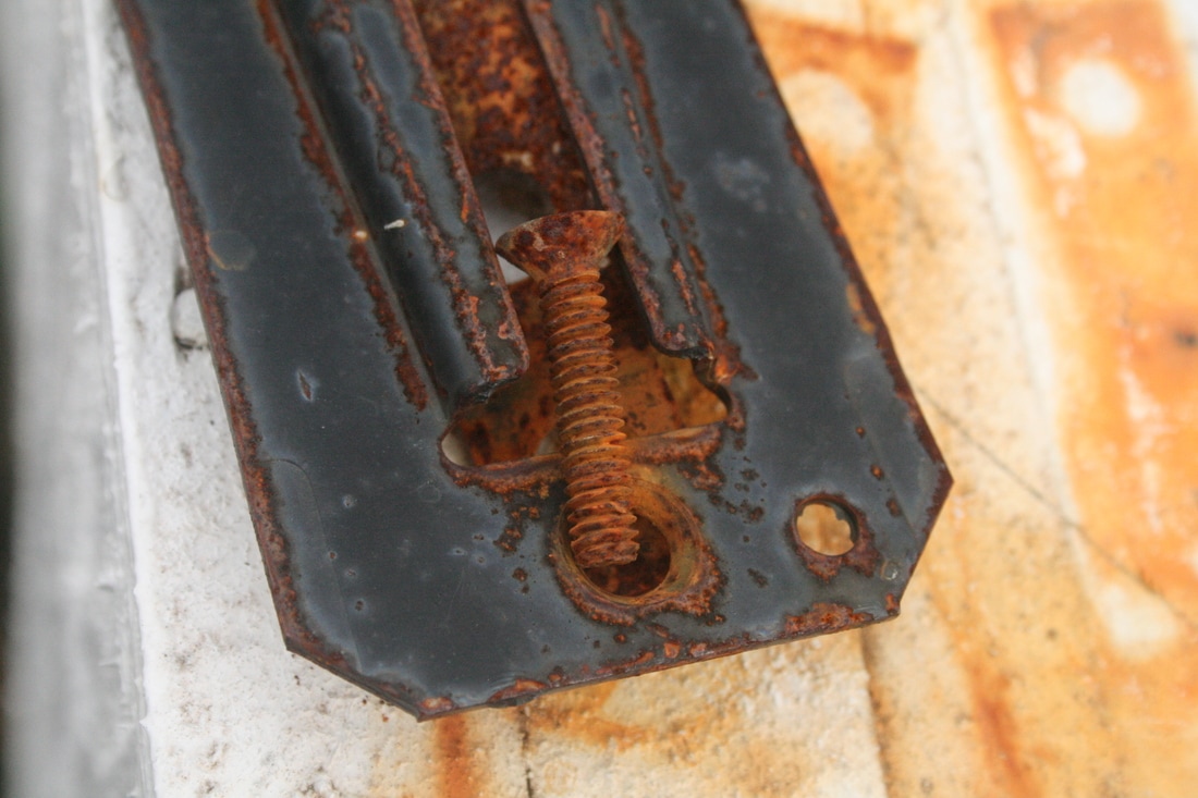
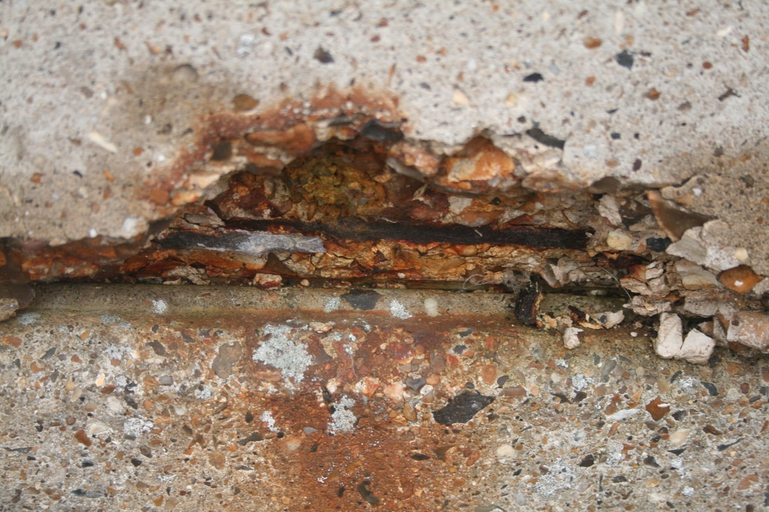
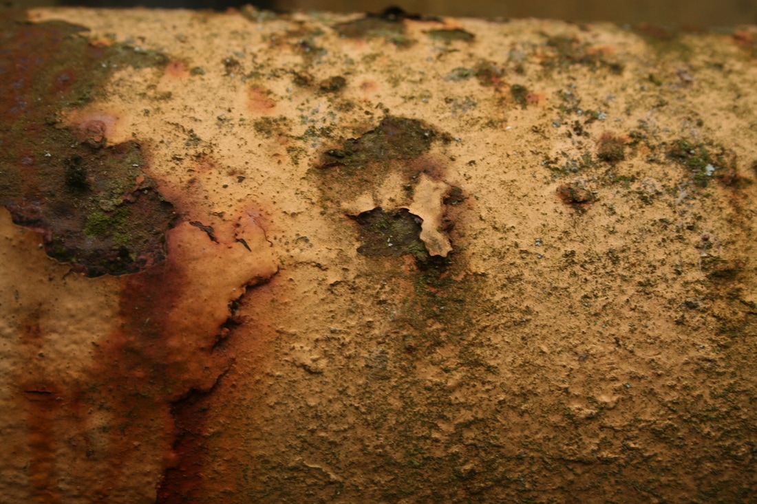
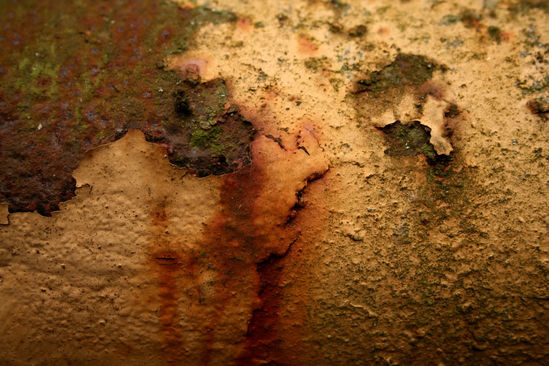
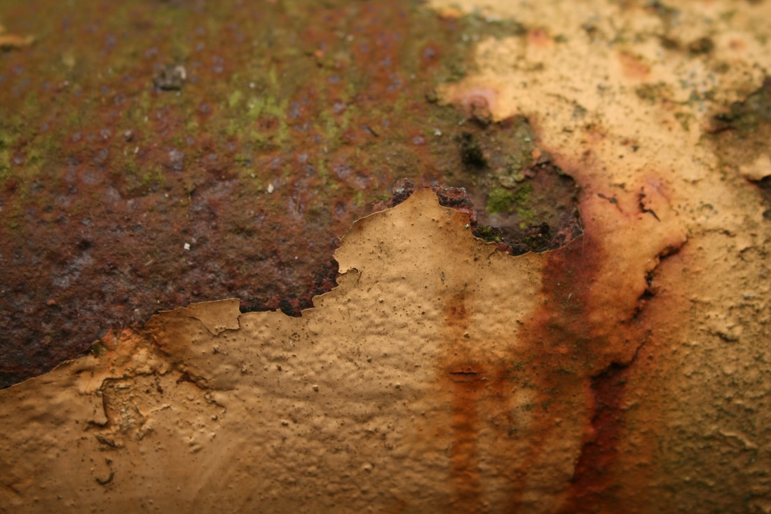
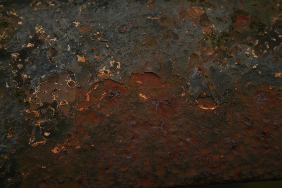
Colin Winterbottom is a photographer who has lived in the suburbs of Washington D.C. all his life. He is fascinated by texture in images and this really shines through in his series Elegant Corrosion (above), but is also visible in his photographs of architecture around the city. The textures in the images above, where Winterbottom has explored rust and corrosion in his environment (particularly on rail engines, cars, and tracks), are so tangible and varied. Winterbottom says that his "primary motivation as a photographer is to convey dramatic and lively textures in my subjects." You how successful he is: Winterbottom finds the beauty in what others might see as signs of misuse and neglect: we see the roughness of peeling paint, natural smoothness of metal, the griminess of mould and fungi.
One very striking thing about Winterbottom's work is how he focuses completely on the tiniest details in his environment to the point of abstraction. This is done by macro-photography camera lenses and has a very interesting effect, as details like like layers, lines, textures and tones are all isolated and brought to our attention. However, it does mean that the images seem to lack any context. But Winterbottom knows that we try to find comparisons from our experiences to the photos before us, for example "rainwater will travel in a way uncannily similar to the path a river cuts across a landscape." I view the image on the left like a field of muddy marshland next to a lake with a sunset reflected in the water; it is probably in truth a metal surface with mould growing on. Winterbottom uses film and then scans it and uses digital methods to create large format prints. He says the film "gives a lively grain" and I think it also emphasises the delicate and intricate textures.
One very striking thing about Winterbottom's work is how he focuses completely on the tiniest details in his environment to the point of abstraction. This is done by macro-photography camera lenses and has a very interesting effect, as details like like layers, lines, textures and tones are all isolated and brought to our attention. However, it does mean that the images seem to lack any context. But Winterbottom knows that we try to find comparisons from our experiences to the photos before us, for example "rainwater will travel in a way uncannily similar to the path a river cuts across a landscape." I view the image on the left like a field of muddy marshland next to a lake with a sunset reflected in the water; it is probably in truth a metal surface with mould growing on. Winterbottom uses film and then scans it and uses digital methods to create large format prints. He says the film "gives a lively grain" and I think it also emphasises the delicate and intricate textures.
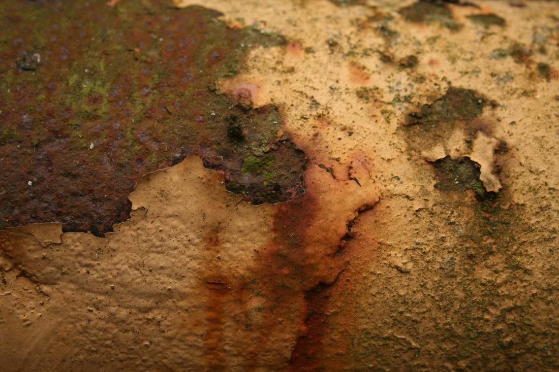
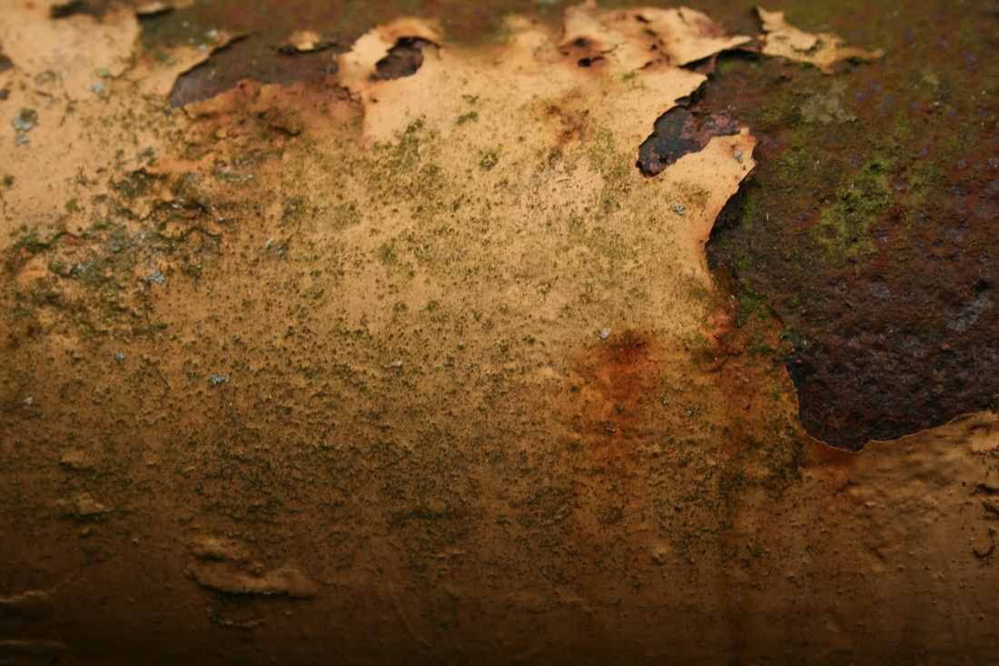
my response

|
|
|
|

|

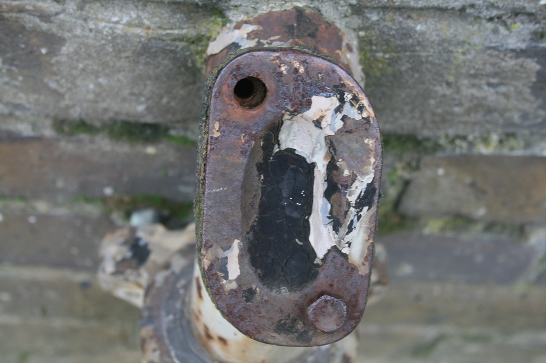

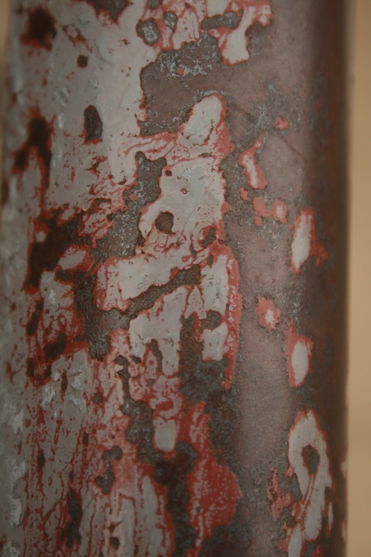

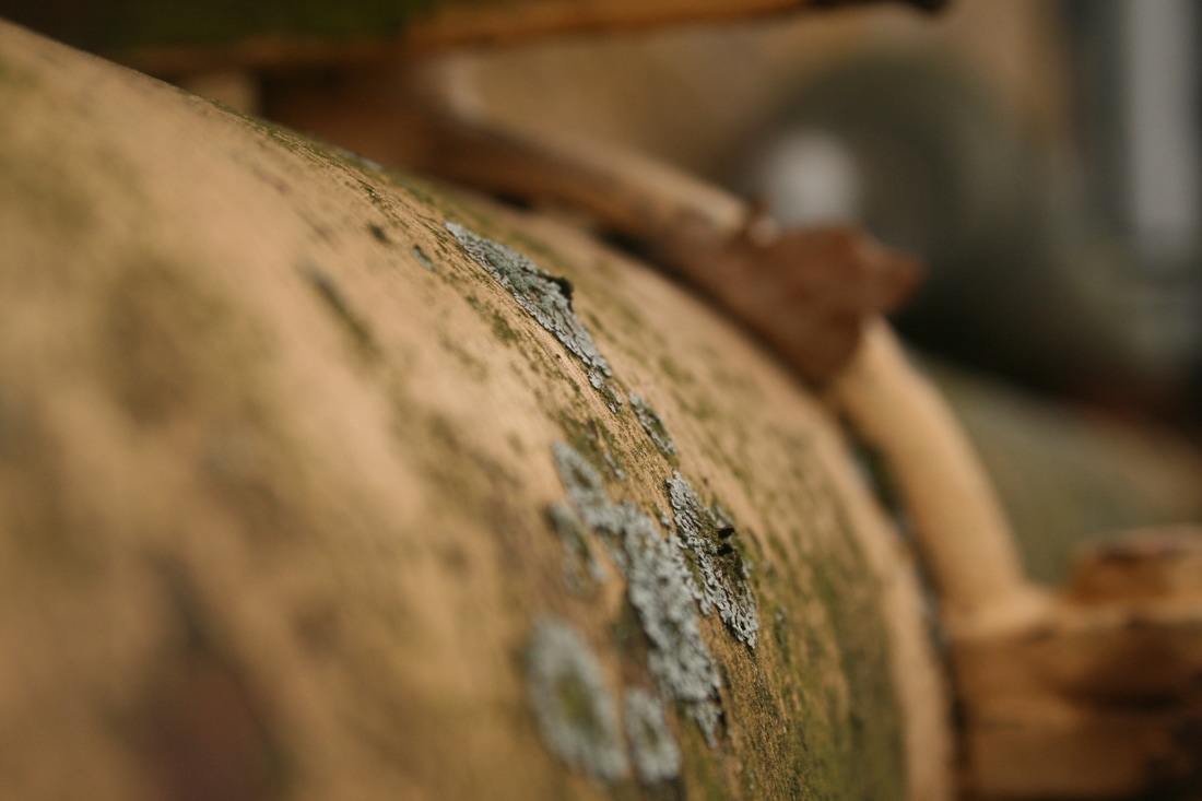
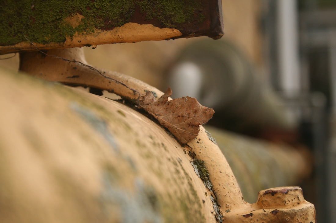
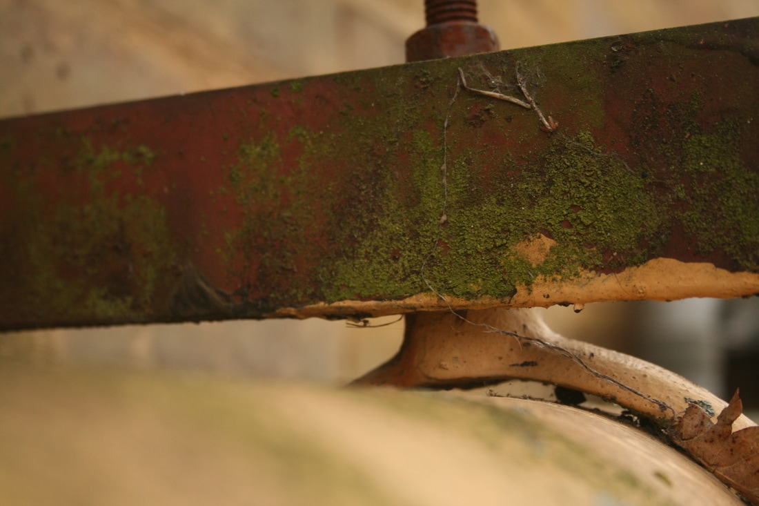
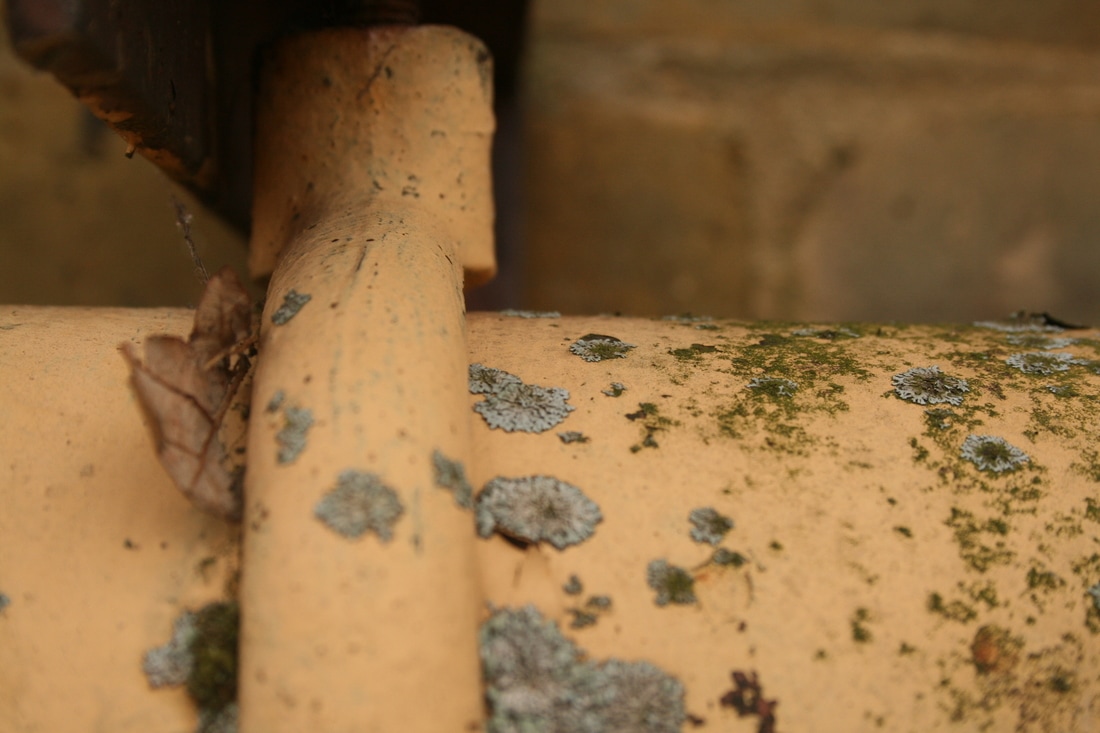
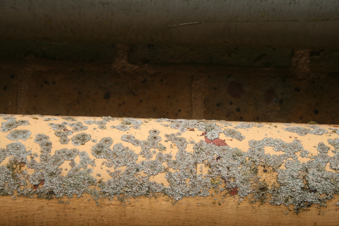


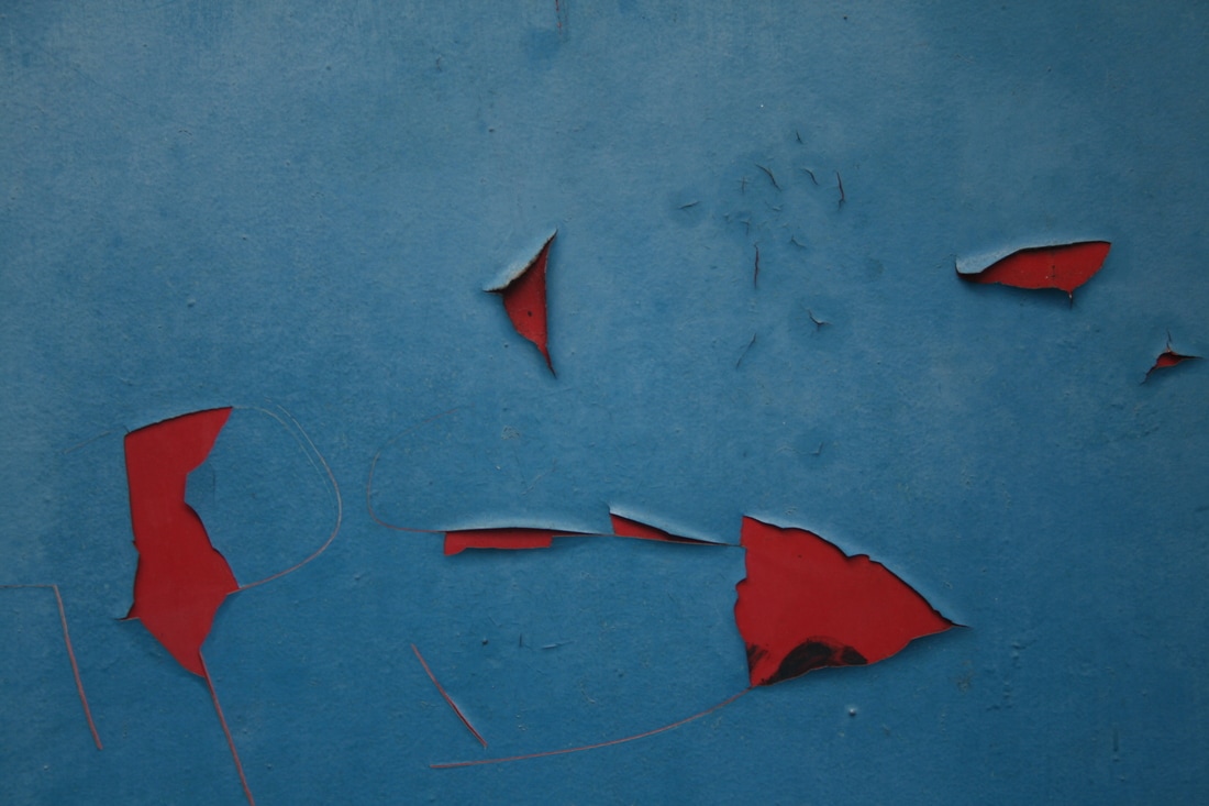
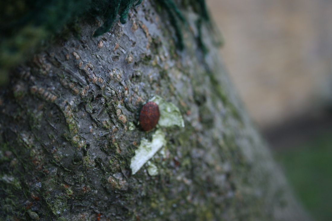
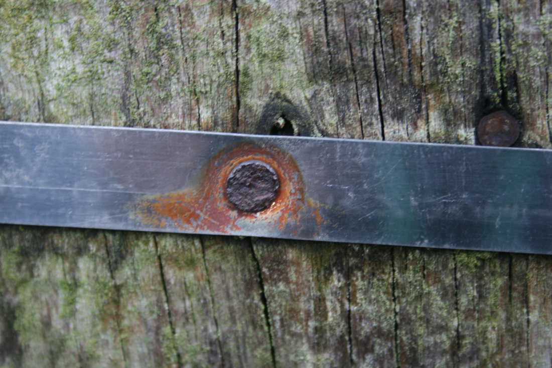
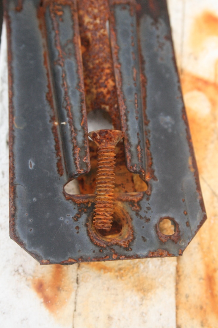
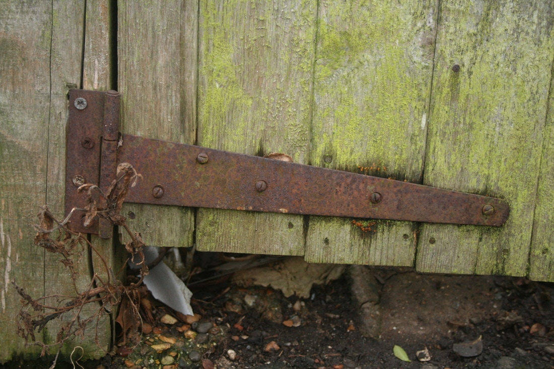
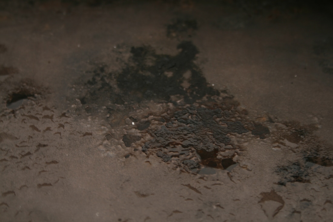
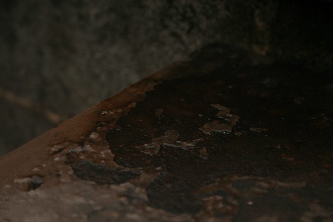
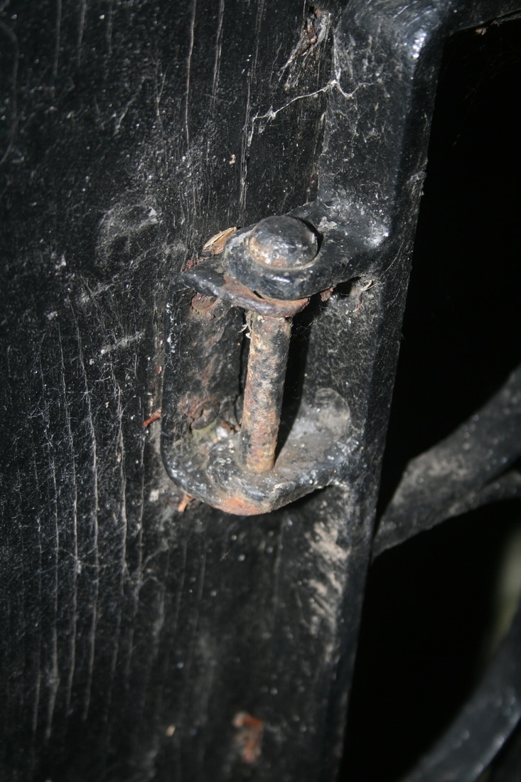
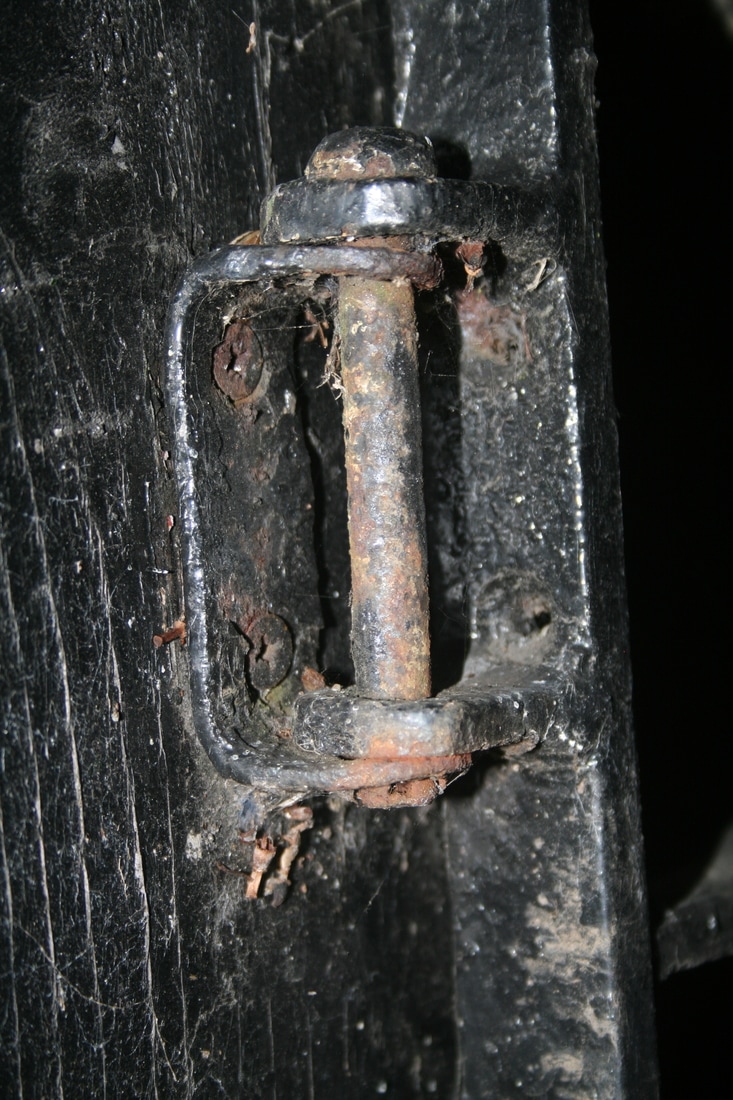
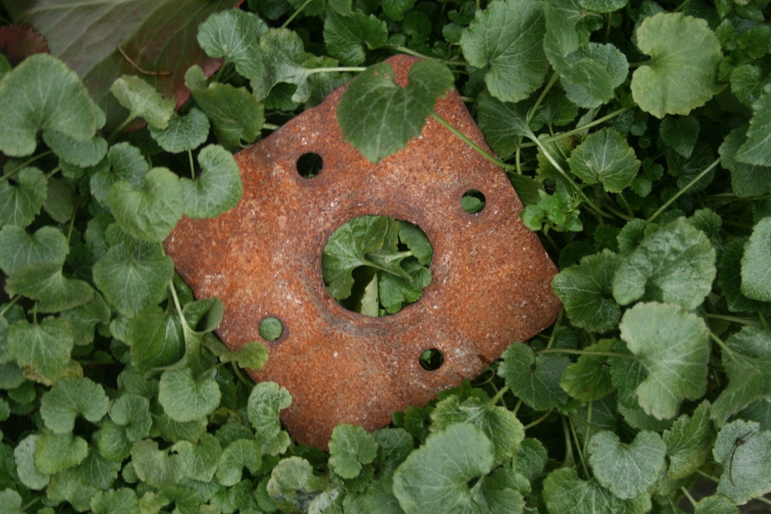
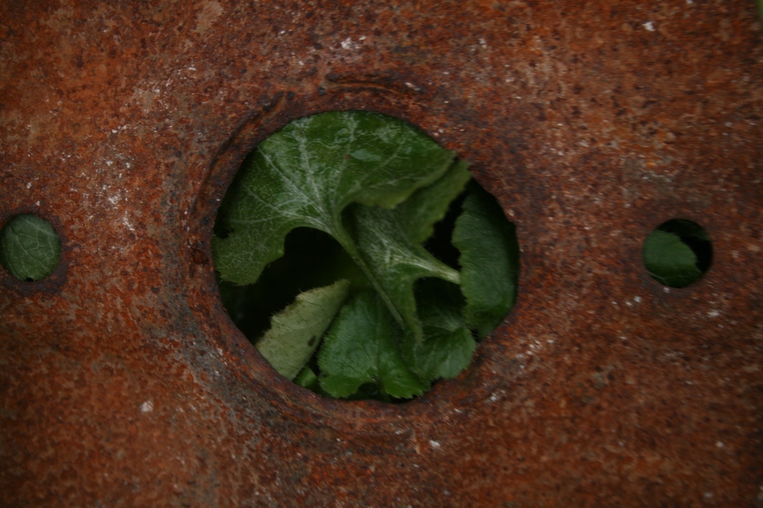
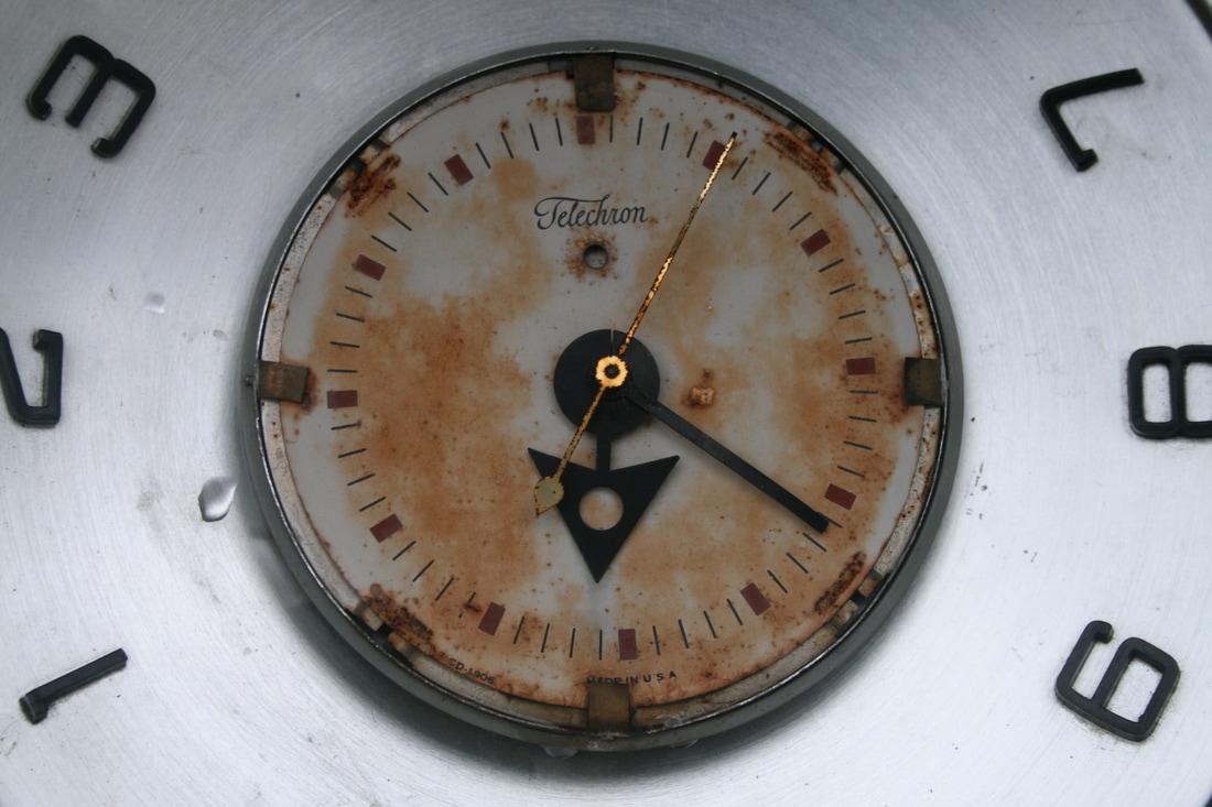
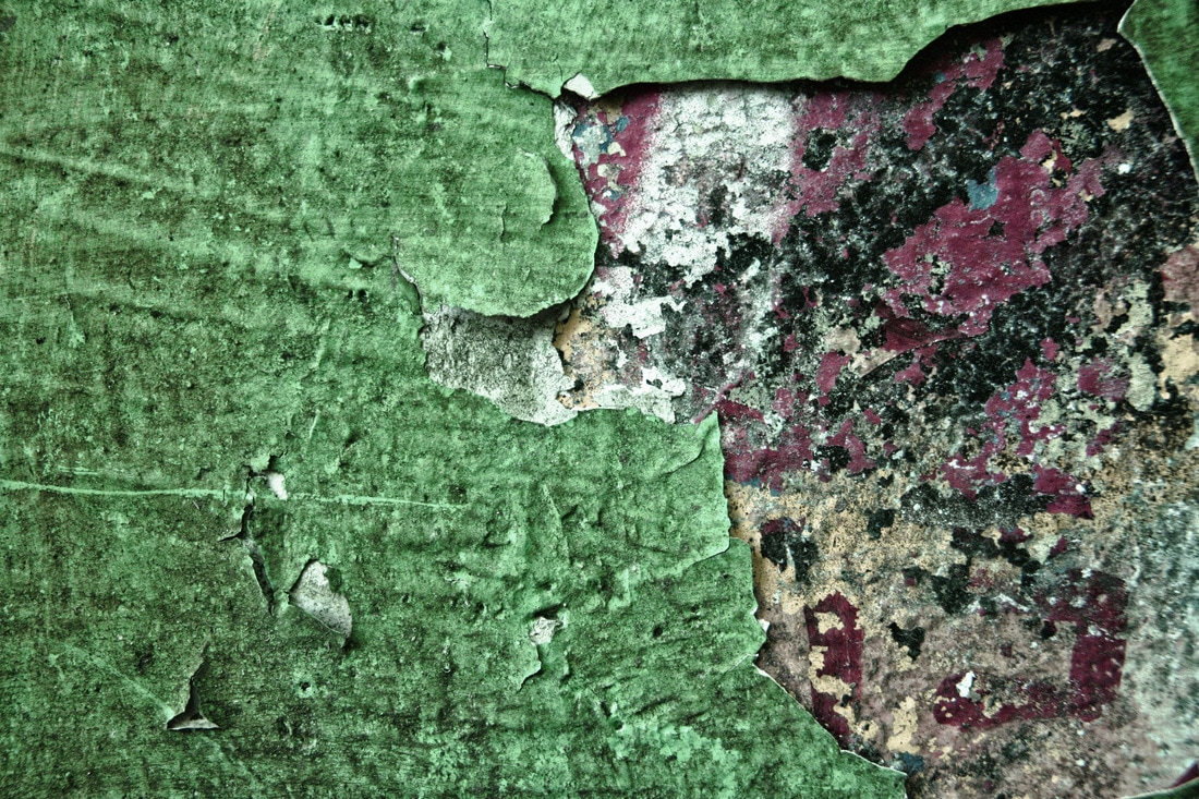
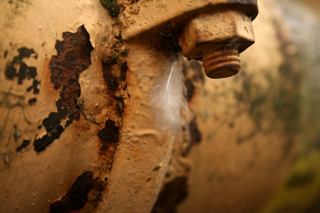
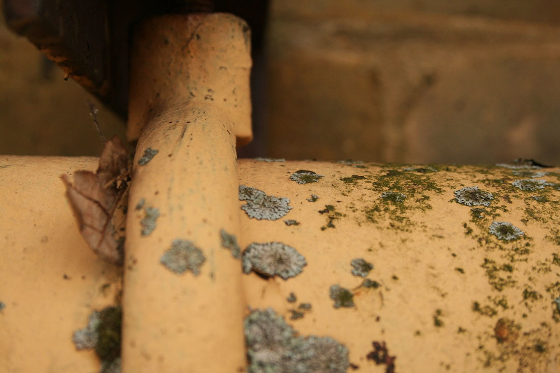
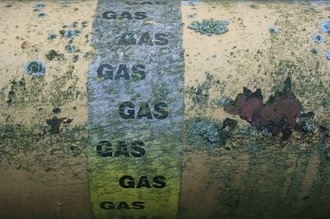
WWW: Similarly to Colin Winterbottom, I really focused on texture when I approached my final piece. As you can see from the first enlargement in particular, I think this paid off: I like how the smoother brown/green moss meets the old peeling paint which has a much rougher surface. You can also see deep red crack in the paint which cuts through the centre of the image. I also like the contrast between the fragile white feather that I found resting under the screw (in the second enlargement) and the dark, uneven tears in the paint.
EBI: There is a lack of a range of colours in a lot of the photos, which I had to compensate for by changing the contrast and levels in Photoshop to get some variety in tones. For example, the 5th row, 1st image has only black and brown colours which are pretty forgettable, however it has interesting texture. In the same row, the light red paint and grey layers clash and don't work well enough together without another colour.
EBI: There is a lack of a range of colours in a lot of the photos, which I had to compensate for by changing the contrast and levels in Photoshop to get some variety in tones. For example, the 5th row, 1st image has only black and brown colours which are pretty forgettable, however it has interesting texture. In the same row, the light red paint and grey layers clash and don't work well enough together without another colour.
