force
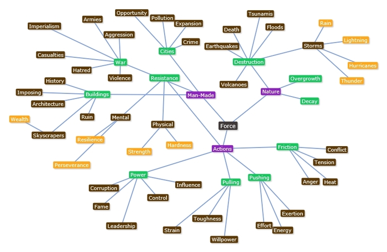
Mind map
INSPIRING ARTISts
JIANG ZHI
|
|
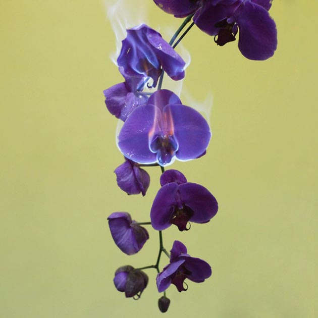
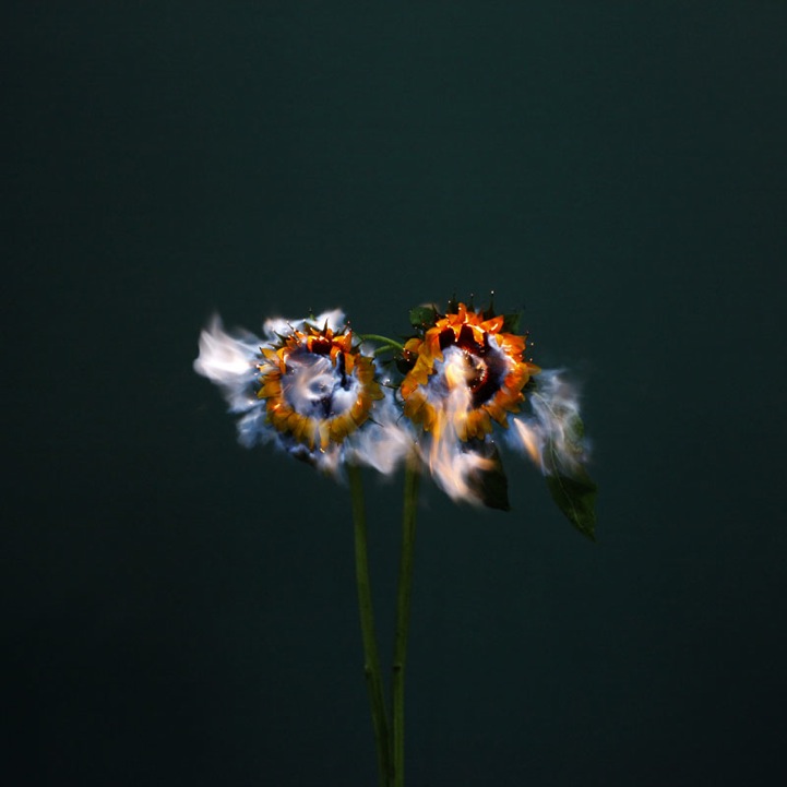
Jiang Zhi is a contemporary Chinese photographer who currently works in Beijing and Shenzhen. Interestingly, Zhi explores the workings of how his images actually come to be. The burning flowers are not only the compelling subjects but also provide the light source that is need to capture the moment.
In the photo on the left, Zhi uses very basic complementary colours: a deep, rich violet and pastel yellow. There is also a lot of bold symbolism at work. The beautiful flowers represent love and fidelity, while the flames seem to suggest passion (which could be linked to love) and rage. I feel like the contrast between 'rage' or 'fury' and the fragility of the flowers and 'love' is particularly significant, as it reflects Zhi's feelings when he produced the work. His wife suddenly died at the age of 37, a short time before he created the images.
In the photo of the right, the flame seems to have a really interesting effect on the flowers. While the leaves have started to wilt and die, the vibrant flowers are still the heart of the image. Like in the other image, they have kept their beauty; the effect is given that it is immortal. The huge amount of negative space (dark blue paint) not only contrasts with the bright colour and flame, but furthers the idea of death and oblivion.
NADAv kander
|
|
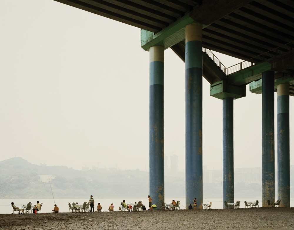
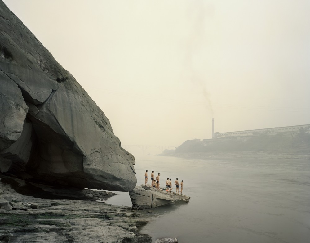
I am going to analyse Nadav Kander twice in this topic of 'Force'. Firstly, he took a series of images near the Yangtze River in China (which the two images above are from). Secondly, he made a project in Chernobyl titled 'Half Life'. Kander, born in 1961, is based in London. The images show the really interesting relationship between landscape and people.
However, the image on the left shows the relationship with man-made structures, rather than nature. The first thing that strikes the
viewer is the immense contrast in size between the people and the bridge. However, this is countered by the fact the bridge was built by people; is there a suggestion that our creations will be more powerful then we will ever be? I like the way that the chairs gradually begin to empty as they get nearer to the pillars, like the people are apprehensive of being under the shadow of them when they could have a closer bond with the open beach and nature.
The image on the right shows a group of men standing on a rock, preparing to dive in to the river. The linearity between the large rock and the divers gives the whole image such a smooth and definite feel. The whole power of the image is that one can just imagine how the divers (when they dive) would curve into the path that the rock seems to take. Interestingly, Nadav Kander was fascinated with how the Yangzte River played "an essential role in the spiritual and physical lives of the people; it's embedded in the consciousness of the Chinese". More people live on the banks of the Yangtze than the population of the USA - one in every 18 people on the planet.
Chris hondros
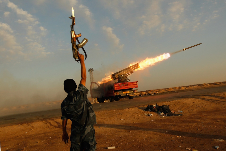
A rebel fighter celebrates as his comrades fire a rocket barrage toward the positions of troops loyal to Libyan ruler Muammar Gaddafi on April 14, 2011, 6 days before Hondros was killed.
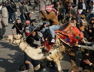
A Mubarak supporter rides into a crowd of anti-government protesters in Tahrir Square, Cairo on Feb 12th 2011.
|
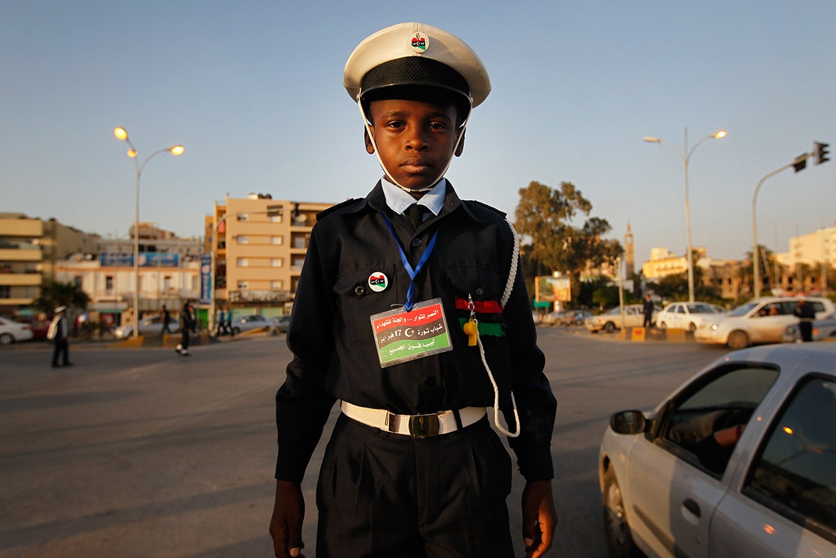
Ali Salem el-Faizani, 10, works as a traffic cop in Benghazi, Libya. Schools were closed throughout eastern Libya due to the ongoing civil conflict, so some children found work to pass the time.
Chris Hondros was a war photographer who grew up in New York City. His parents were immigrants from WW2. He was incredibly hard-working and determined and went to some of the world's most dangerous conflict zones to capture the shocking and harrowing force of war. On April 20th 2011, Hondros was killed aged 41 by a mortar attack by Libyan government forces in Misrata, Libya.
|
All of the images by Hondros that I selected are portraits. However, they are all very different from each other, and in their own ways, they are all very troubling. For example, while the image is above is not sickening like some war photos, it shocking because of how young the boy is. We are reminded of his youth and innocence by the small details in the image: his yellow toy whistle and badges on his hat and chest; of course this contrasts against the importance and maturity of his job. Therefore, we can see the subtler effects of conflict. Less subtle is the top-left image, where a man celebrates the firing of a rocket. Whatever side you're on, there is something disturbing about seeing someone finding joy in something that will cause so much death and destruction. Also, the fact that the soldier is facing away from the camera shows how anonymous war has become. You could think the image on the left is comical until you see the looks of hatred on the faces of the men attacking the man on the camel. Hondros really captured how angry and furious normal people become essentially just because they have different views on who should run their country. Hondros really captured the powerful force that conflict has to effect us as humans,
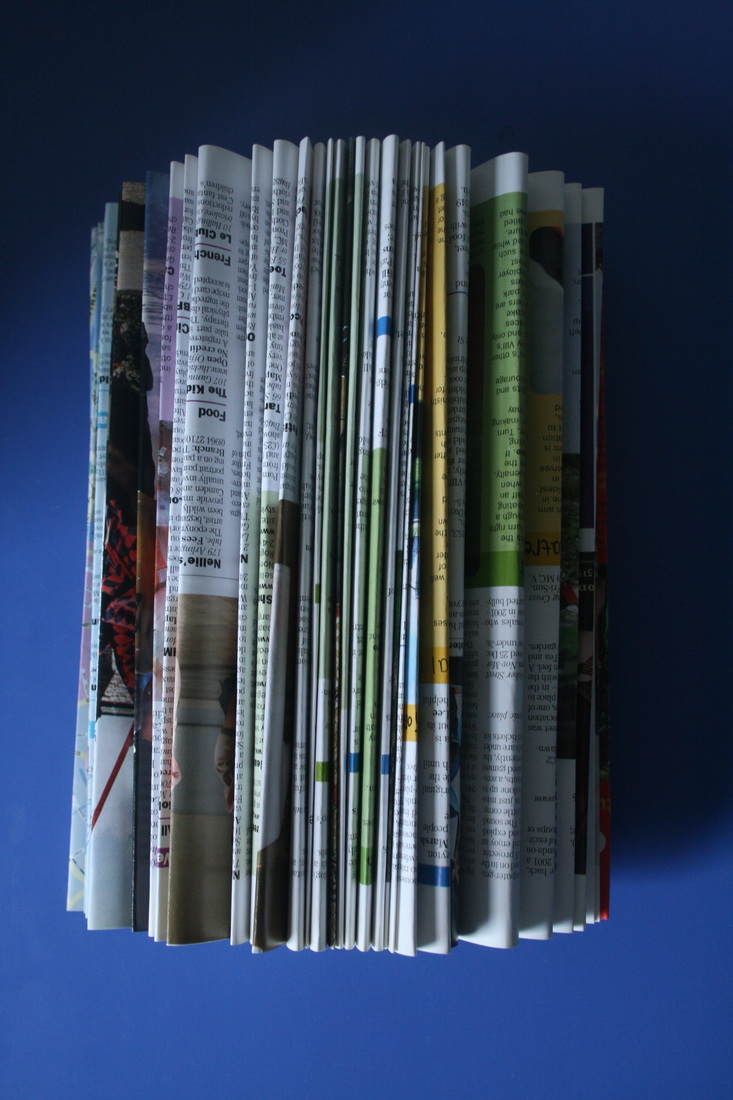
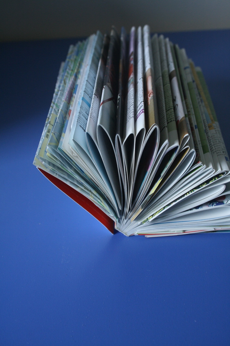
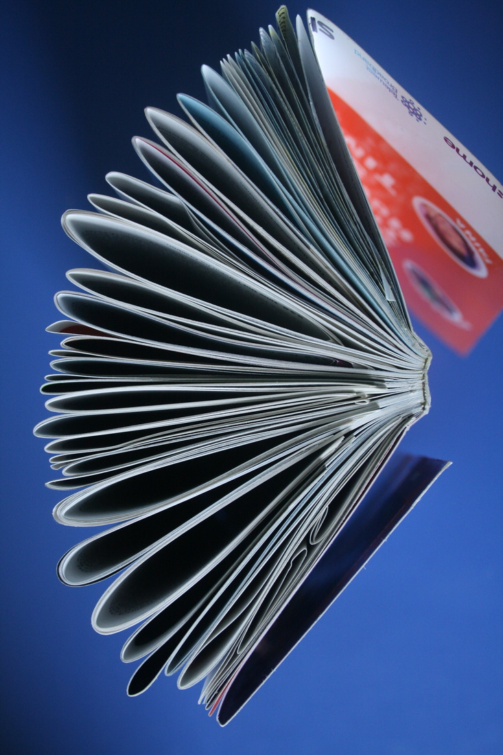
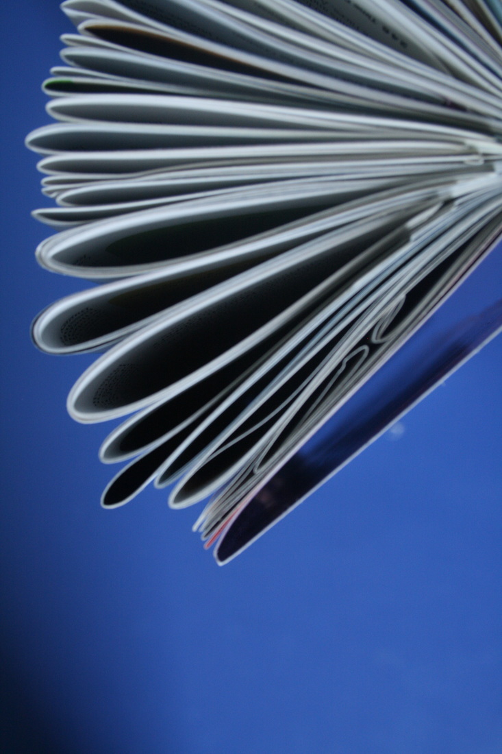
strand 3: DEConstructing objects
I think this project relates really strong to 'Force', as I literally used force to take apart objects, smashing, dissecting and breaking them. Then I laid them out, revealing the complex and intricate tiny parts of objects that we use every day.
Todd mclellan
|
|
|
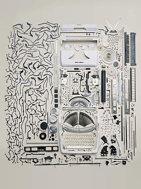
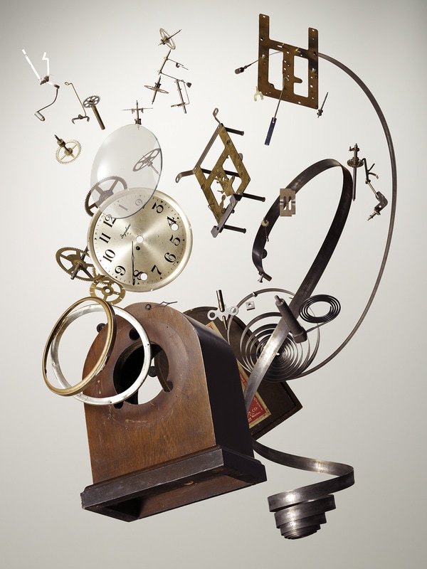
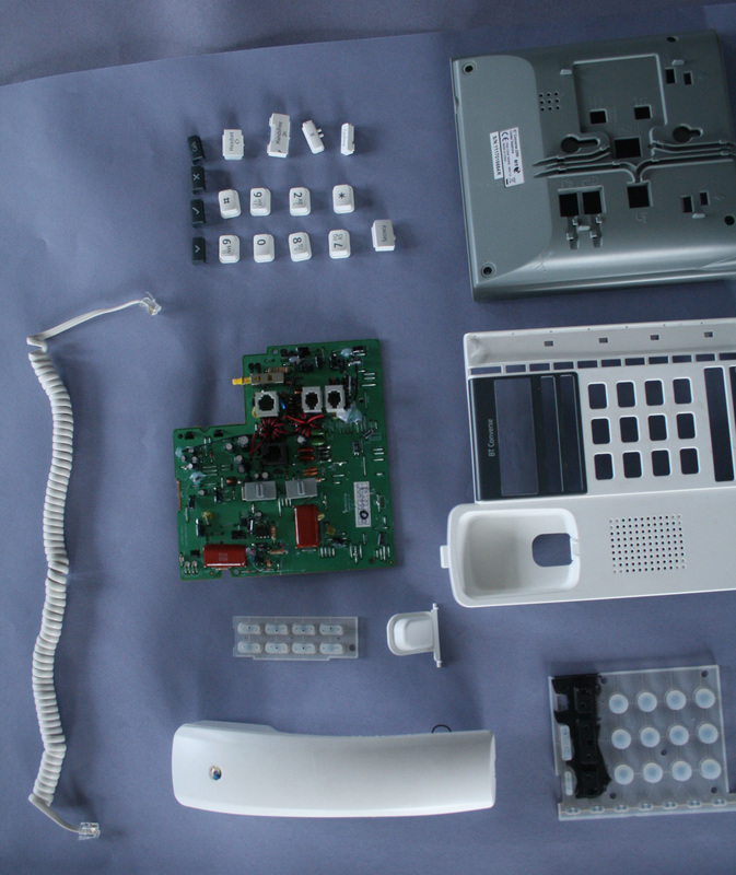
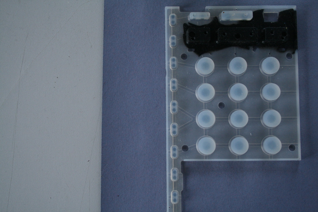
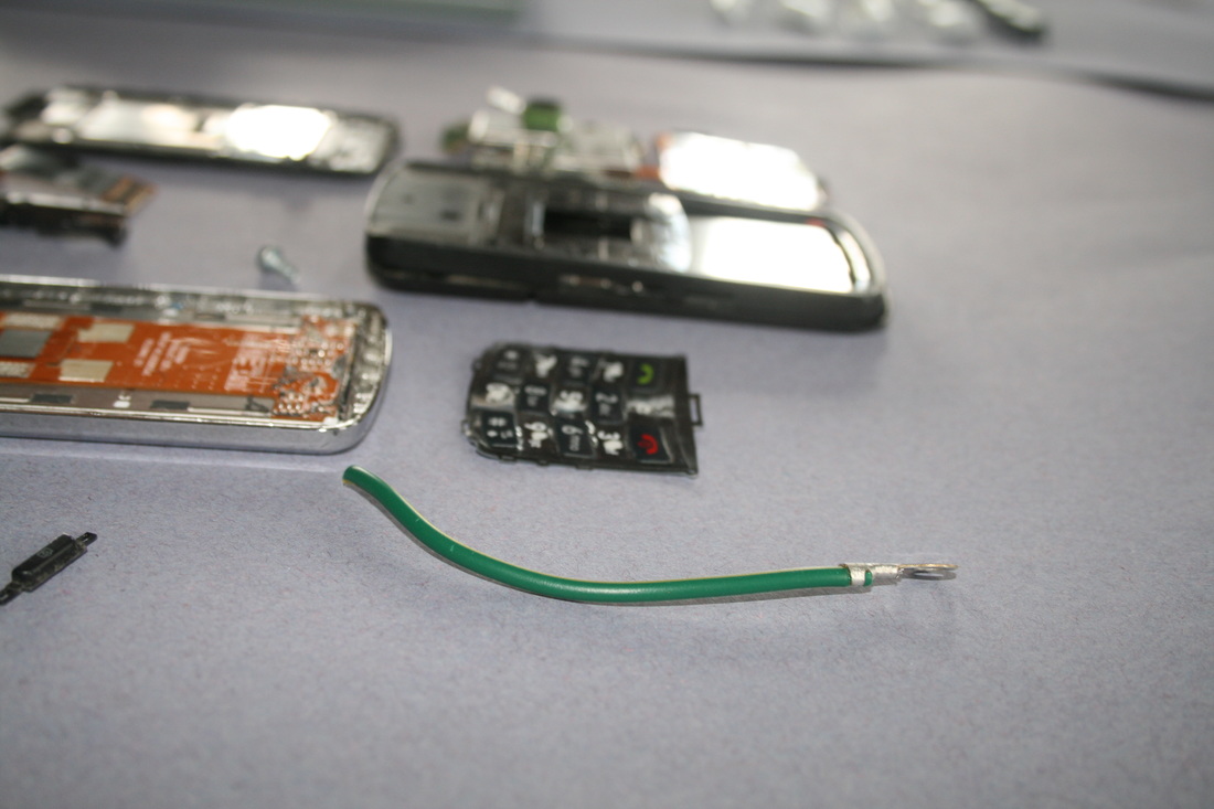
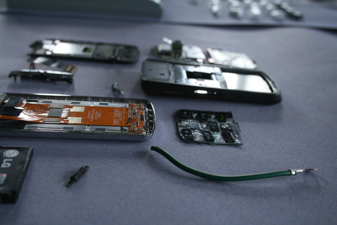
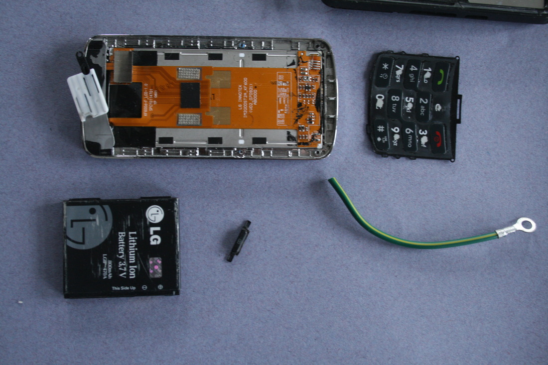
Todd McLellan is a Canadian photographer who takes apart objects and meticulously lays out all the parts. It all started when he had an old black telephone lying around in his house, so he decided to take it apart. However, he found he was trying to hard and putting to much emphasis on the Photoshop side of it: he just wanted to "show how this phone came apart and what’s involved in it". All the parts of the images flow amazingly across the canvas, even when they aren't exploding upwards. Like in the central image above, for some reason all the parts seem to work so well together and the overall effect is so simple yet so aesthetically pleasing. As McLellan says, "I wasn’t creating a pattern. I just wanted the layout to make sense as to how the object was pulled apart".
The images on the left and right are both just really fun and have so much energy. McLellan shot them by simply throwing the parts in the air and capturing them with a high speed strobe (effectively a remote-controlled flash). For something like what McLellan does, there is a risk that the images might be quite stuffy and unexciting. However, McLellan realised this, and he now has a balance of order and disorder, because "there’s a nice organised way to doing things and there’s a haphazard way to doing things".
The images on the left and right are both just really fun and have so much energy. McLellan shot them by simply throwing the parts in the air and capturing them with a high speed strobe (effectively a remote-controlled flash). For something like what McLellan does, there is a risk that the images might be quite stuffy and unexciting. However, McLellan realised this, and he now has a balance of order and disorder, because "there’s a nice organised way to doing things and there’s a haphazard way to doing things".
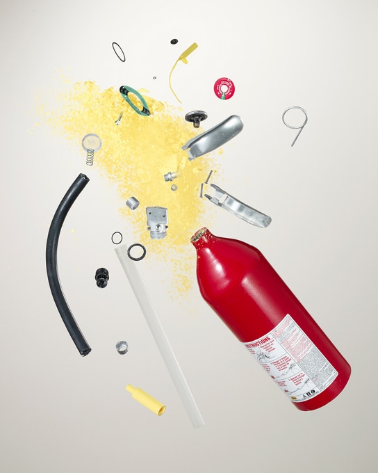
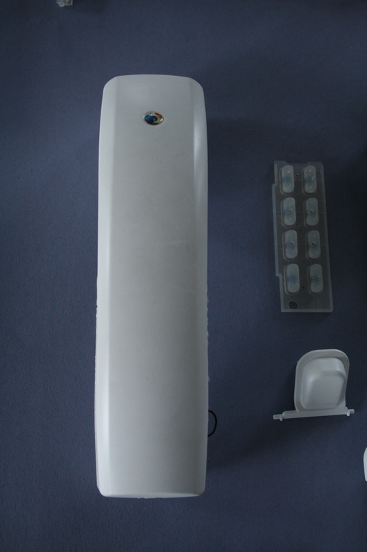
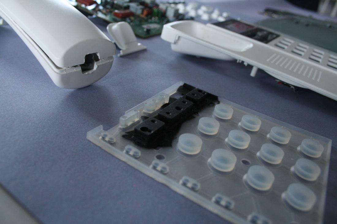
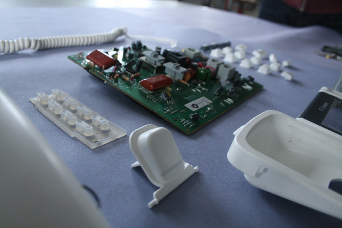
Object 1: Landline


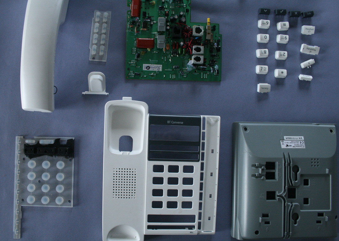

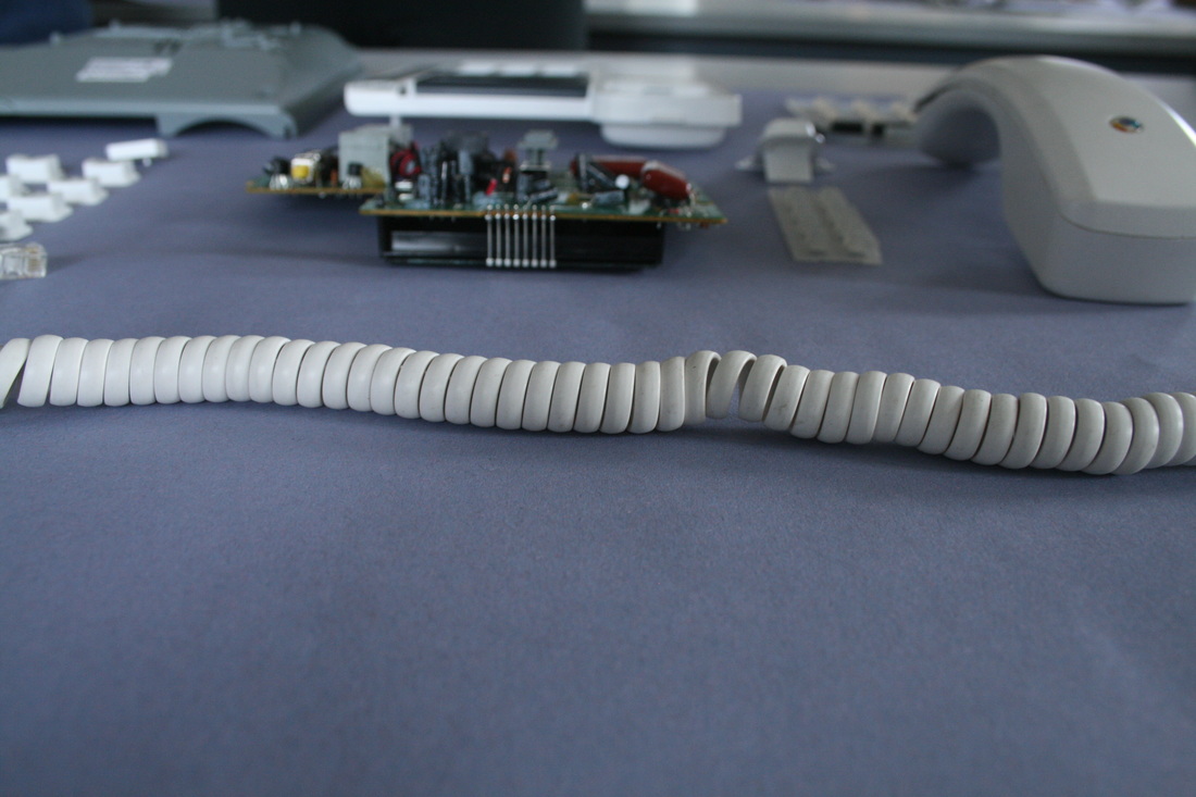
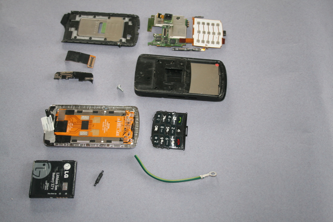
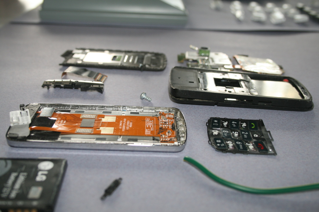
Object 2: Mobile Phone


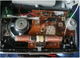
OBJECT 3: radio

|

|
|
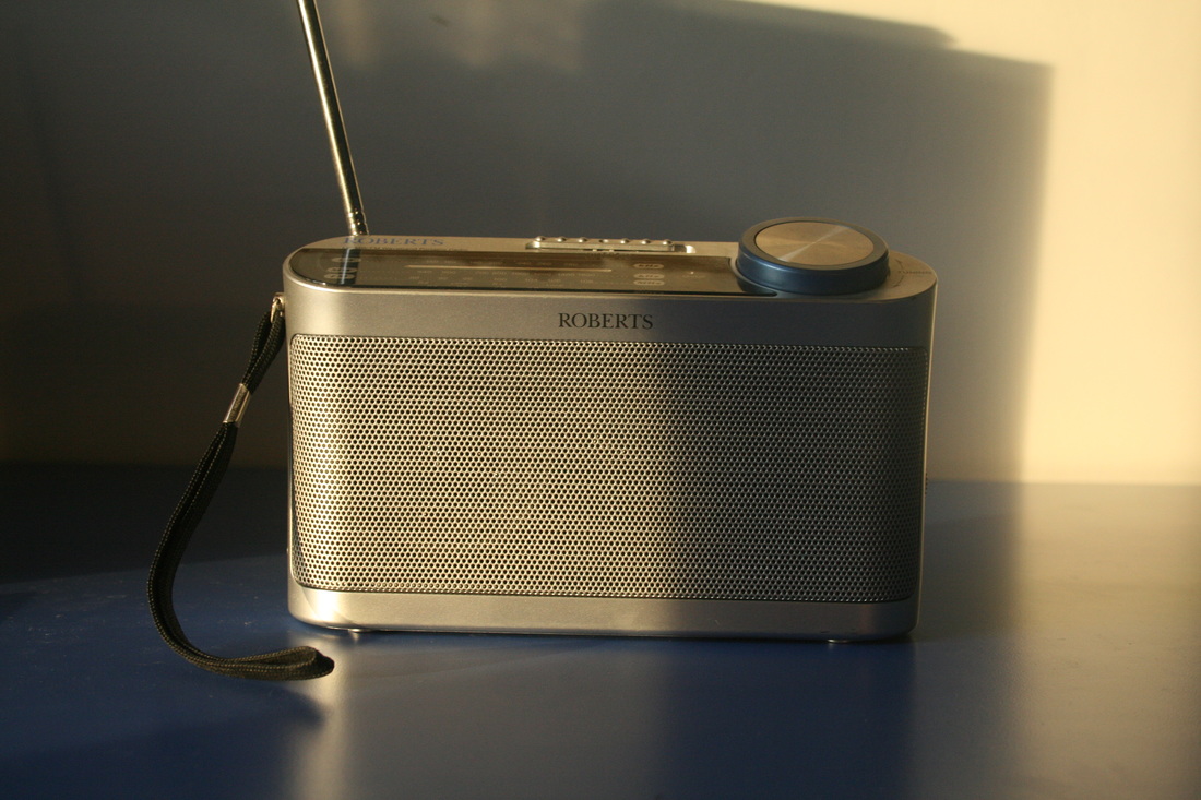
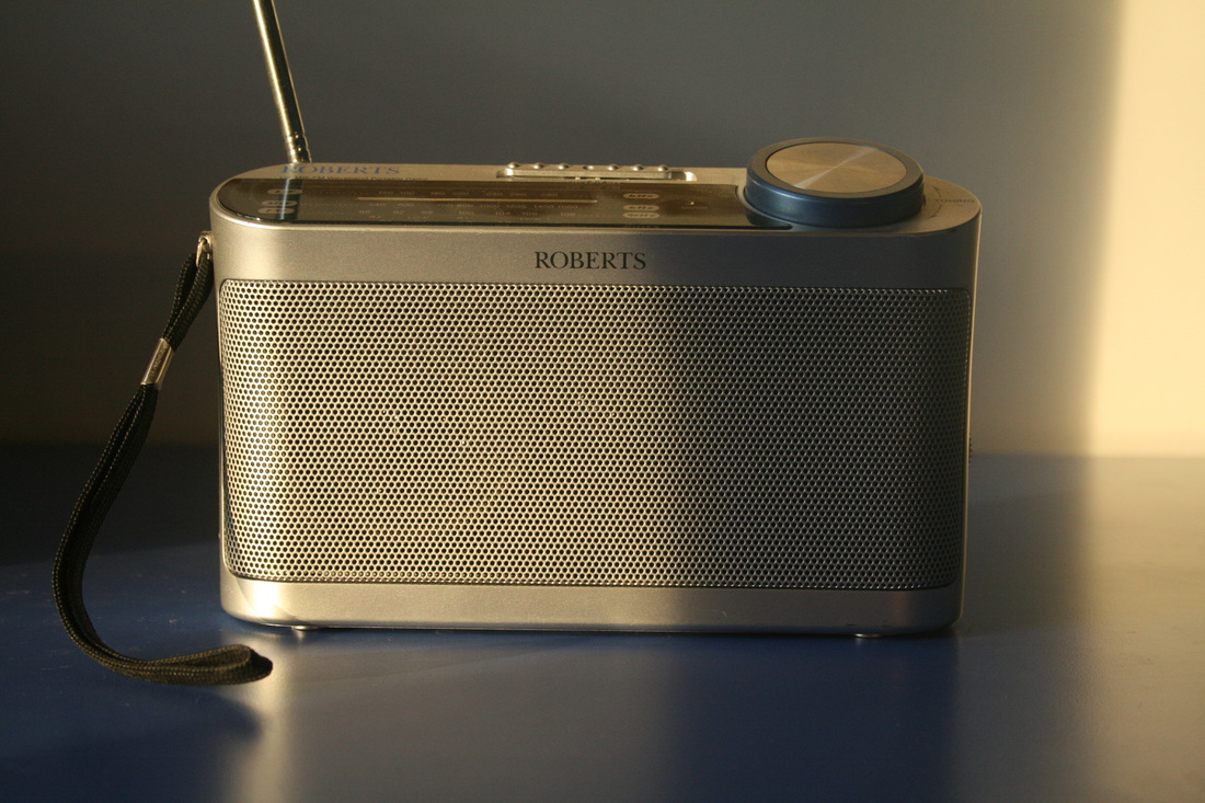
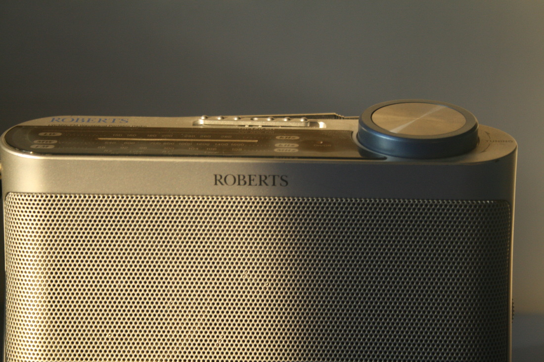
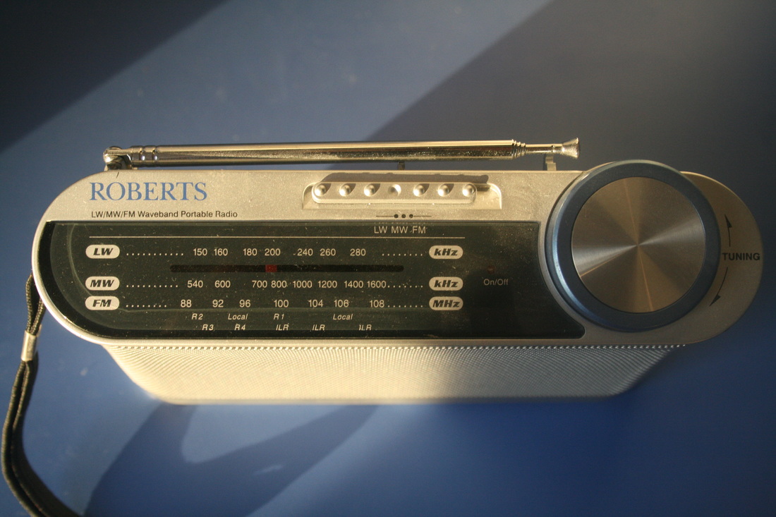
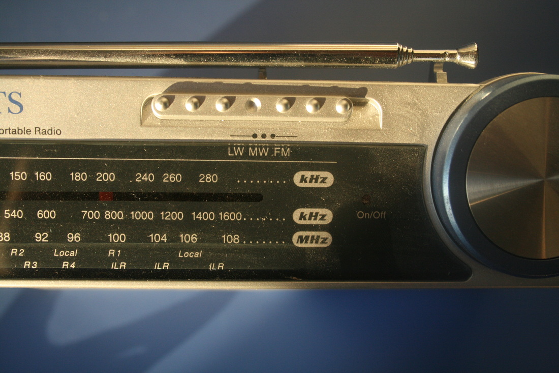

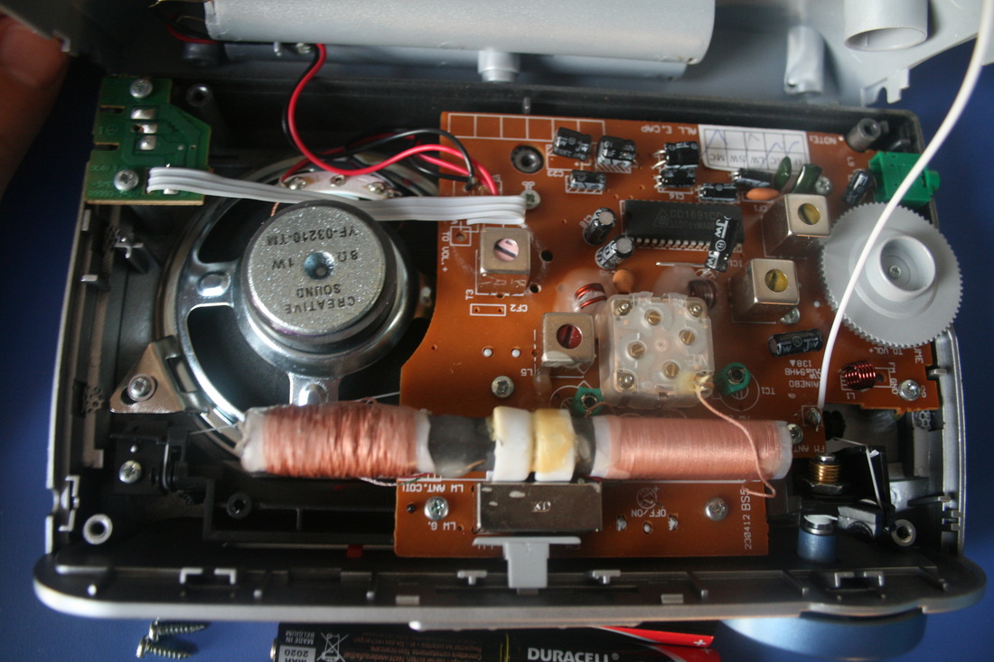
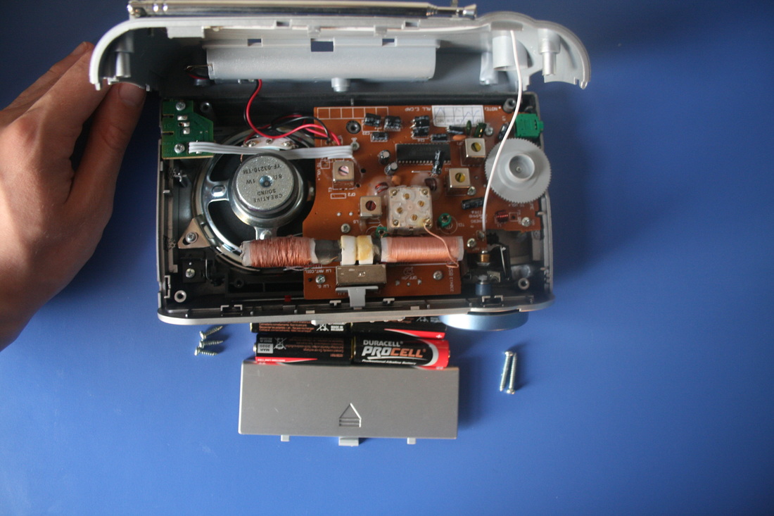
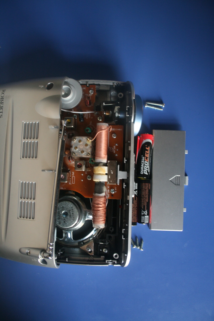
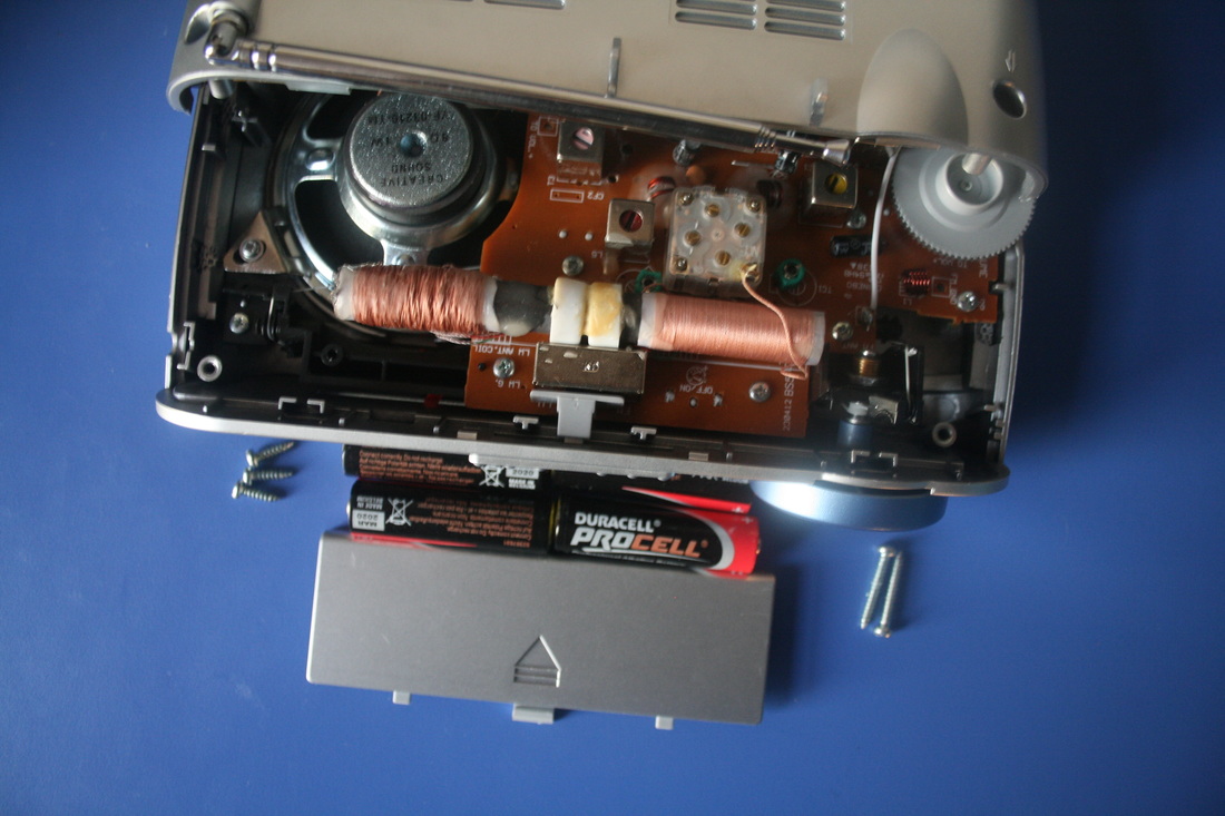
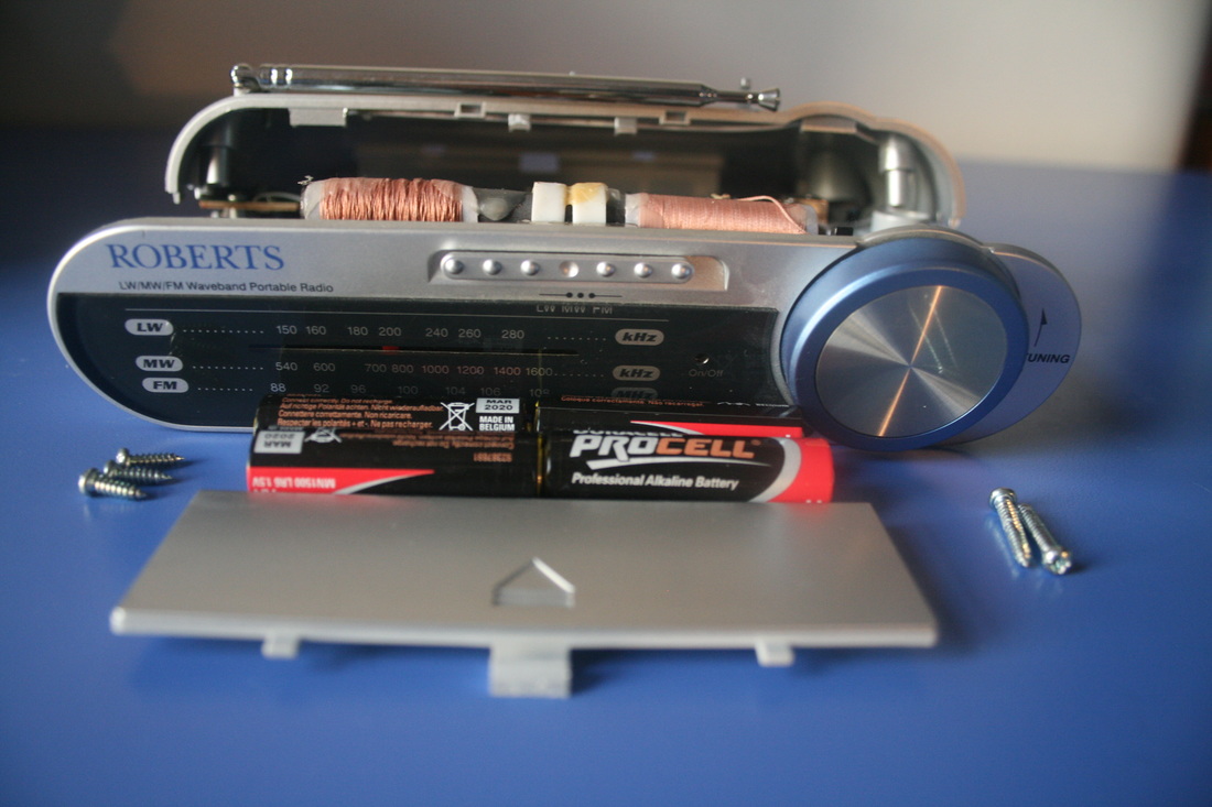

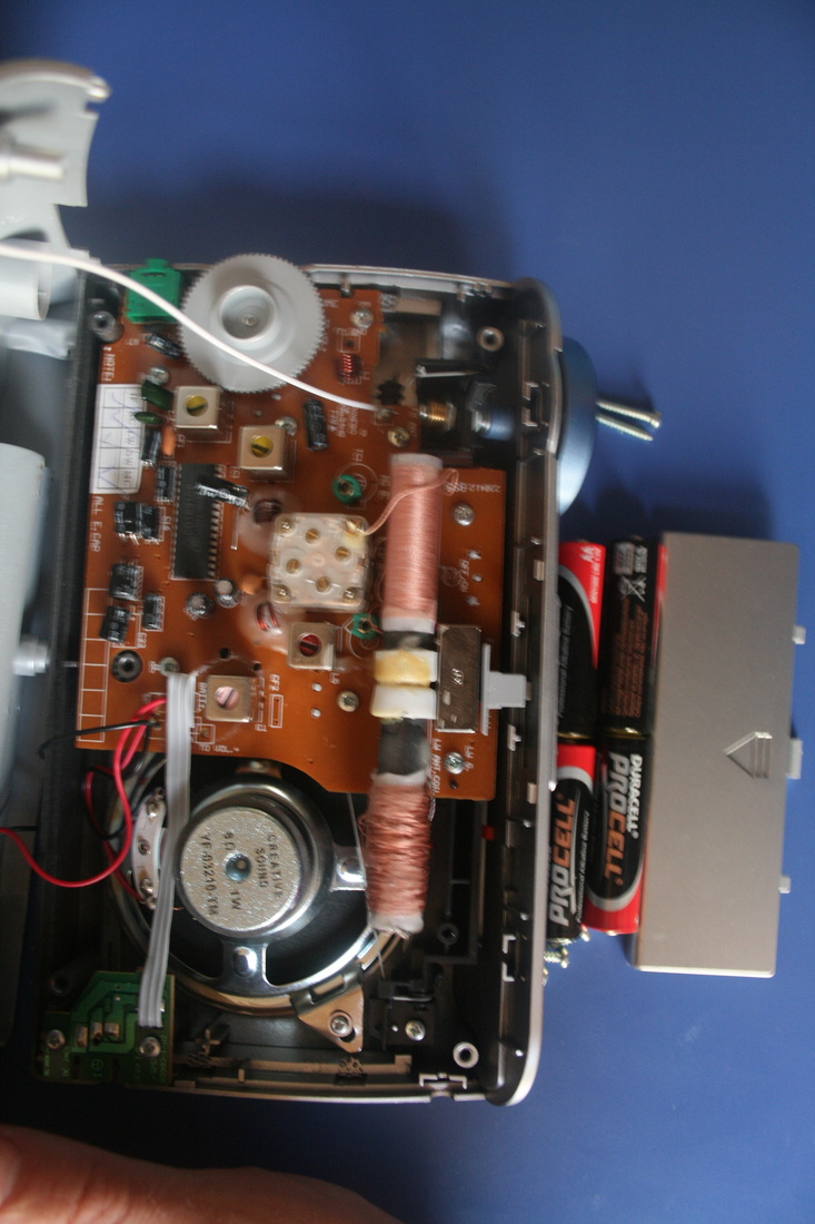
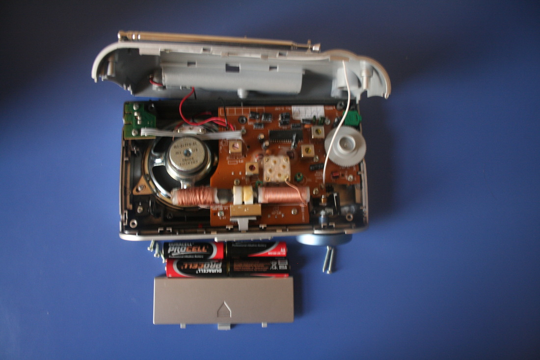
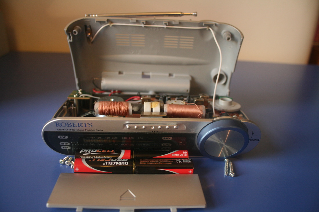
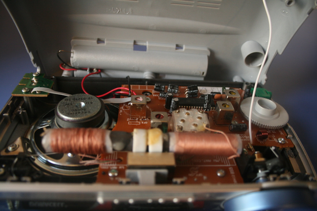
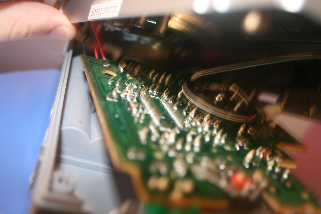
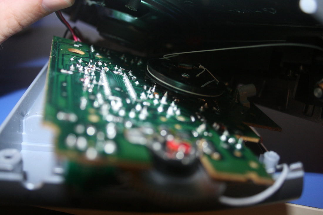
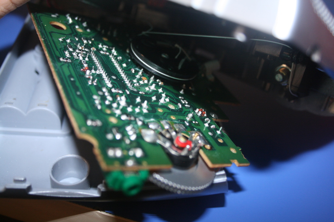
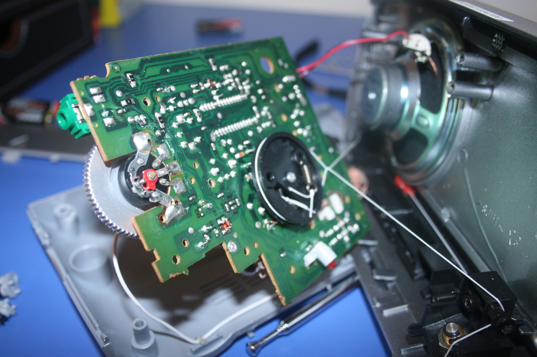
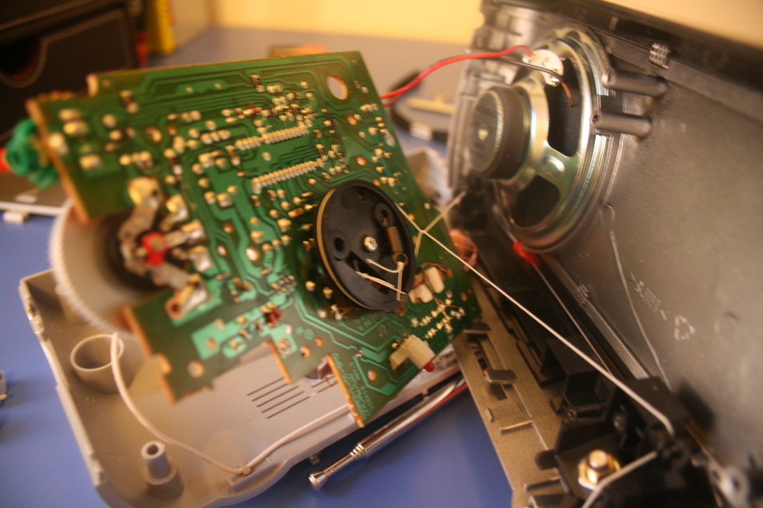


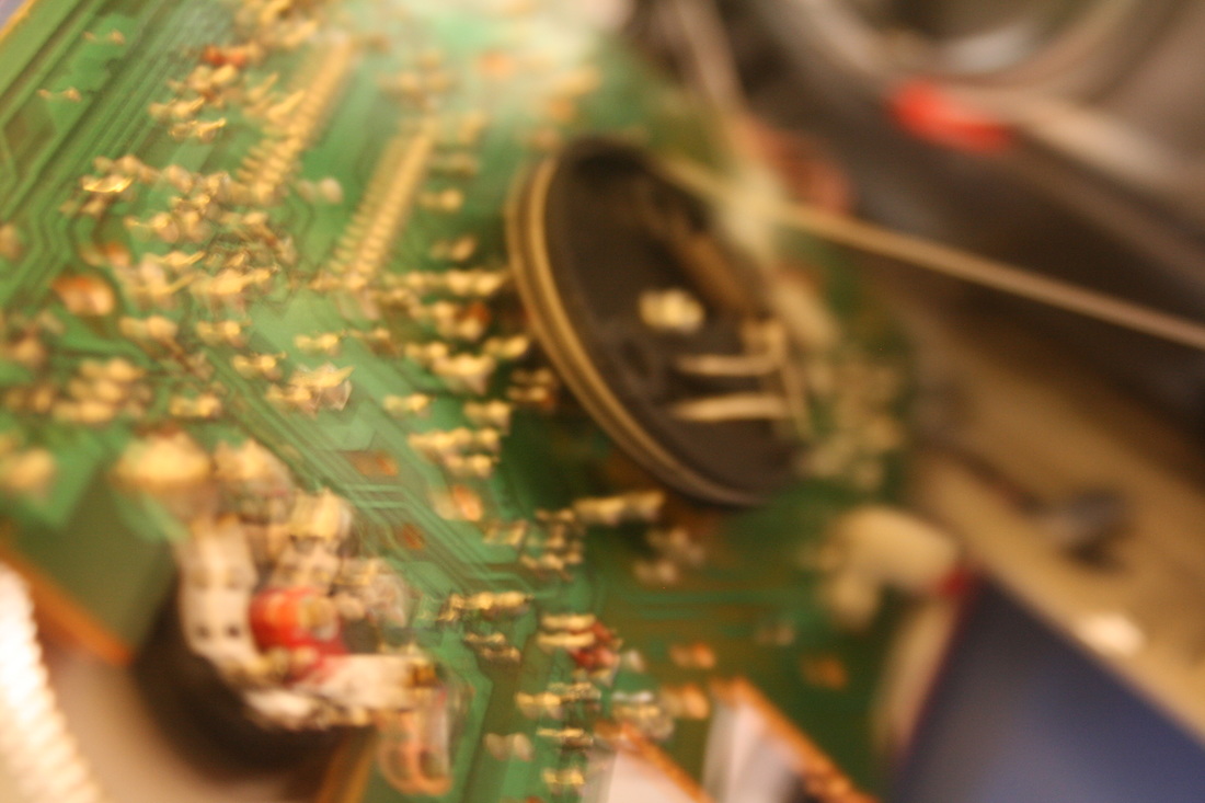
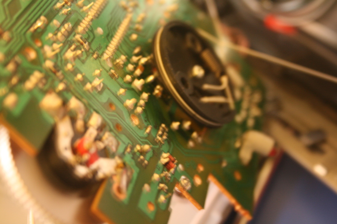

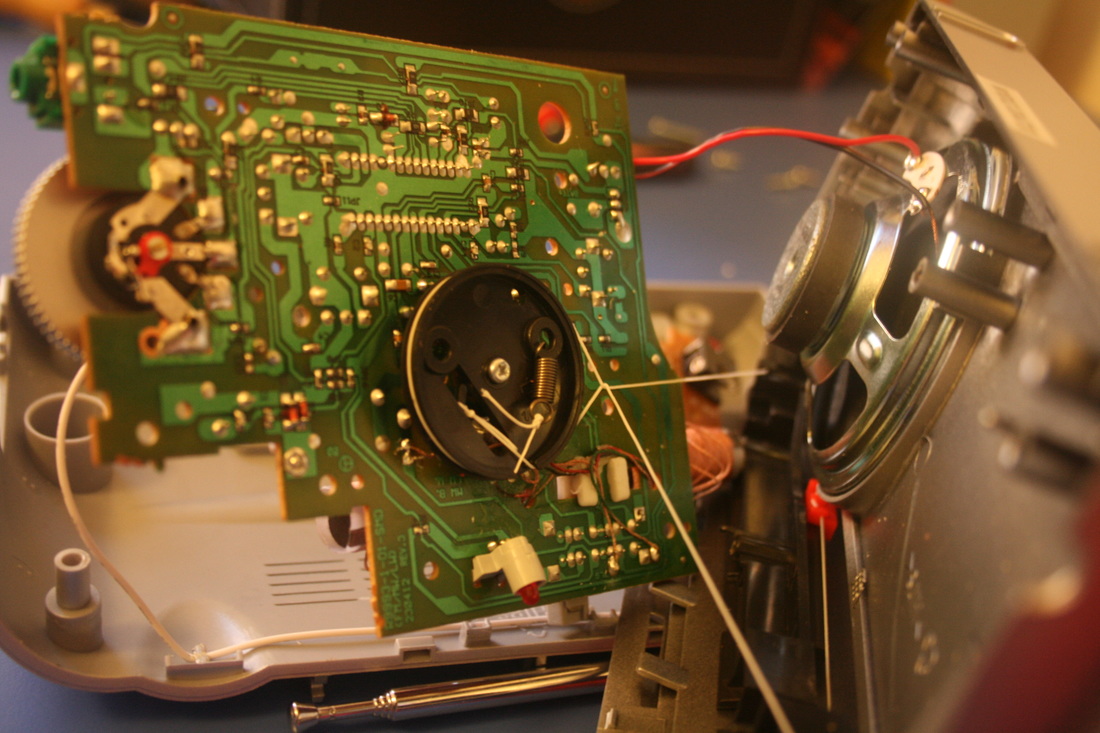
WWW: I think the radio has the strongest set of images out of the three. I worked hard to get to the heart of the radio, which revealed a fascinatingly intricate circuit board. I think the radio was a really good choice of object as its wiring is so complex, and I showed framed the images well, shooting from directly above and also very close-up to the circuit board.
EBI: Todd McLellan's images (above) have a lot of energy, which he creates by throwing the parts in the air. They appear chaotic and fun, which is something that my images lack and I could've tried.
EBI: Todd McLellan's images (above) have a lot of energy, which he creates by throwing the parts in the air. They appear chaotic and fun, which is something that my images lack and I could've tried.
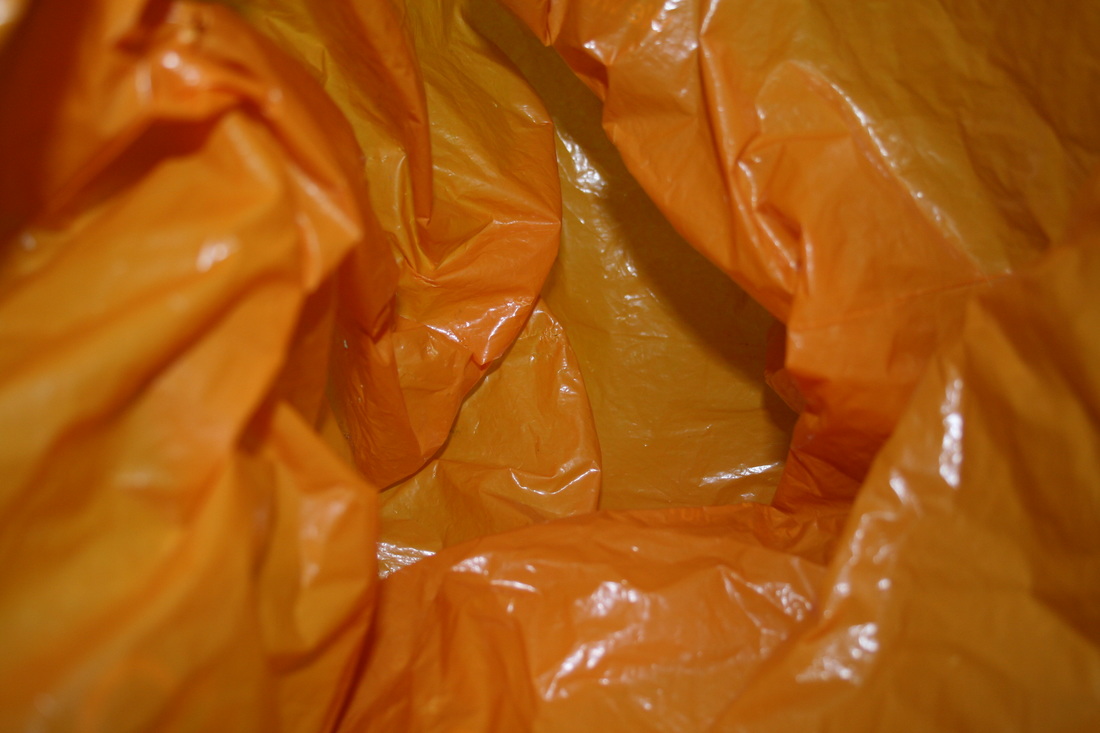
Applied force
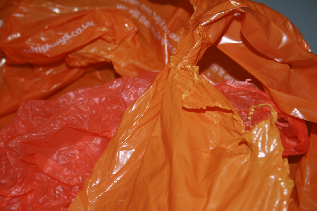
In 'Applied Force' we looked at how we use force to manipulate objects (like a plastic bag, below) and also destroy them (crushing, below). This is 'force' in its most literal, physical sense and I think it was good to capture that.
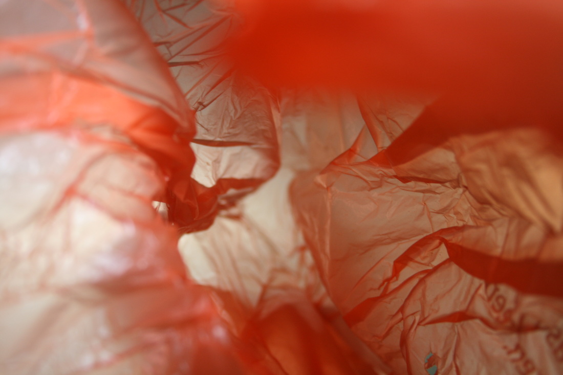
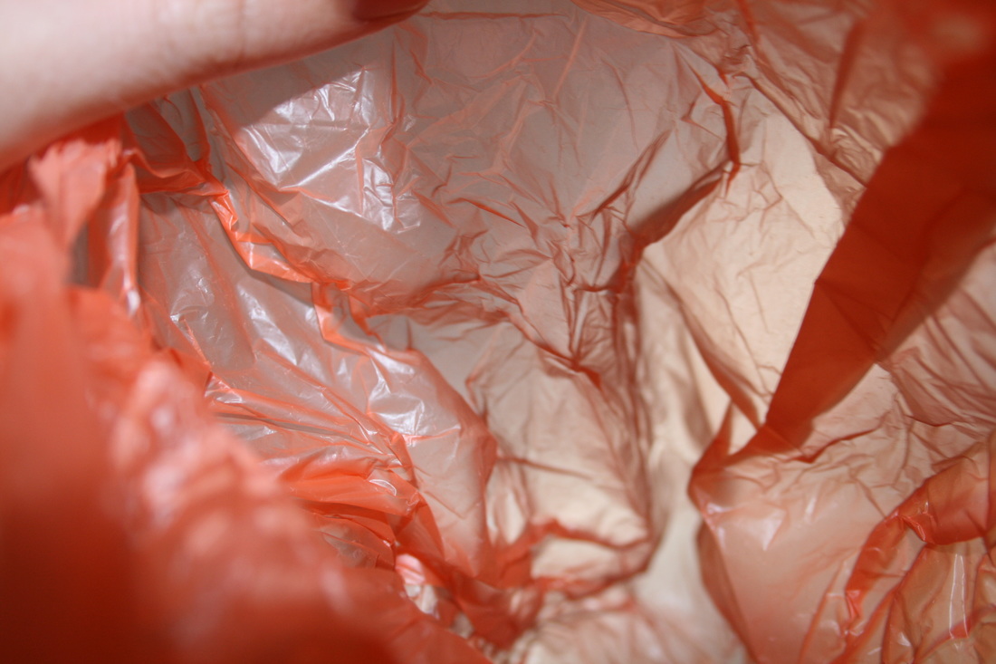
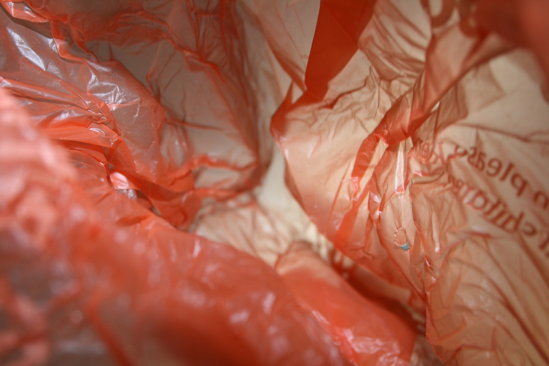
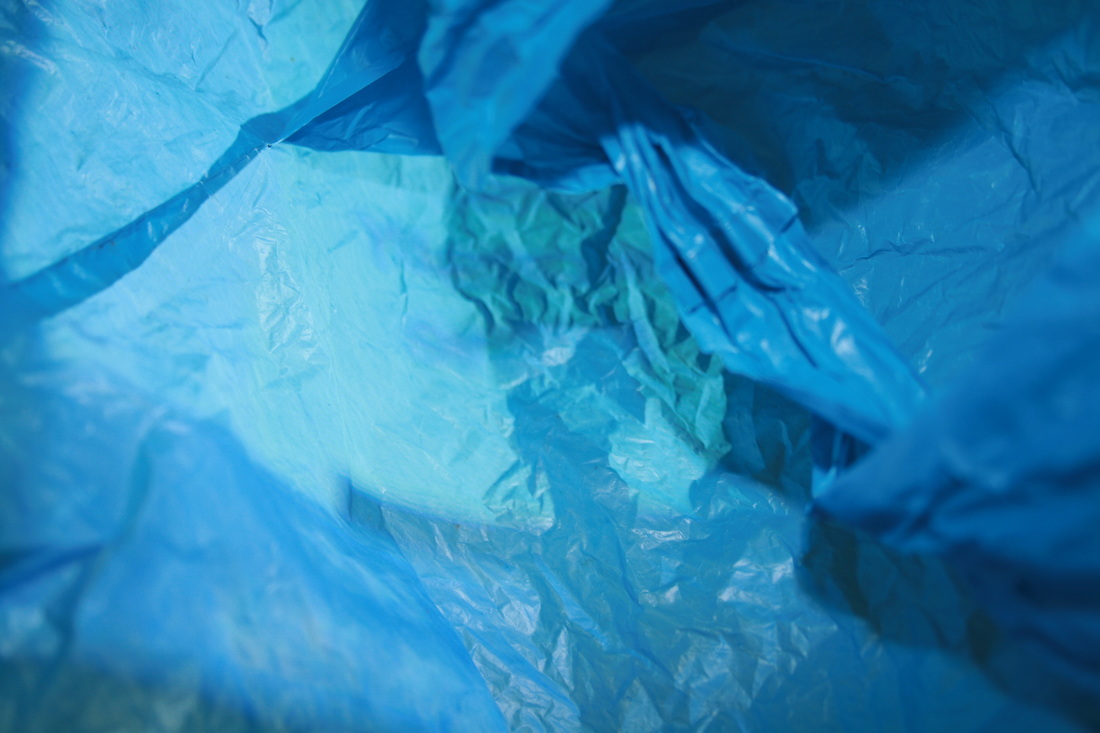
Francois Delfosse - 'Antarctica in a bag'
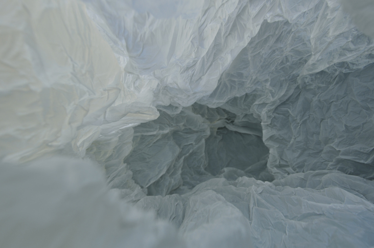
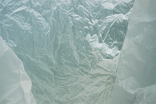
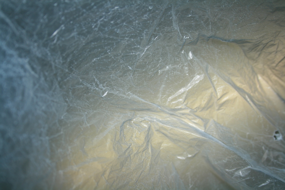
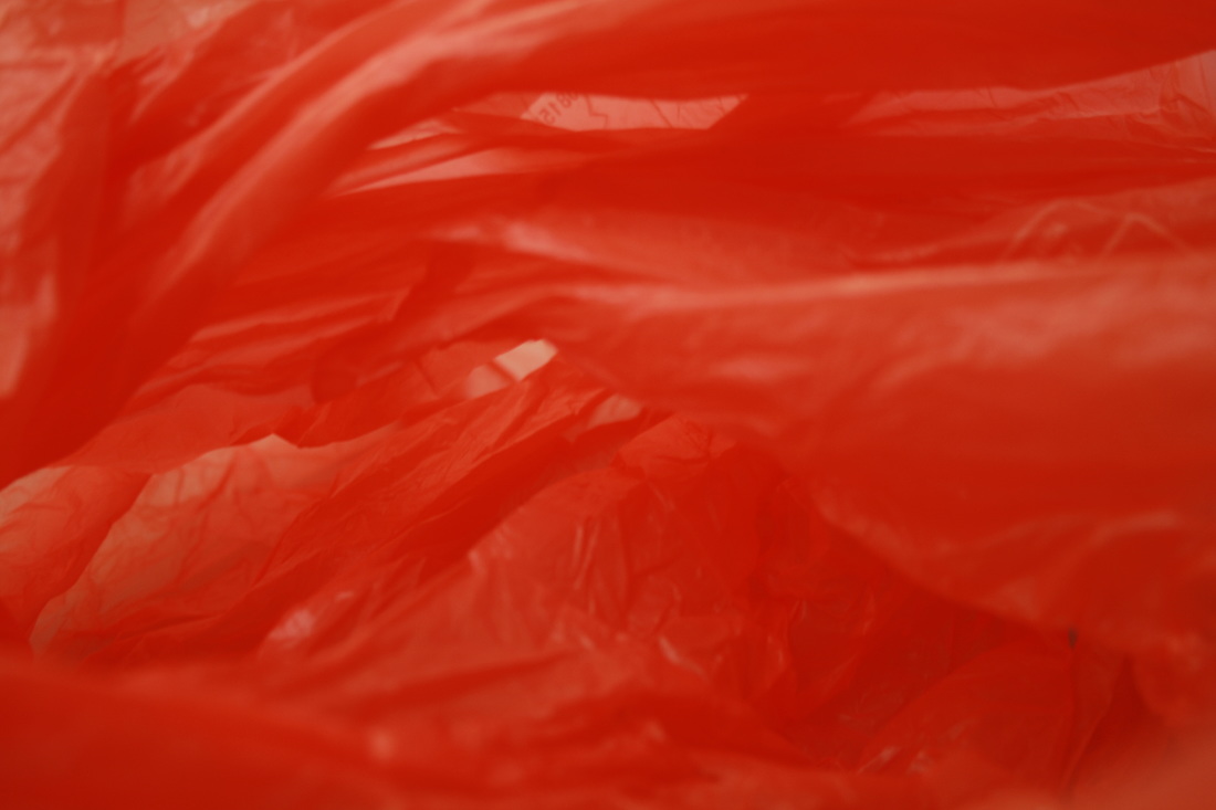
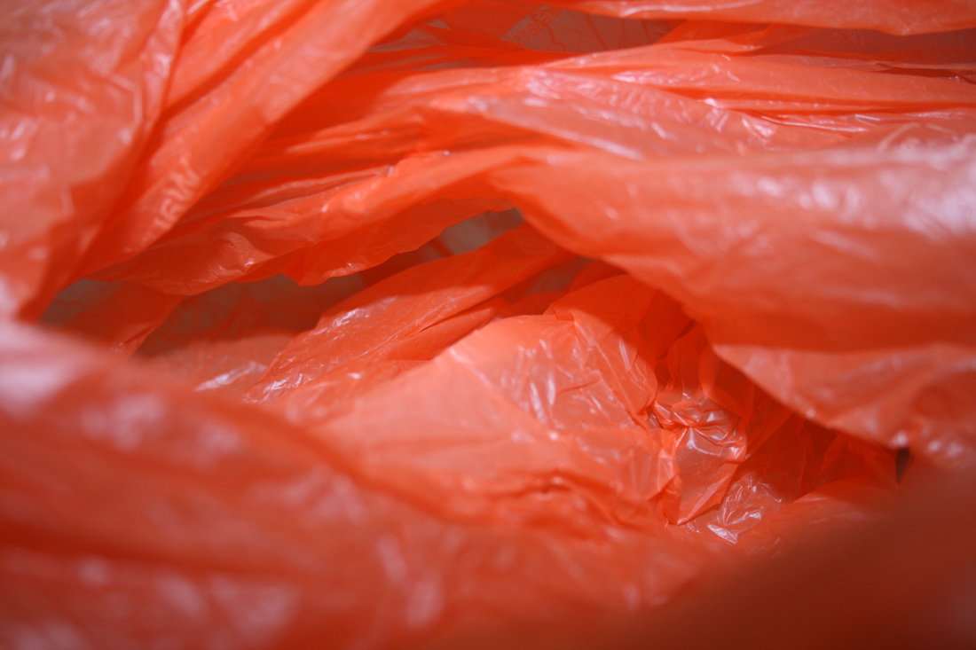
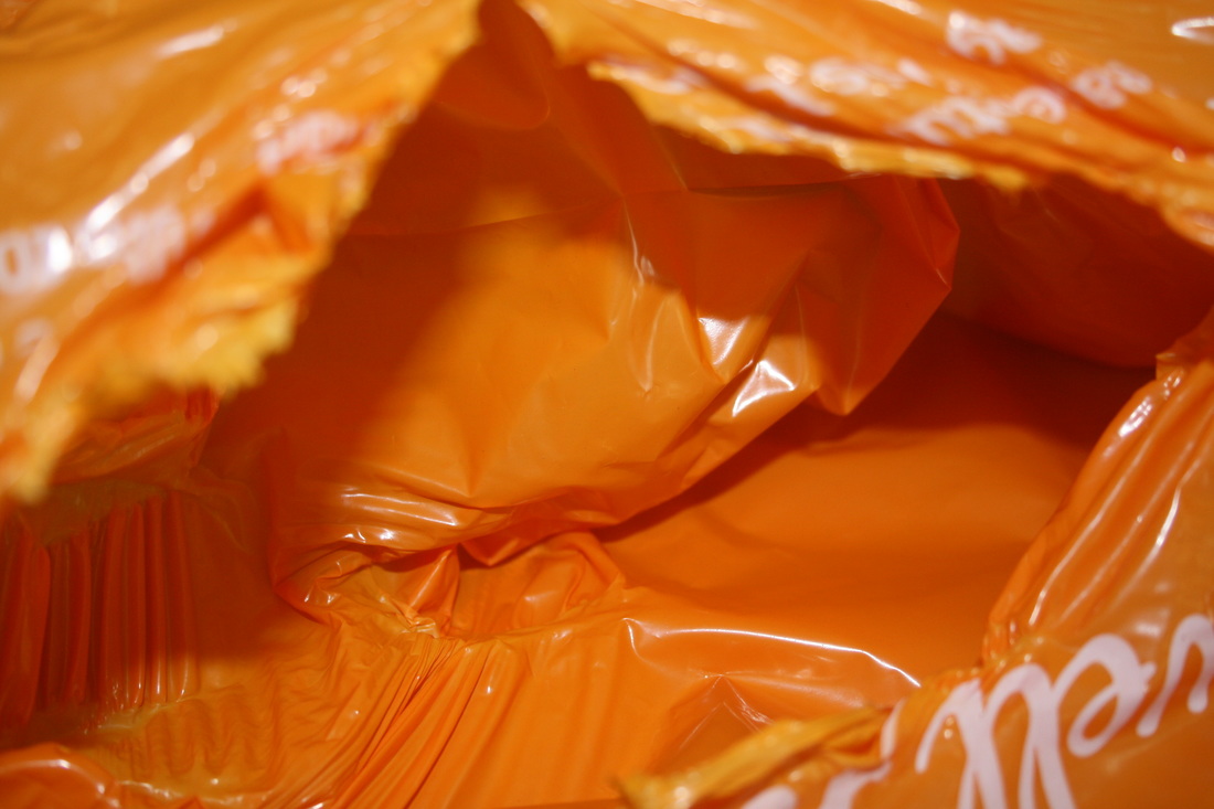
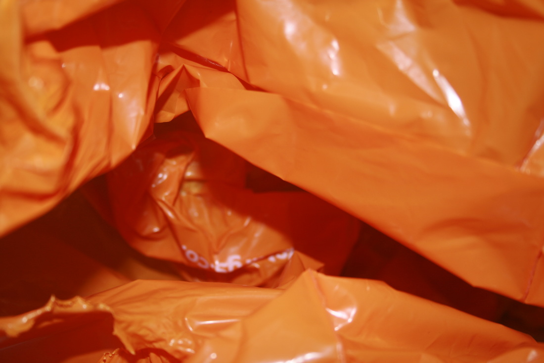
Francois Delfosse is a French photographer and architect. In this abstract series titled 'Antarctica in a Bag' he has taken shots of lots of different perspectives from the inside of a huge white plastic bag. The link with Antarctica is that the surfaces of the plastic bag seem strikingly like the continent's colossal glaciers of ice. According to Delfosse, "it is painstaking to get the ice to move and shimmer like you want to". Particularly with the image furthest to the right, this effect has been achieved to perfection as the shimmering crinkles in the side of the wall look like ridges in the walls of ice. Like any photographer, Delfosse put a lot of effort to achieve his final images: he "structured [his] set and studied the lighting & props". The series is really interesting because it plays on the idea of our awe and captivation of this incredibly powerful force of nature (the glaciers); these images replicate them so well, and yet they are simply flimsy and cheap plastic bags.
|
|
In the image on the left, our perspective is looking down, into a crack, or hole between glaciers. The way the wall go closer together, and the gap gets thinner, creates a claustrophobic effect; like the walls ares slowly closing in on us. Furthermore, we appear to be peering over the edge, on the verge of falling off the precipice, which exacerbates the sense of dread and claustrophobia. A feature of all of these images is the limited range of colours: usually white, grey or icy blue. However, this countered by the strong variety of tones, especially in this image. The tones get darker as we goes further down the gap, furthering the idea that the ice has been burrowed, or drilled into, and developing the feeling of tension and fear.
In the image on the right, Delfosse has used an interesting depth of field. Two flaps of the plastic bag are out of focus on either side of the frame, and the image seems to be sharpest around the top middle of the shot. The out of focus flaps offer contrast; it makes the rest of the image seem clearer. I like this as it really adds texture as you can see every little ridge and crevice in the walls. Delfosse might have used a high f-stop to get the high depth of field.
In the image on the right, Delfosse has used an interesting depth of field. Two flaps of the plastic bag are out of focus on either side of the frame, and the image seems to be sharpest around the top middle of the shot. The out of focus flaps offer contrast; it makes the rest of the image seem clearer. I like this as it really adds texture as you can see every little ridge and crevice in the walls. Delfosse might have used a high f-stop to get the high depth of field.
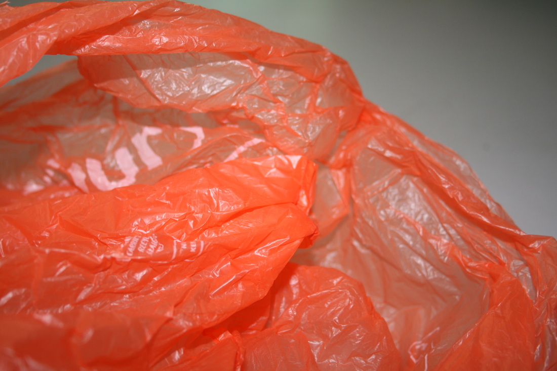
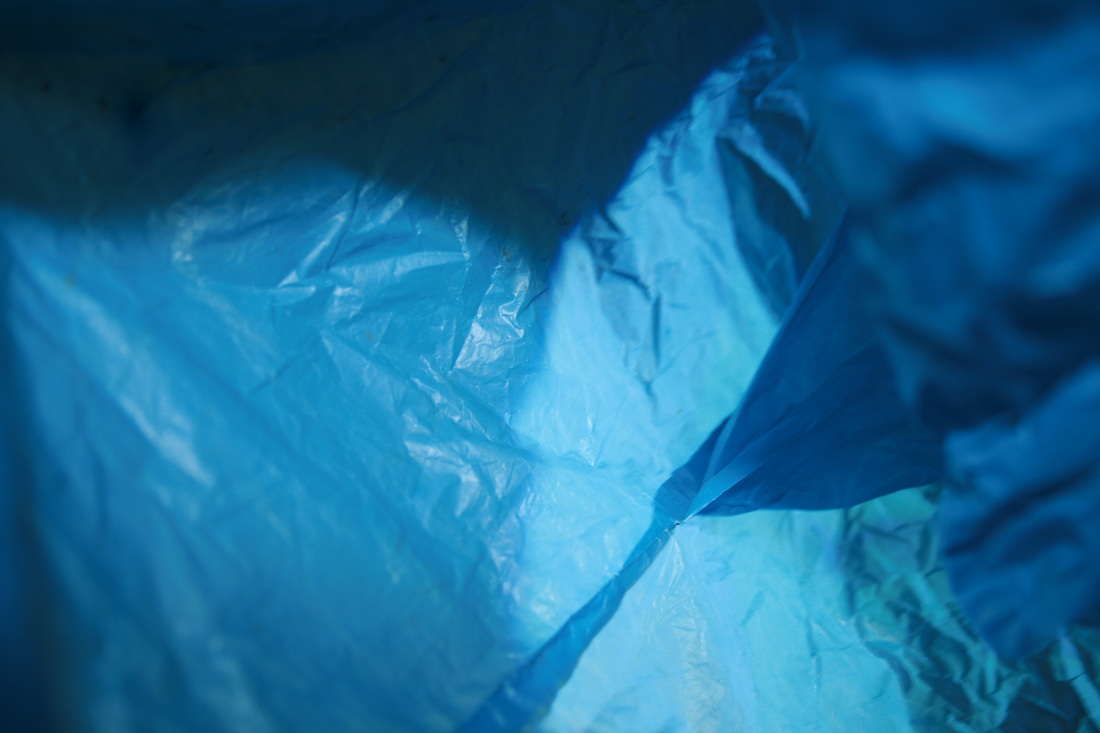
My response

|

|
|

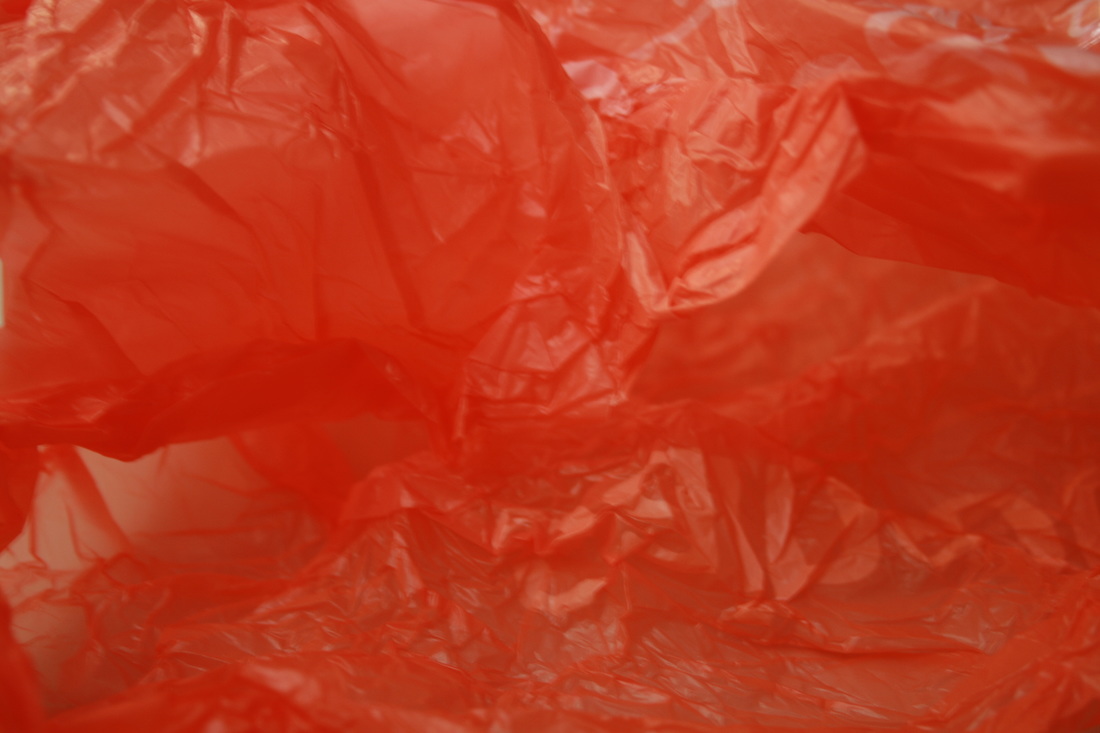
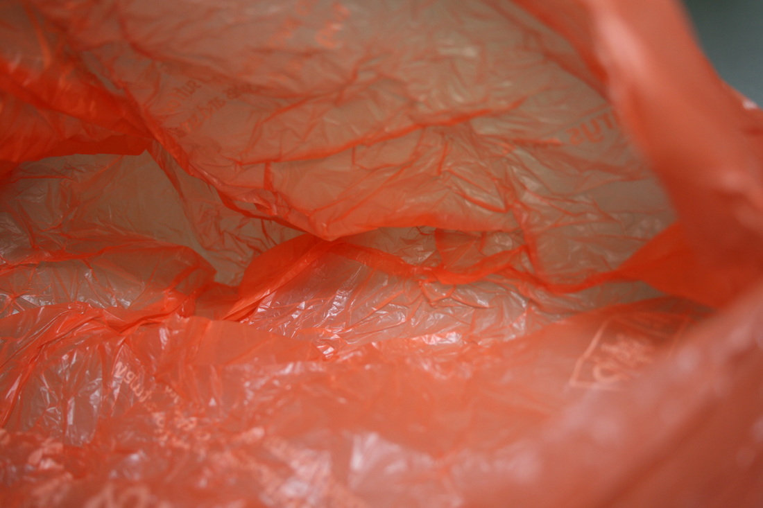
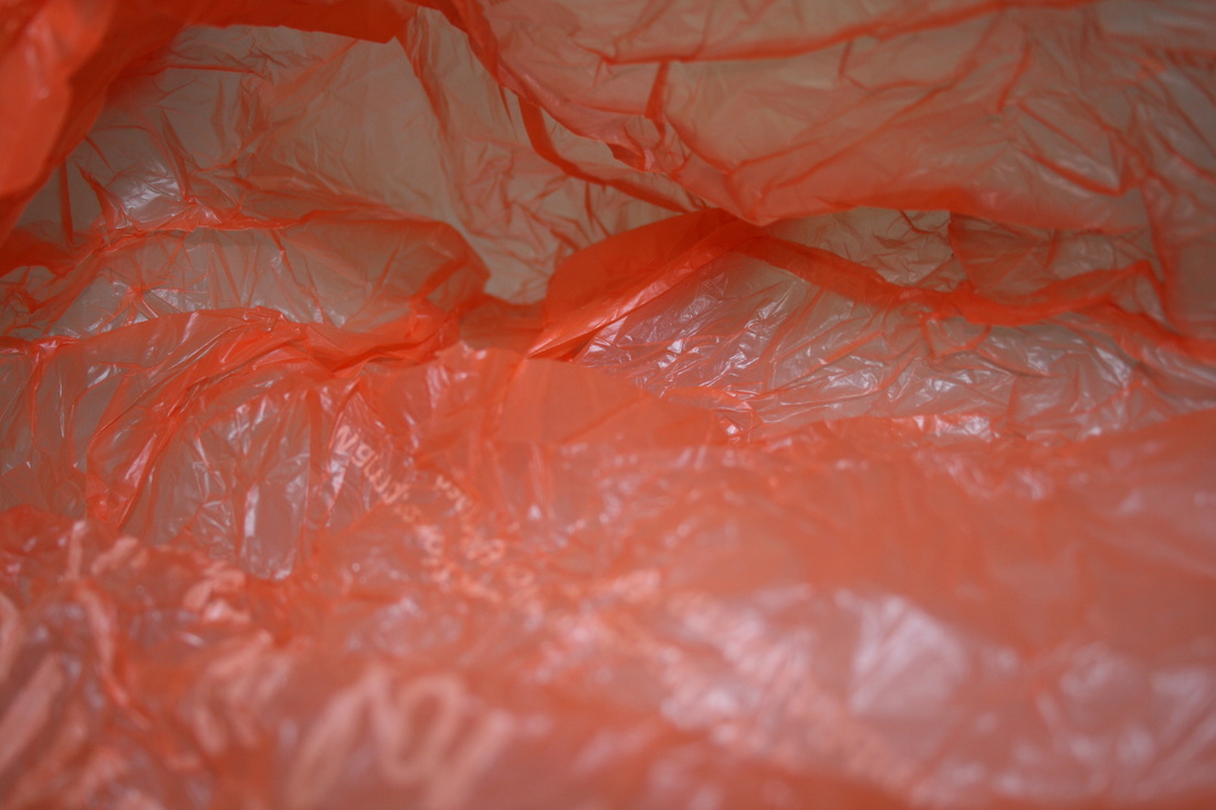


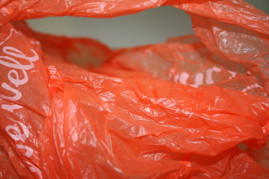
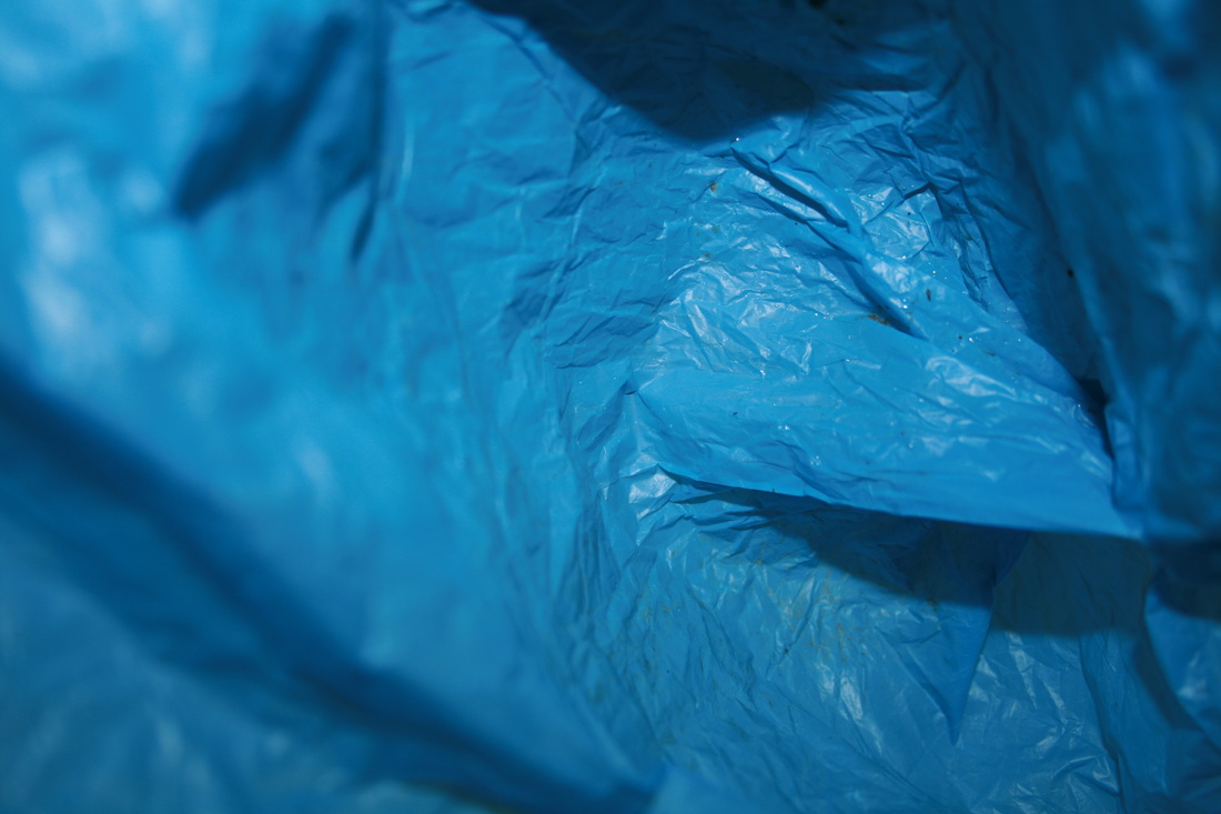
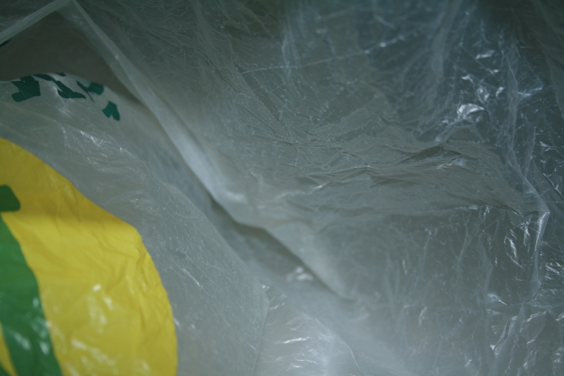
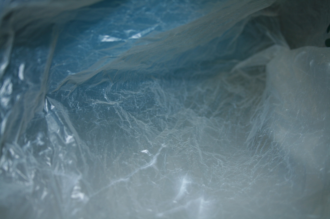
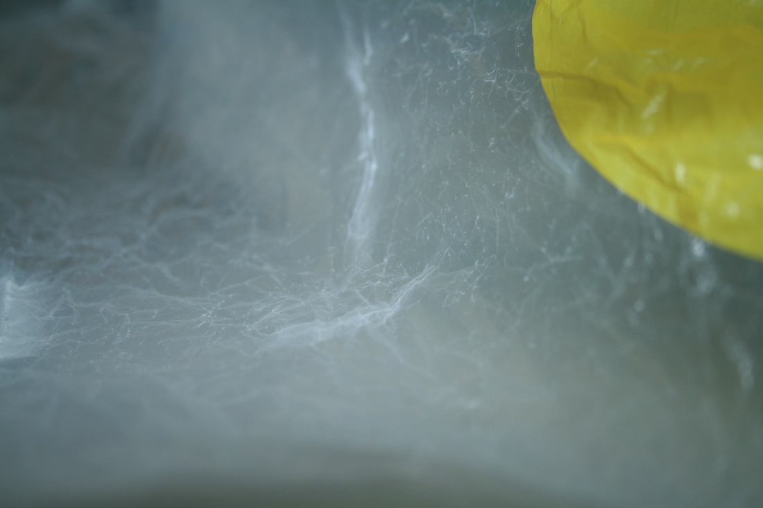

WWW: I got some really nice variety in textures. For example, the right enlargement. In the top of the image, there appears to be a crackly, rough texture caused by the zigzagging white lines. Then, in the centre/right of the image, the bag forms folds that jut out. Also, little smooth ridges fluctuate like waves in the same area. There is so just much going on and contrast in terms of the texture.
EBI: I think the pretty fundamental difference between my response and Delfosse's work is that his photos are intended to look like the glaciers of Antarctica. I didn't set out with an objective to make the plastic bags look like something, which is what makes Delfosse's images so interesting. He makes simple plastic bags look like impressive glaciers. My images look good, but at the end of the day they are just of plastic bags. To improve, a few ideas I have are for the bags to look like sand dunes, grassy hills or an ocean.
EBI: I think the pretty fundamental difference between my response and Delfosse's work is that his photos are intended to look like the glaciers of Antarctica. I didn't set out with an objective to make the plastic bags look like something, which is what makes Delfosse's images so interesting. He makes simple plastic bags look like impressive glaciers. My images look good, but at the end of the day they are just of plastic bags. To improve, a few ideas I have are for the bags to look like sand dunes, grassy hills or an ocean.
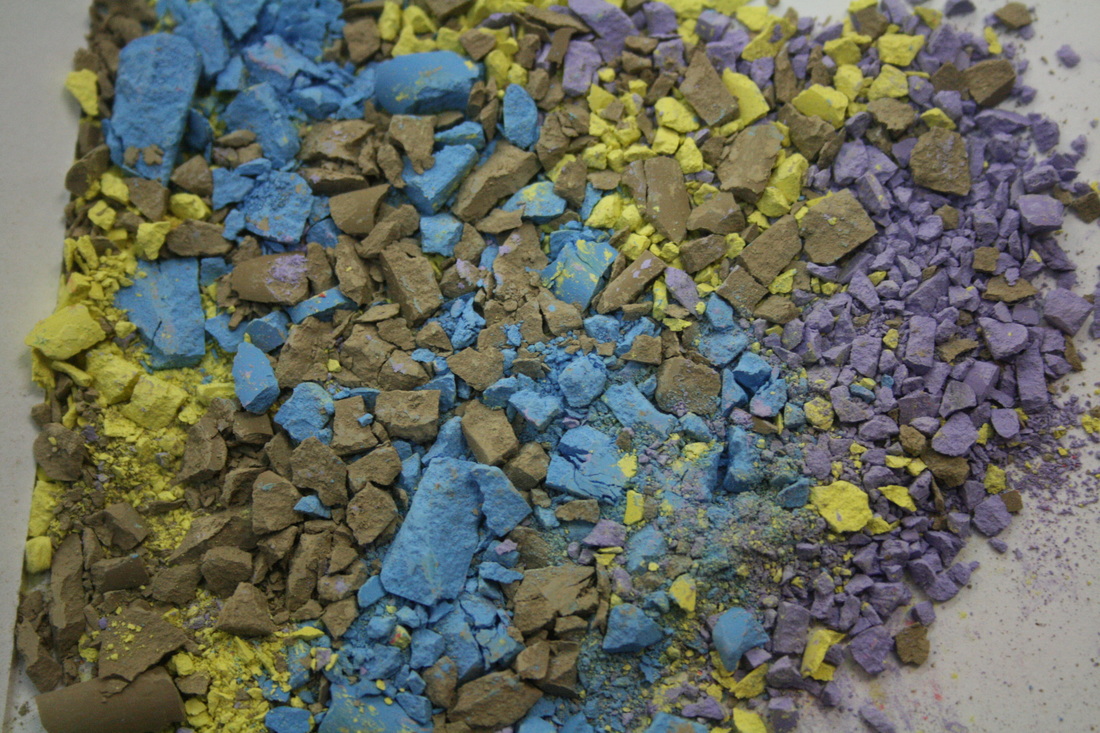
crushing objects
|

|
|
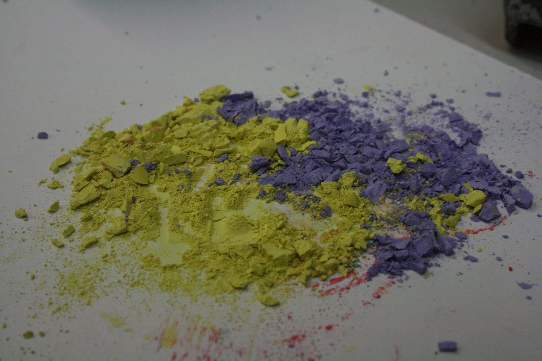
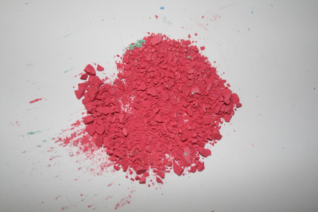
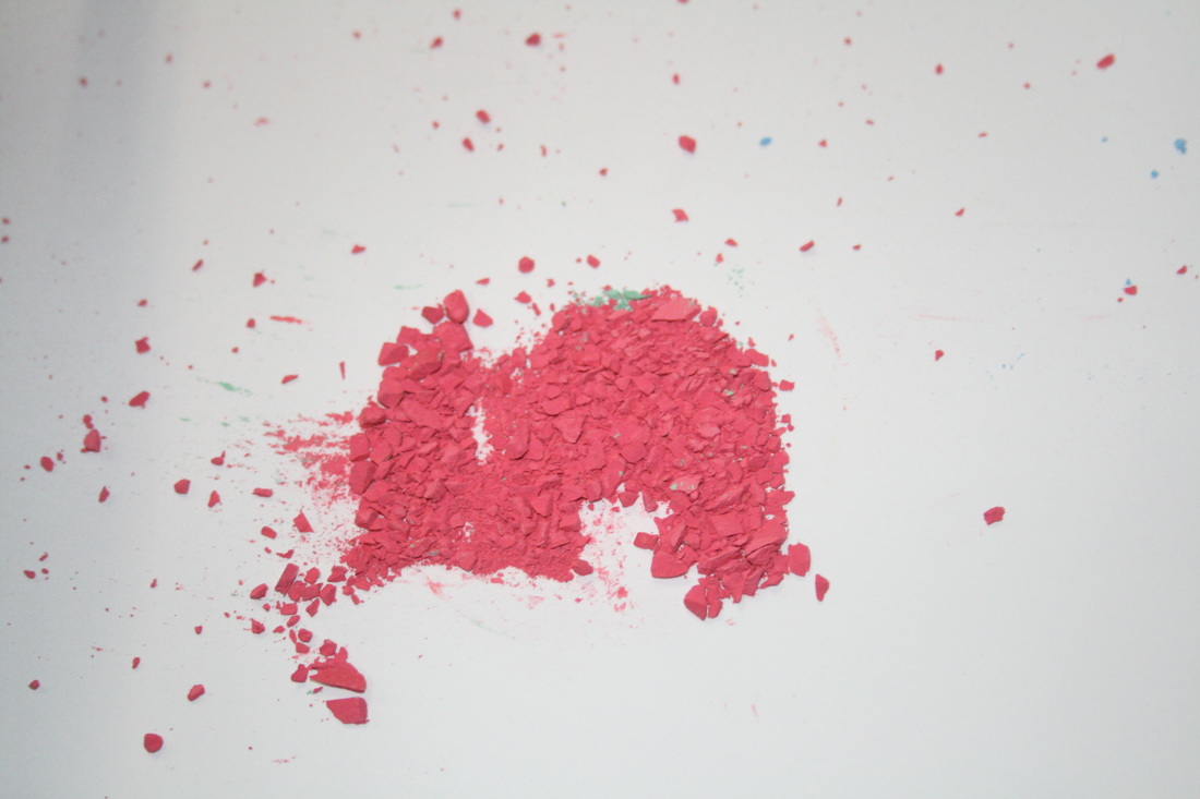

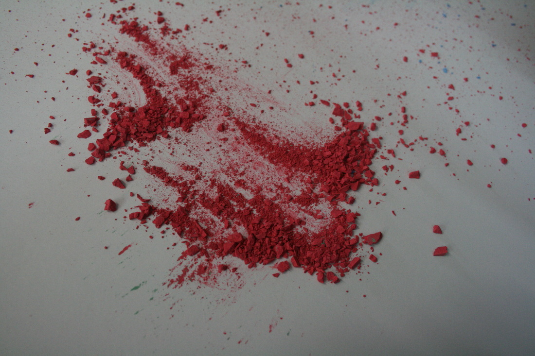
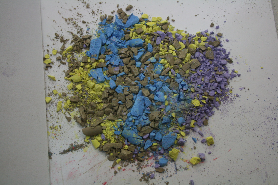
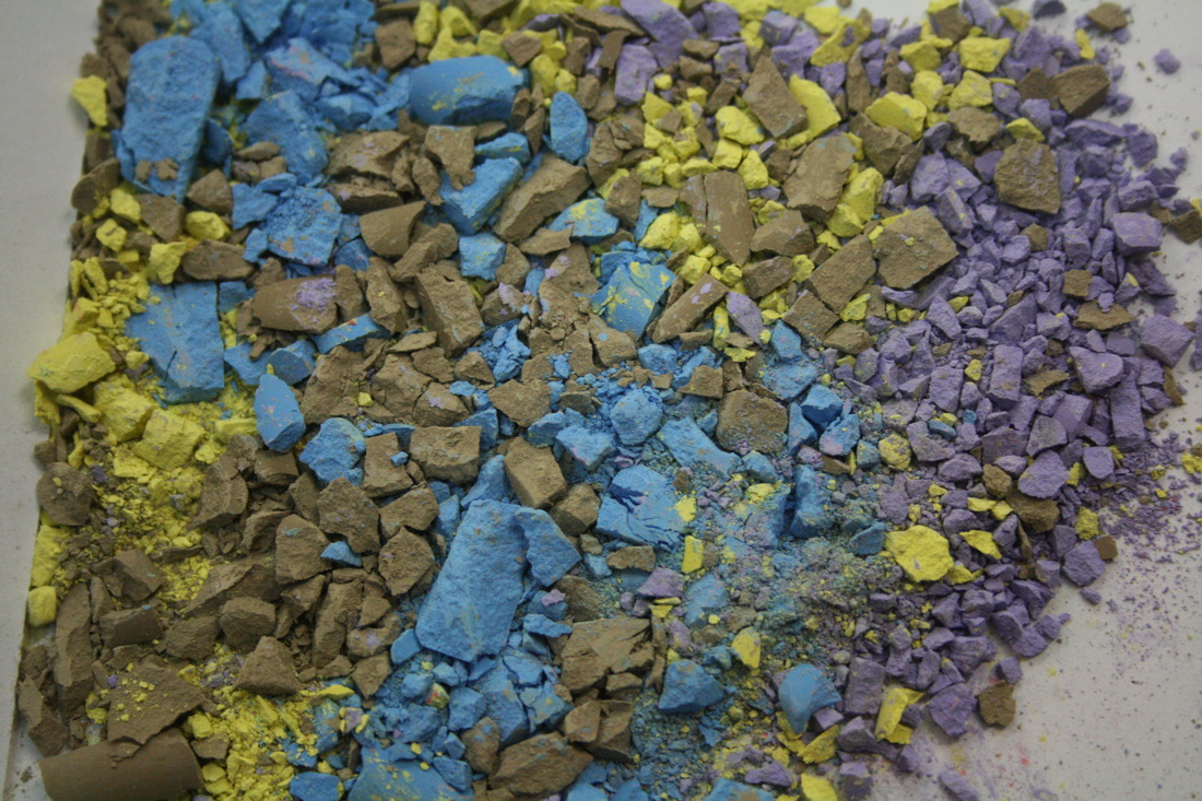
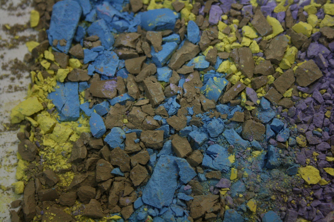
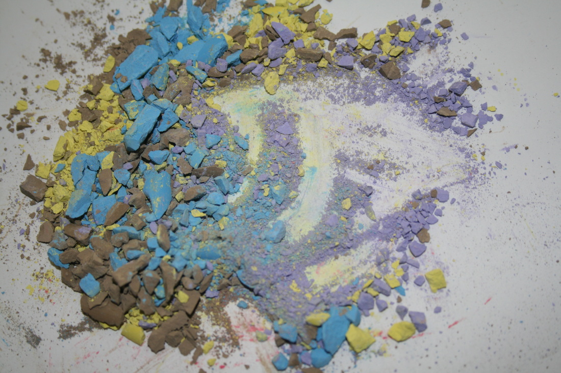
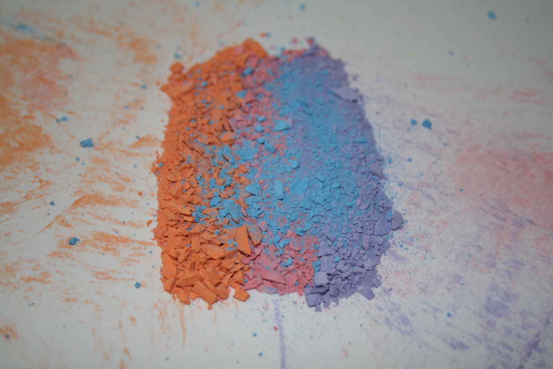
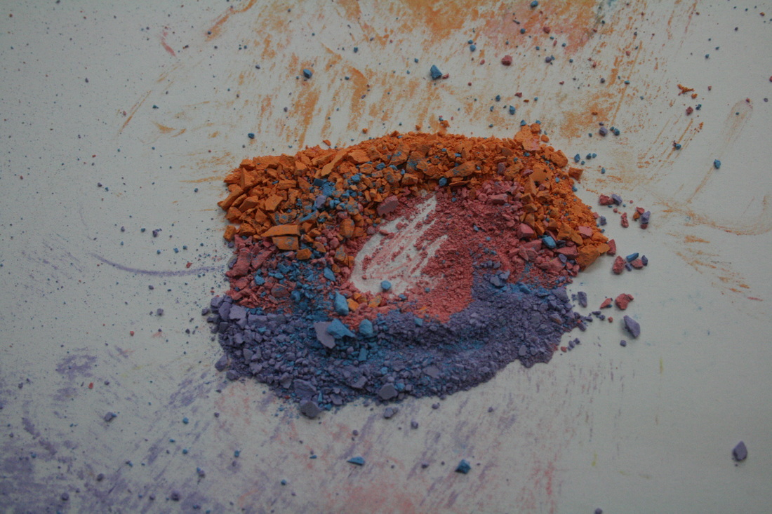
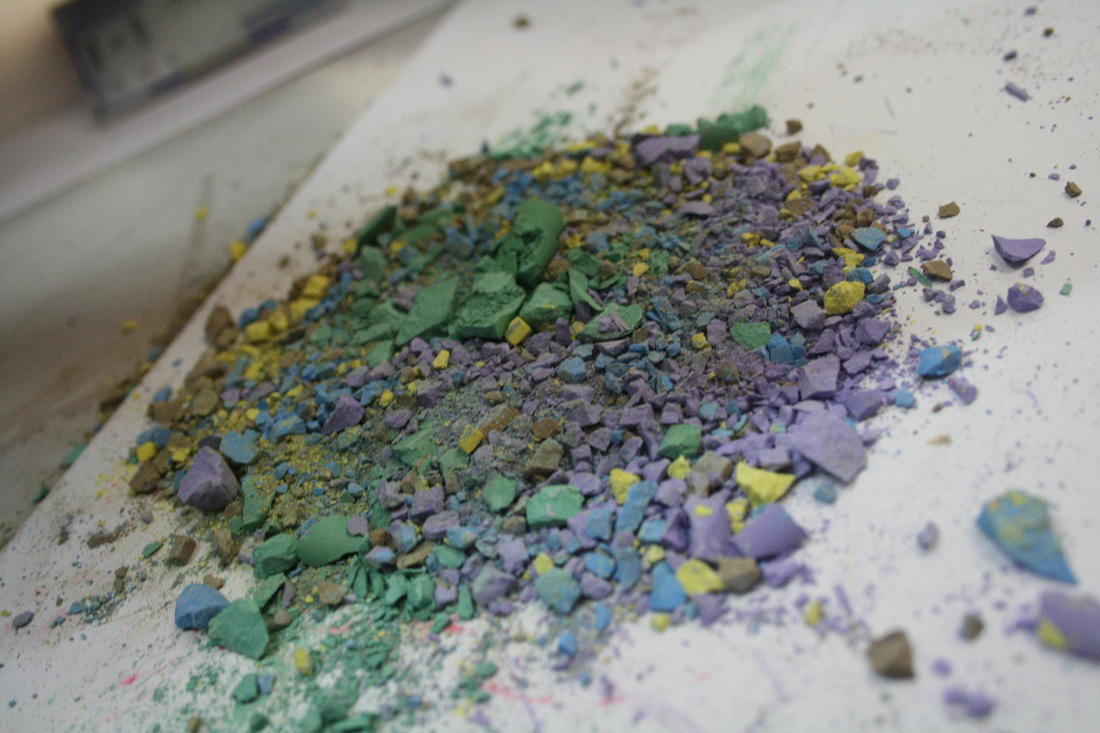
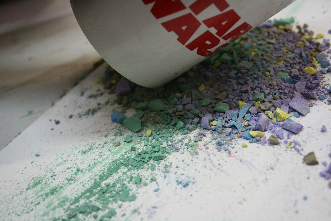
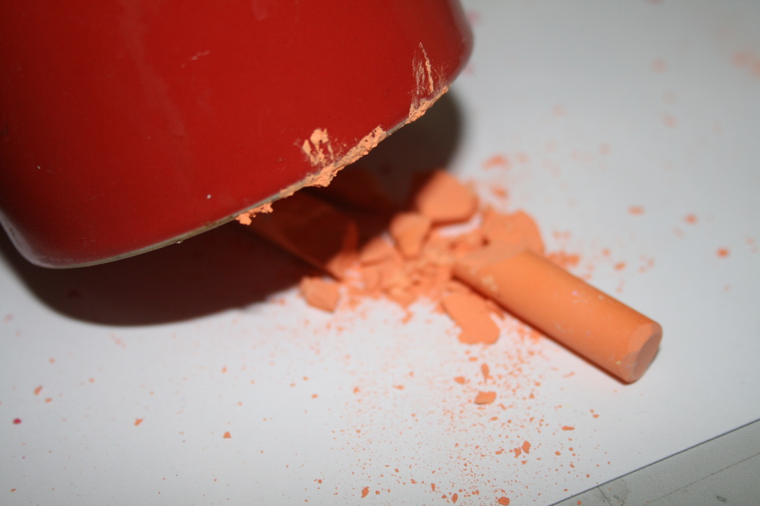
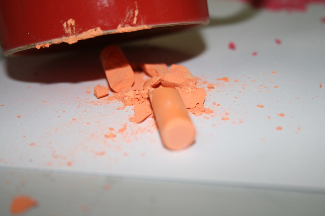
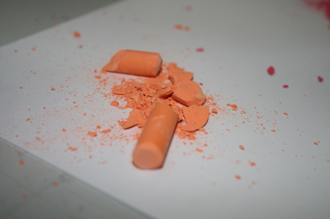
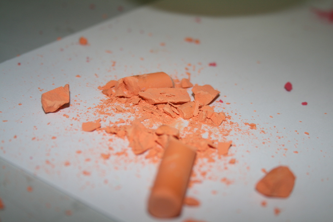
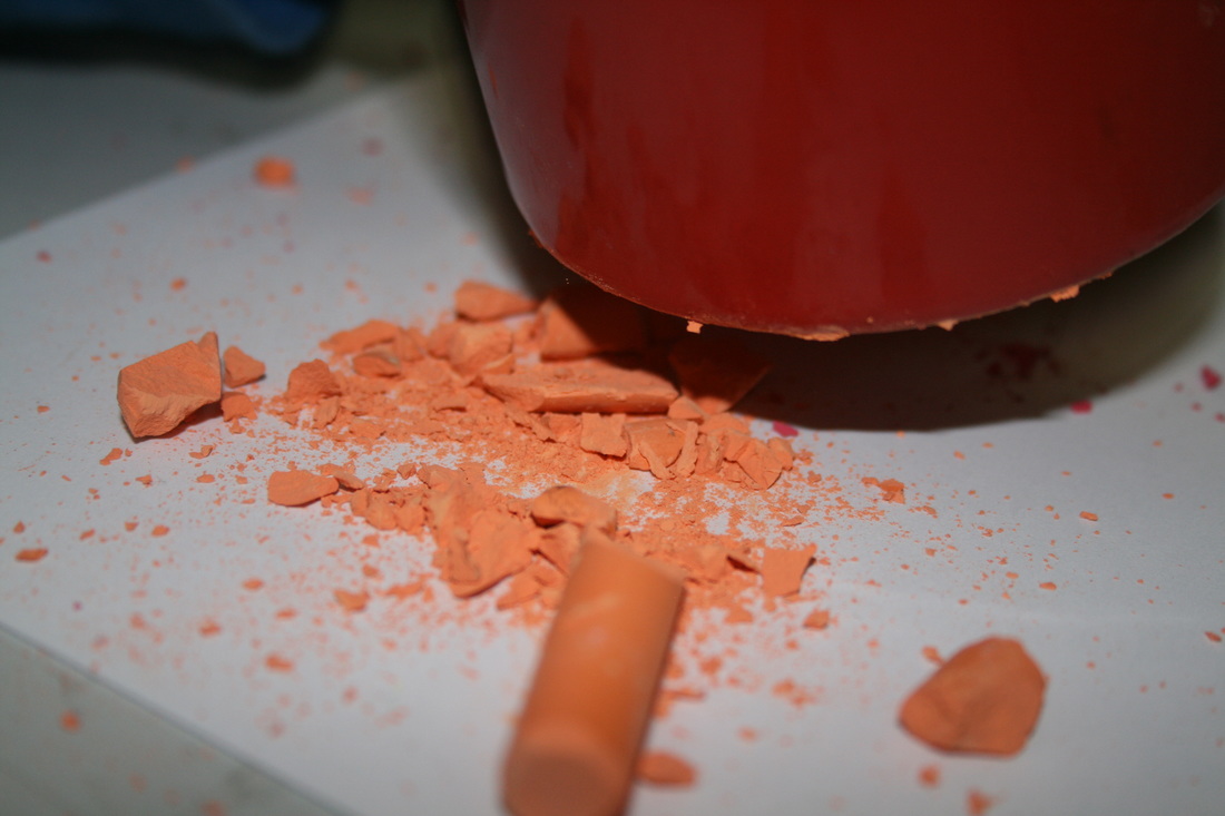
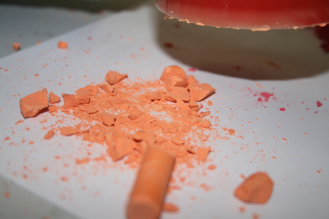
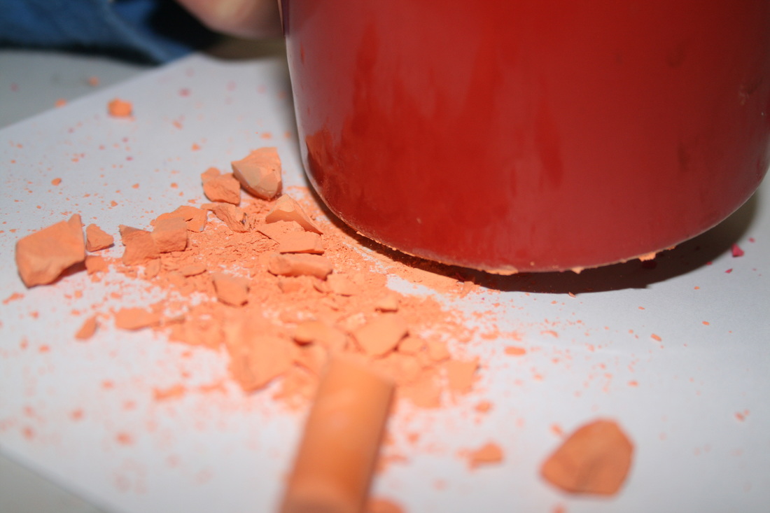
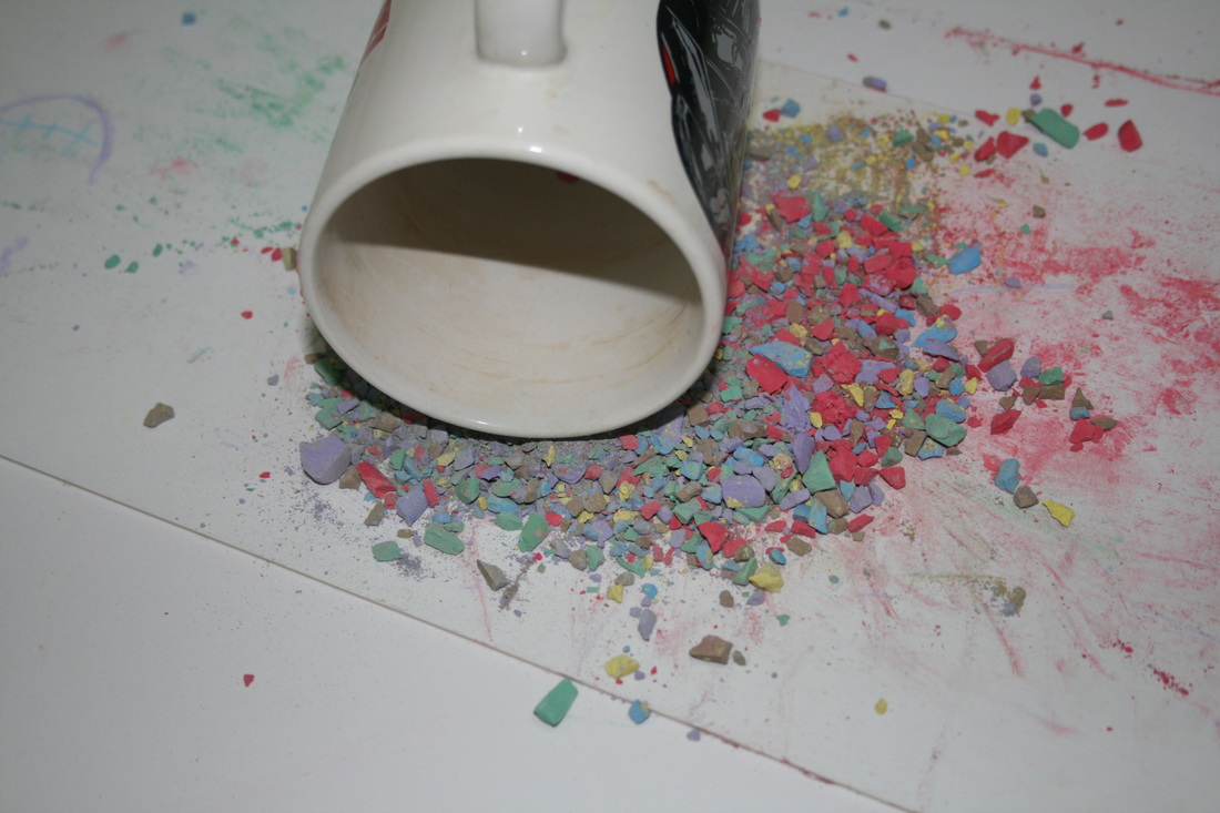
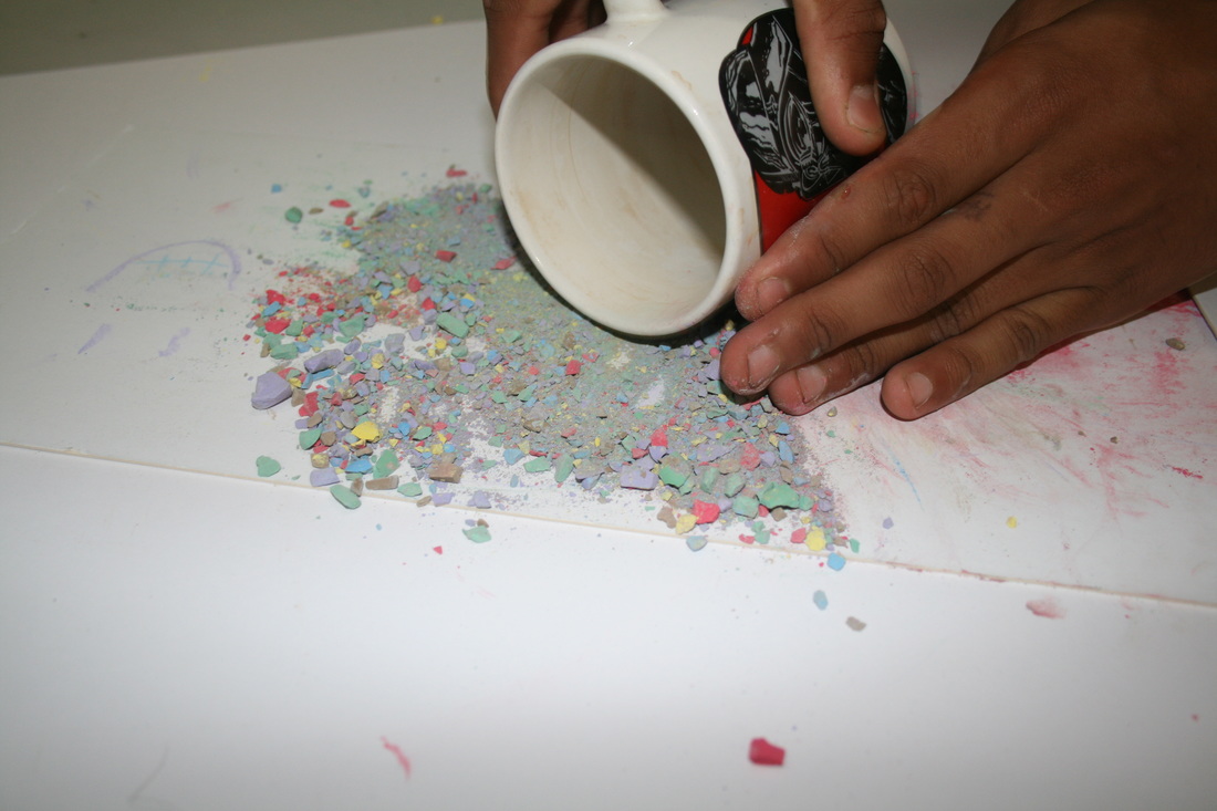

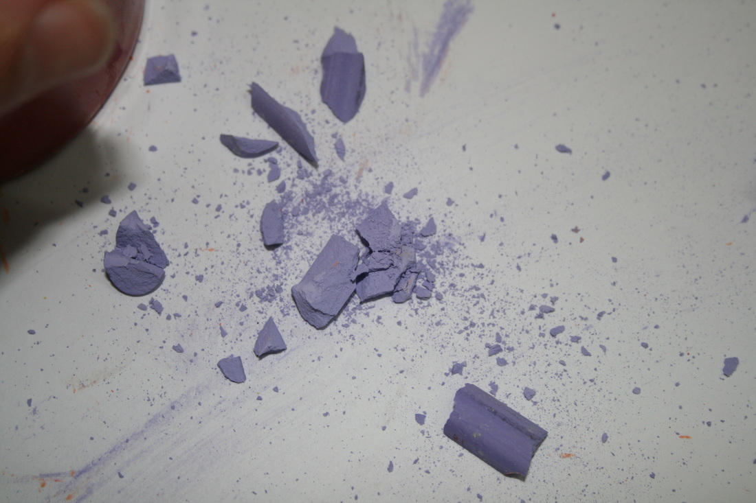
WWW: I thought it was creative to make a GIF of the different stages of crushing the crayon. I also like the photographs with the mugs, which I used to crush the crayons. For example, in the 3rd row, 5th across image, there is a feeling of tension and action as the viewer knows that a second afterwards and the crayon will be smashed.
EBI: I think the composition of a lot of the images could be better: maybe a black background, to contrast against the colours, and better choice of colours to clash less. Maybe also I could have framed some of the images better, perhaps photographing from directly above.
EBI: I think the composition of a lot of the images could be better: maybe a black background, to contrast against the colours, and better choice of colours to clash less. Maybe also I could have framed some of the images better, perhaps photographing from directly above.
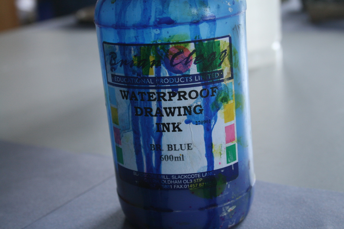
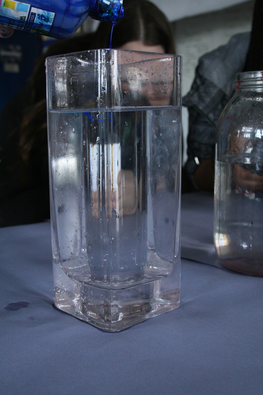
Paint in water
In this next topic, I explored how paint can act as a force in water. It reacts interestingly, spreading out unusually and unevenly as it sinks.
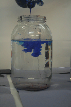


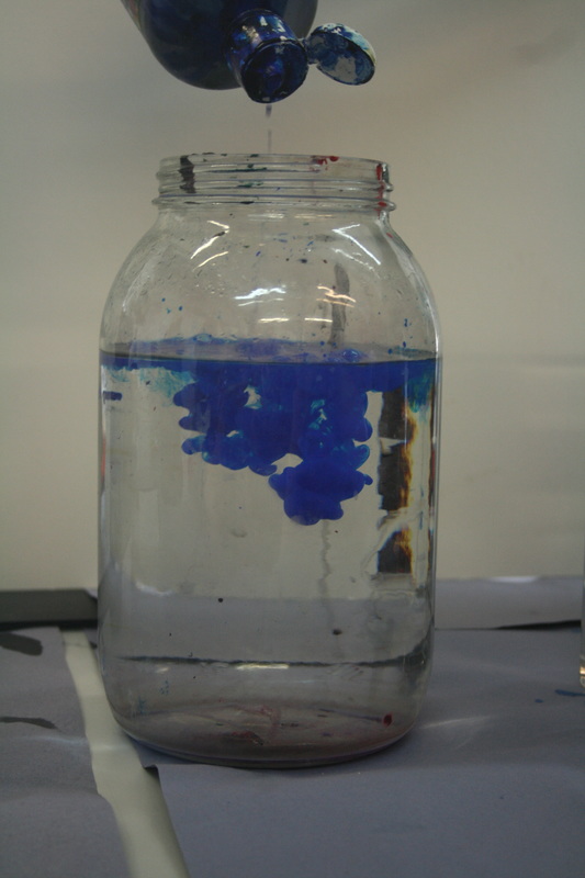

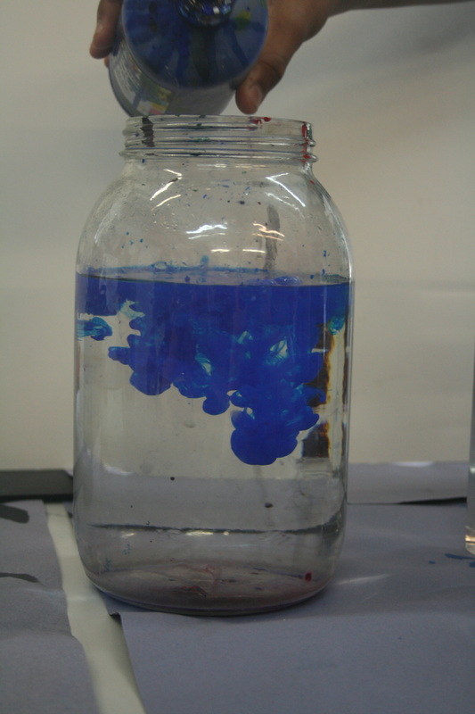
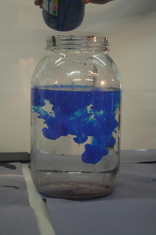
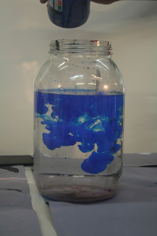
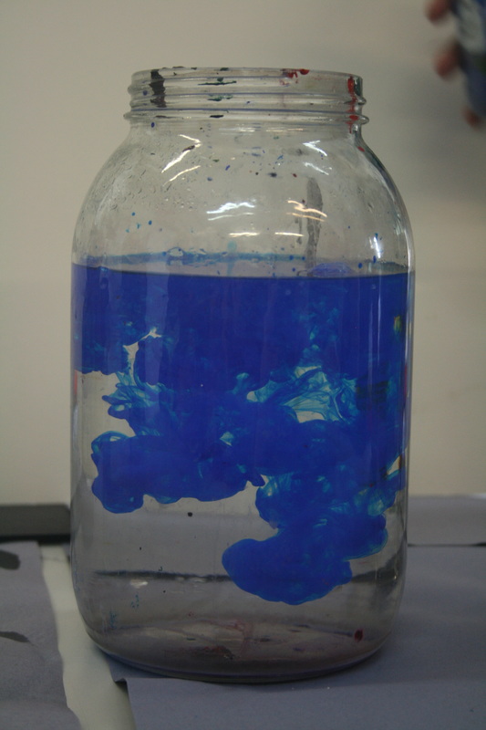
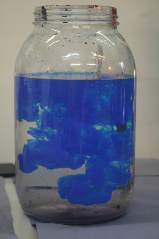
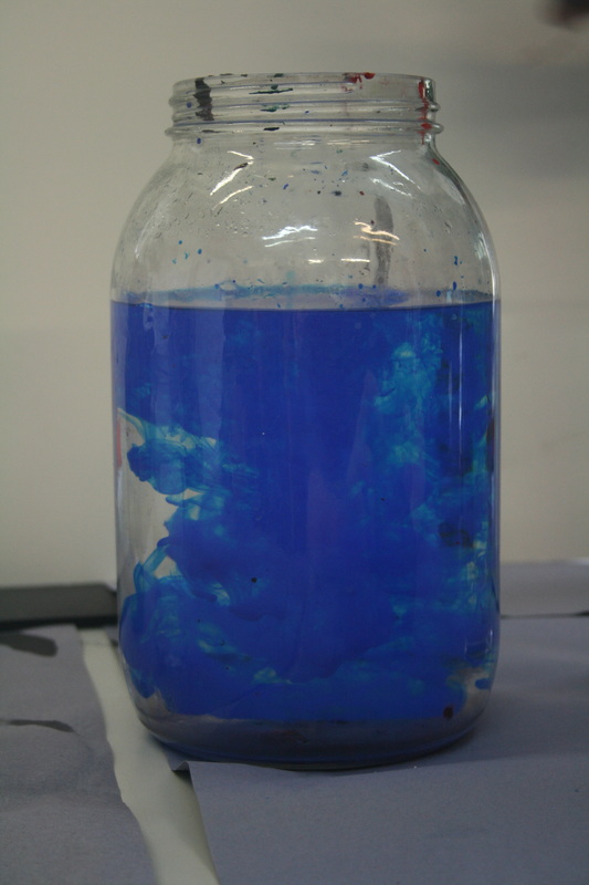
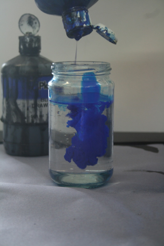
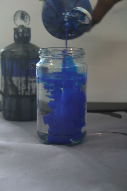

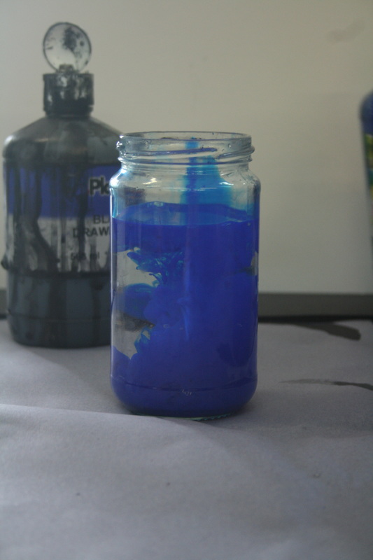
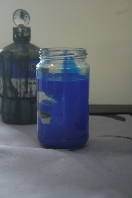
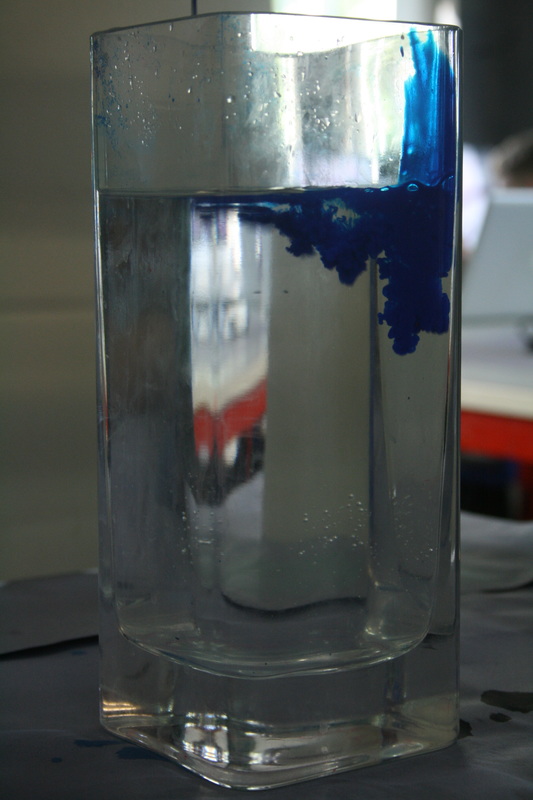
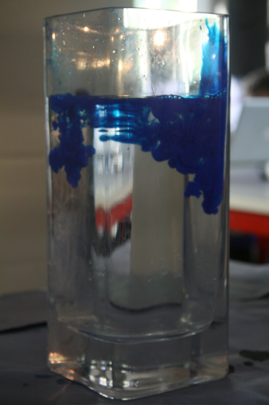
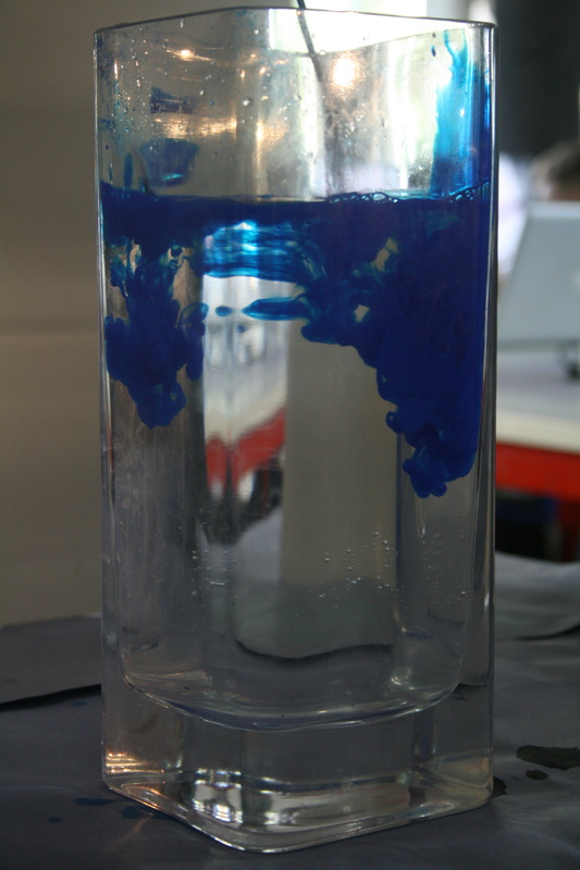

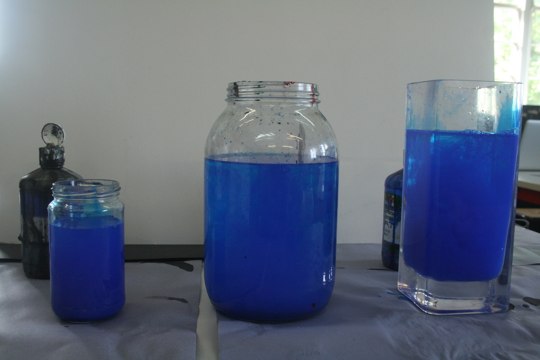
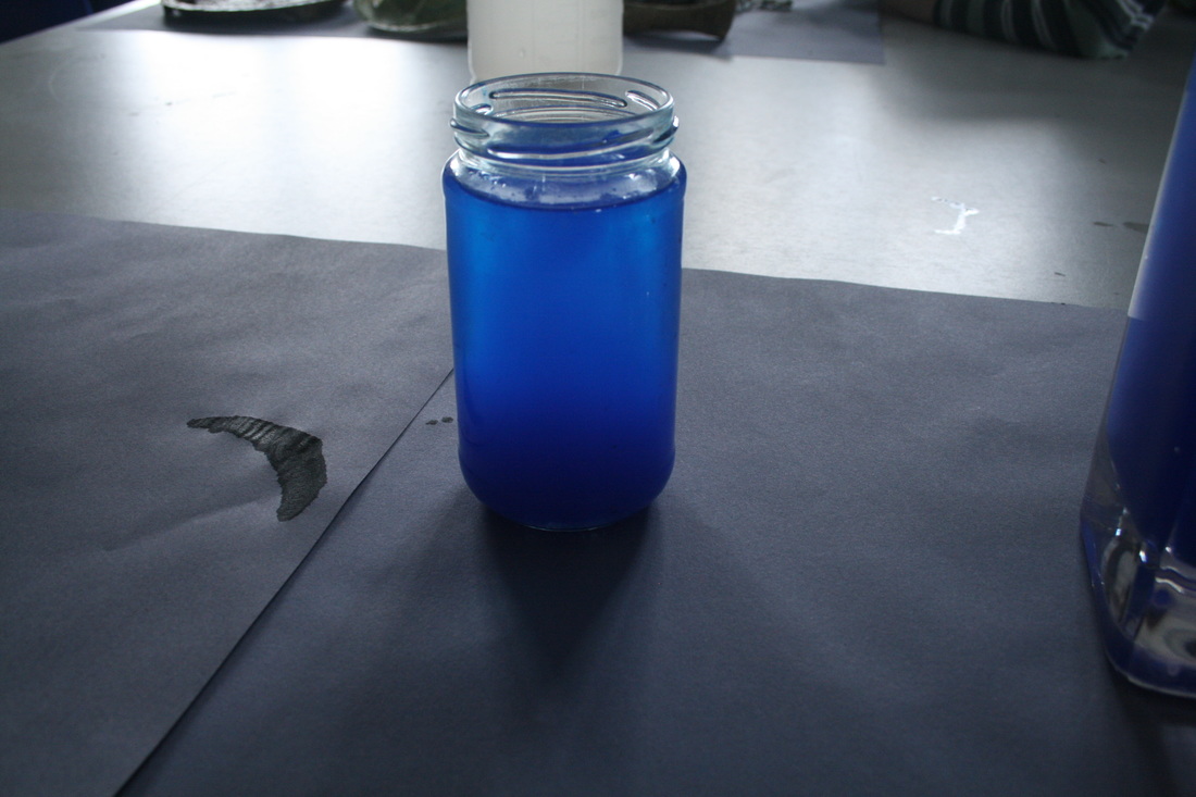

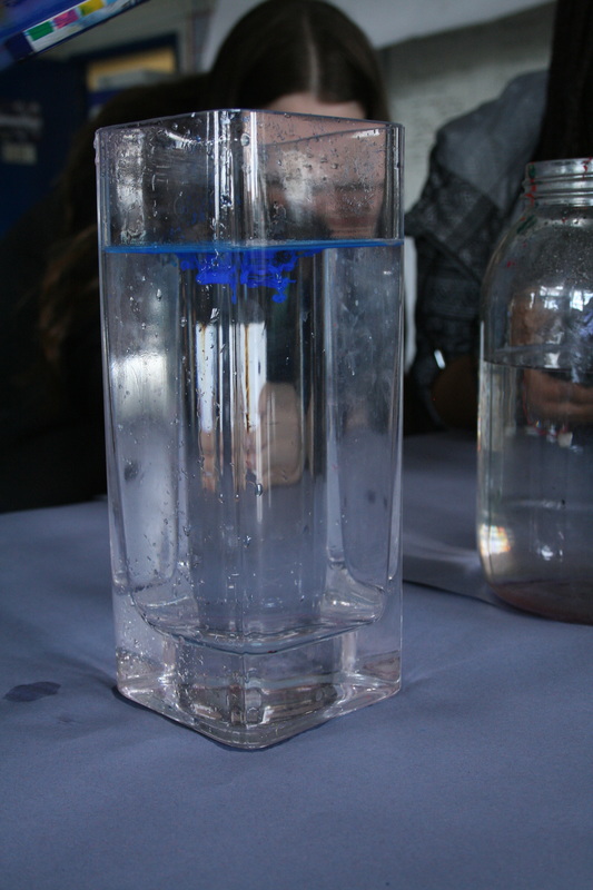

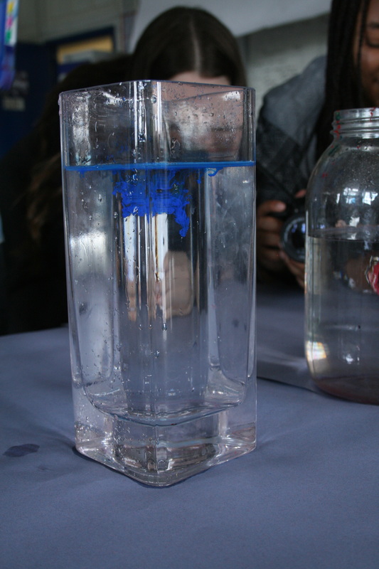
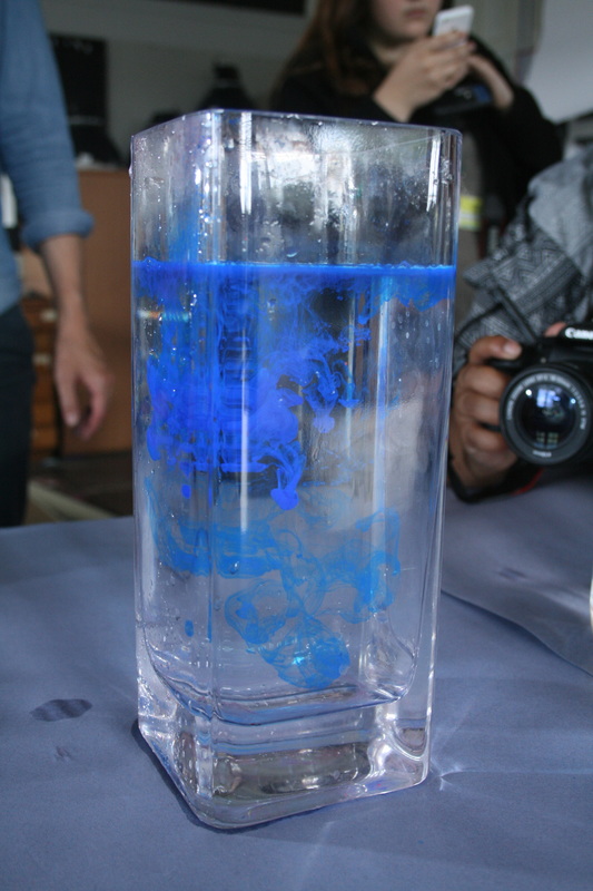
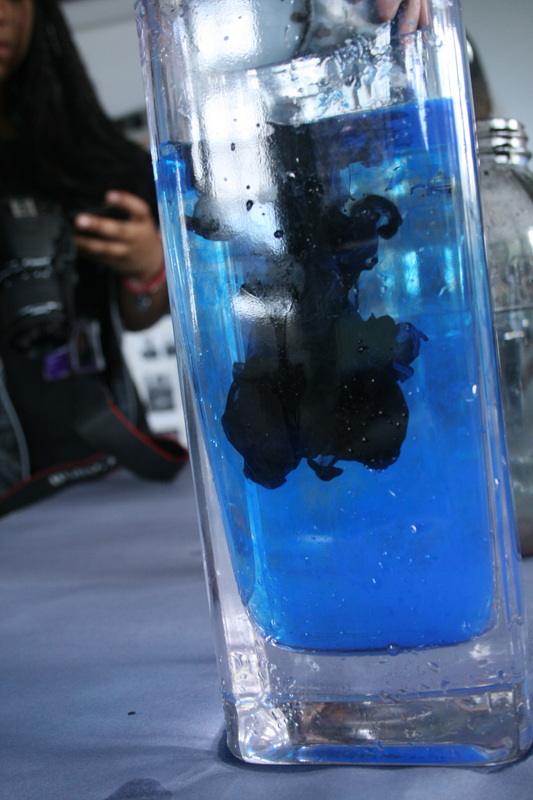
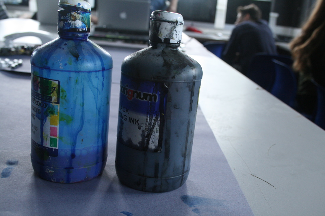
WWW: I like how I showed different stages of the paint spreading out. This also allowed me to create a GIF, and reveals the how parts of the paint spreads out thinly while others remains thick and together.
EBI: I should have used more colours than just the blue paint. I started to do this in the second-last image, but one photo isn't enough to show variety. Also, some of the images aren't crisp enough, which is just more camerawork when I was taking the photos and I wasn't steady enough.
EBI: I should have used more colours than just the blue paint. I started to do this in the second-last image, but one photo isn't enough to show variety. Also, some of the images aren't crisp enough, which is just more camerawork when I was taking the photos and I wasn't steady enough.
3 strands
strand 1: Destroying Books
Similarly to the 'Applied Force' project above
cara barer
|
|
|
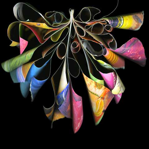
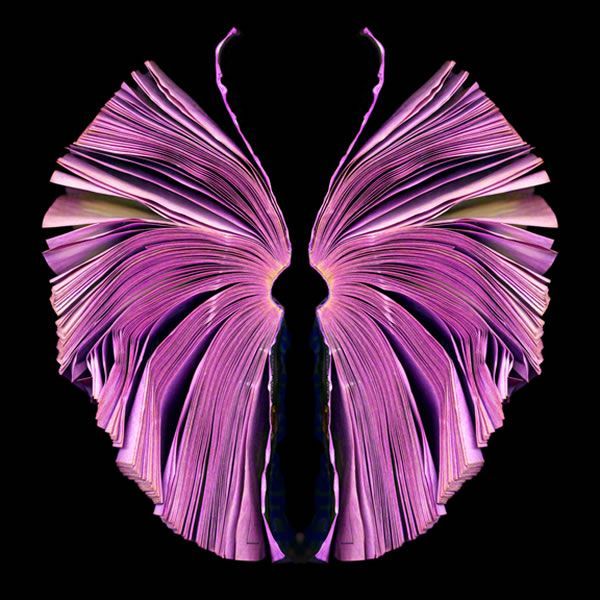
Cara Barer transforms books into warped sculptures. The books have been, in essence, destroyed; their original purpose completely relinquished. In that sense, the could been seen as transgressive, a kind of violation of the original art (the book). For me, it raises the question: how far we can go to destroy things, especially previous works of art, and call our new creations art? Certainly, Barer's work is very original and creative.
In the image on the left, the book has been transformed into the shape of a butterfly. The choice of animal, and the lilac coloured dye, create an elegant and fragile effect. The book almost feels like a fossil, with the imprint of the butterfly captured in time. This perennial effect is really extended by the wilted pages and folds between them. Barer has made no effort to perfectly smooth the edges of the butterfly's 'wings' - they are left naturally to droop as time goes on.
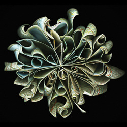
In the image in the centre and on the right, Barer has gone through a very extensive process to produce her art. Originally inspired by a rain-soaked Yellow Pages she saw on the ground, Barer soaks the books for hours (sometimes in dye), then carefully positions the pages before curling and distorting them. This last step is done with clever techniques, like curling the pages with hair rollers or fixing them with Velcro. What really grabbed my attention was the physical properties of the books and how they affected the image. The paper is clearly softer and weaker in the central image, as it wilts and droops more. The colours are very vibrant and bold, but this is countered by the lack of substance to the book. The image on the left, however, is much more densely packed with pages which cling and roll into each other in a much more comforting way.
In the image on the left, the book has been transformed into the shape of a butterfly. The choice of animal, and the lilac coloured dye, create an elegant and fragile effect. The book almost feels like a fossil, with the imprint of the butterfly captured in time. This perennial effect is really extended by the wilted pages and folds between them. Barer has made no effort to perfectly smooth the edges of the butterfly's 'wings' - they are left naturally to droop as time goes on.
In the image in the centre and on the right, Barer has gone through a very extensive process to produce her art. Originally inspired by a rain-soaked Yellow Pages she saw on the ground, Barer soaks the books for hours (sometimes in dye), then carefully positions the pages before curling and distorting them. This last step is done with clever techniques, like curling the pages with hair rollers or fixing them with Velcro. What really grabbed my attention was the physical properties of the books and how they affected the image. The paper is clearly softer and weaker in the central image, as it wilts and droops more. The colours are very vibrant and bold, but this is countered by the lack of substance to the book. The image on the left, however, is much more densely packed with pages which cling and roll into each other in a much more comforting way.
My response
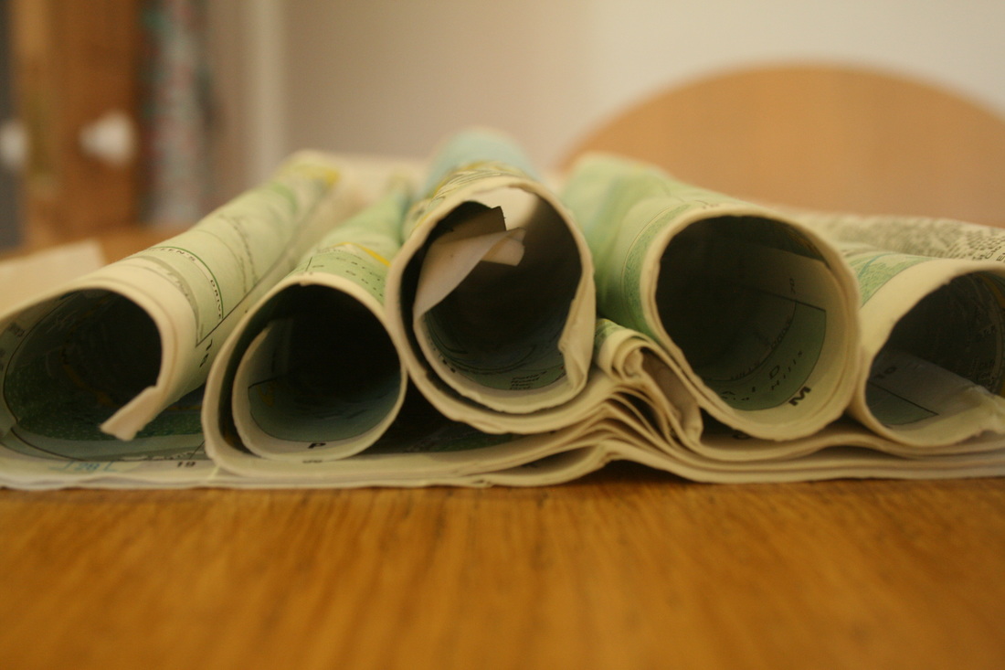
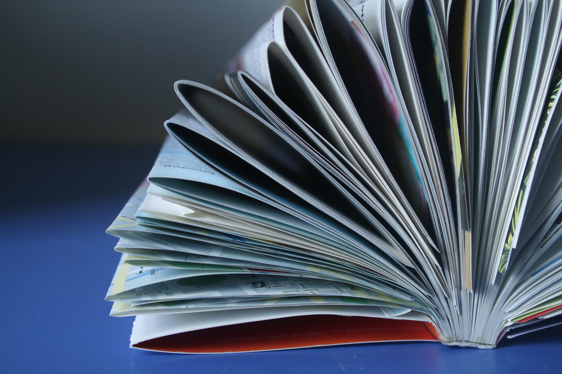
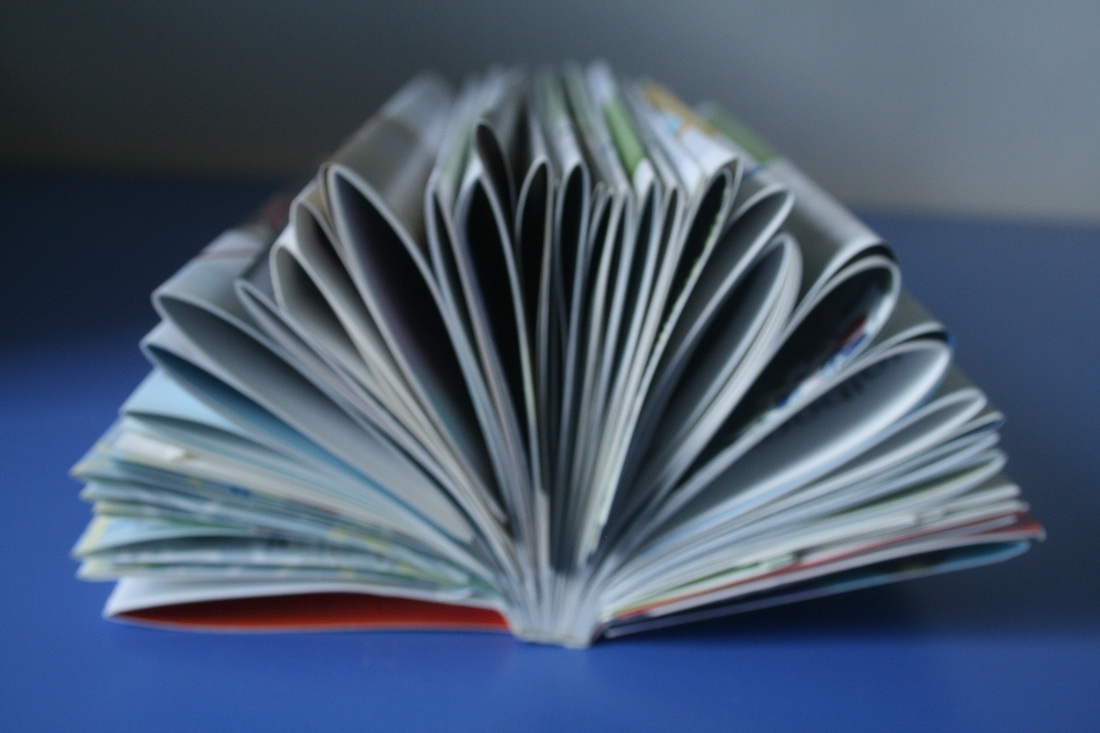
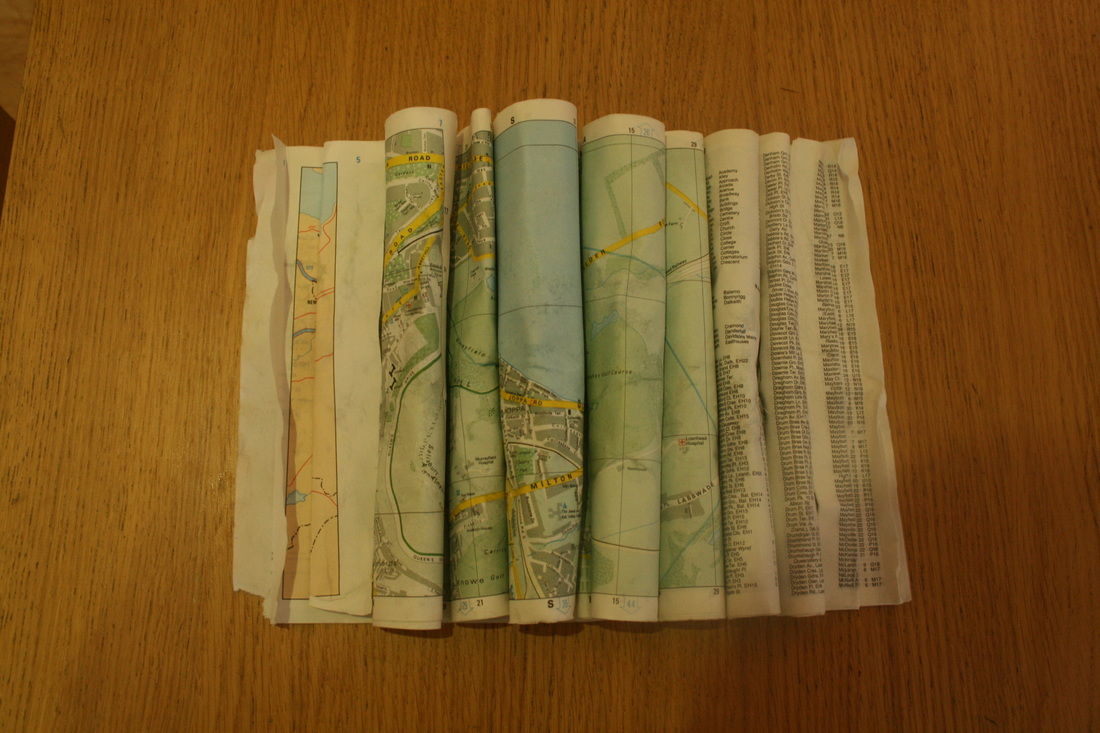
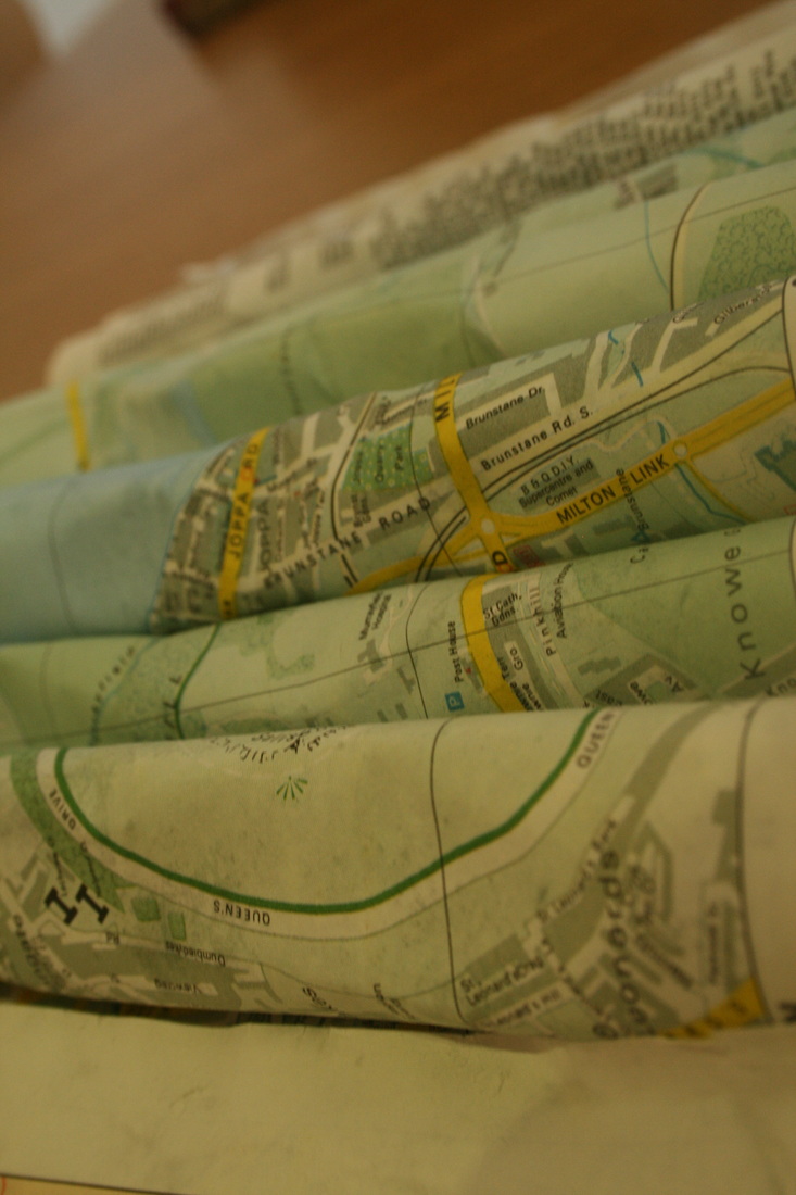
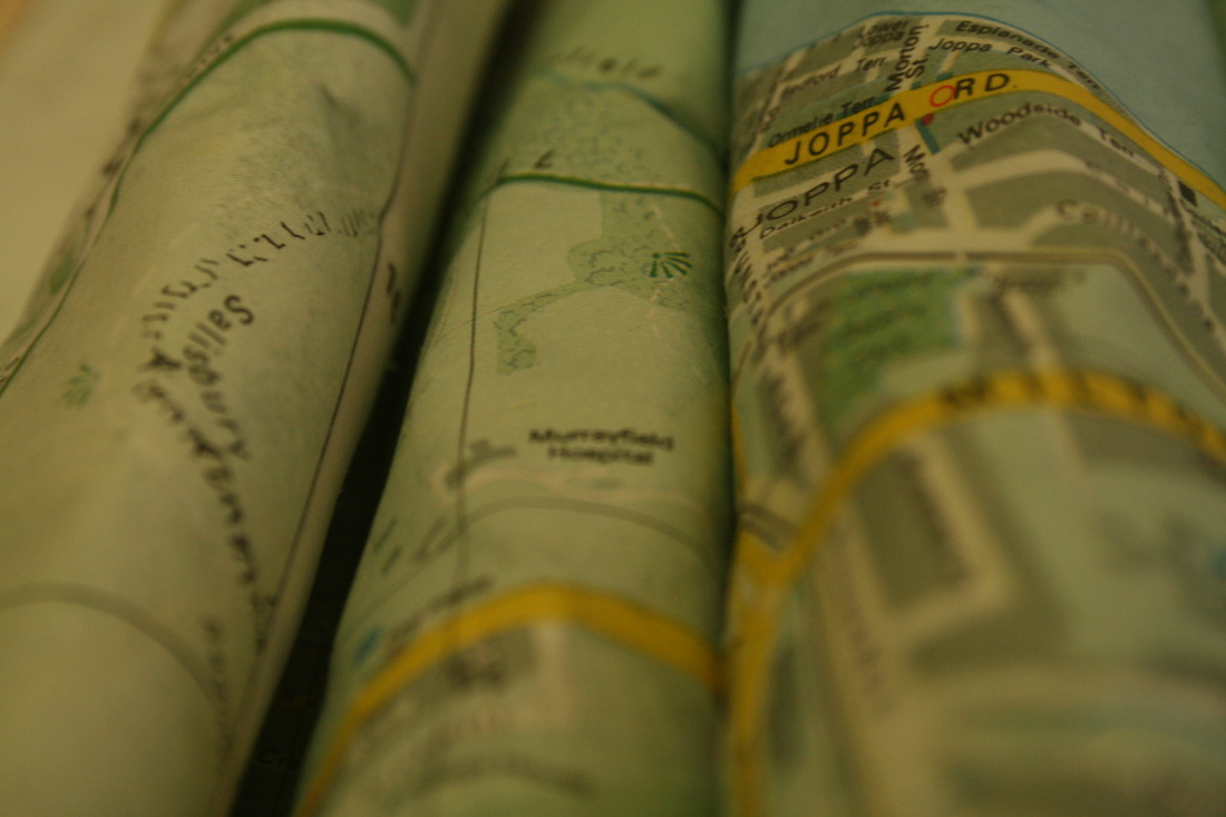
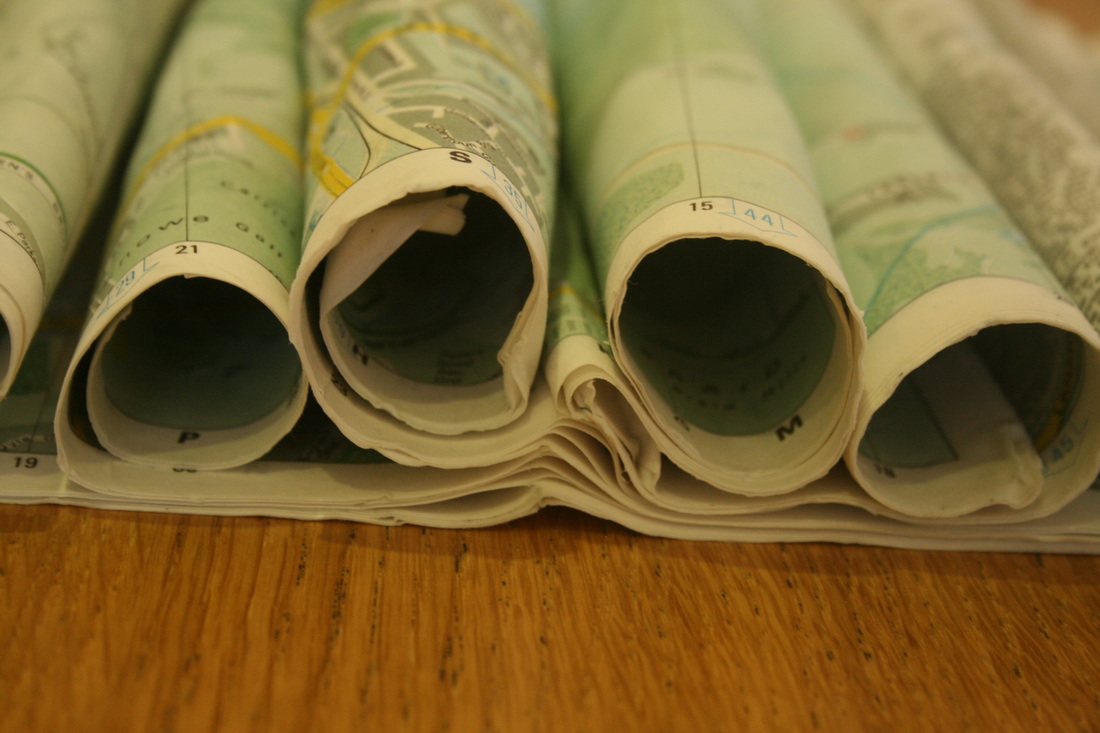
For this strand, I tried to destroy some old books and maps (that we were going to throw away anyway), kind of in the style of Cara Barer. However, unlike Barer, I used much more physical force on the books; crumpling, tearing, folding and rolling them. Then, I flooded them with coffee, seeing how liquid could act as a force to damage the books, and then crushed them more.

|
|

|


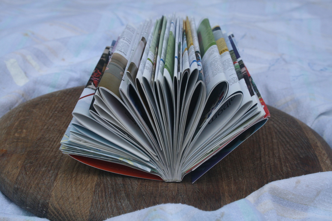
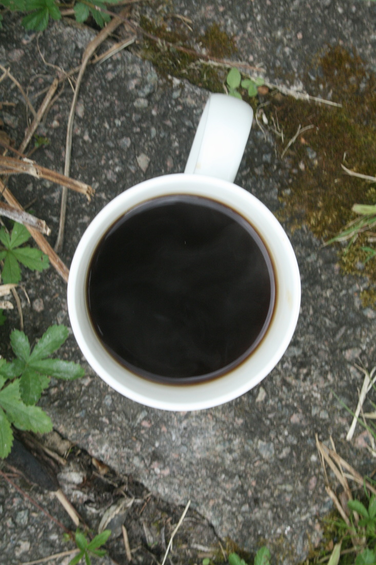
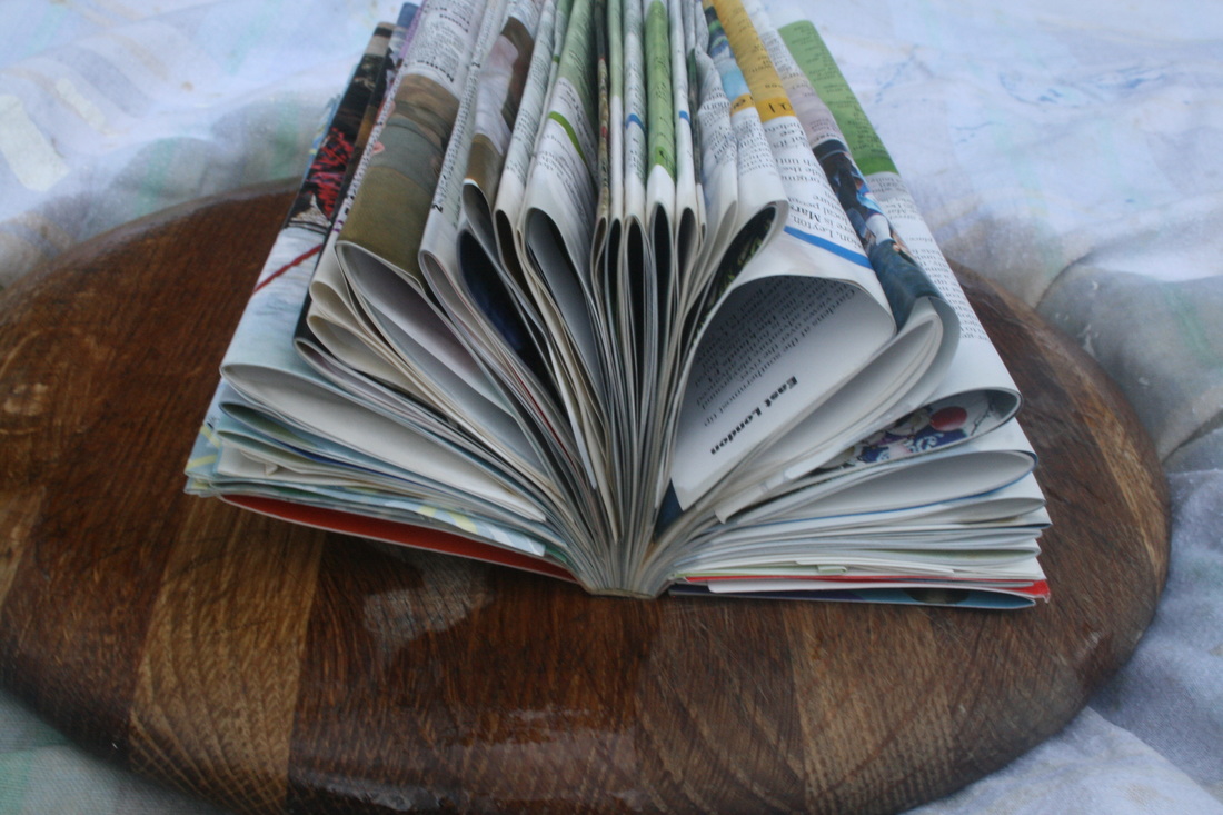
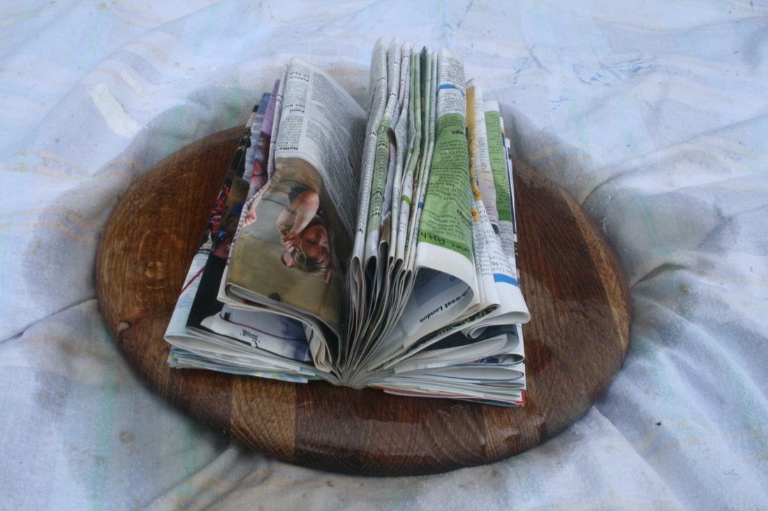
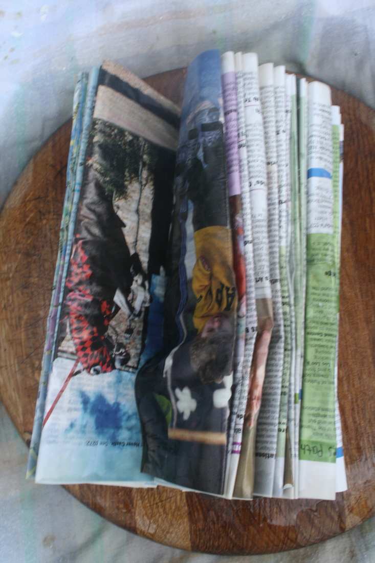
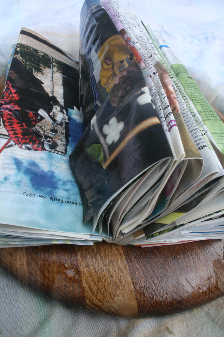
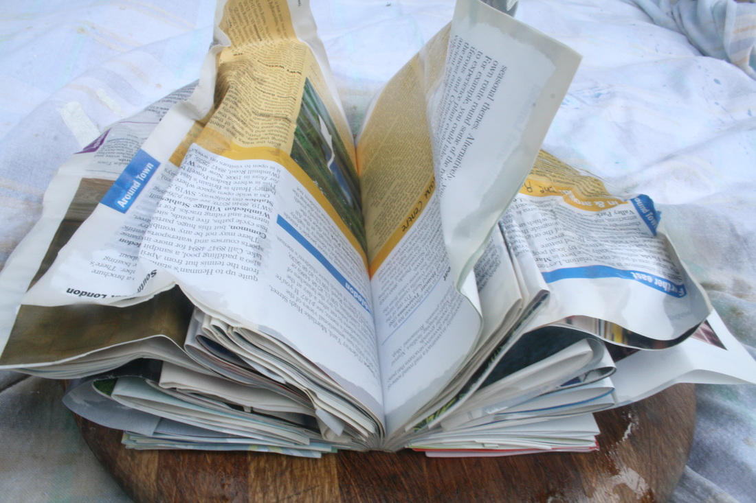
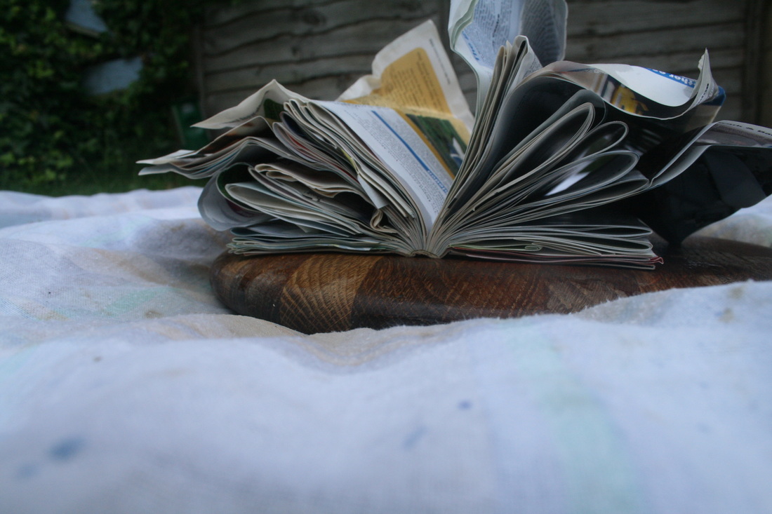
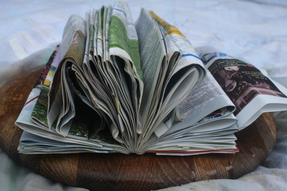
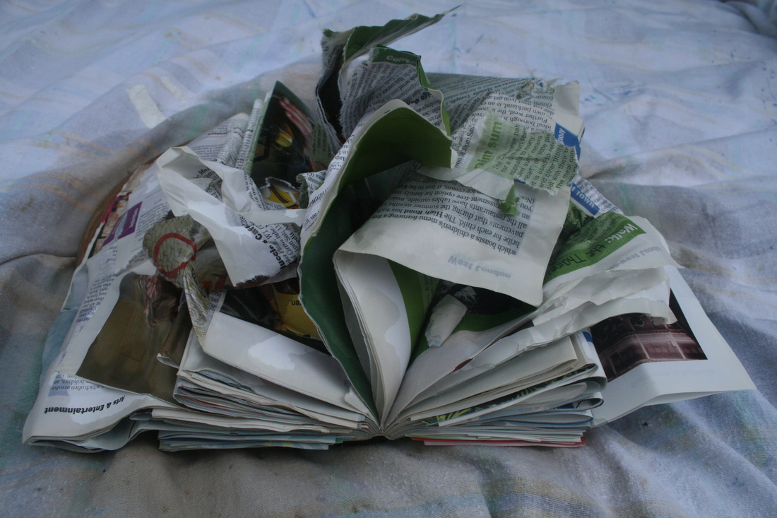
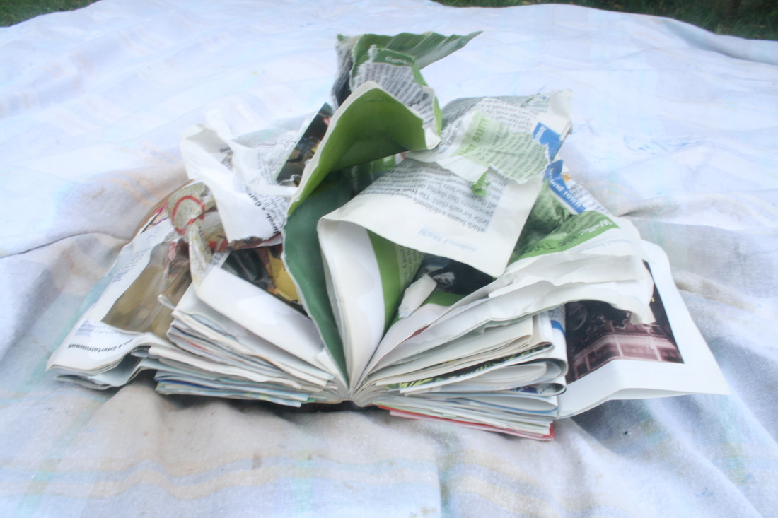
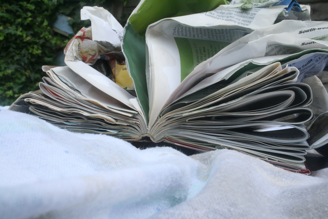
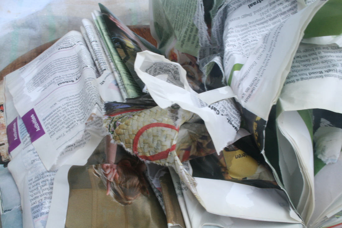
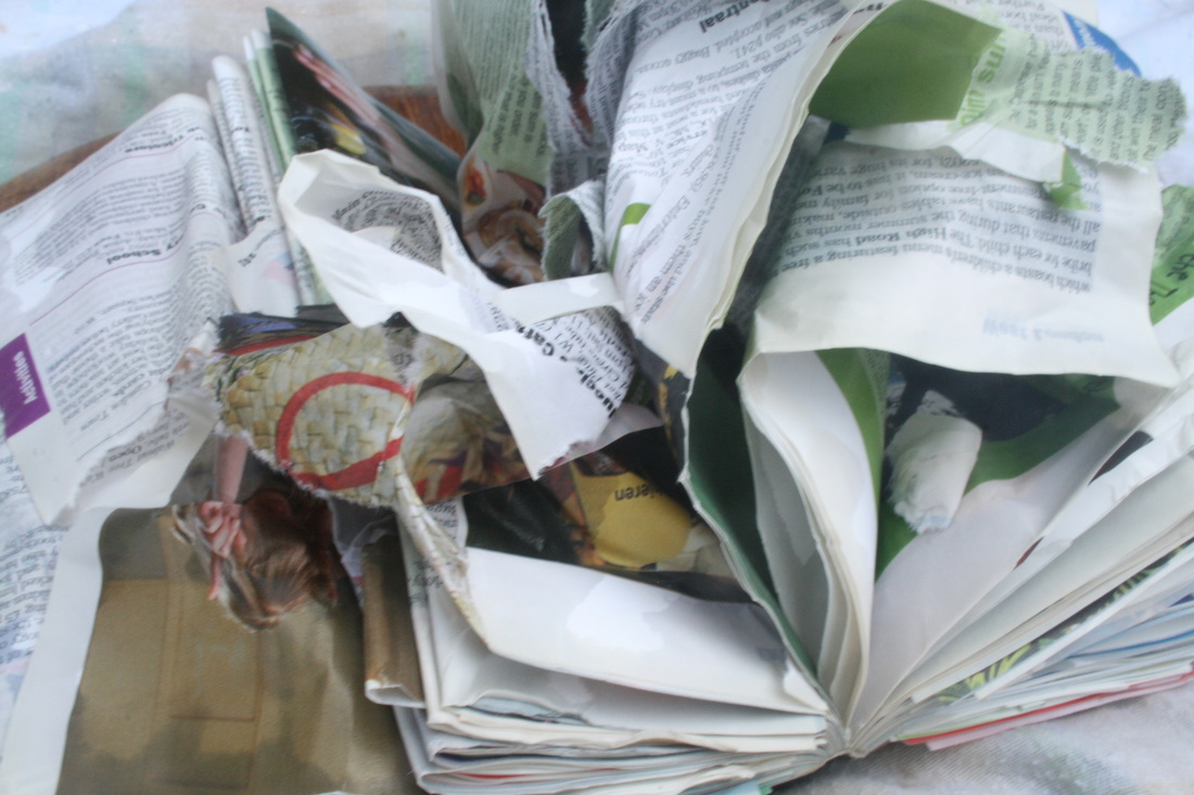
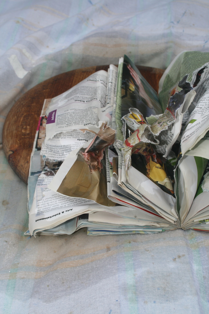

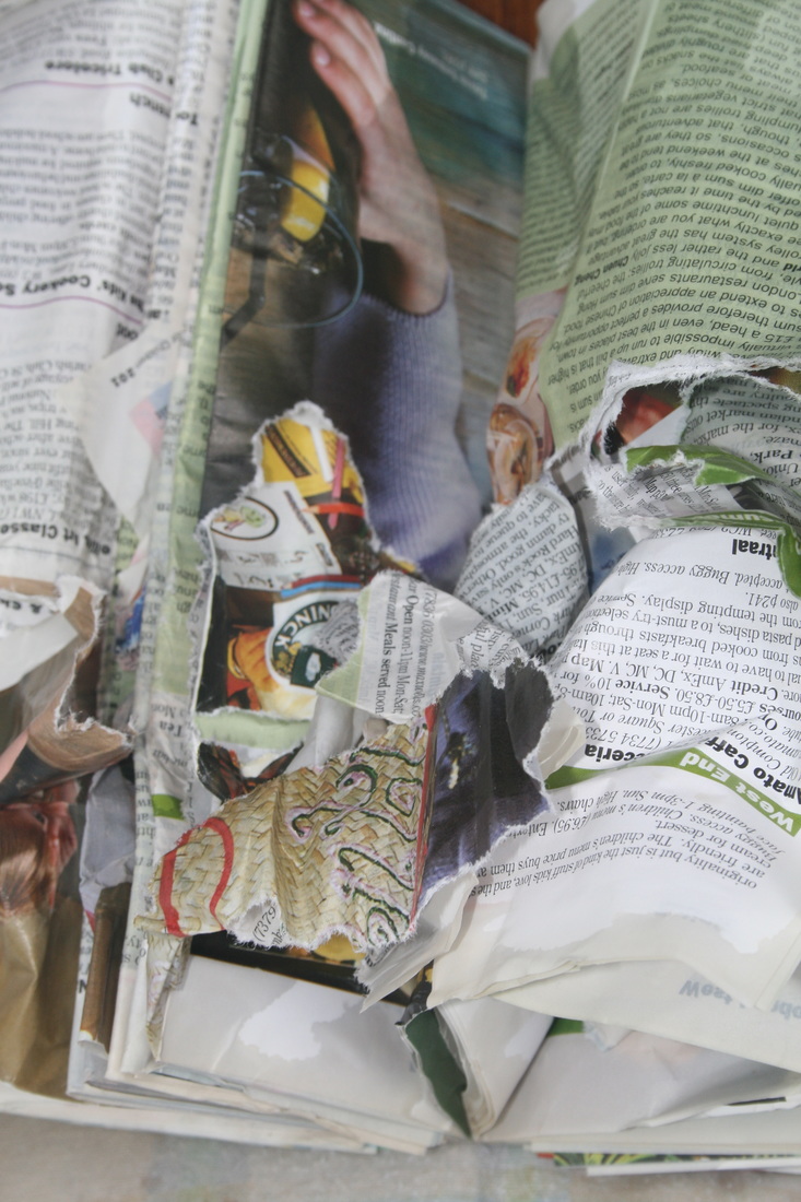
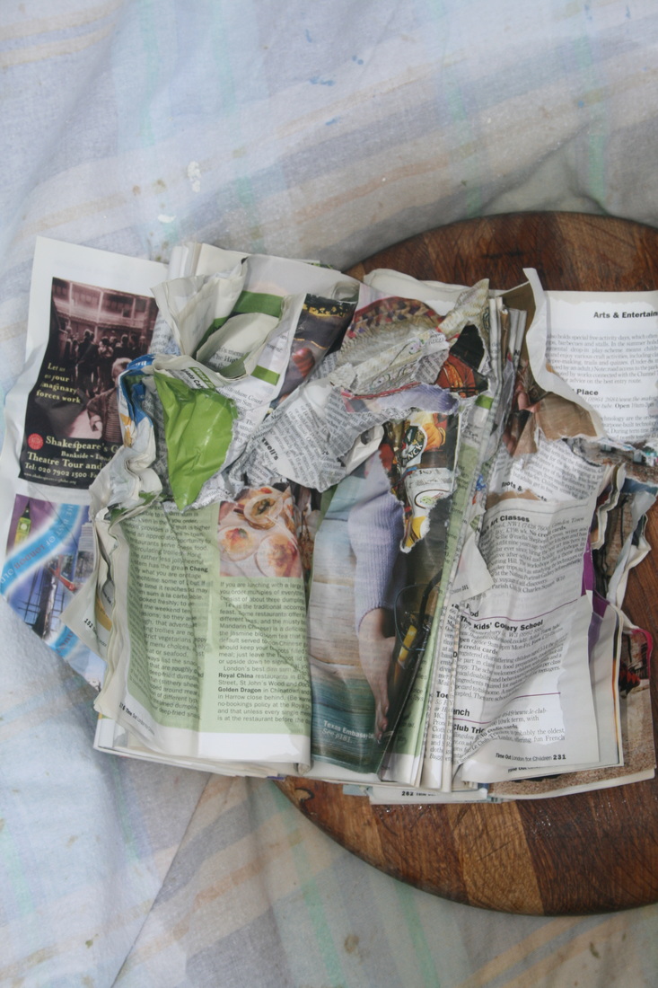


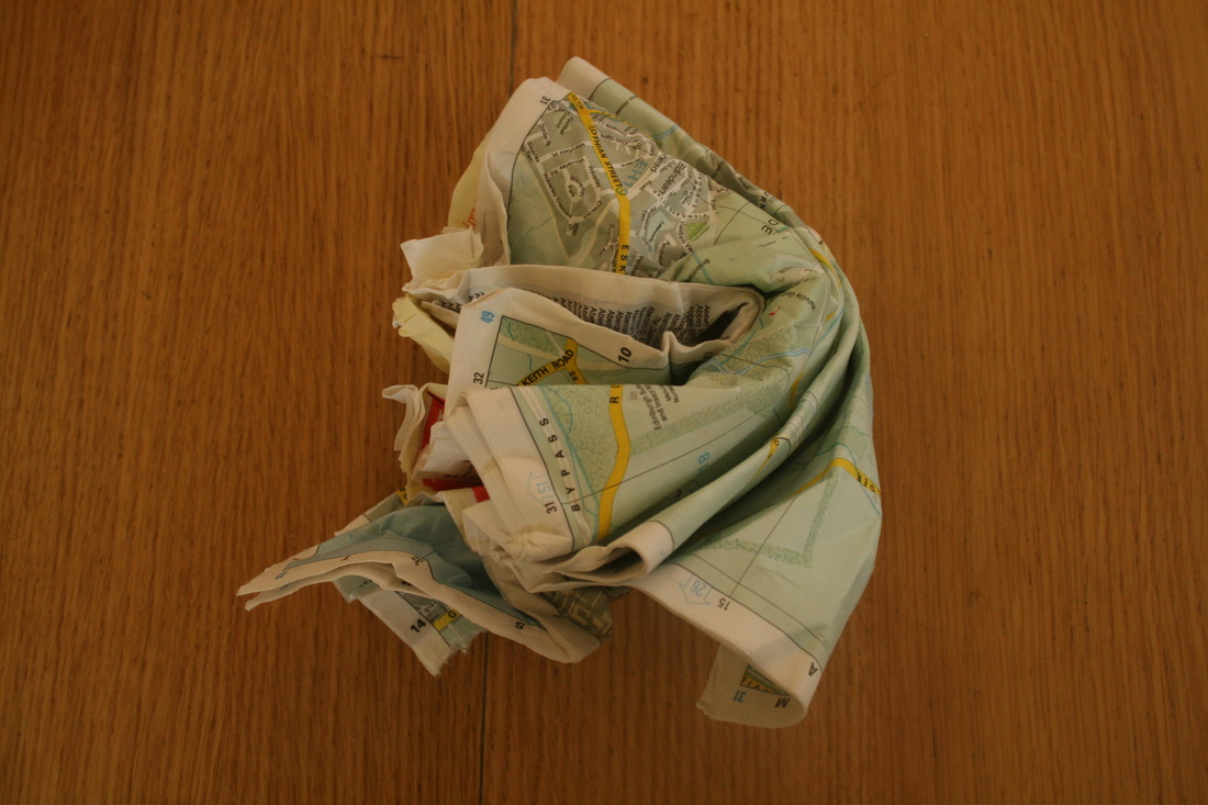
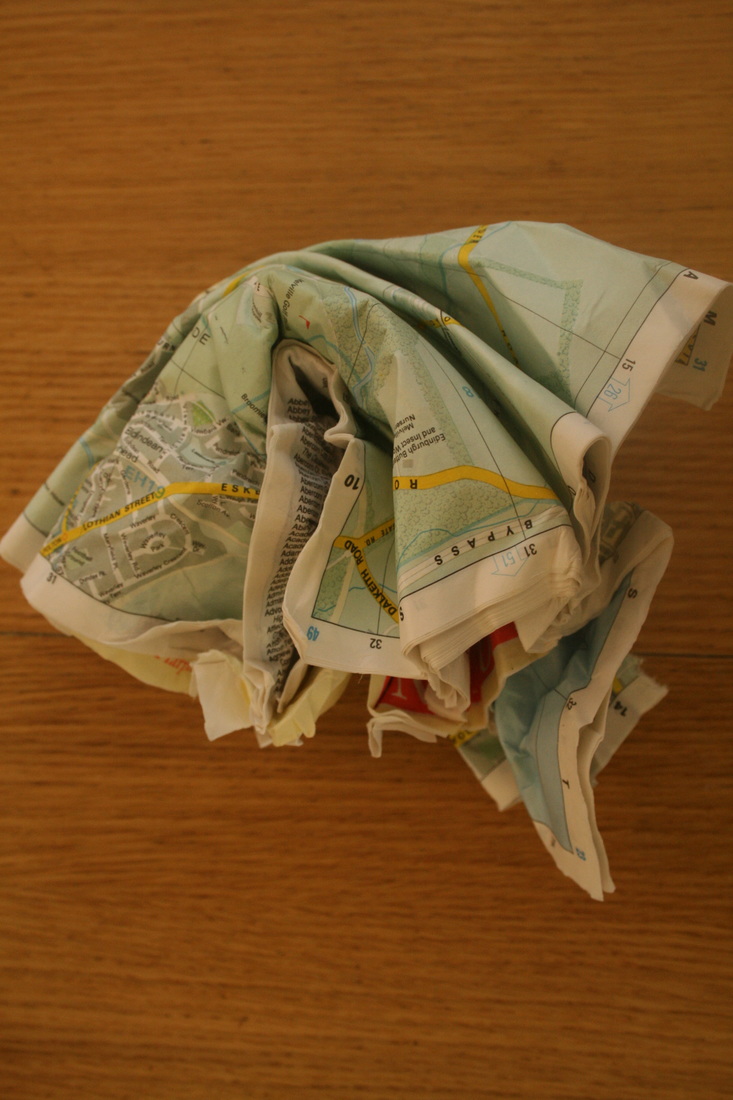
EBI: The coffee didn't really have the effect I wanted. It didn't add the stains or colour I was originally looking for, and Barer uses colour really effectively when flooding her books with dye. Next time, I could improve this technique with food colouring, or finding a more effective method with tea or coffee (like baking it together in an oven). However. the coffee did make the books wet and this created a different effect when I crushed them. There was also quite an intense smell, but it would be very difficult to convey this through an image.
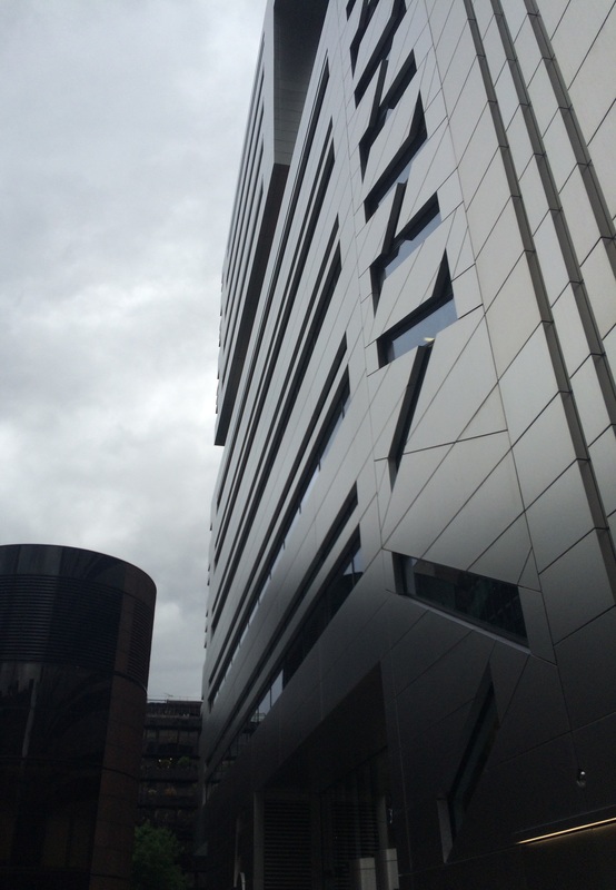
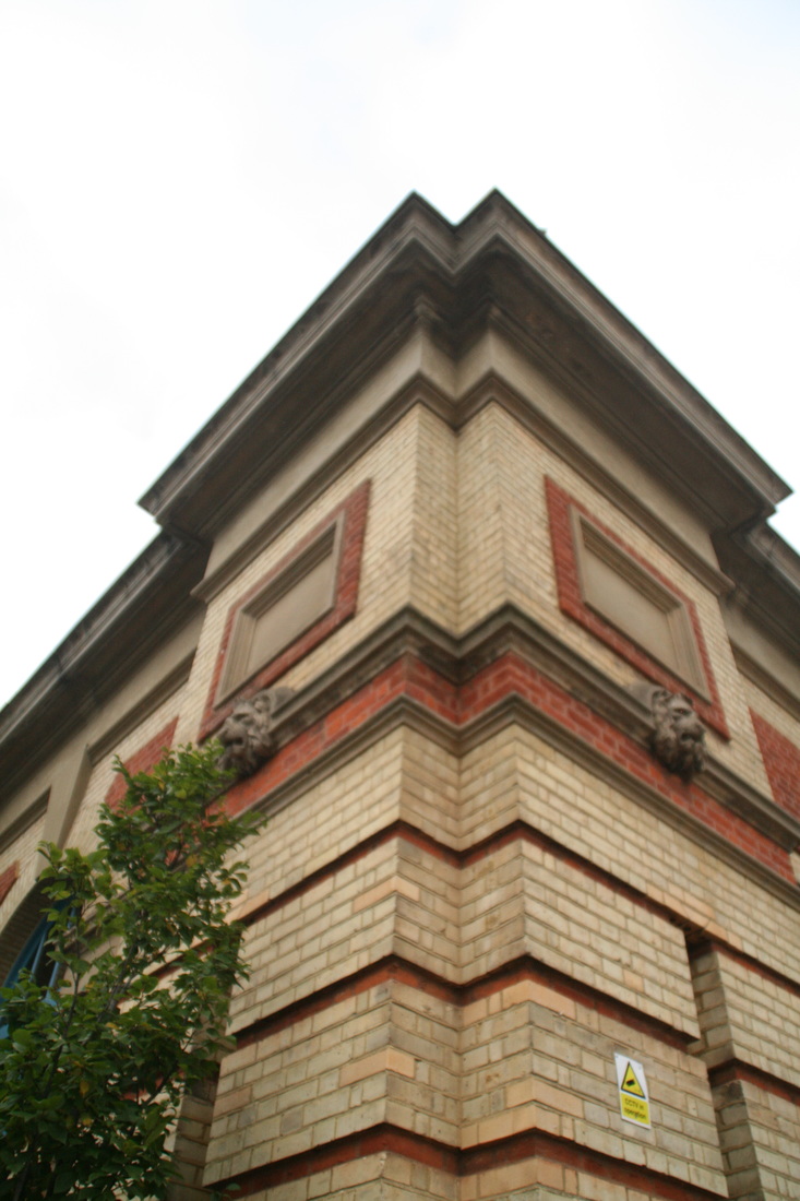
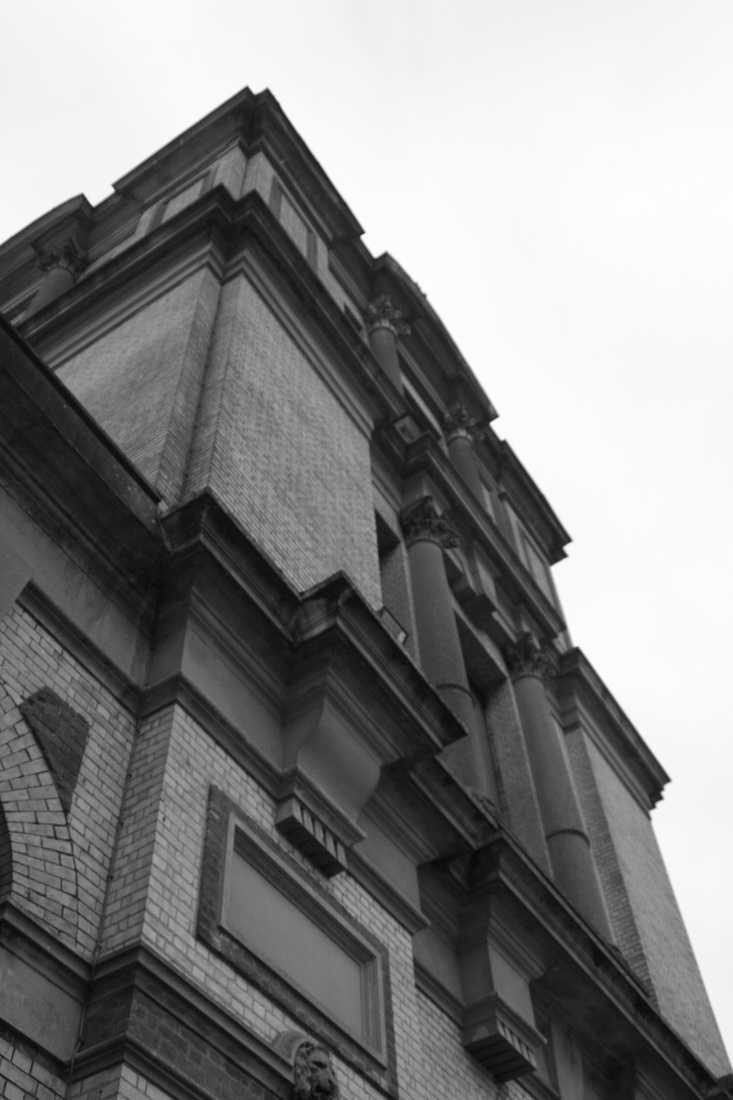
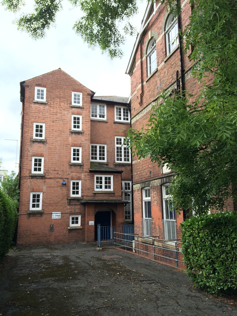
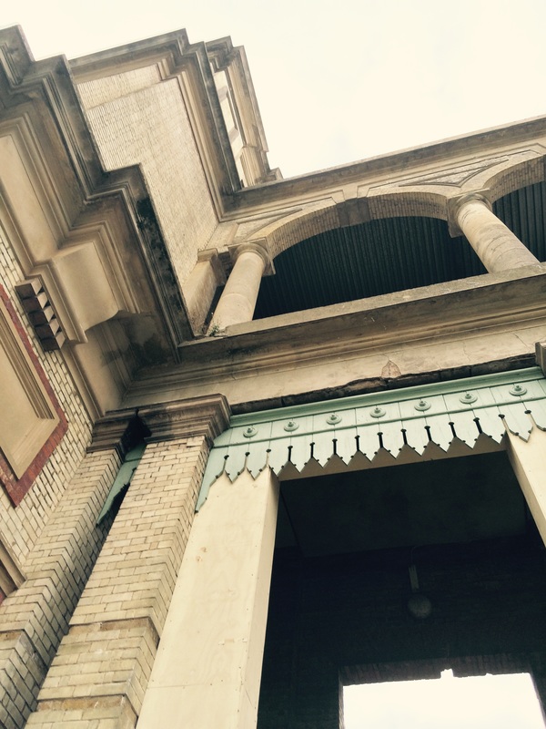
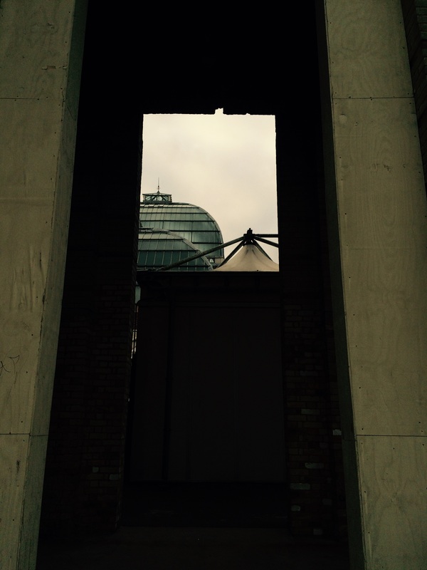
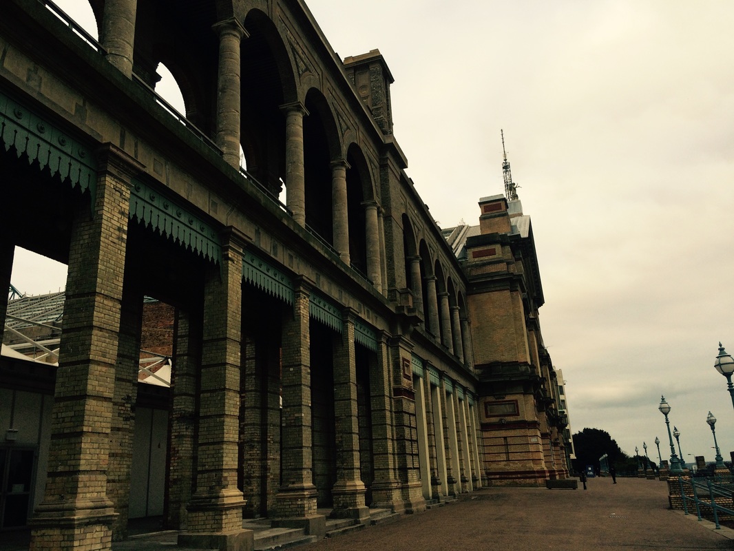
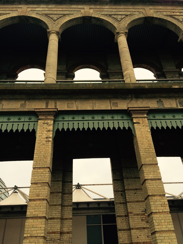
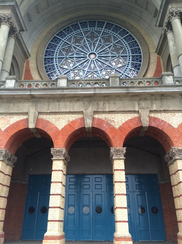
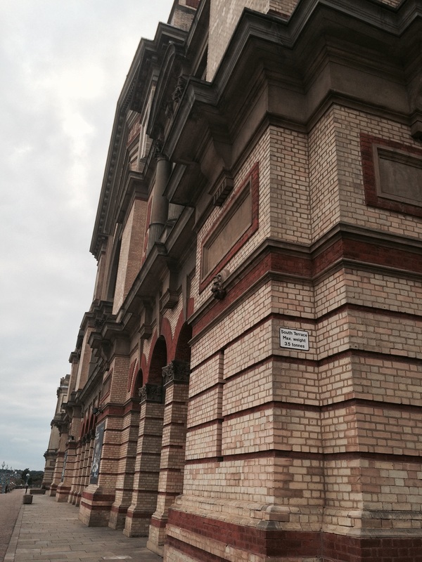
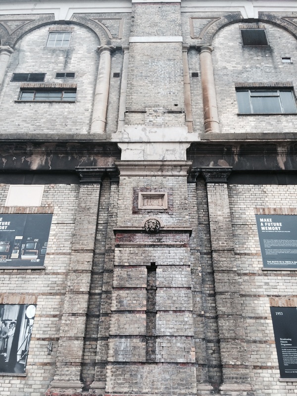
strand 2: Imposing Architecture
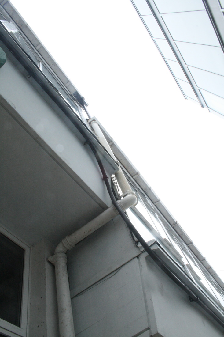
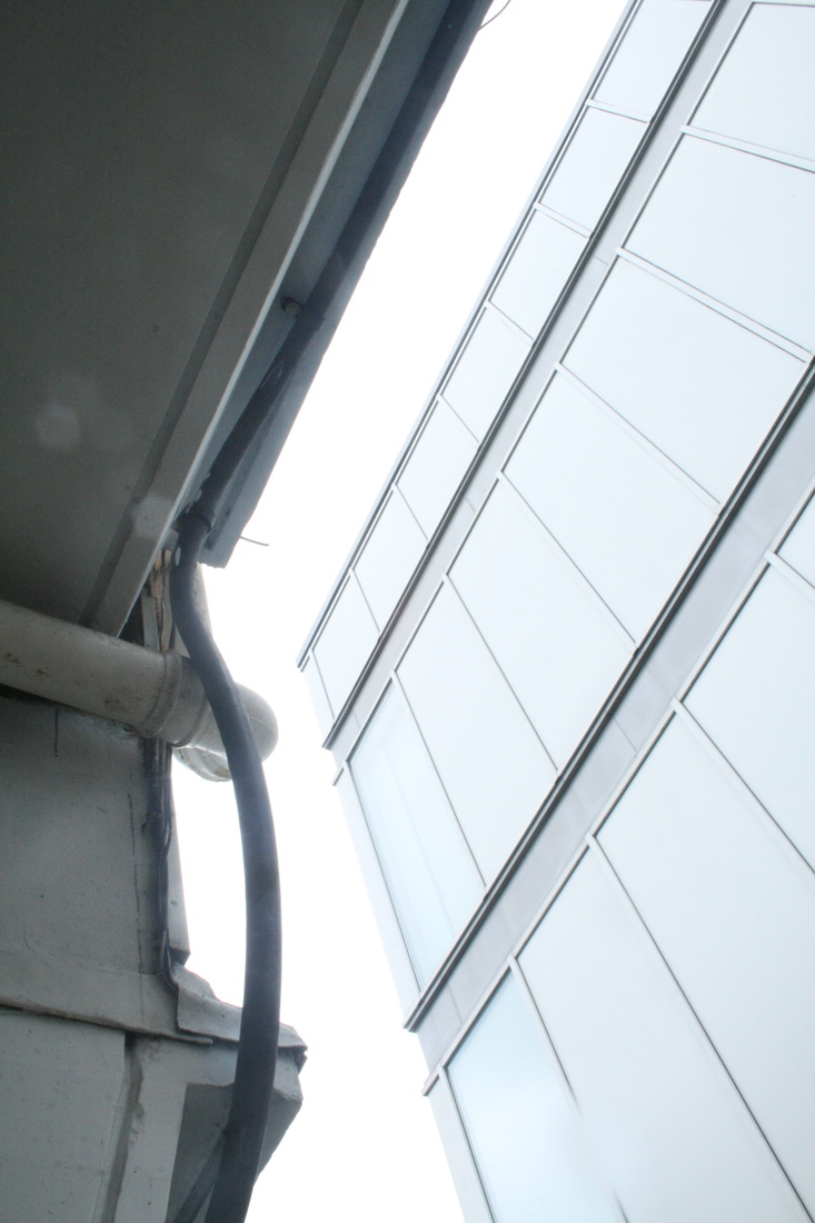
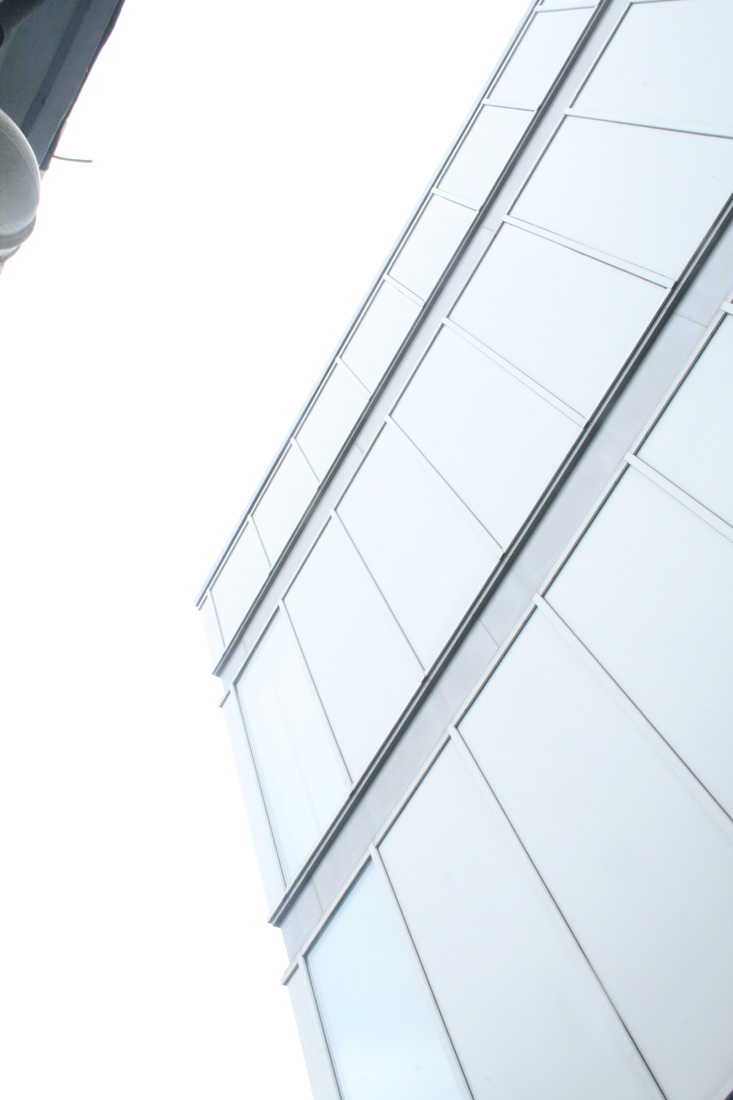
Buildings, by nature, are very large and towering and as a result often feel very powerful, imposing and forceful. I wanted to capture this in this strand, really focusing on the techniques of using scale, angles, and perspective.
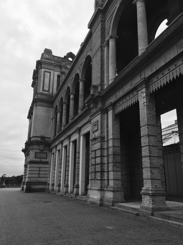
fIRST RESPONSE - SCHOOL
please click on the images to enlarge them
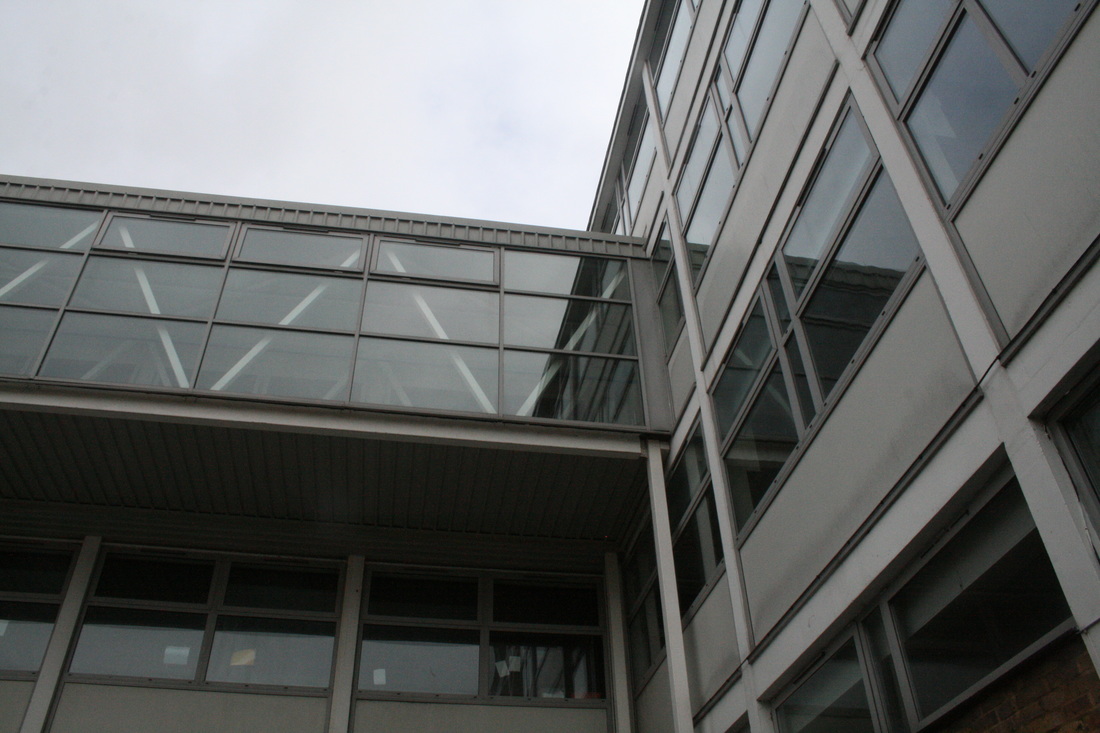
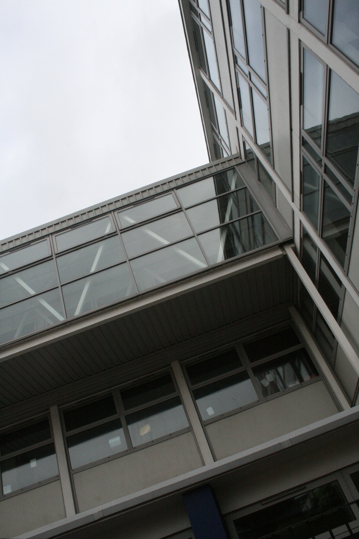
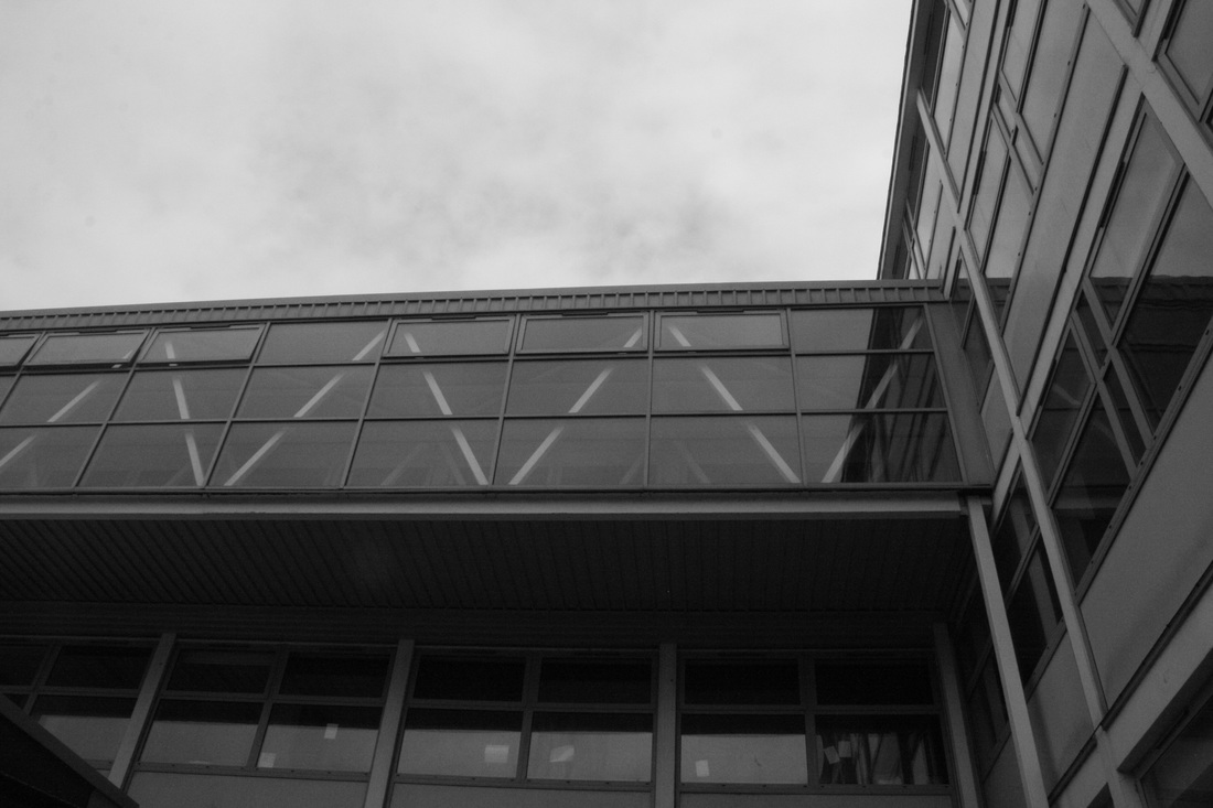
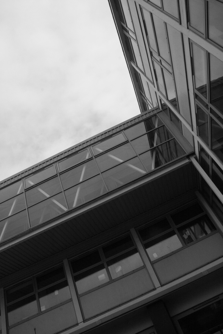

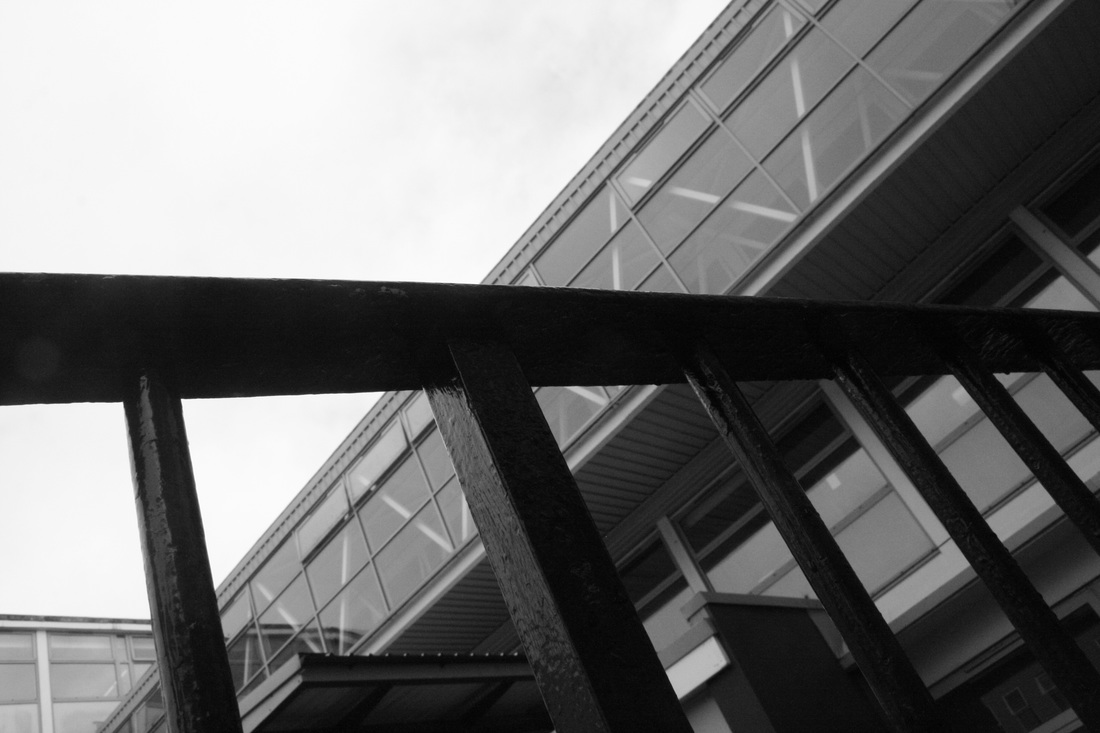
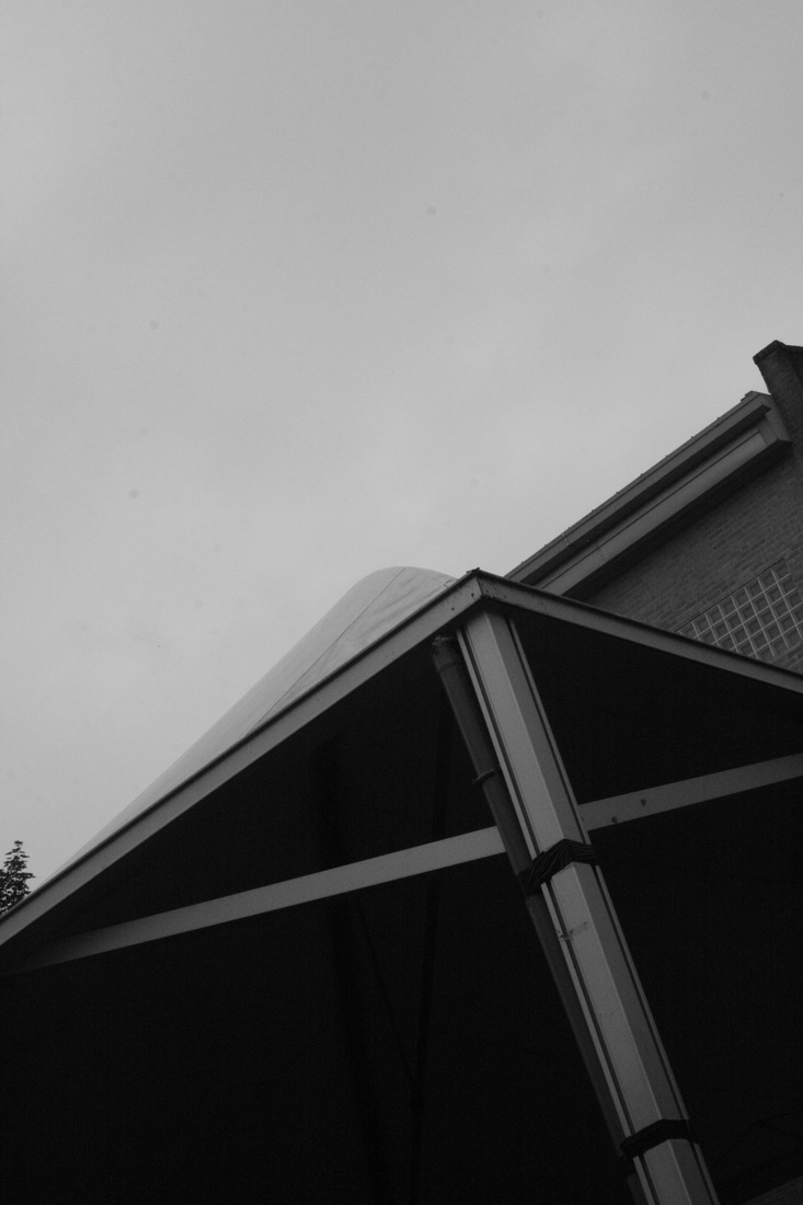
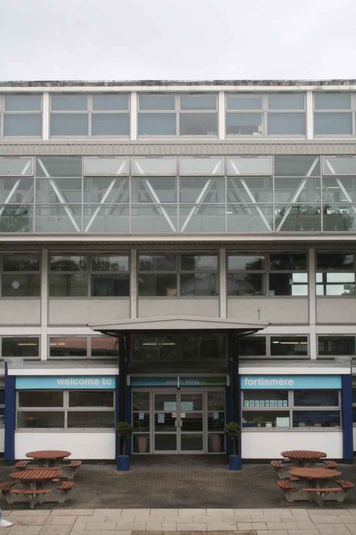
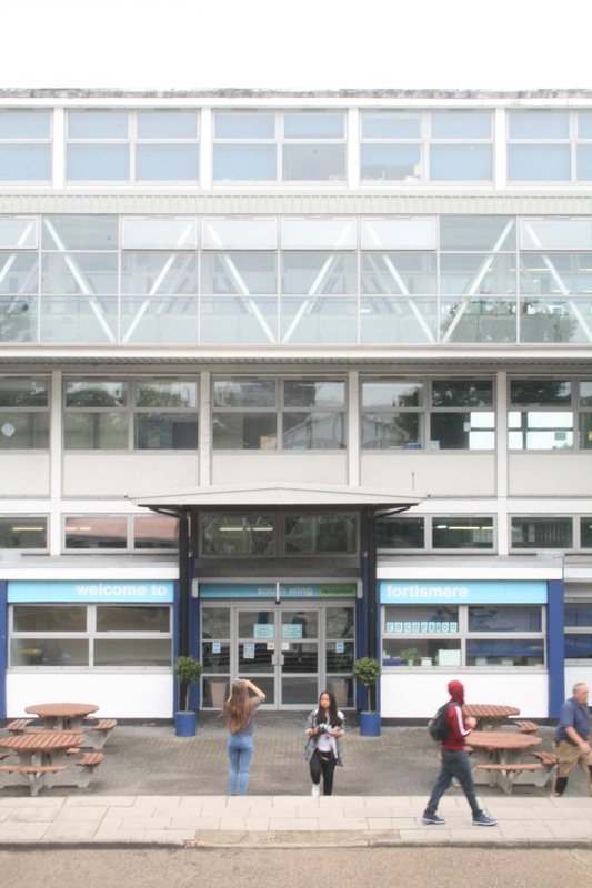
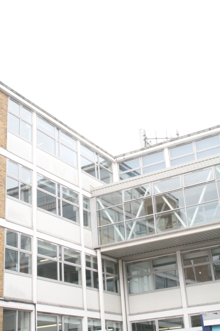
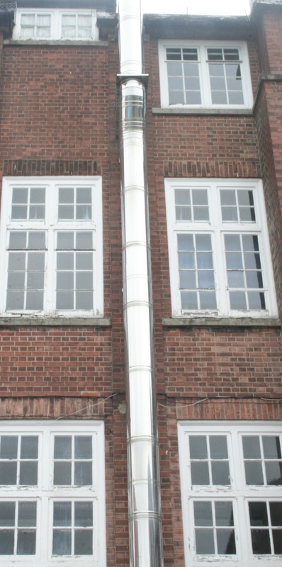
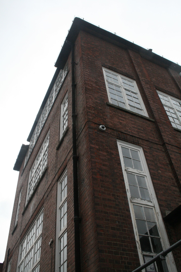


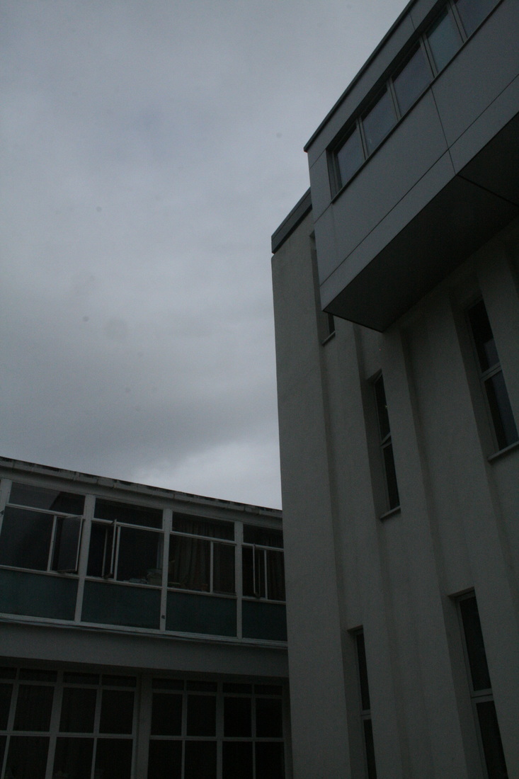


WWW: In the top row, I shot some of the images in 'monochrome'. This photographs the buildings only in black, white and grey, which creates a very gloomy and ominous feeling. This of course ties in well with the topic of 'imposing' buildings.
EBI: Some of the images are overexposed, particularly in the fourth row. I like how they look clean and precise, but overall I think they should be darker and would look more imposing if they did. Also I think I could have maybe got my framing better - shooting from a much lower perspective, looking up, which creates a more imposing effect.
EBI: Some of the images are overexposed, particularly in the fourth row. I like how they look clean and precise, but overall I think they should be darker and would look more imposing if they did. Also I think I could have maybe got my framing better - shooting from a much lower perspective, looking up, which creates a more imposing effect.
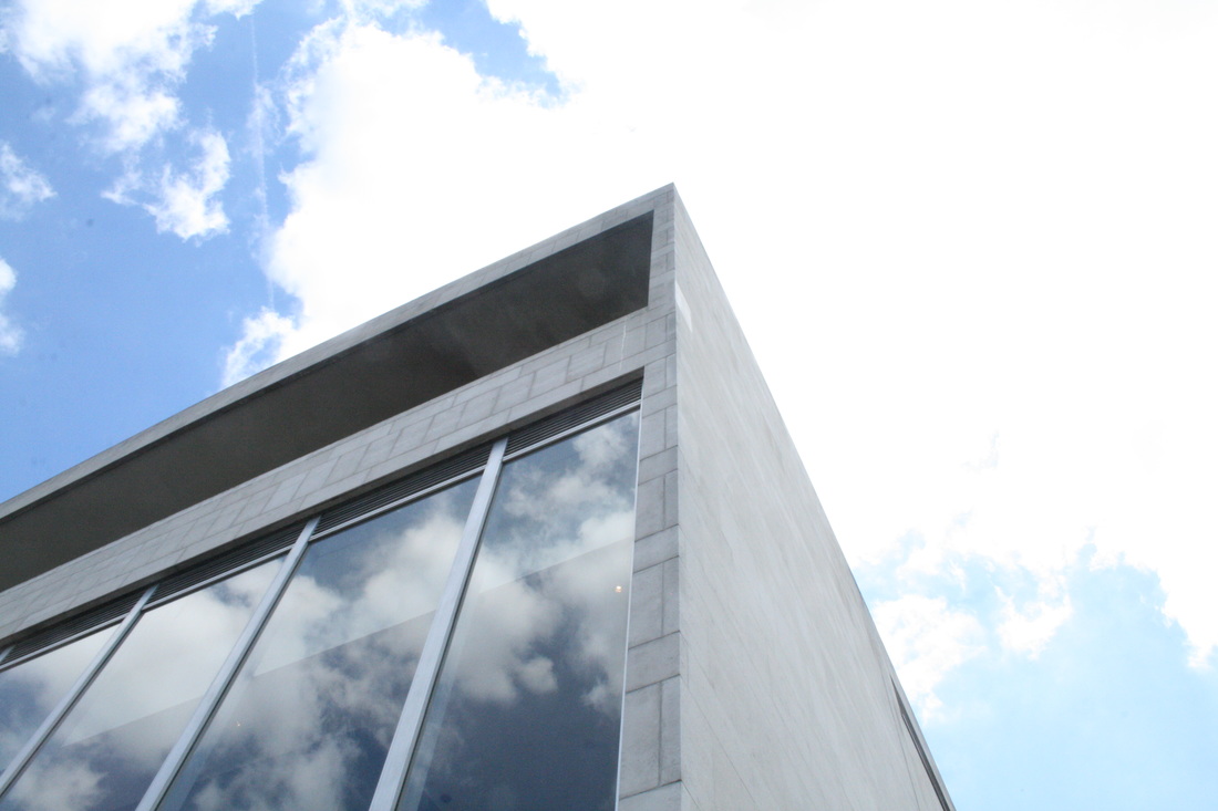
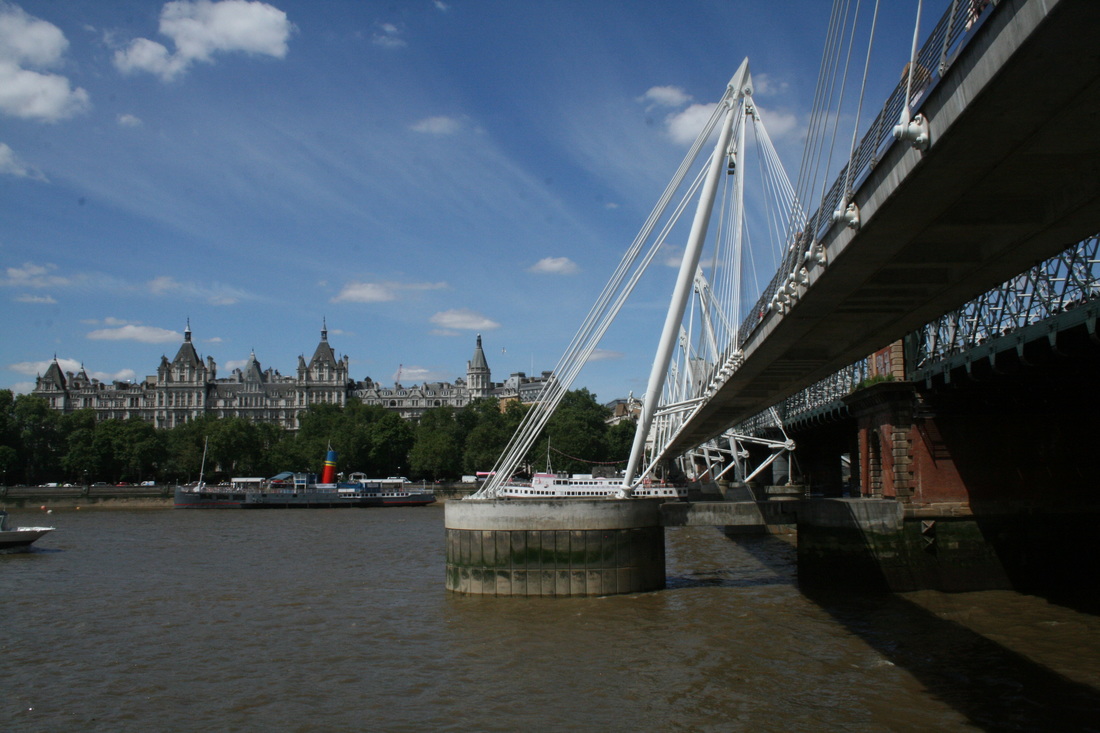
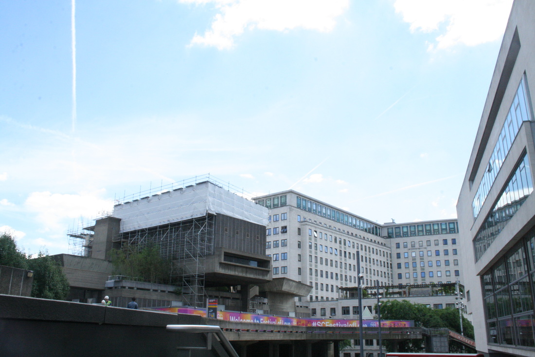
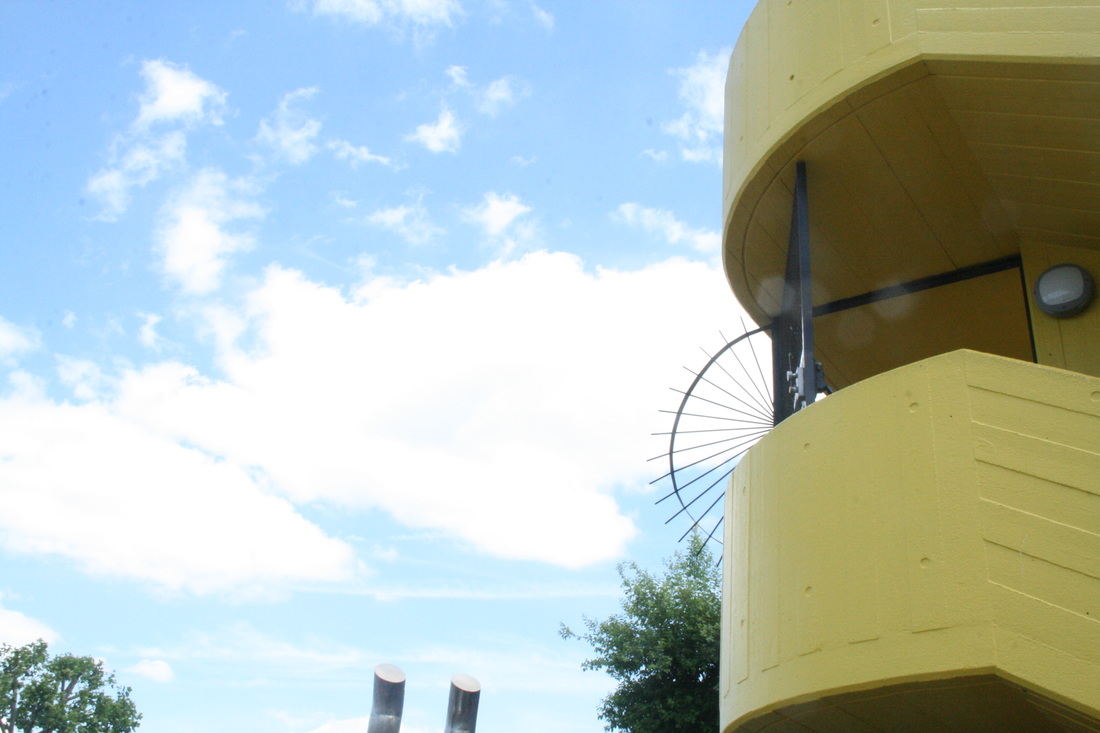
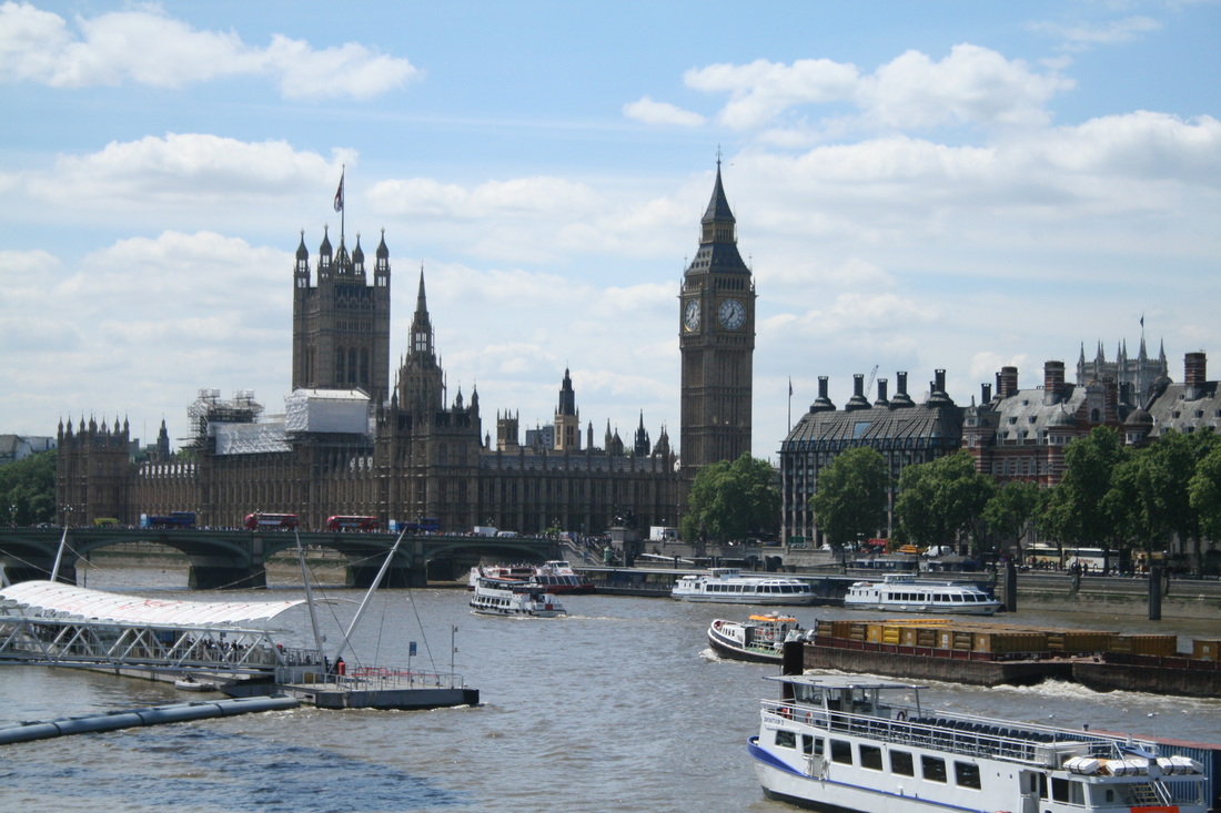
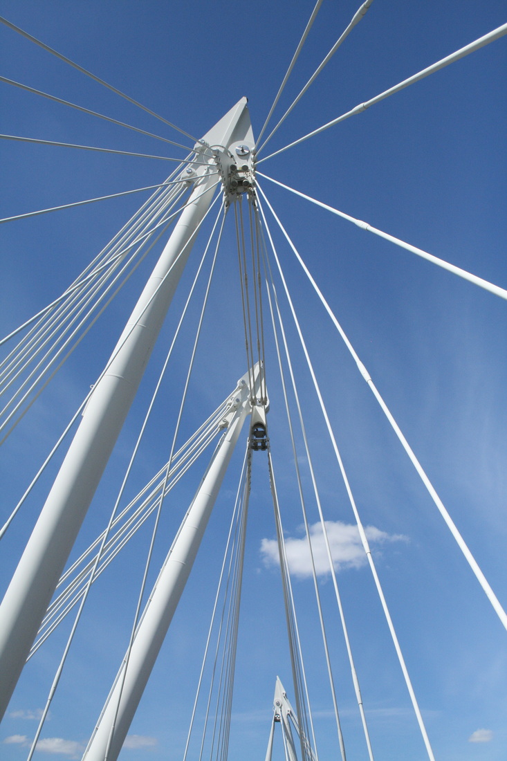
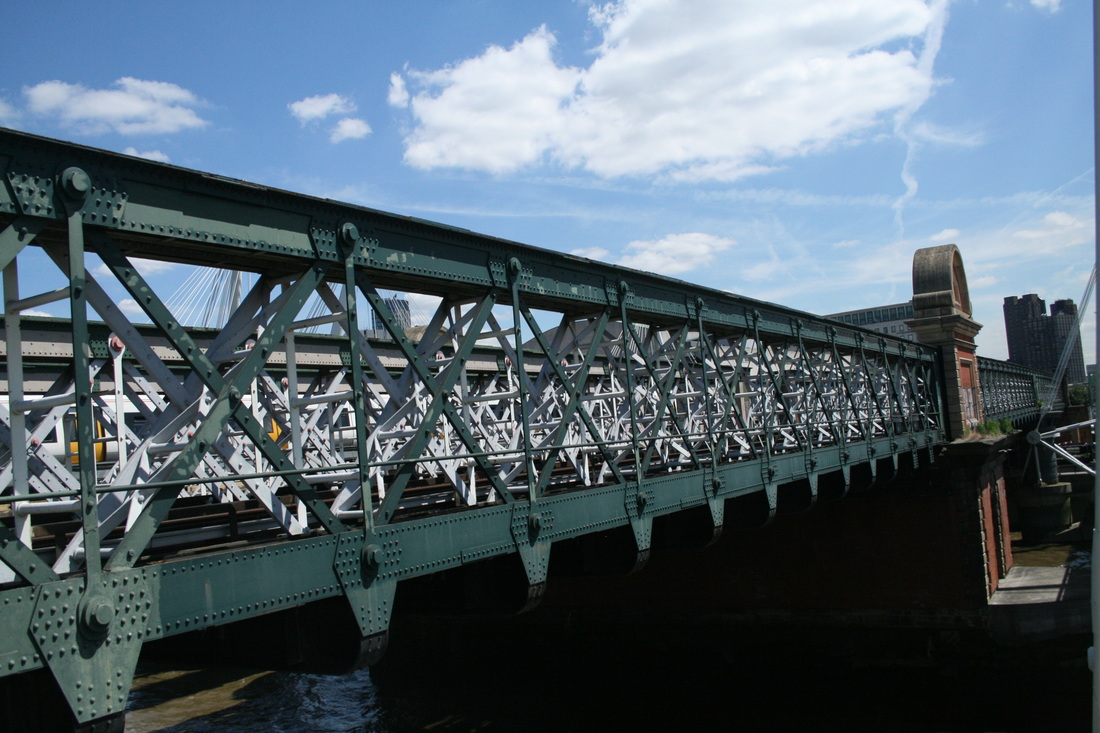
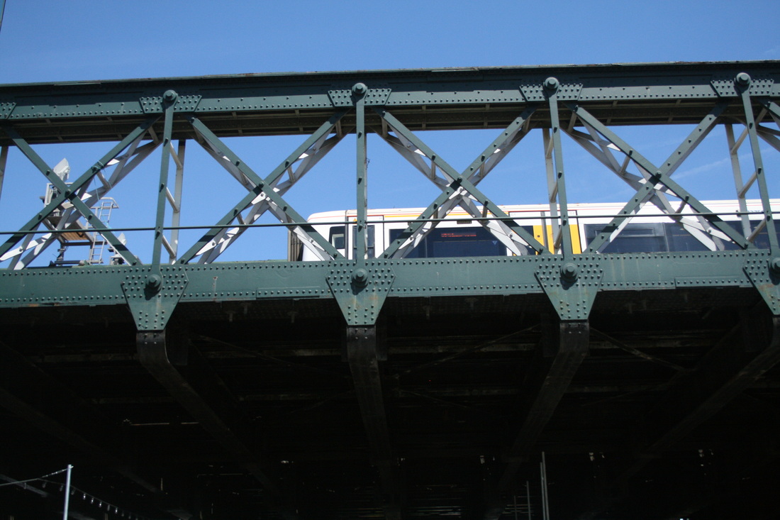
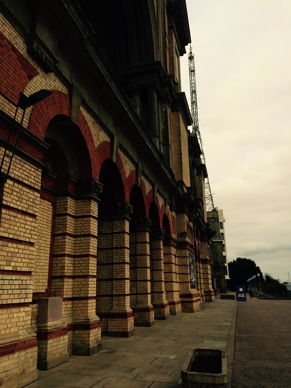
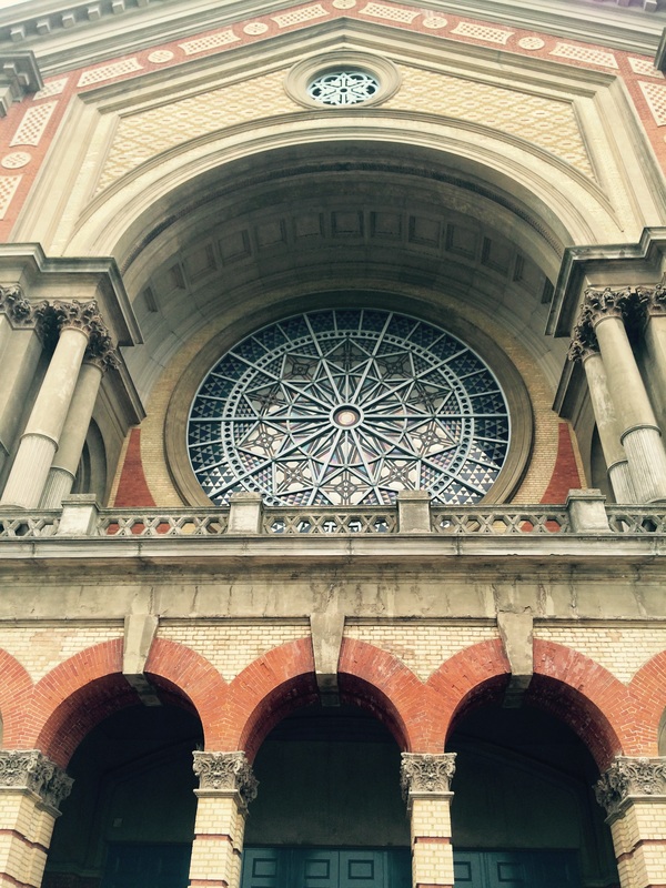
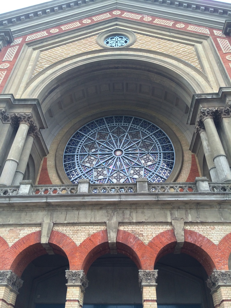
second RESPONSE - THE SOUTHBANK
please click on the images to enlarge them
|
|

|
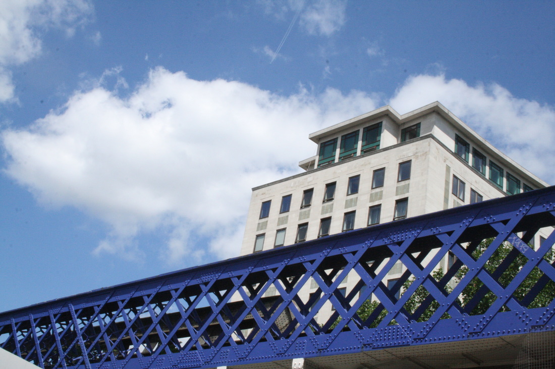


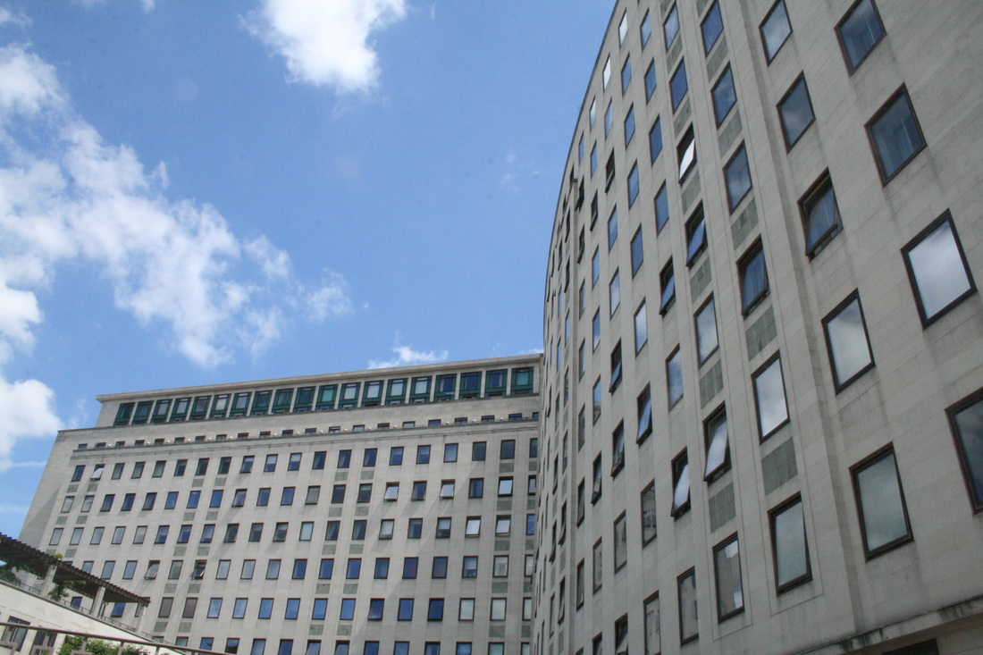
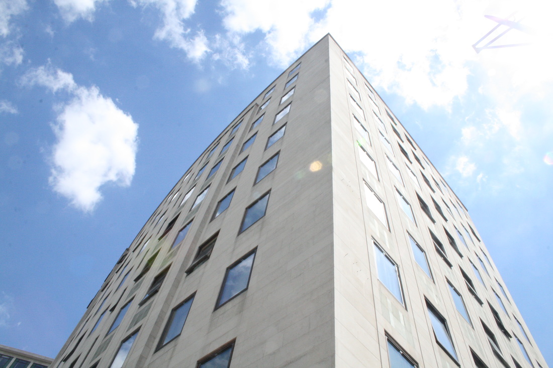
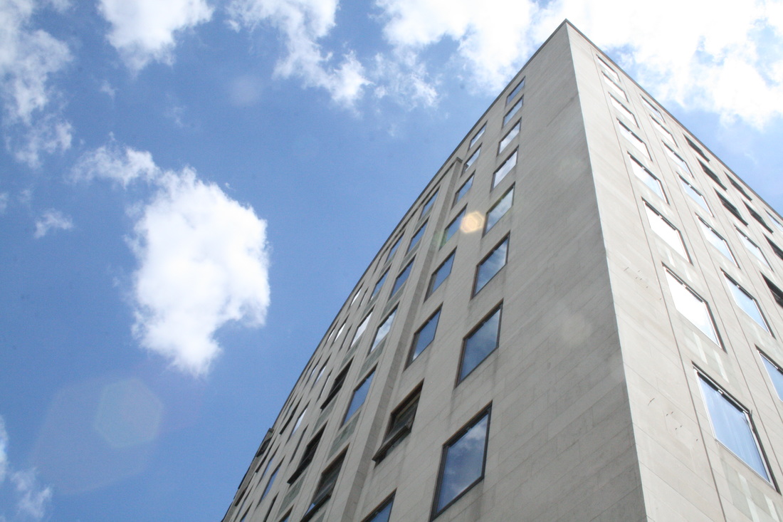
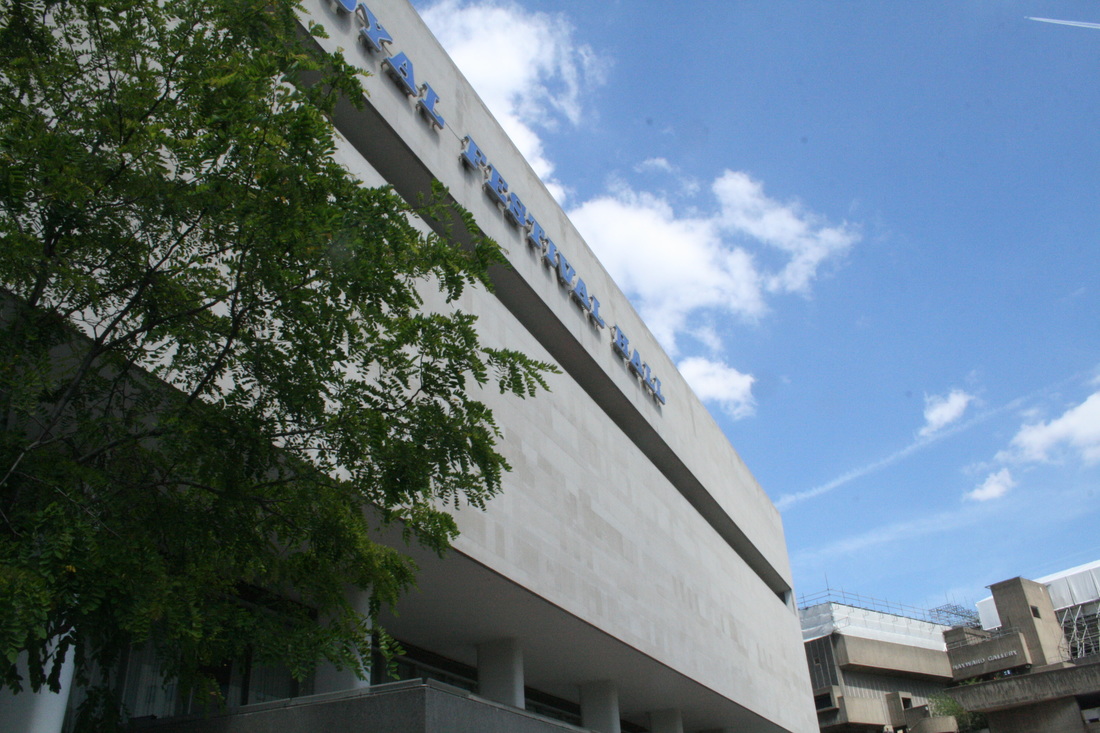
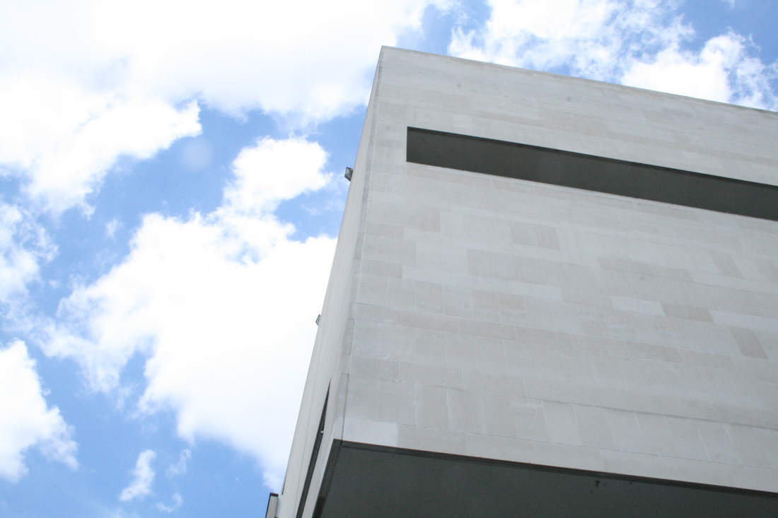
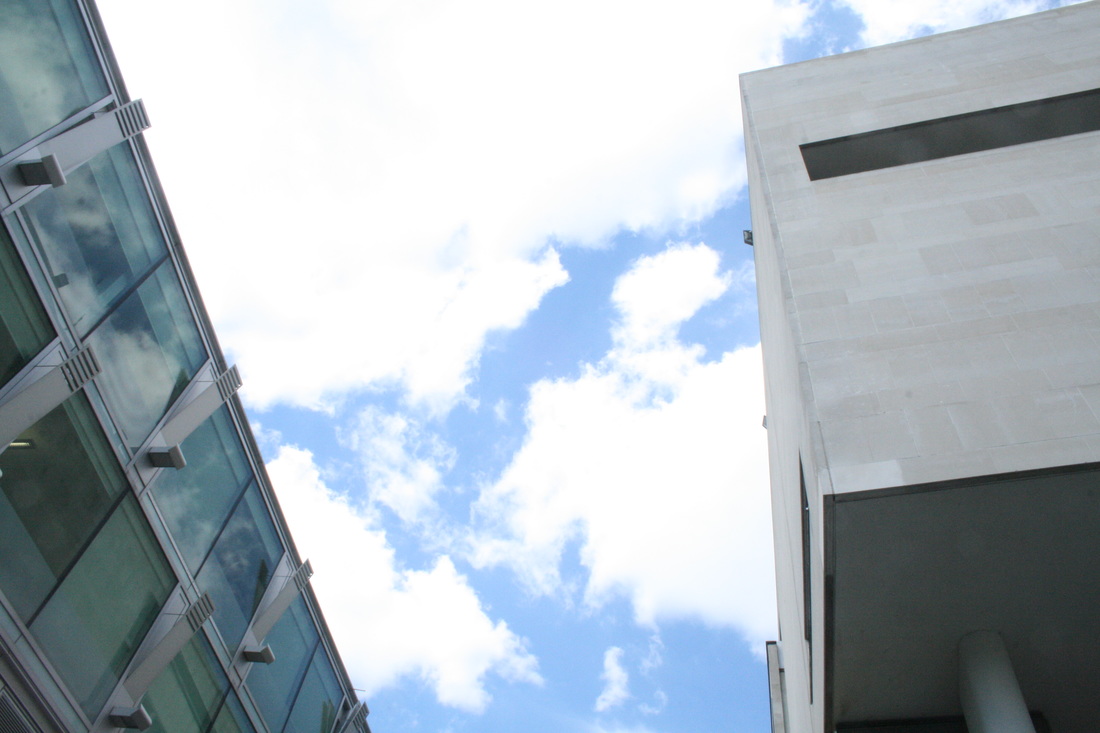


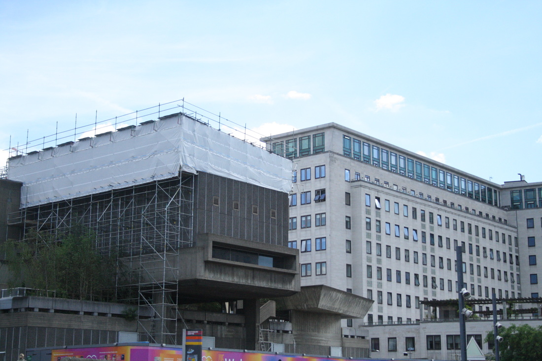
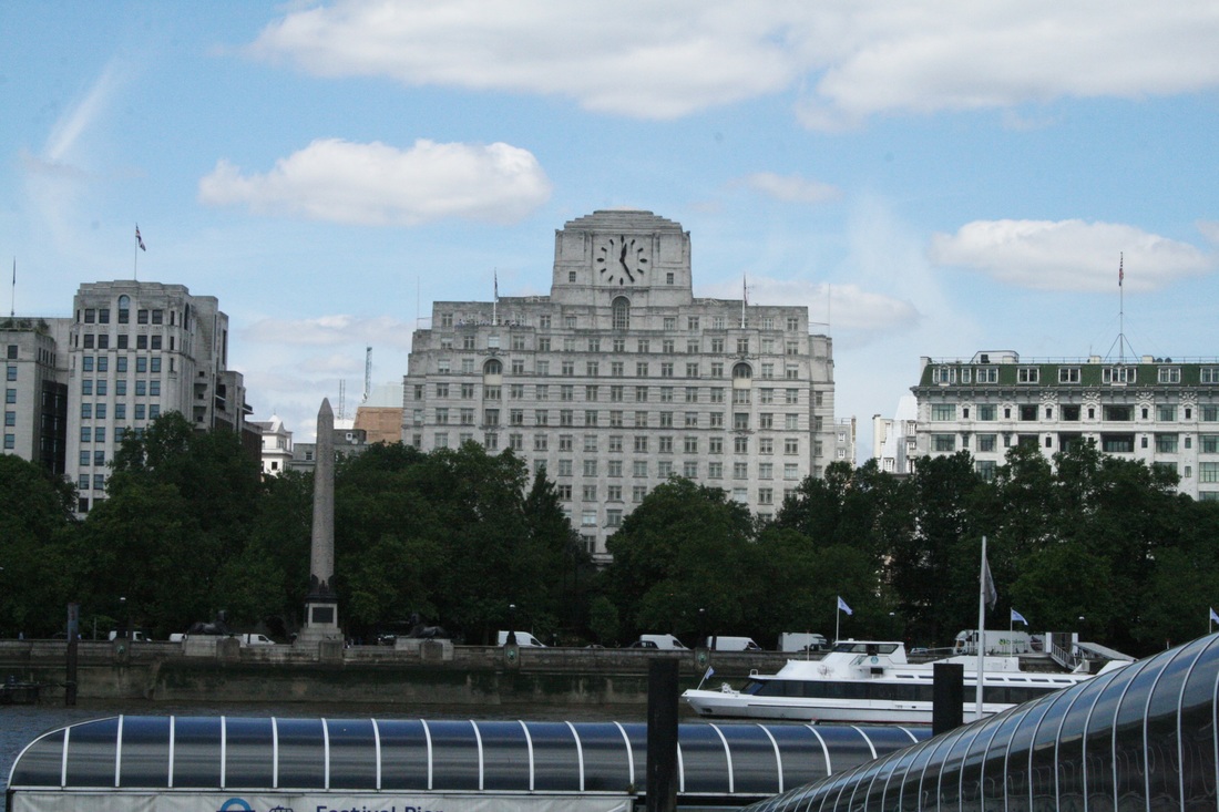
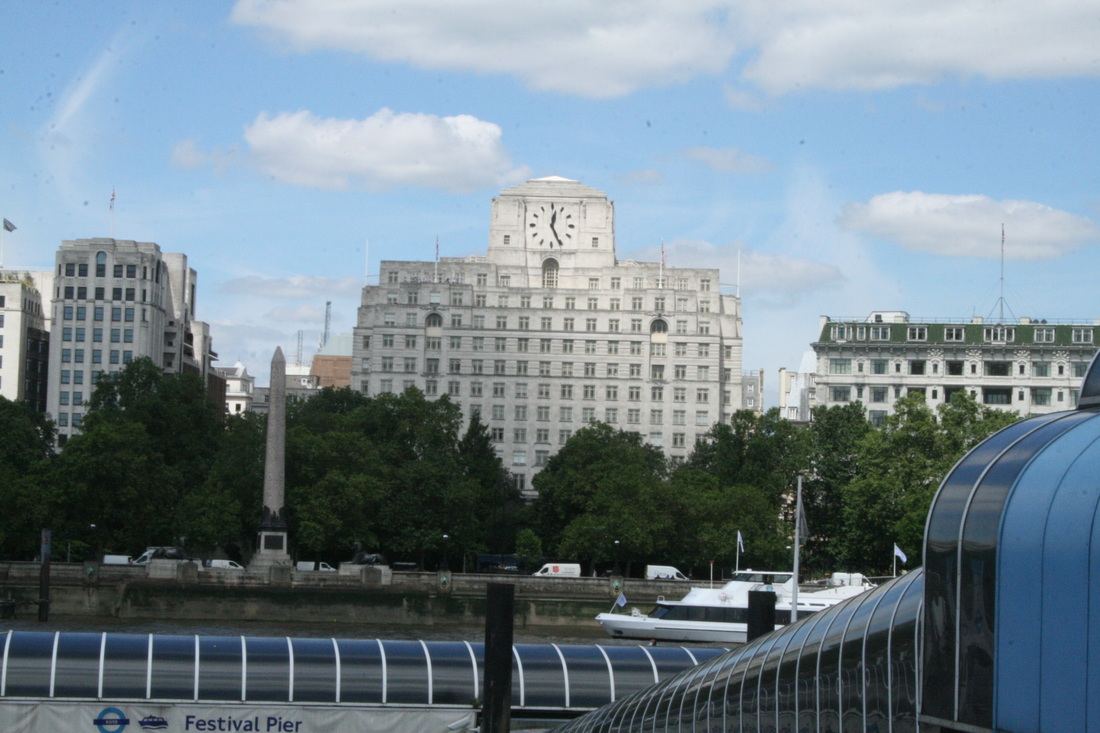

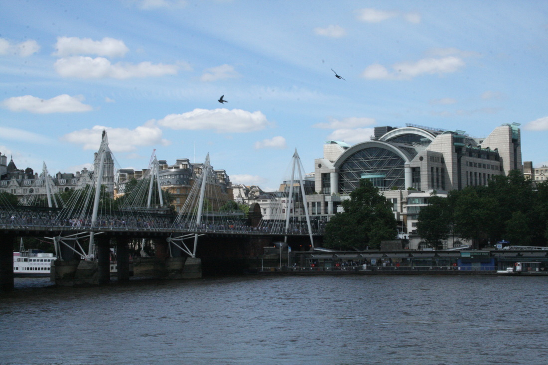


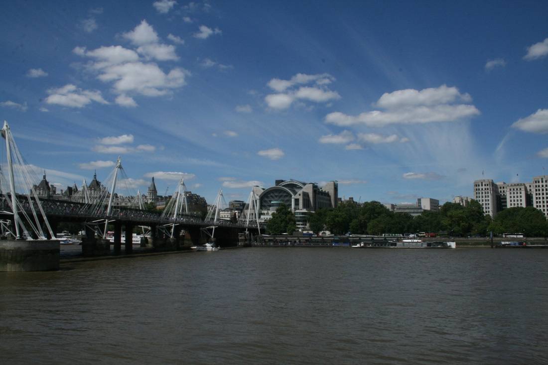
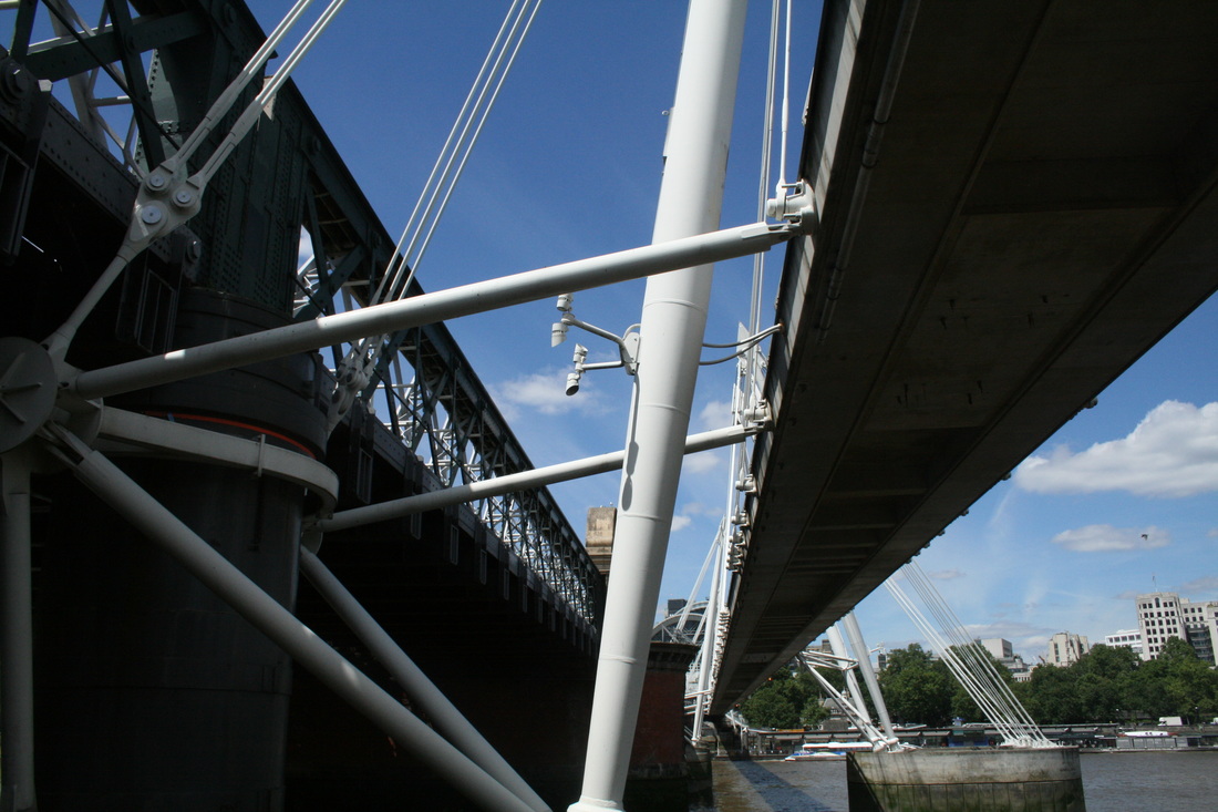
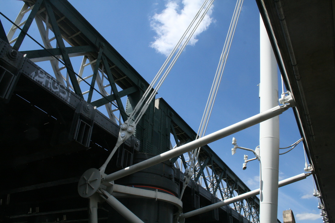

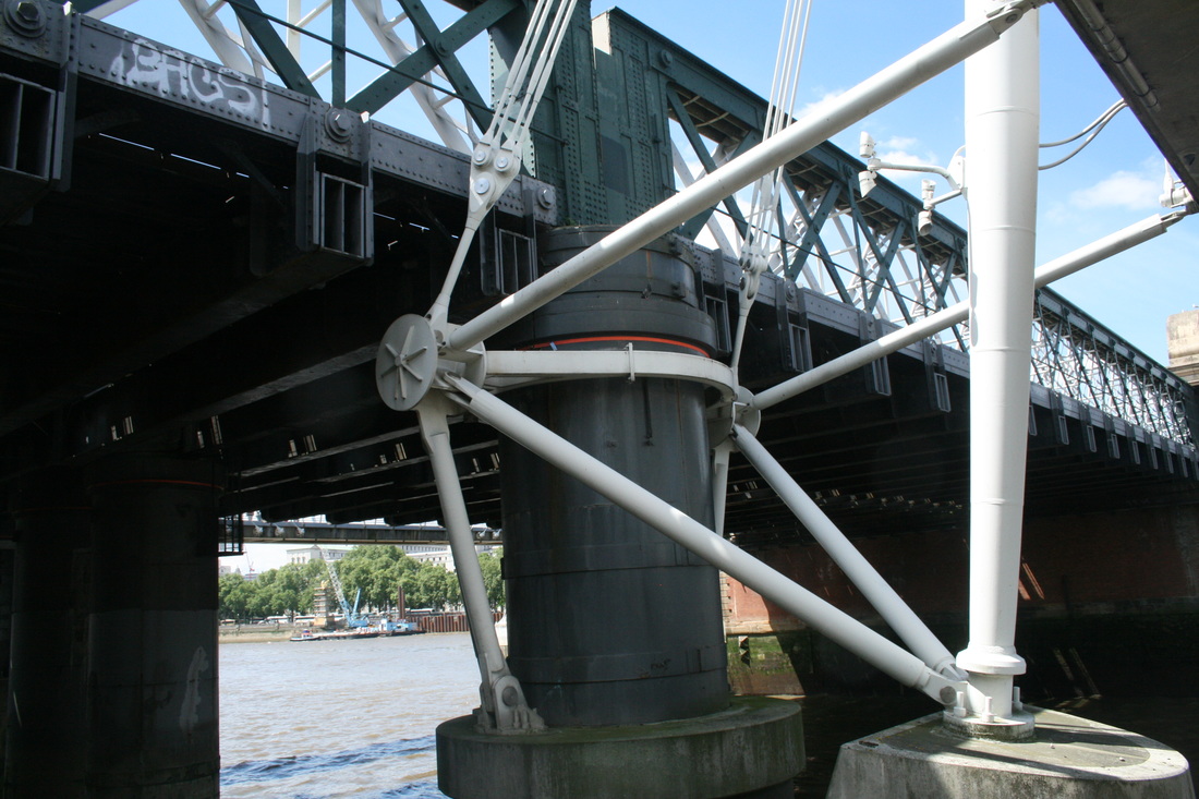

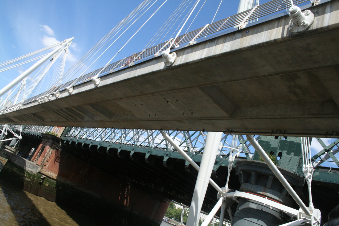


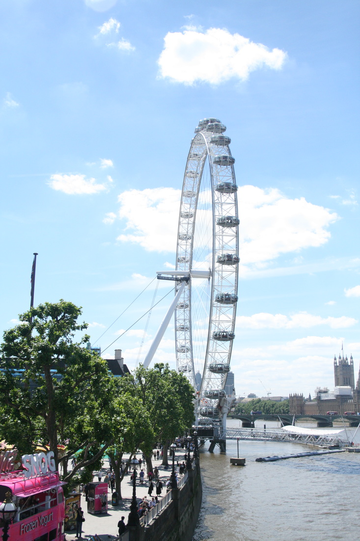
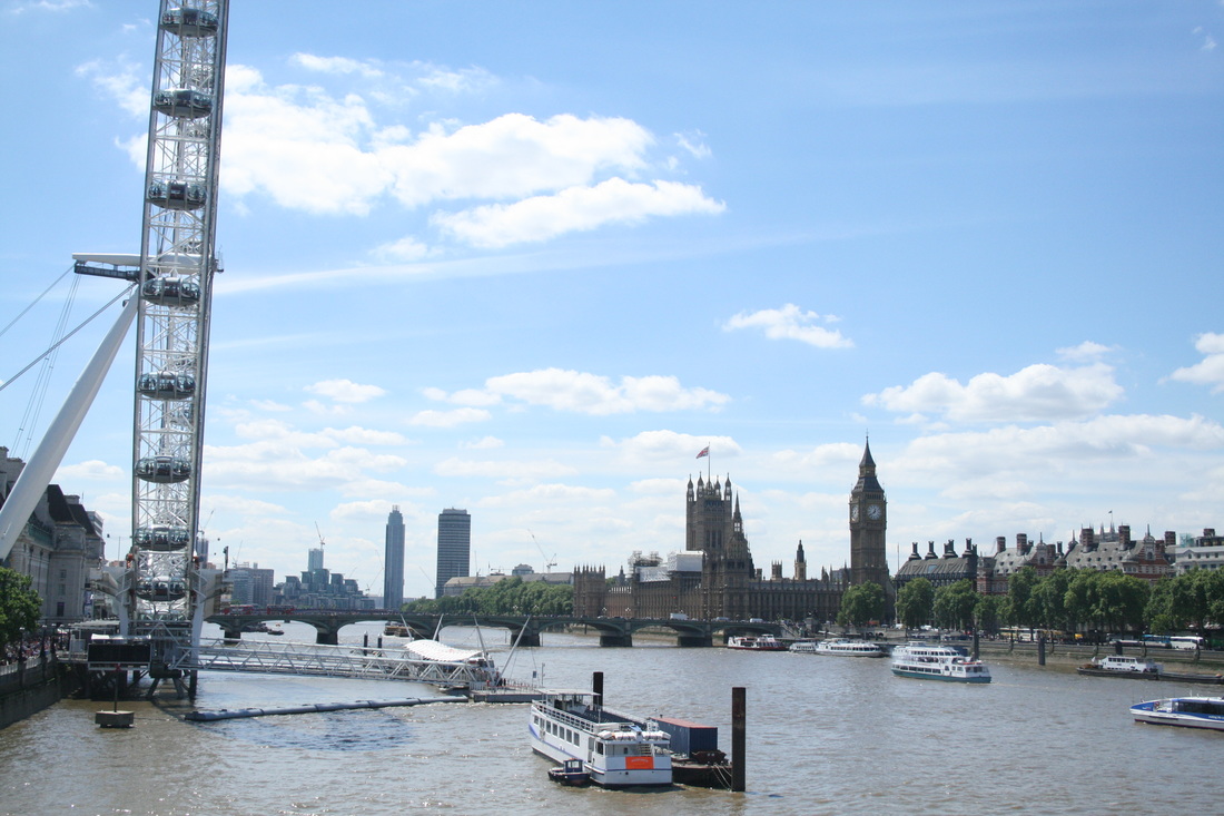
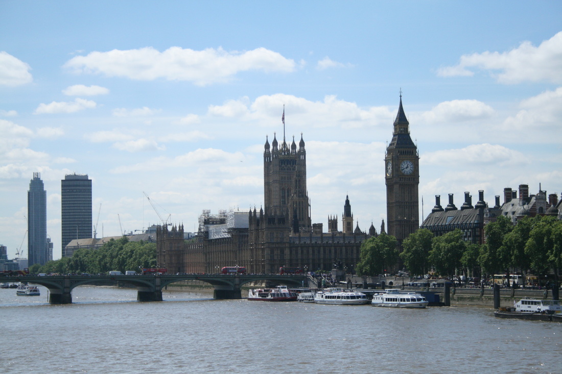
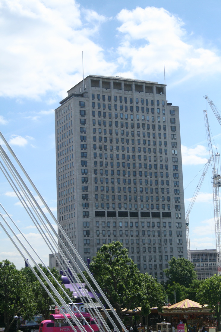
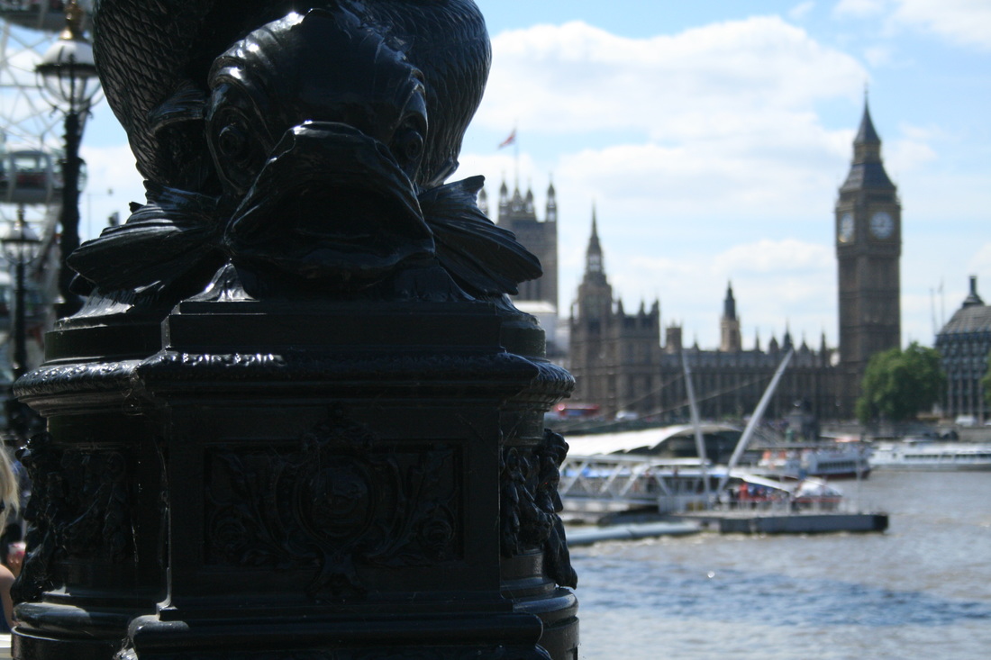
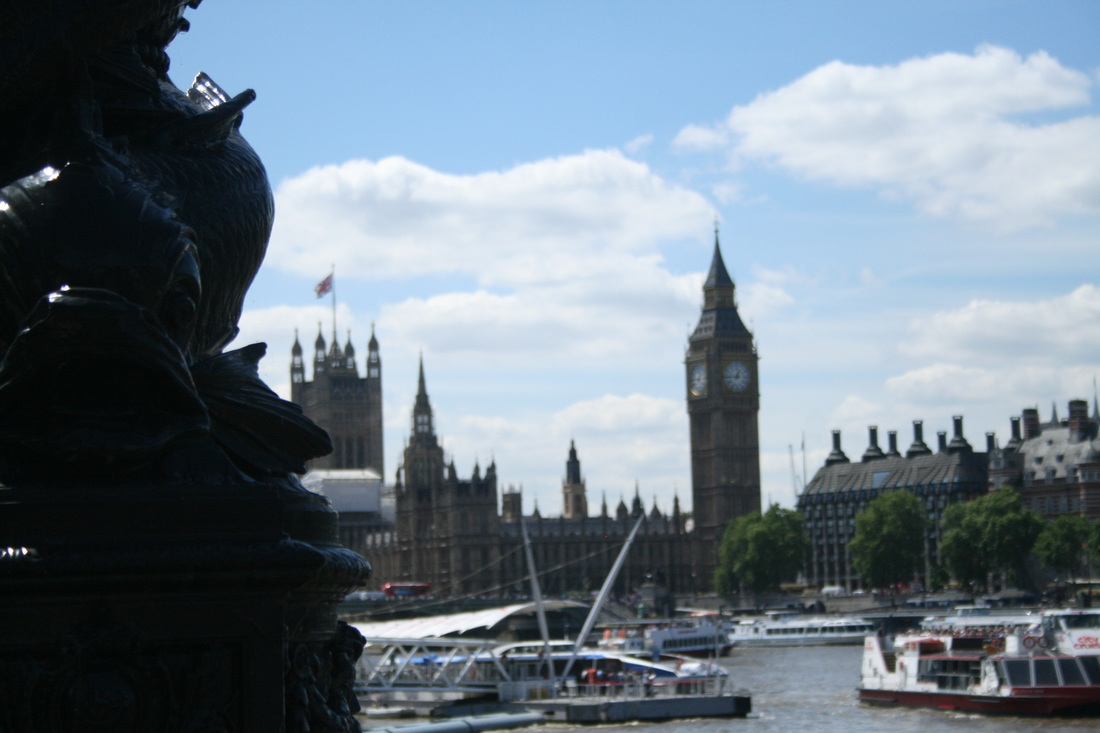
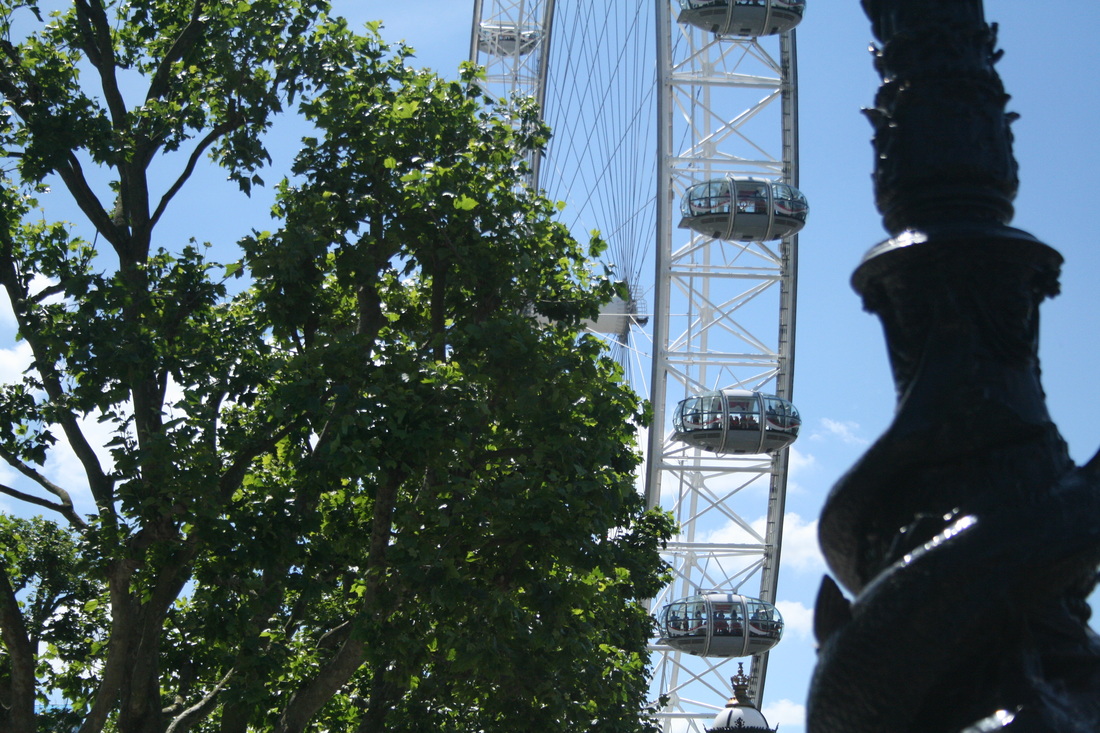
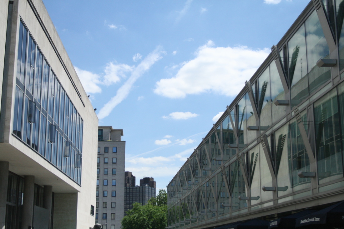

WWW: I incorporated the weather well into the images. Luckily it was a nice day, but I was looked to see how I could use the weather. For instance, in the first enlargement I like how the clouds are reflected in the windows of the building. In the image next to it, the clouds have formed really straight, direct lines which seem to follow the direction of the bridge.
EBI: I changed the depth of field in some of photos, for instance the 2nd and 3rd images in the 9th row. While this creates a cool effect as the Houses of Parliament are in the background, it falls away from the theme of 'Imposing Architecture' as the buildings lose their sense of size.
EBI: I changed the depth of field in some of photos, for instance the 2nd and 3rd images in the 9th row. While this creates a cool effect as the Houses of Parliament are in the background, it falls away from the theme of 'Imposing Architecture' as the buildings lose their sense of size.
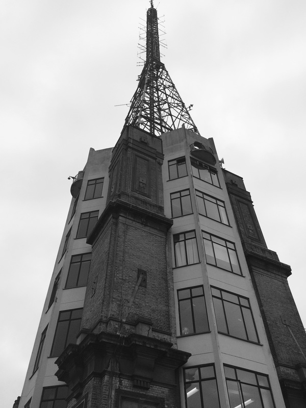
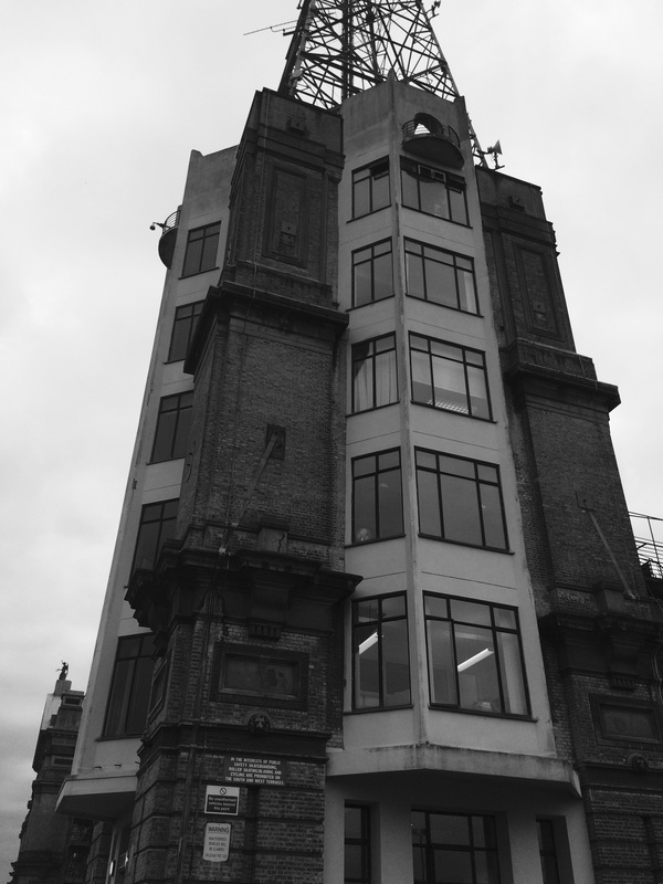
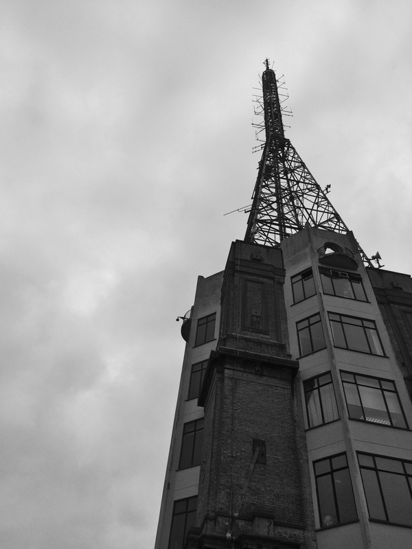
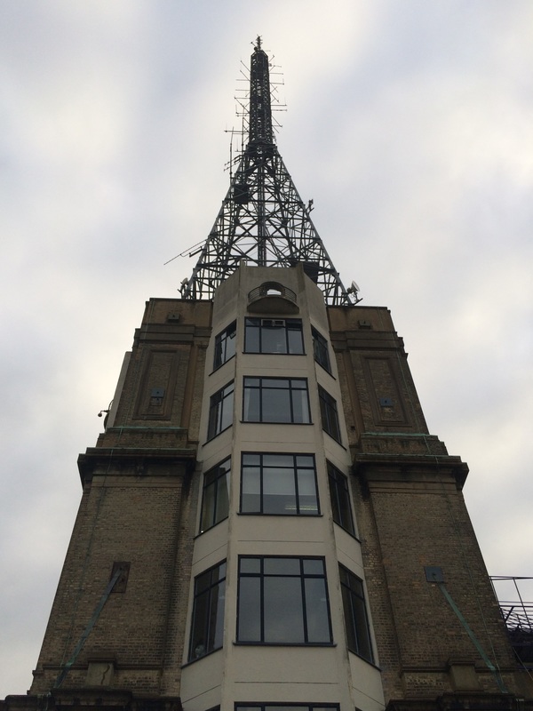
Allen klosowski - ARTIST ANALYSIS
|
|
Allen Klosowski is a photographer based in Denver, Colorado. He photographs a lot of Denver but also around the world (the image of the left is from New York and the image on the right is from Cologne). I think his best work is of buildings, and the gloomy tones and looming architecture make them really imposing; a great inspiration for my work (as you can see from the comparison below).
In the image on the left, Klosowski has really played with perception and viewpoint. The building is only in a reflection in a gritty puddle on the side of the road, but somehow we still get the feeling it is imposing and towering over us. The ripples in the puddle create a fantastic effect on the surface of the picture and it gives the impression that the photo is actually a watercolour painting. However, I think the image is a bit bland and the image would be a lot more engaging with more colour or more of the building filling the shot.
In the image on the right, Klosowski has used a low exposure to create a gloomy and sombre atmosphere. The glass ceiling splits the image into two as we look up: this technique is unique because most photographers would look to split an image diagonally, horizontally or with an imaginary line vertically though the centre. The upper half of the building looks like it is rising into the sky, splitting the clouds. This makes it seem so impressive and sky-scraping, like the top floor is on the same level as heaven, or the gods.
Artist comparison
Allen klosowski |
Me |
|
|
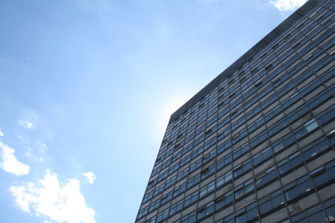
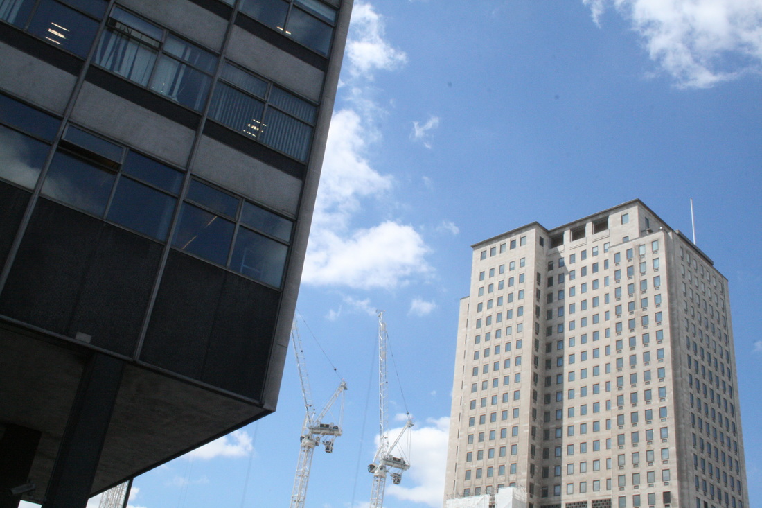
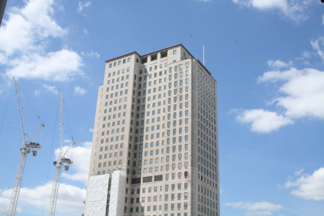
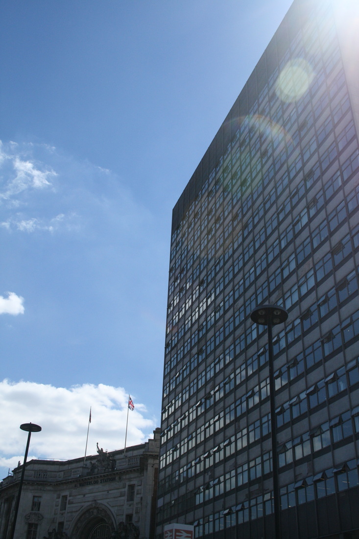
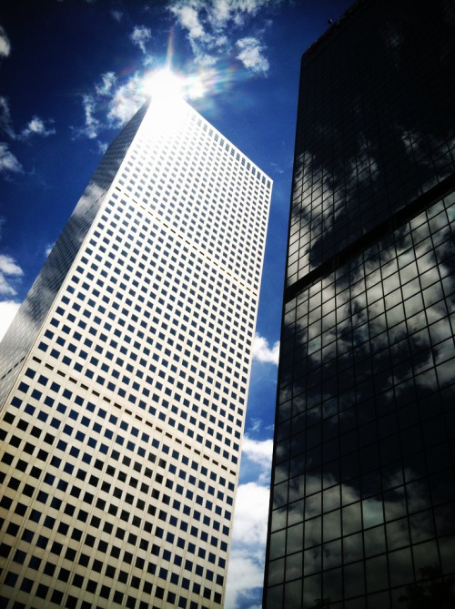
The first obvious difference is that my photo is in landscape, while Klosowski's is in portrait. I definitely prefer the portrait view; it gives the buildings a better sense of height and stature, soaring over us. Also, it just makes sense as the buildings are a tall, vertical object and there whole frame can be more easily fit into the shot without having to stand too far away.
Secondly, Klosowski has incorporated two different buildings into his image. This allows for a contrast of colour/tone and the reflected clouds are a nice effect. Furthermore, the second building makes the image more imposing and claustrophobic, like we are being closed in upon from all around. I have done this to an extent with the cranes; however they make it more imposing as they show how wide and powerful the building is in comparison. The cranes suddenly look very fragile.
Finally, Klosowski's image is much more precise. Unlike mine, the sun doesn't create a flare and he has used it to his advantage, illuminating the reflections and emphasizing the difference in colour. The squares on each building are perfectly uniform and ordered; the windows on my building range in colour and perhaps I'm not close enough to convey their uniformity.
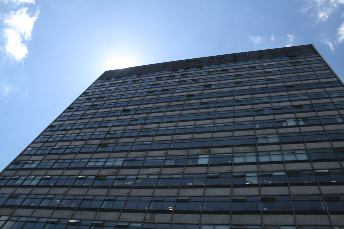
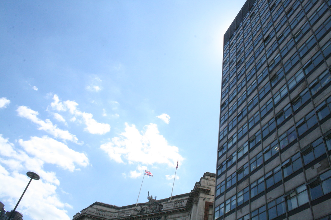
third response
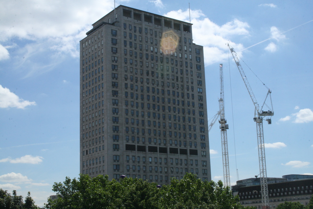
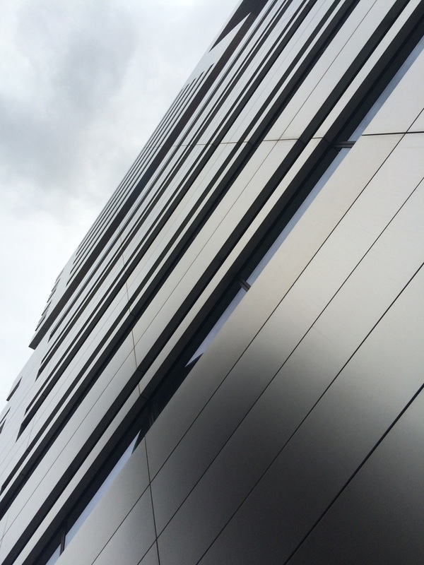
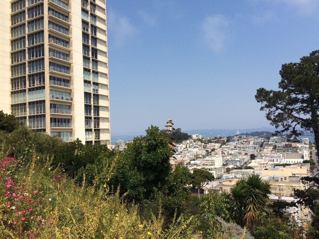
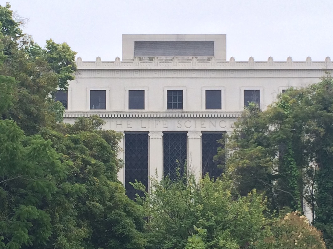
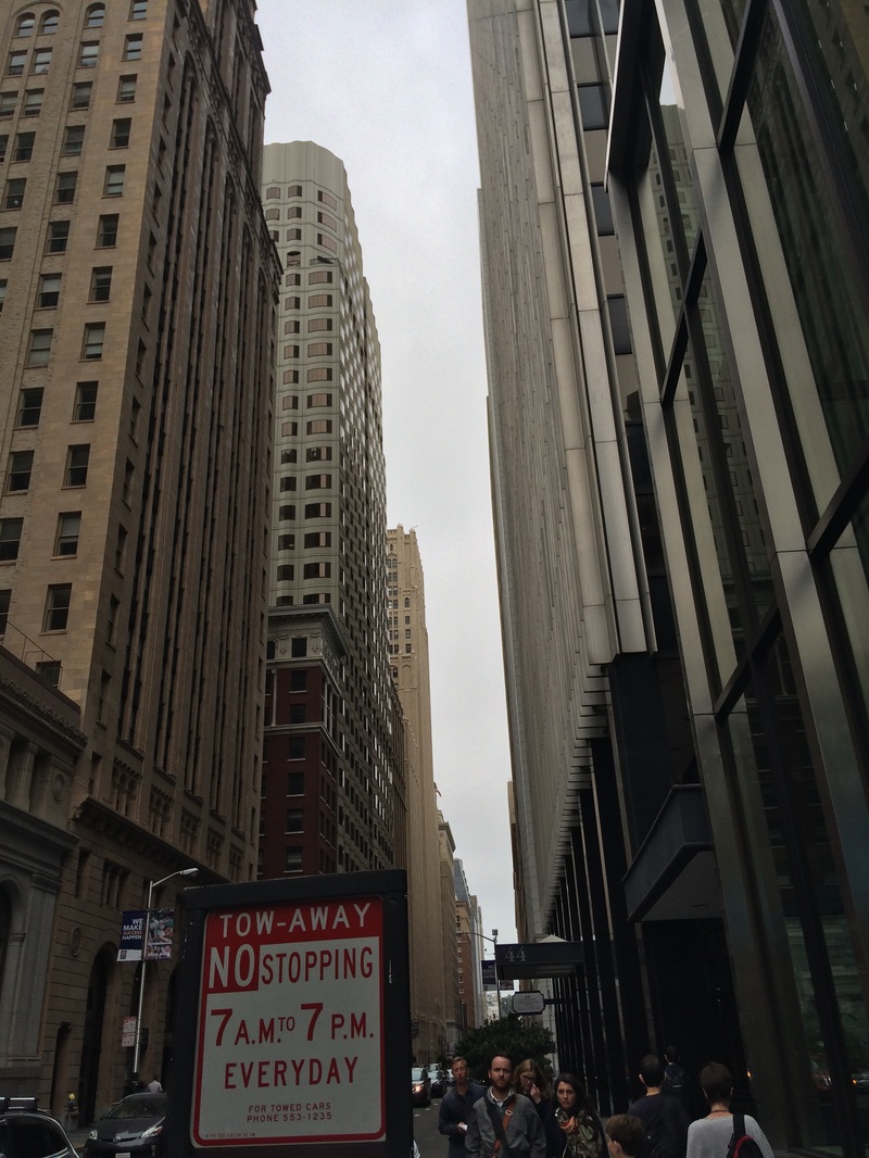
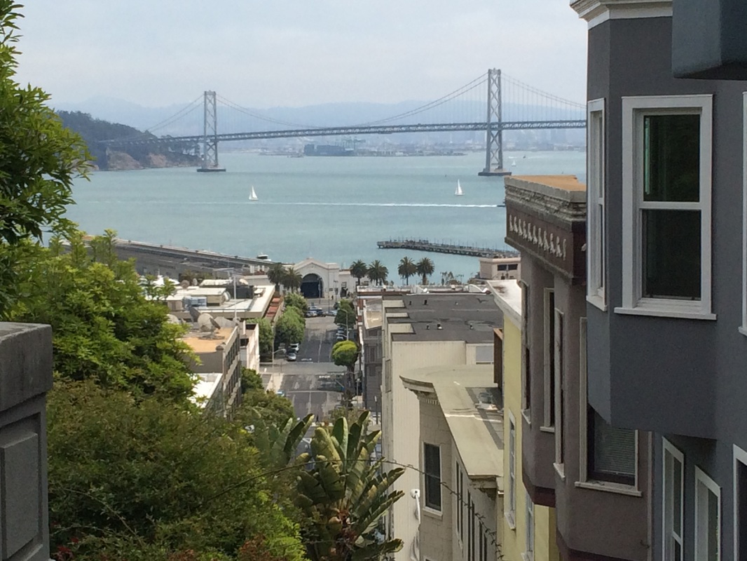
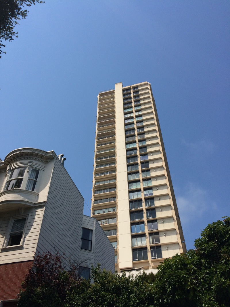
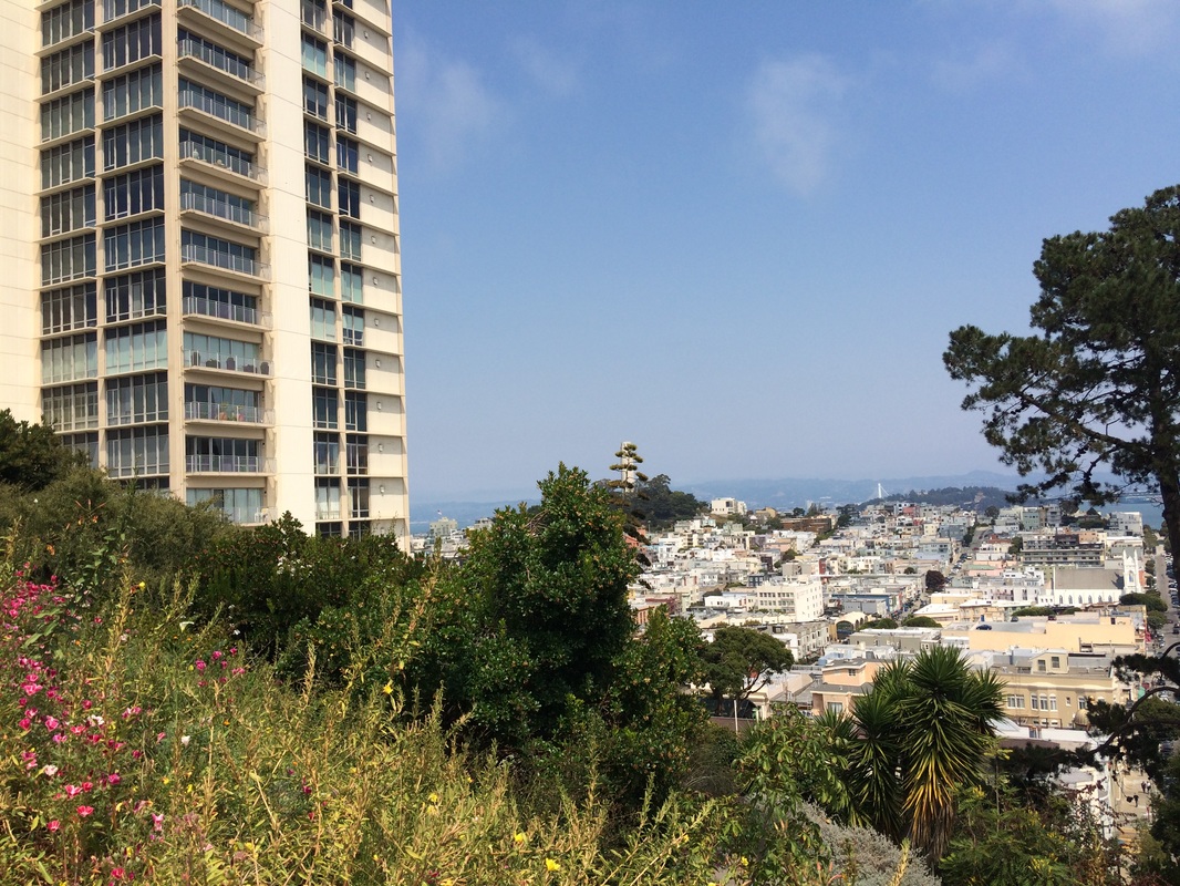
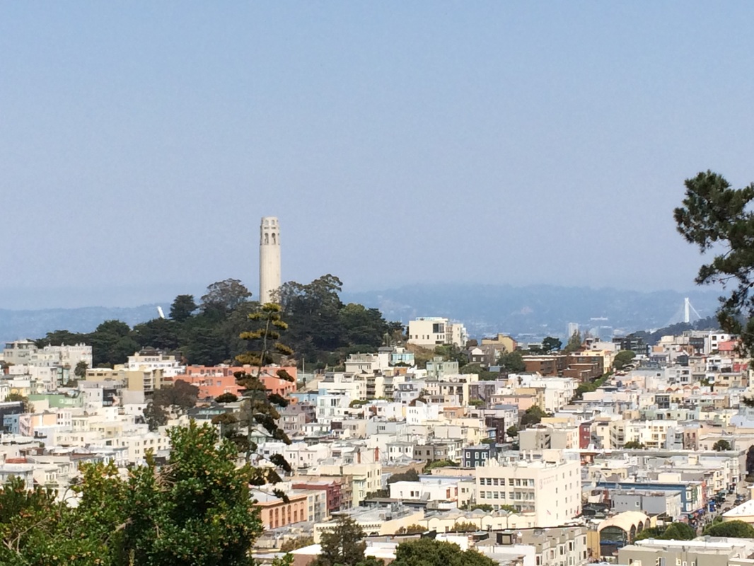
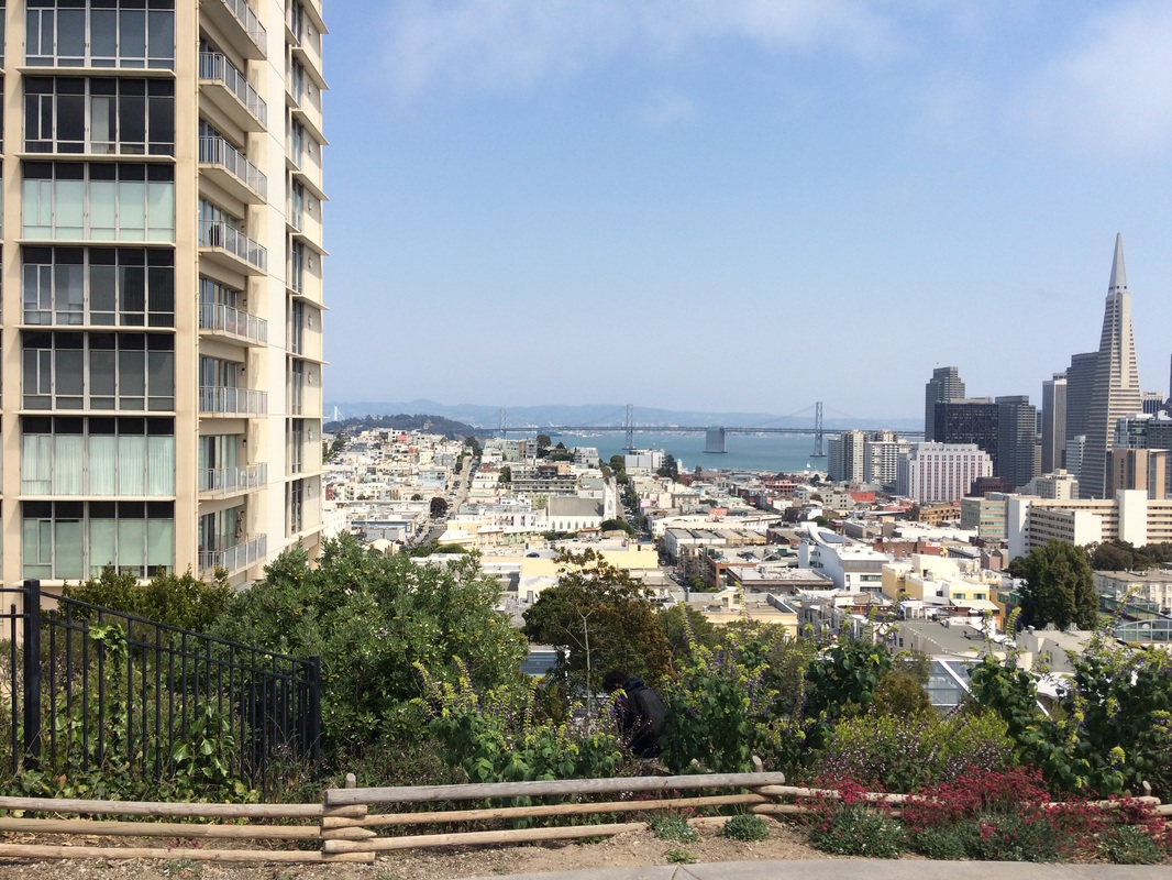
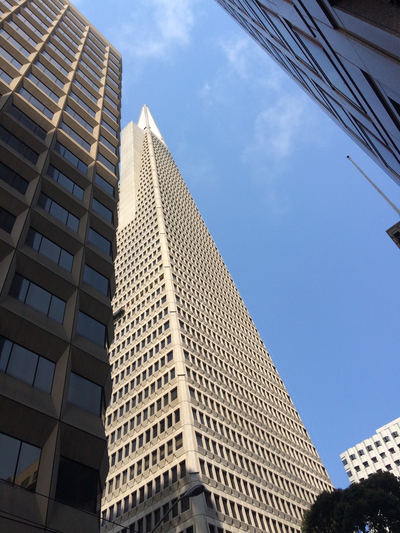
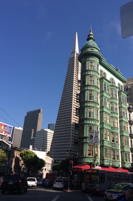
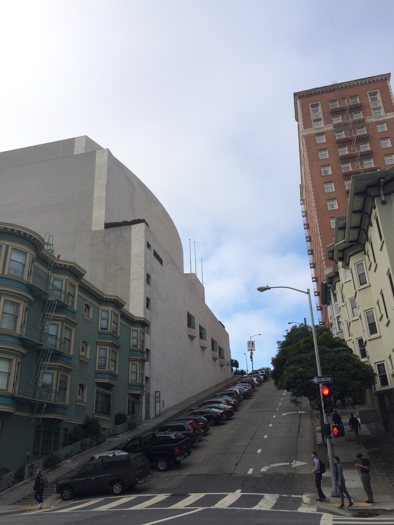
Earlier on in 'this project, I took images in my school and the Southbank in central London. In San Francisco, it was amazing as the architecture was so much more colourful and varied. However, in the city center, there also were a lot of tall office blocks that were completely different. A lot of them were quite ugly and plain, but this helped them to fill the criteria of 'imposing buildings'.
|
|

|
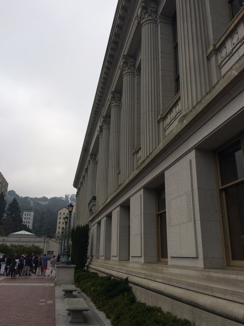
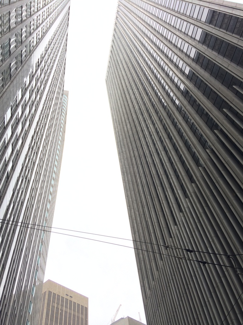


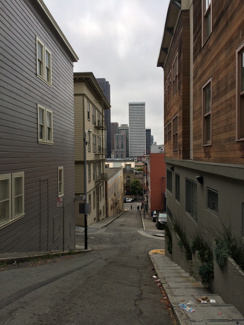
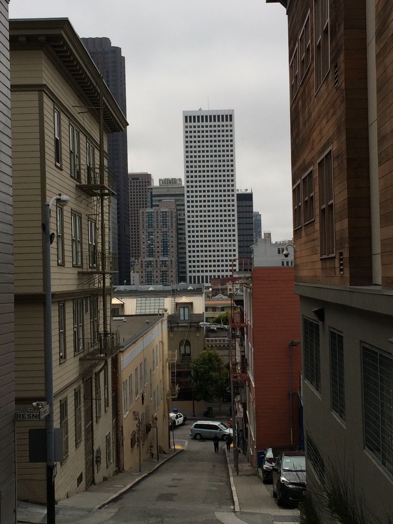
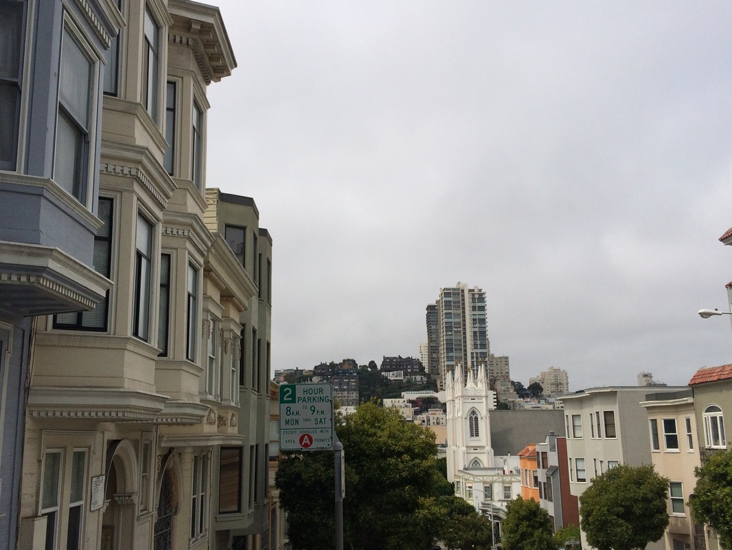
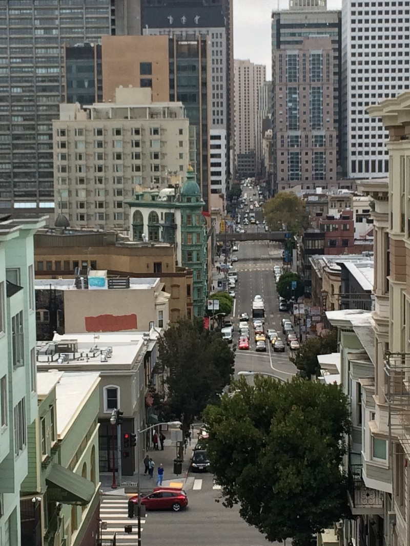

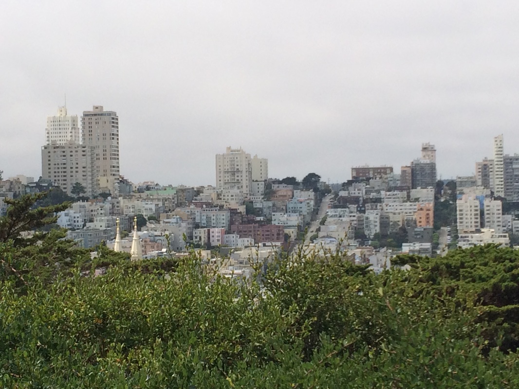


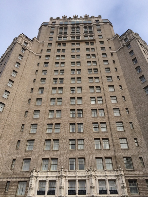

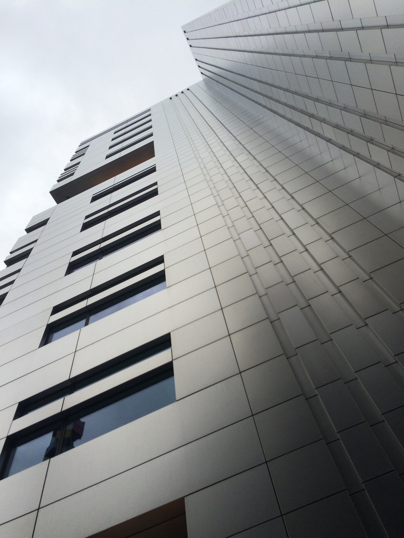

WWW: I think I managed the light a lot of the time when I shot, and although it was very bright a lot of the time, hardly any of the images appear overexposed. I also used scale effectively, comparing the size of the buildings to cars, smaller buildings and people. I did this sometimes using a compressed perspective (like you can see from the 5th row, 2nd across image).
EBI: The shadow forming a smudge on the first enlargement is frustrating as it is distracting. Also, when I edited the third enlargement, I used too much contrast and as a result it detracts from the overall image.
EBI: The shadow forming a smudge on the first enlargement is frustrating as it is distracting. Also, when I edited the third enlargement, I used too much contrast and as a result it detracts from the overall image.
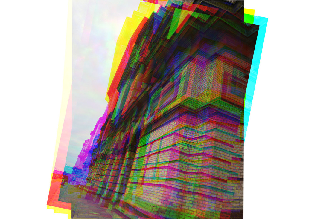
fourth response: Alexandra palace
For this development, I photographed Alexandra Palace, with the intention of taking the best images and applying a 'glitch' effect in Photoshop, which displaces the channels of colours in the photo.
glitch photography (photoshop)
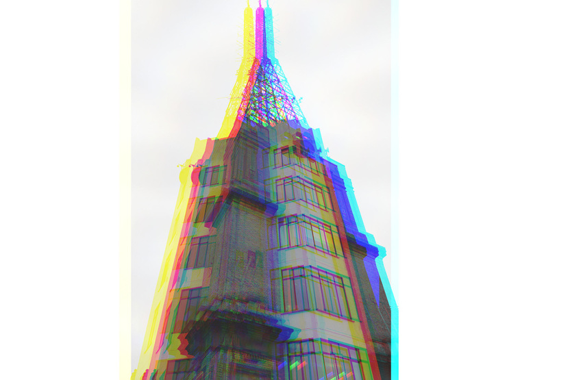
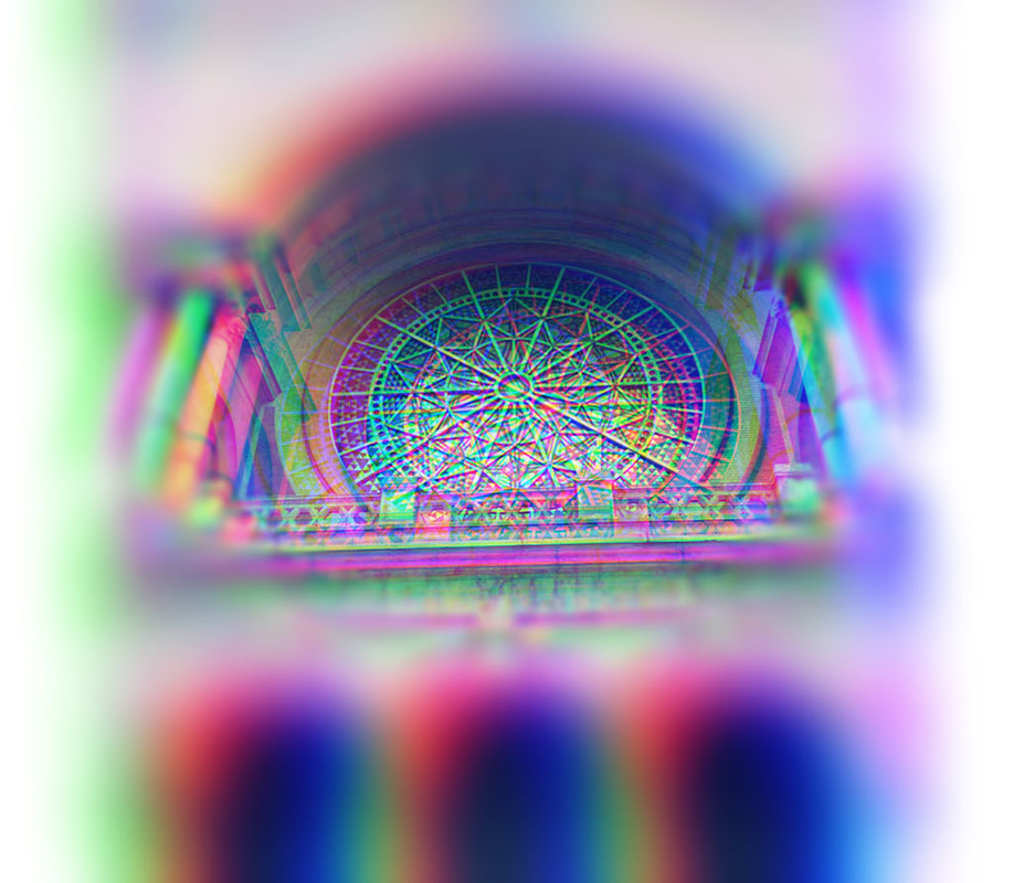
78% opacity, luminosity filter
|
|
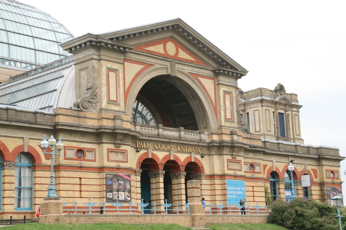
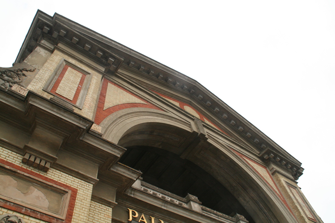

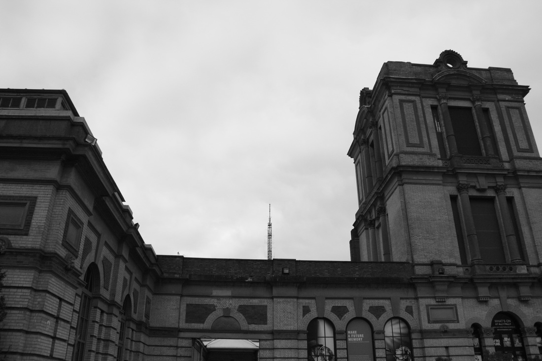
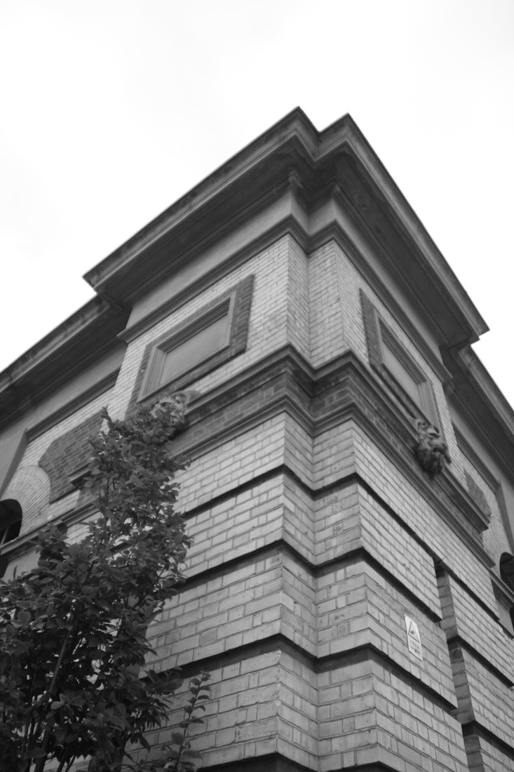
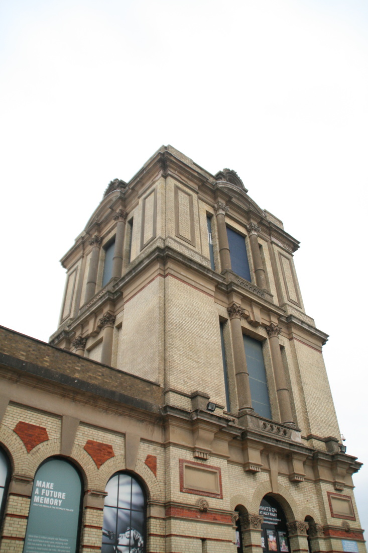
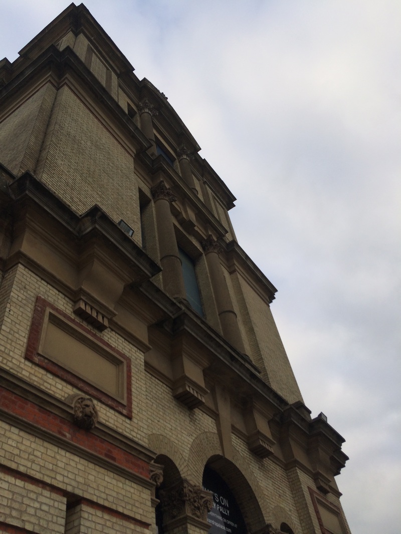
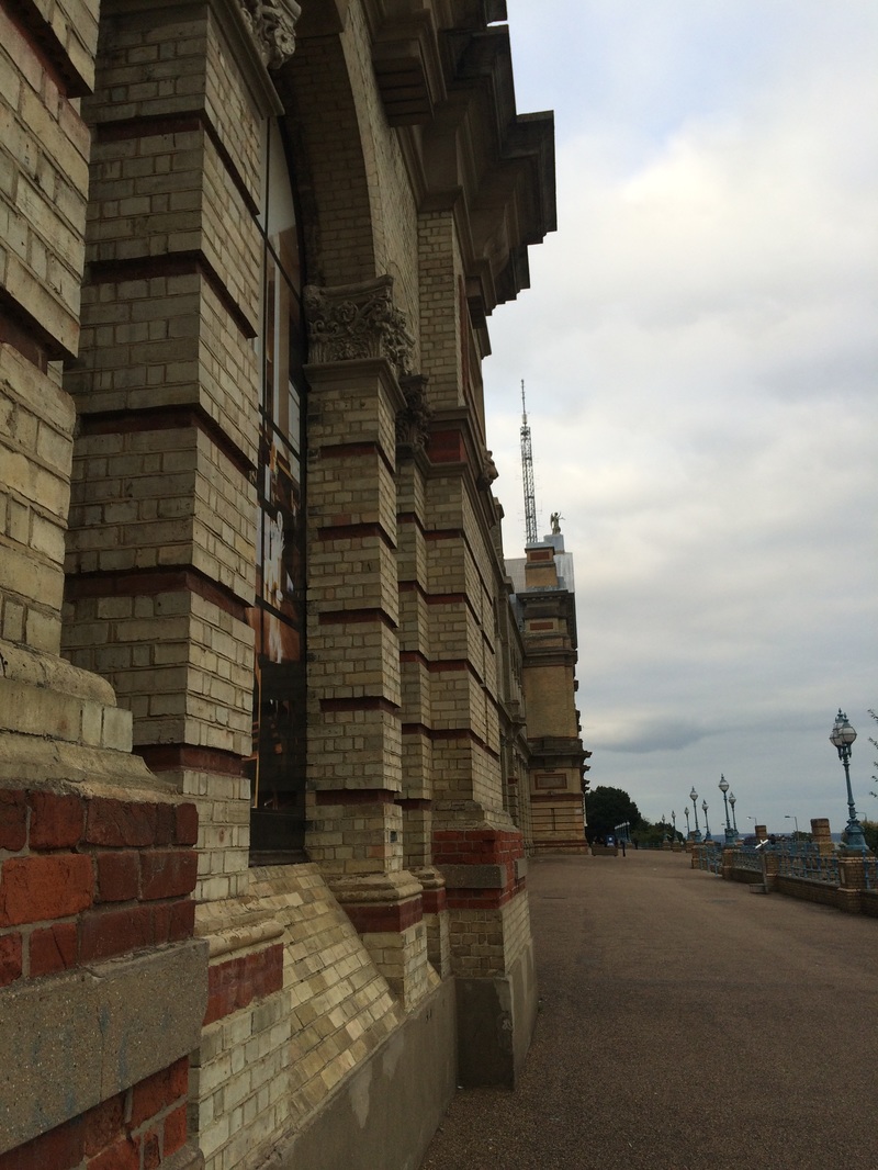

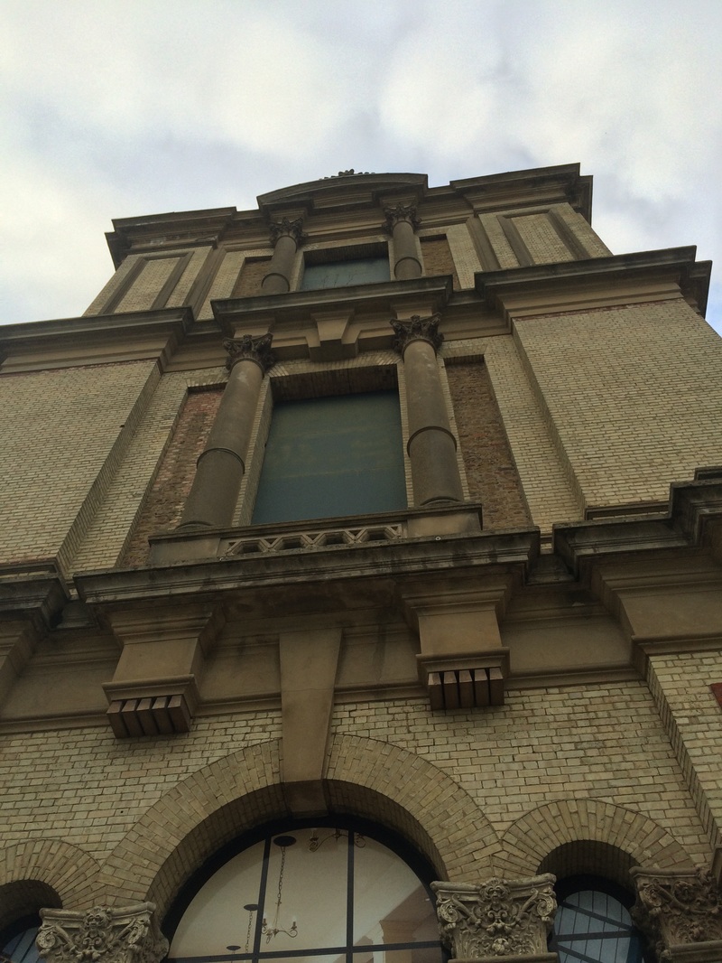
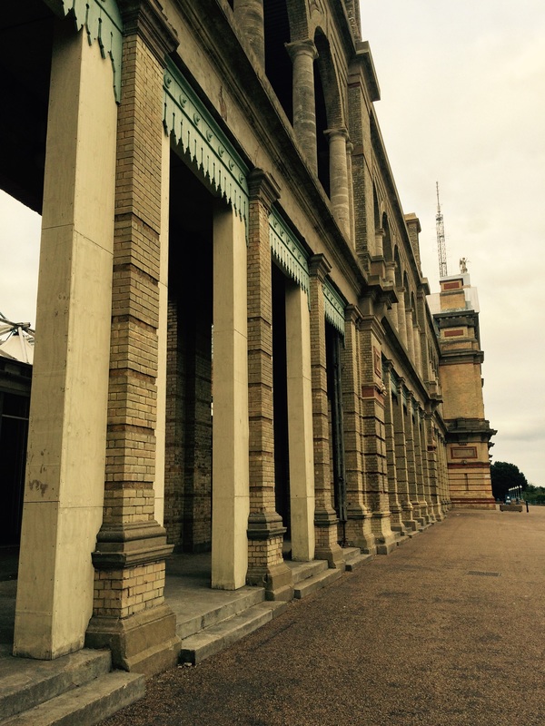
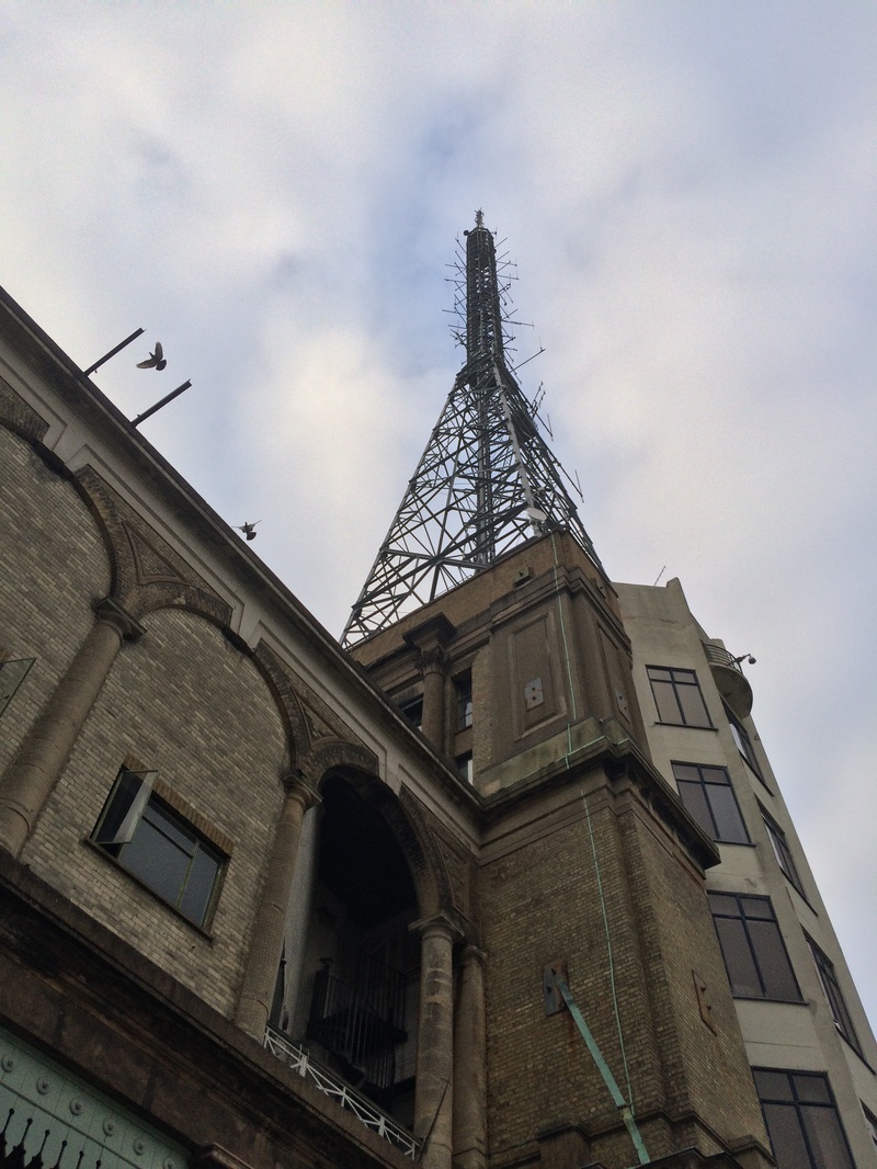


WWW: I captured a wide variety of angles and perspectives when I went to Alexandra Palace. I also composed the images well when shooting, using symmetry, depth, the rule of thirds and also framing the image so the main subjects would be in the centre of the images. I also like the monochrome images, which have quite an ominous and imposing mood. I also used a low view in some of the images to increase the feeling of power, scale and imposing. The glitch-effect images, especially the top one, are successful as they appear distorted.
EBI: Maybe the setting was restrictive as I could effectively only photograph 2 or 3 different parts of the building to create a sense of imposingness.
EBI: Maybe the setting was restrictive as I could effectively only photograph 2 or 3 different parts of the building to create a sense of imposingness.
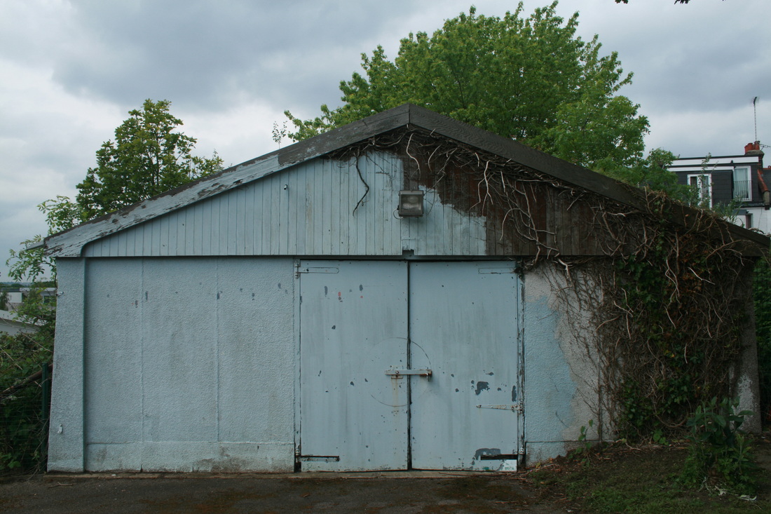
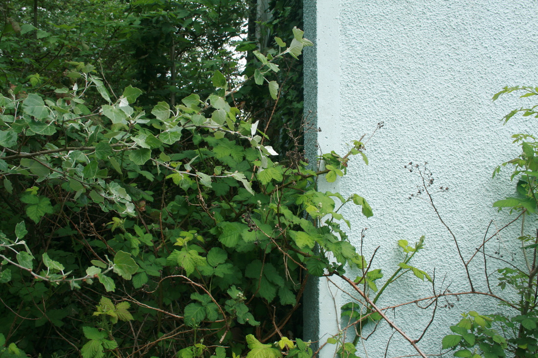
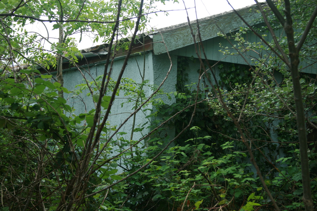
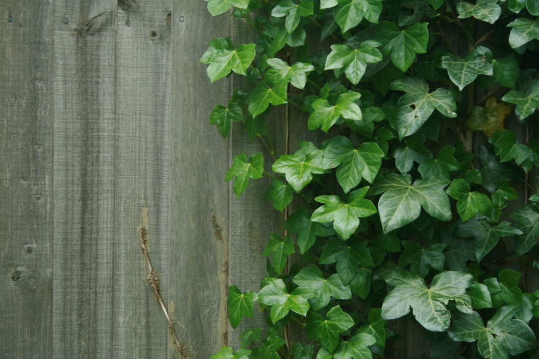
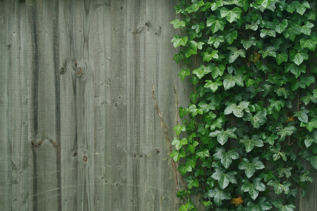
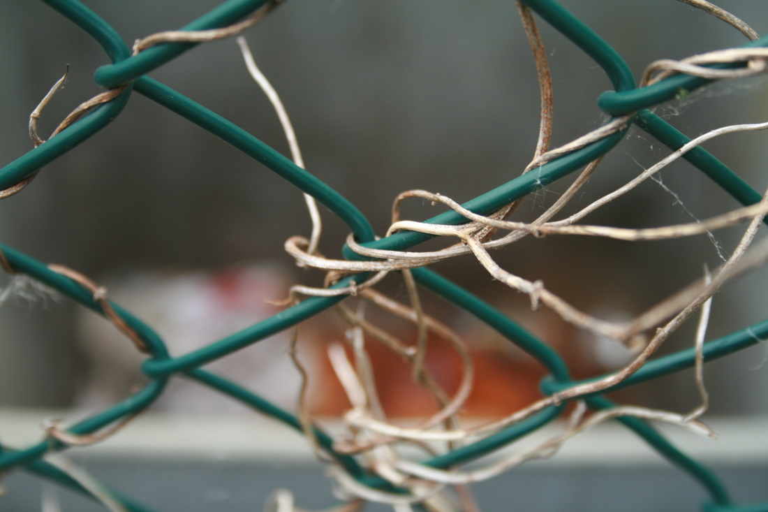
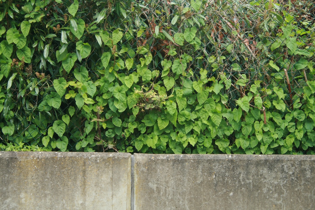
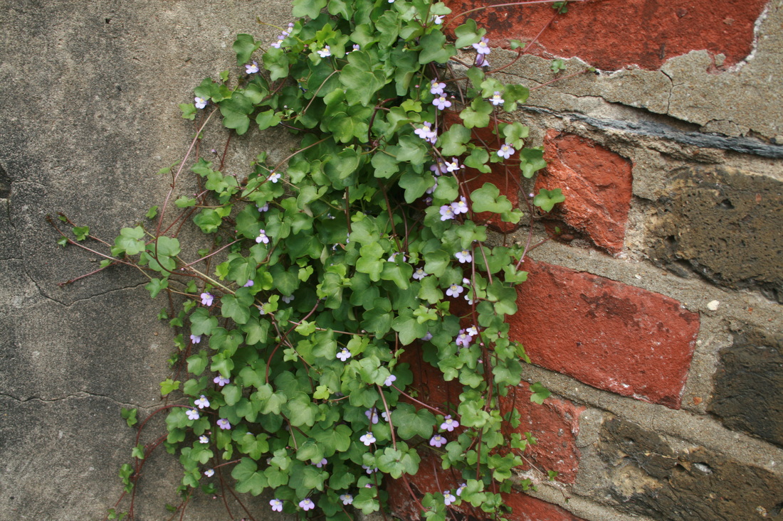
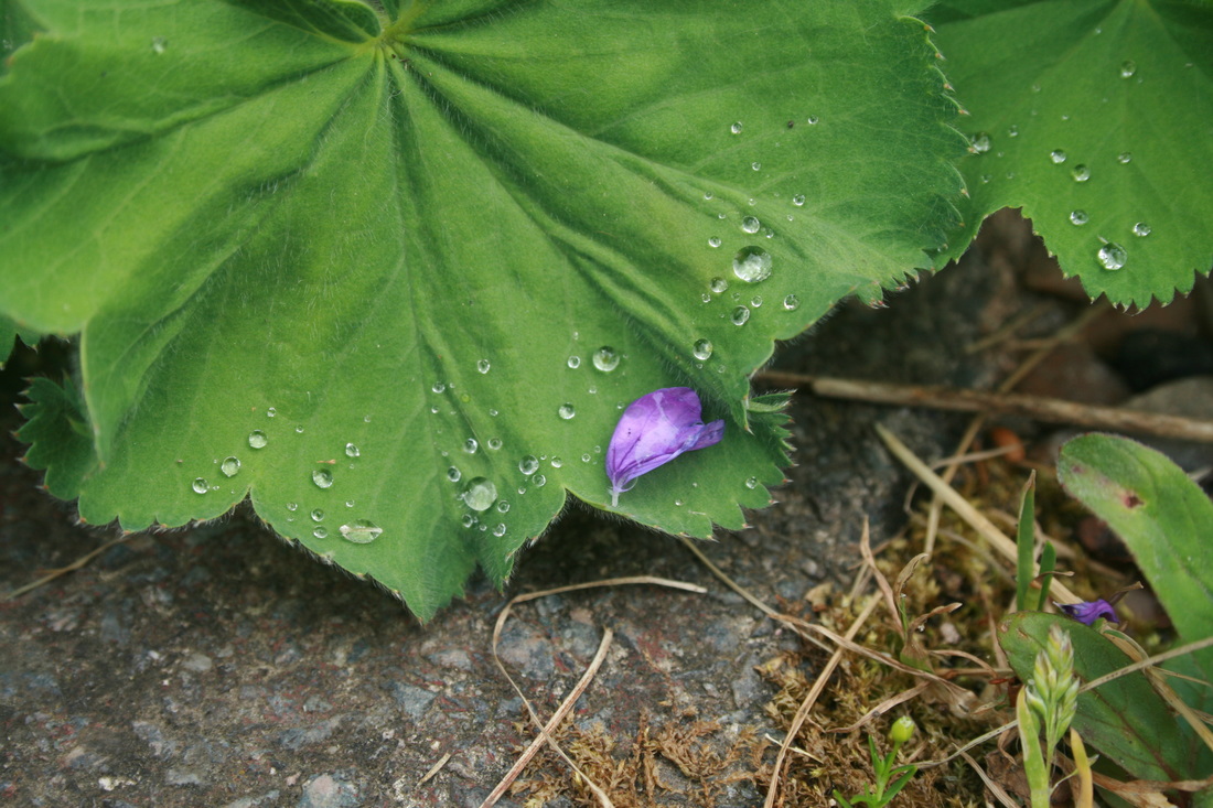
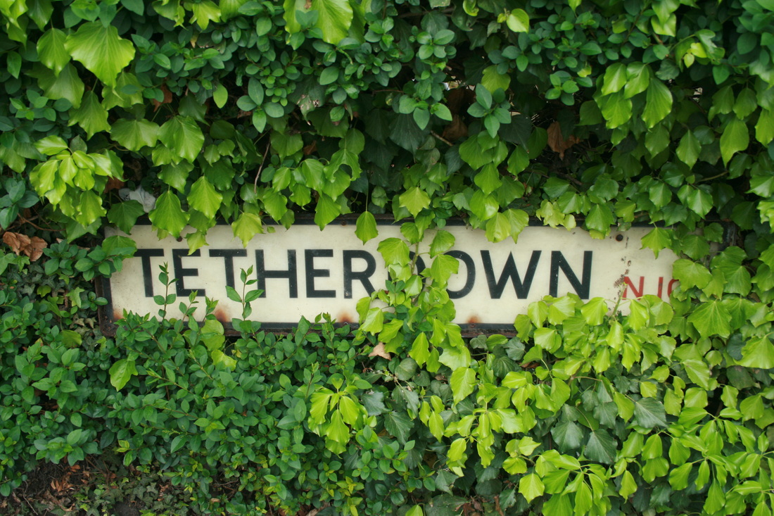
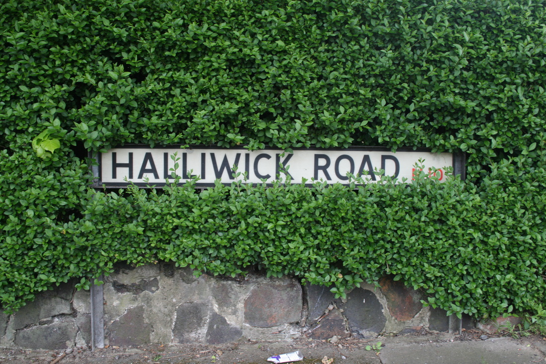
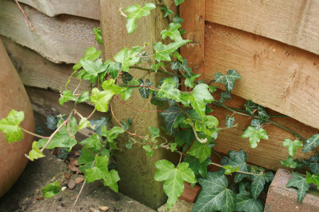
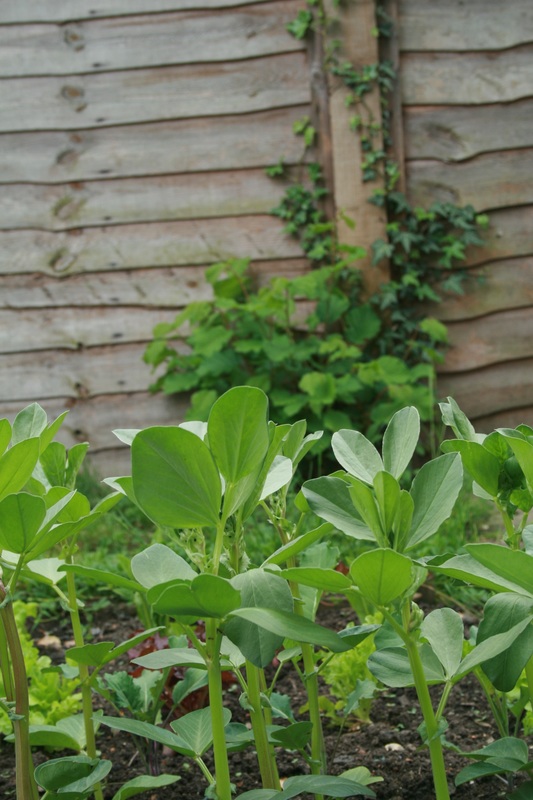
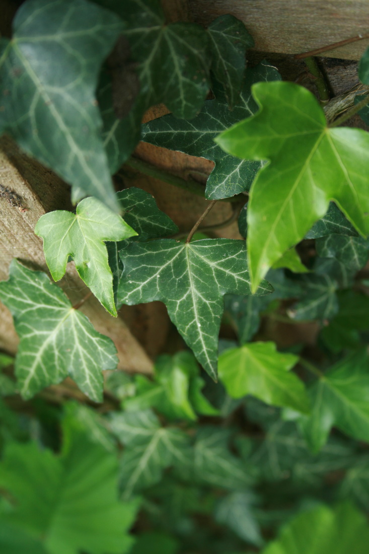
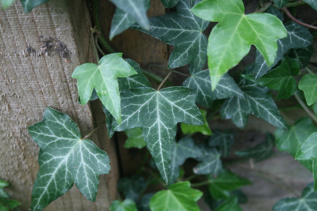
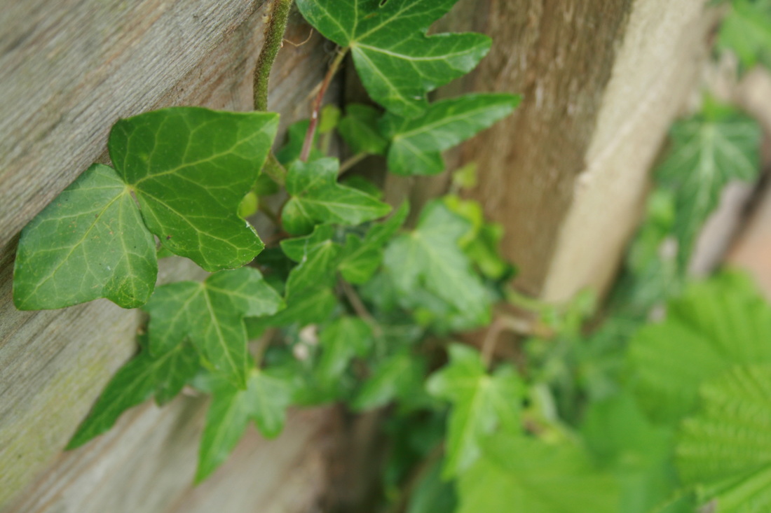
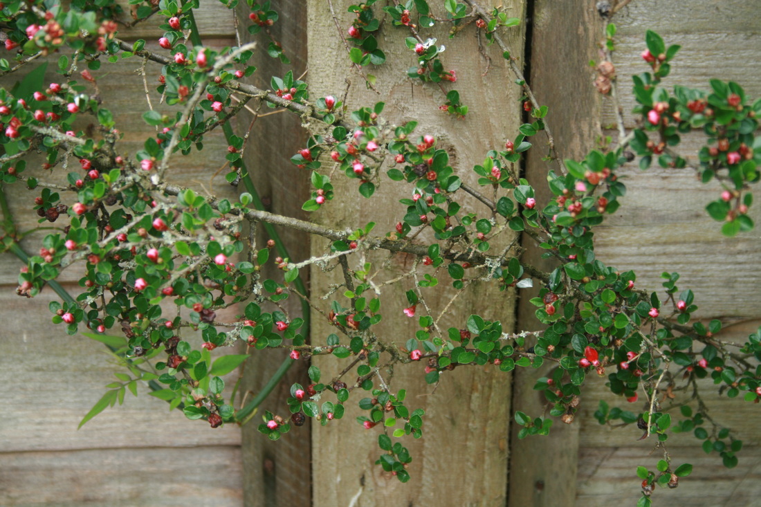
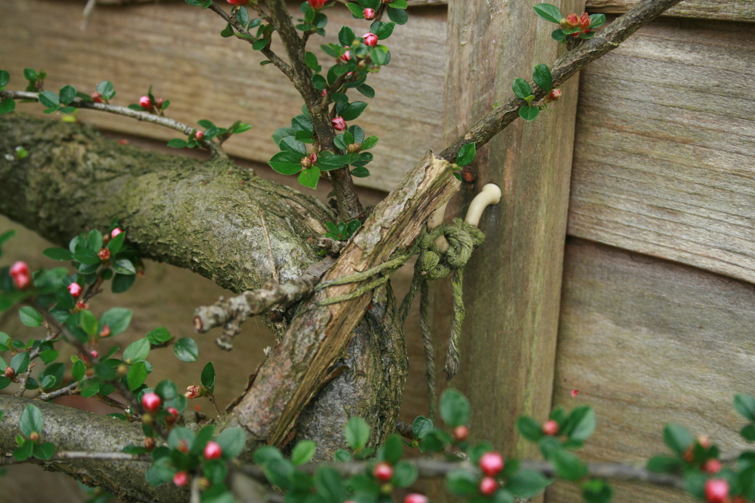
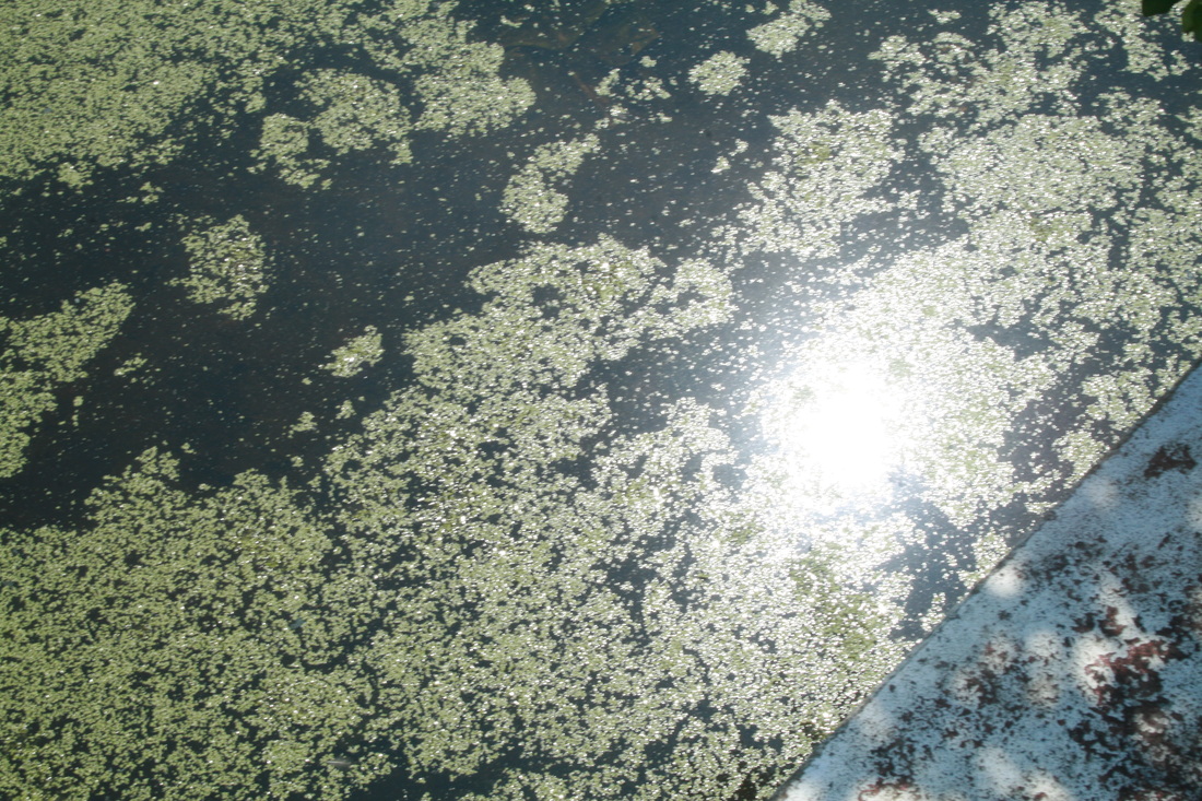
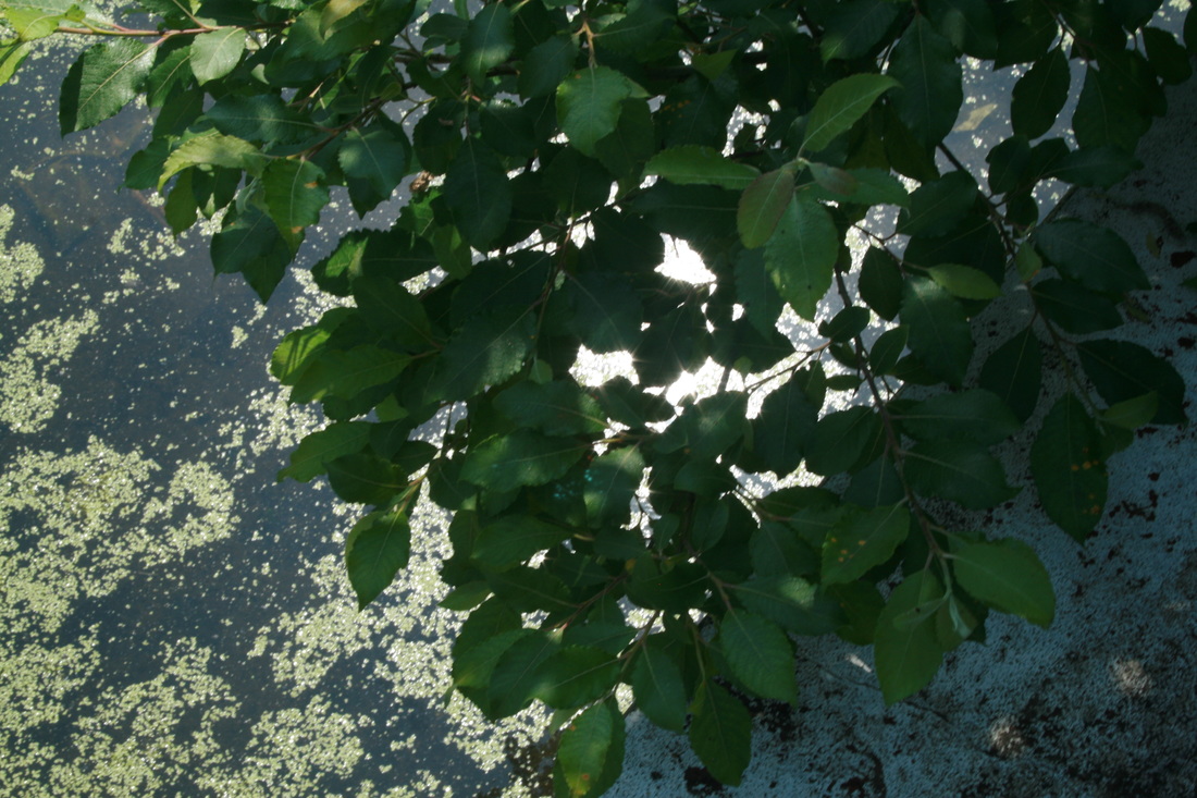
strand 3: force of nature
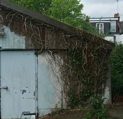
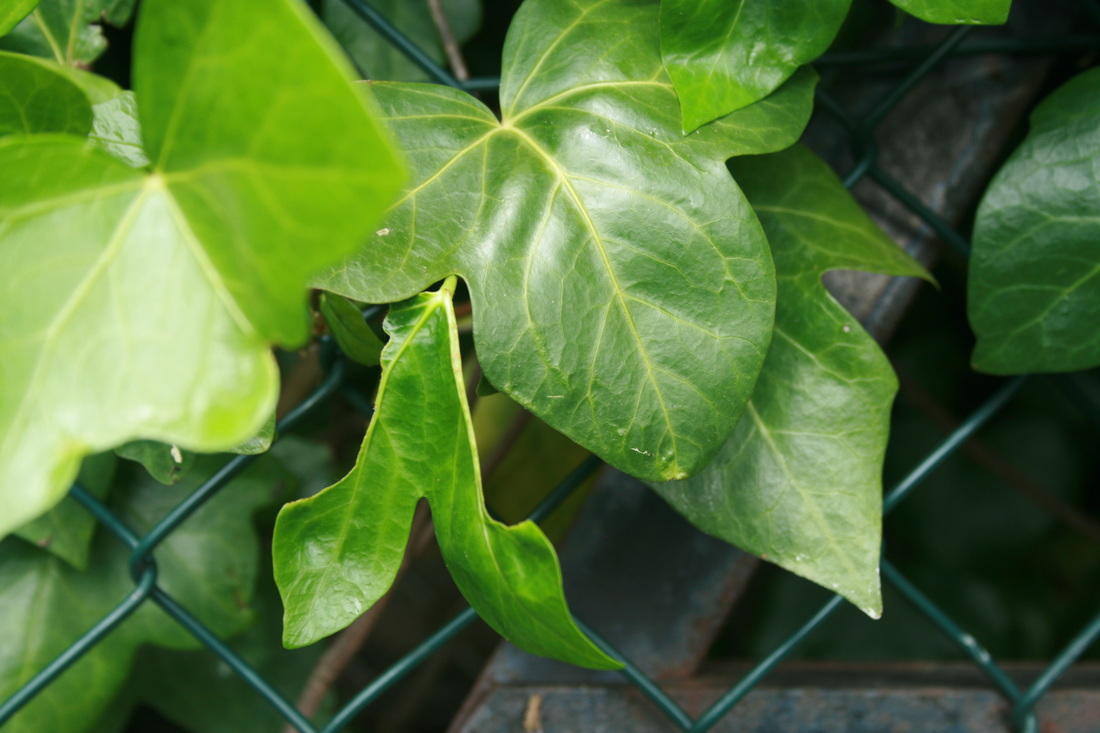
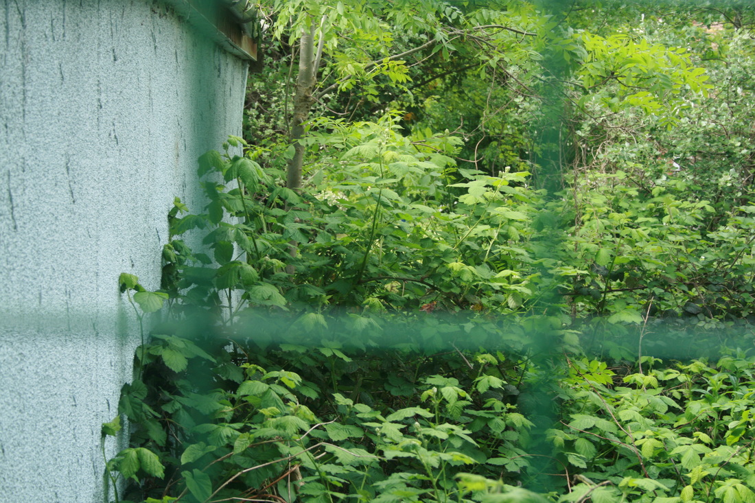
In this project, we looked at how nature can act as a force, by taking over man-made structures. Nature is caught in a unceasing battle, growing through cracks, swarming over walls and eating through objects. Our homes and buildings are above all intended to keep us safe and protected and this function is constantly under threat from nature.
First response

|
|
|
please click on the images to enlarge them
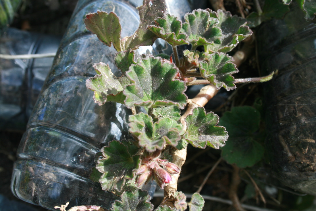
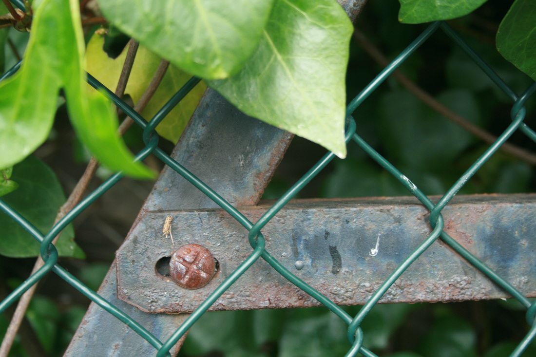


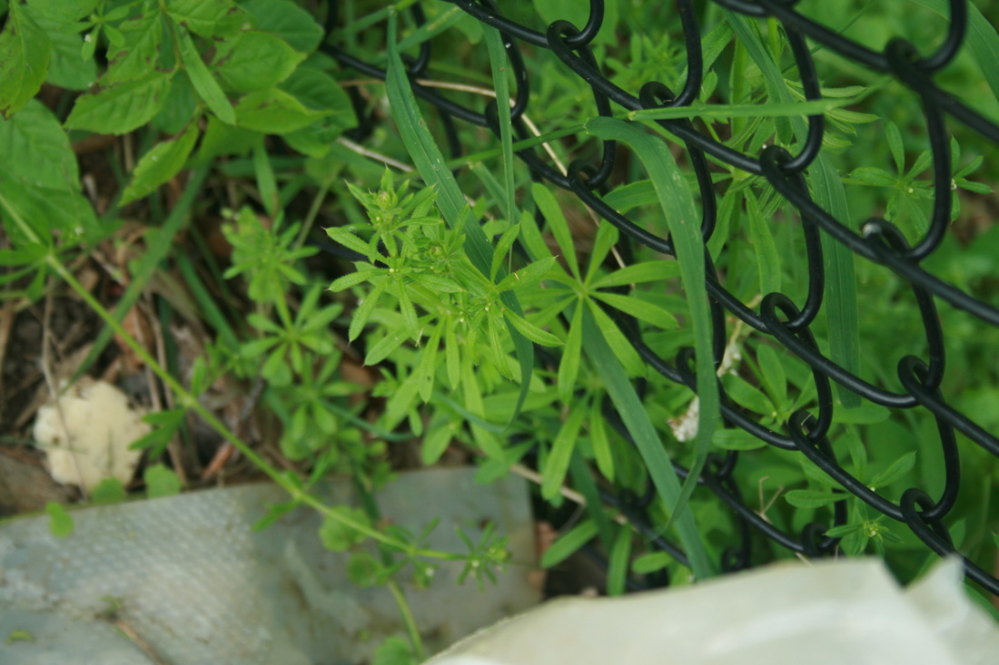
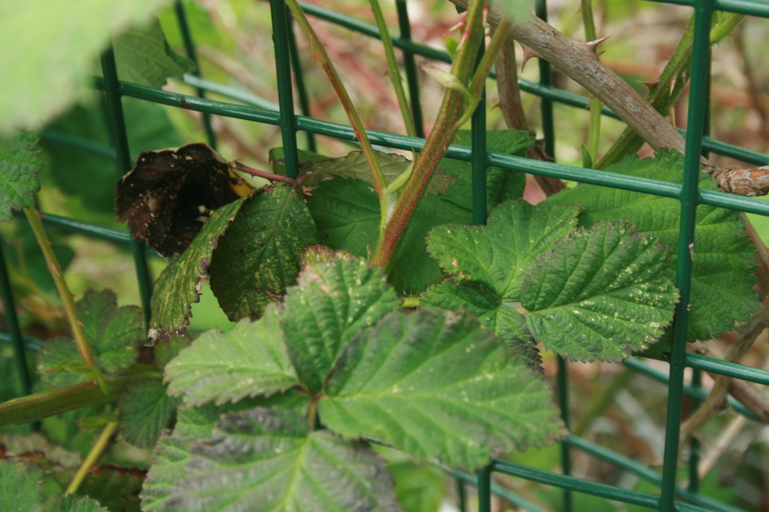

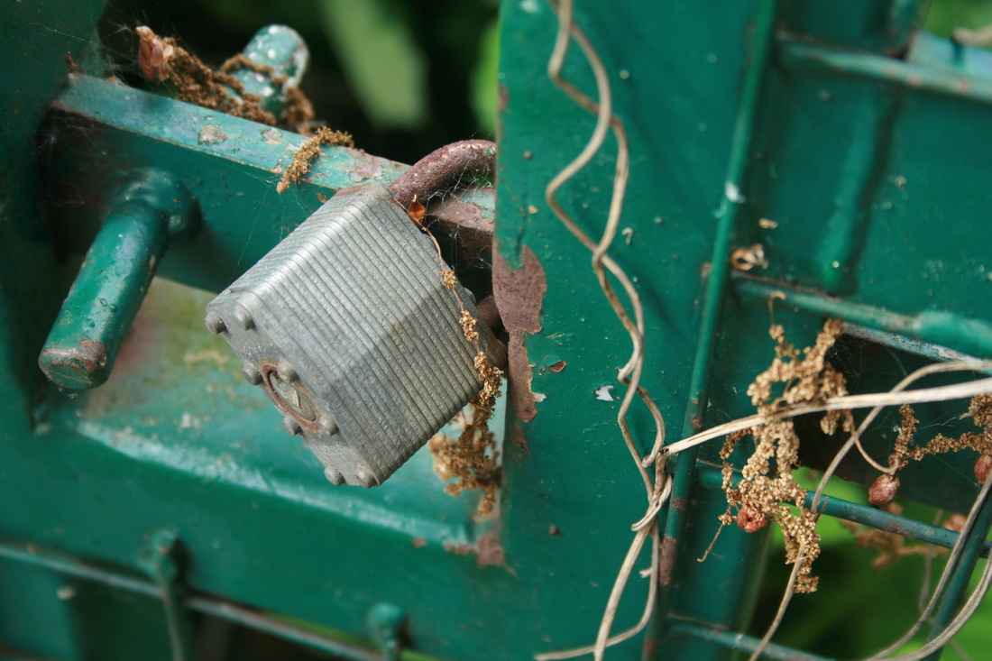
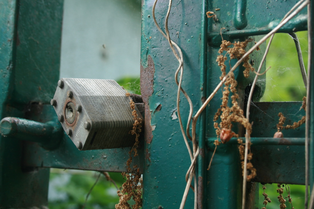
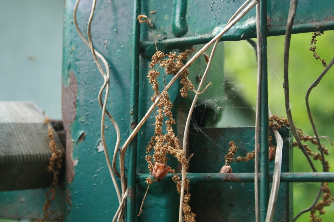
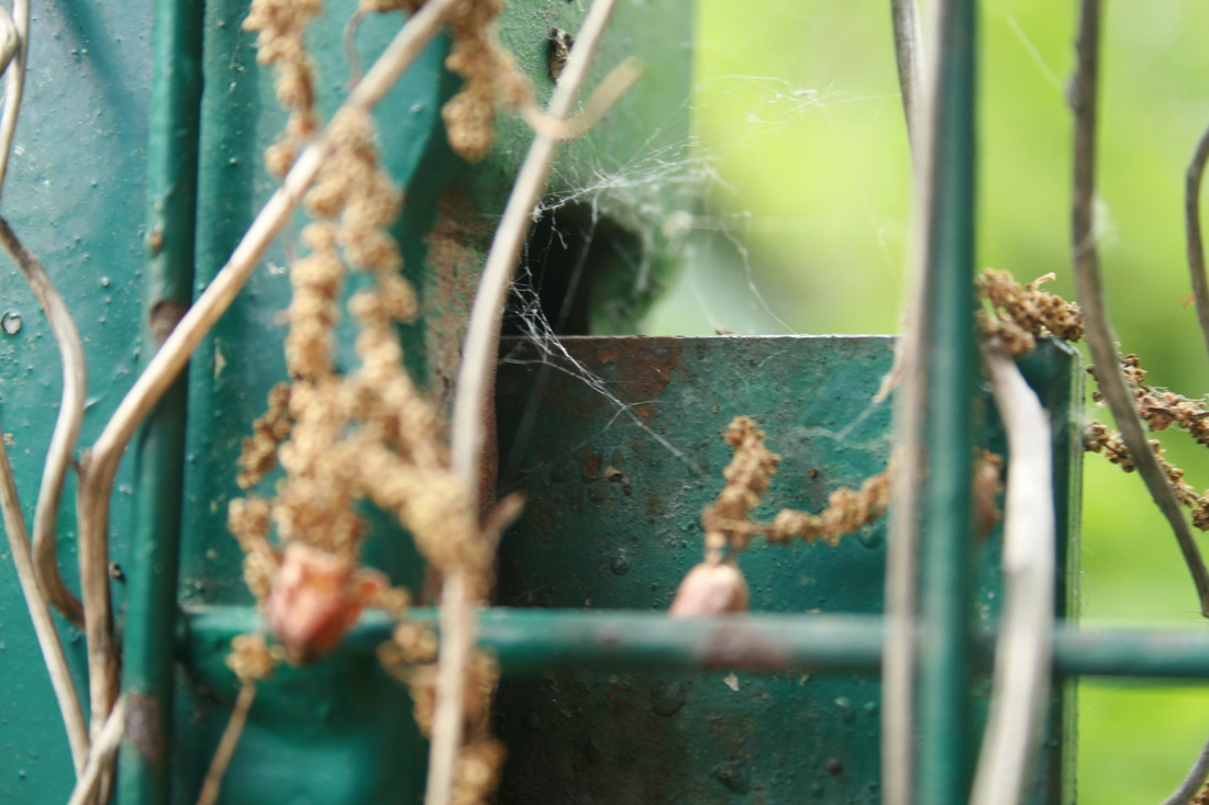
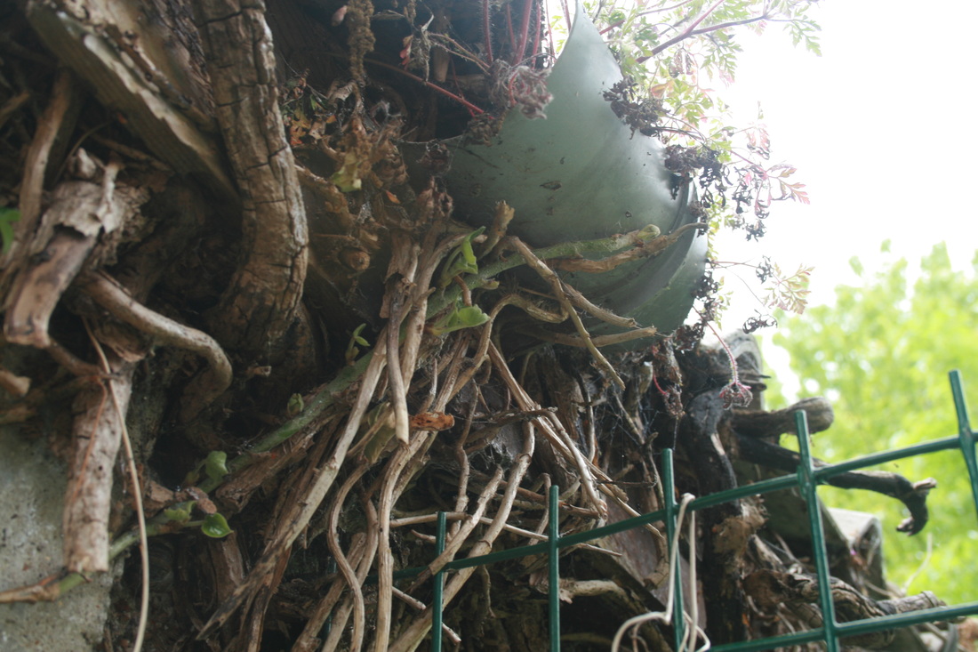


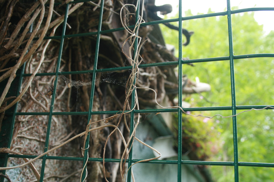
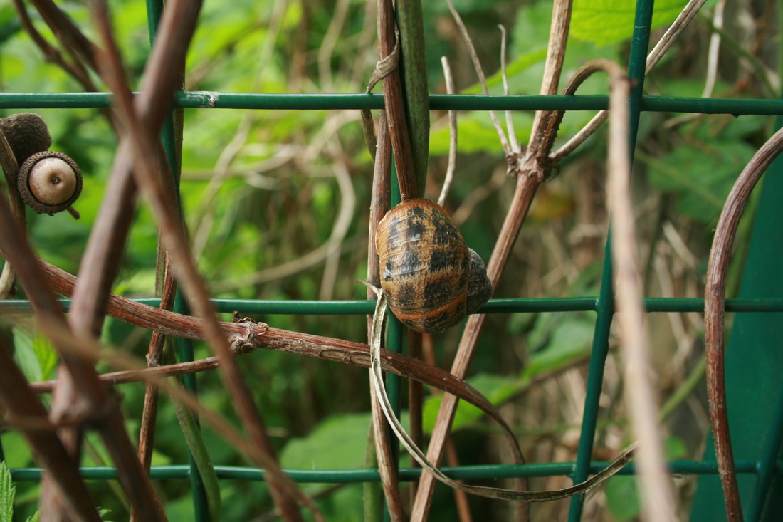
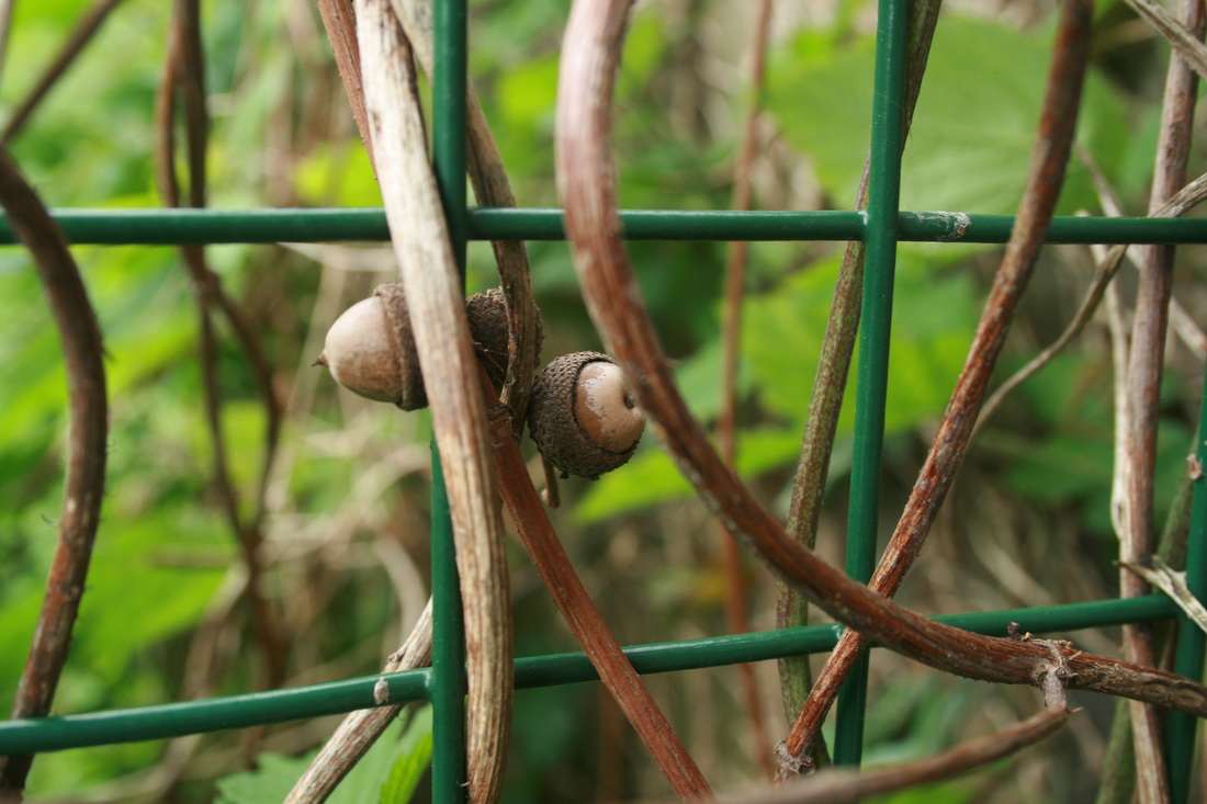

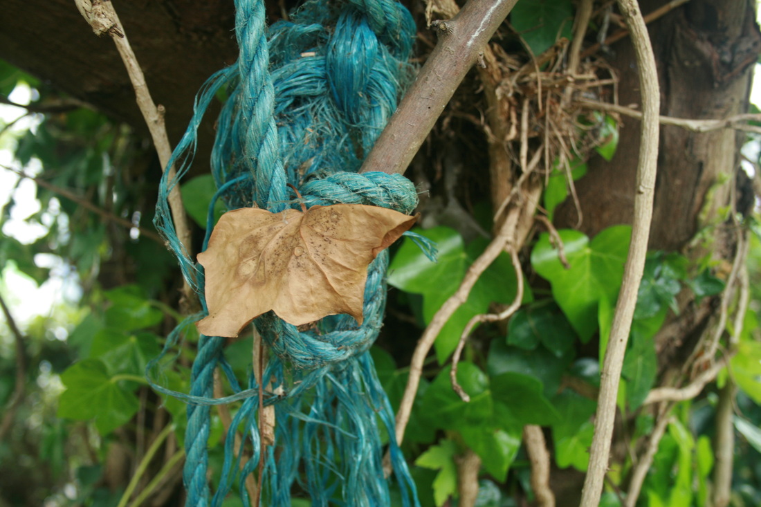
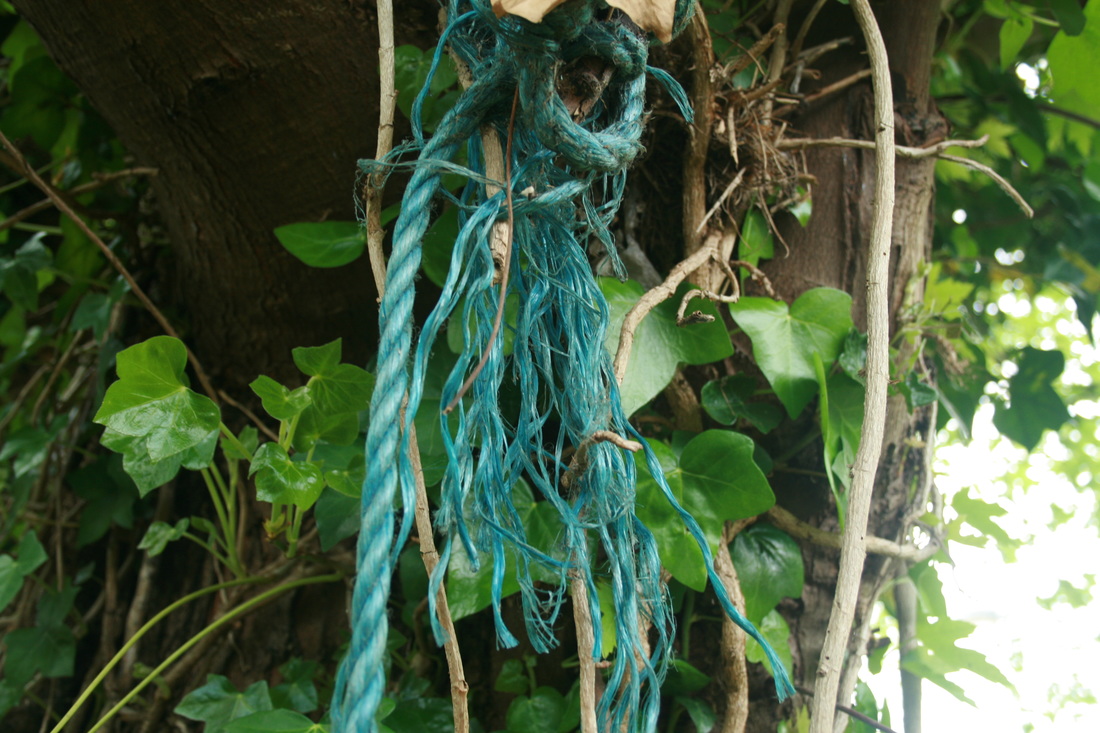
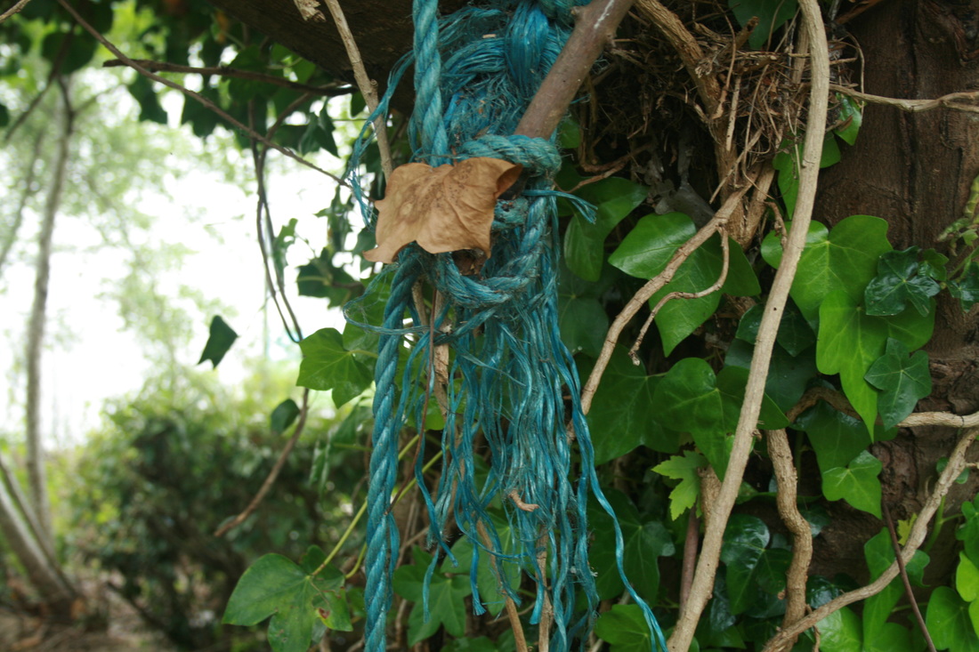
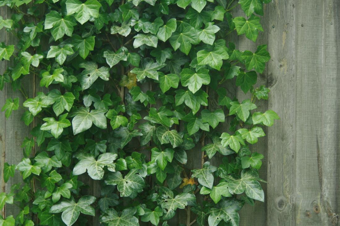
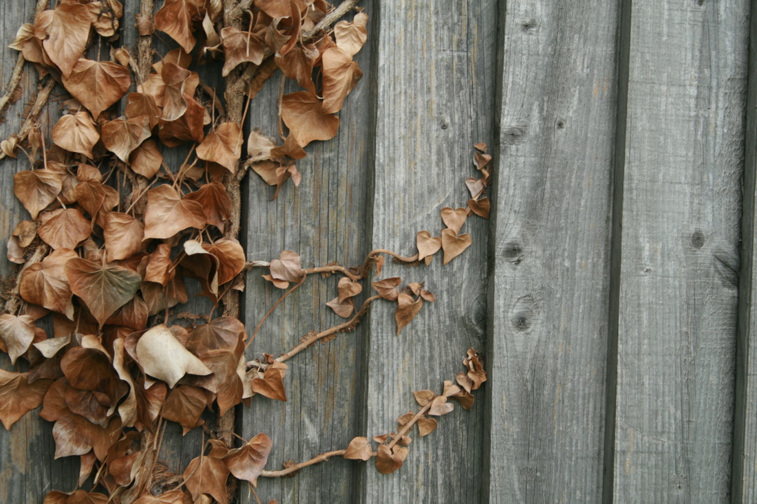


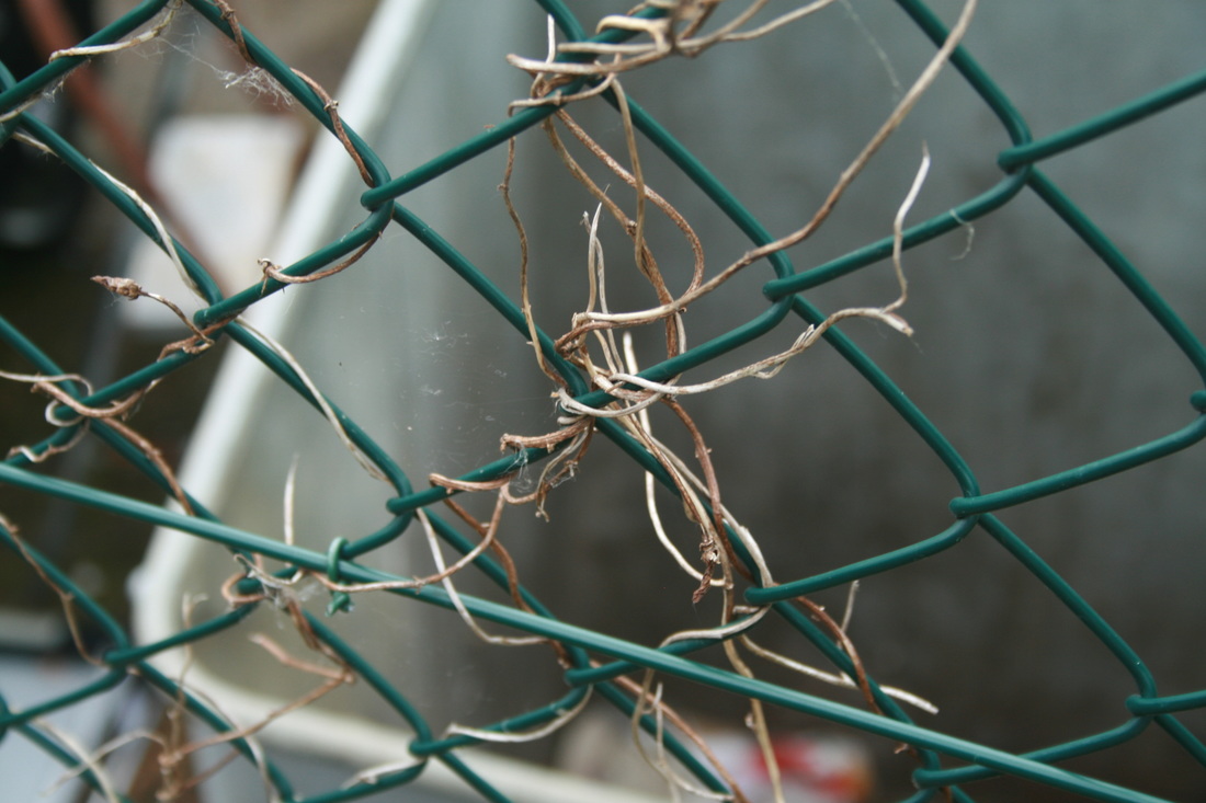

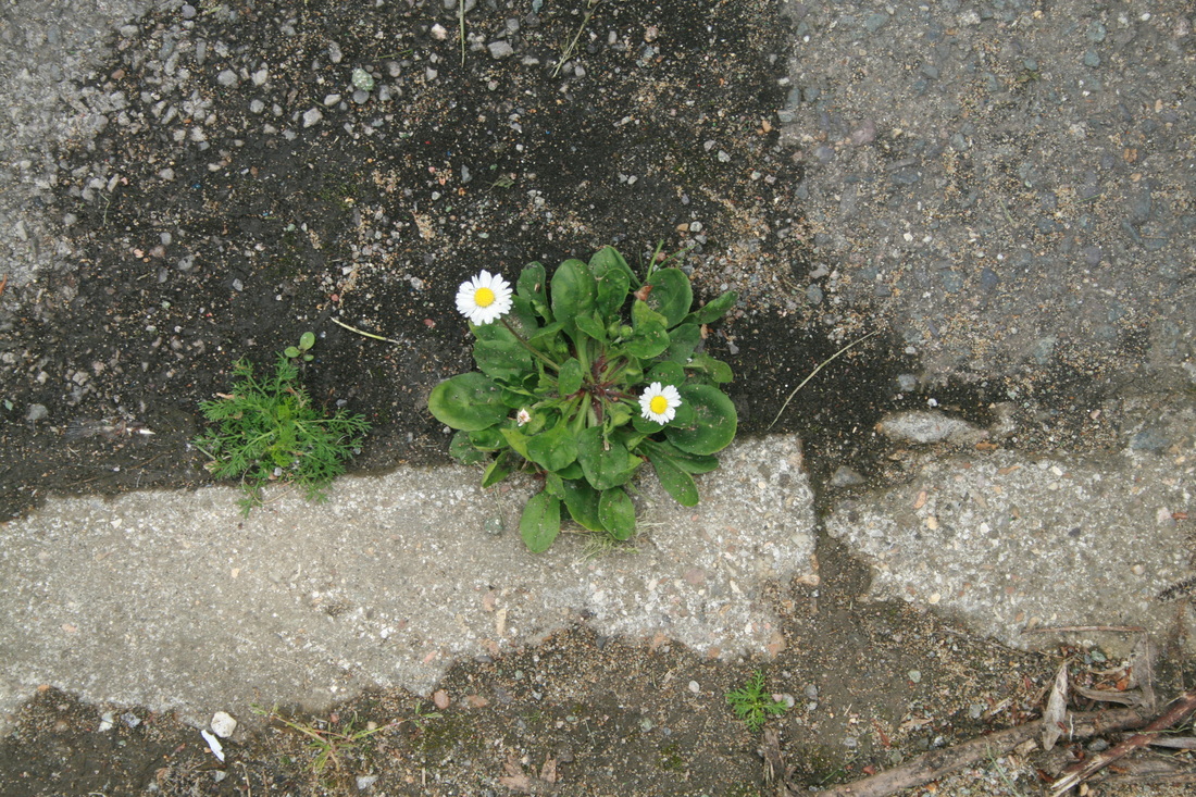
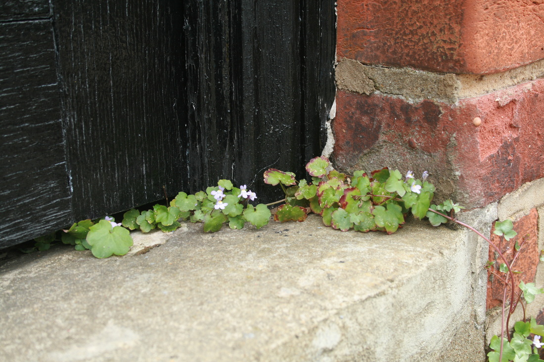
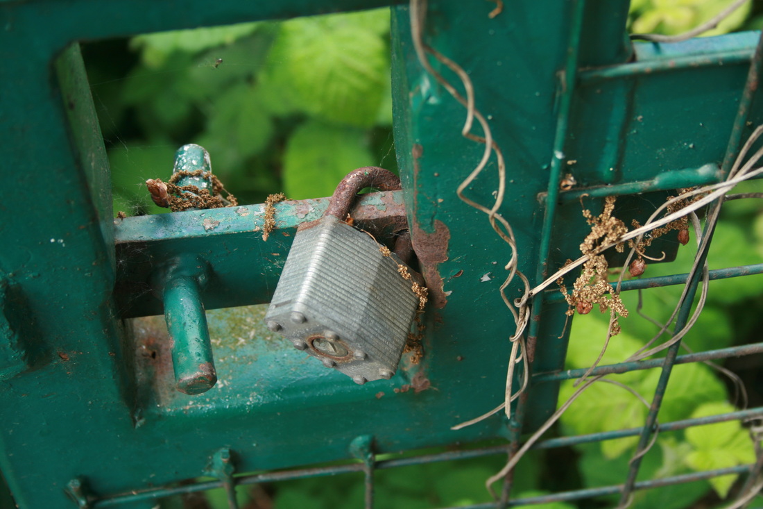
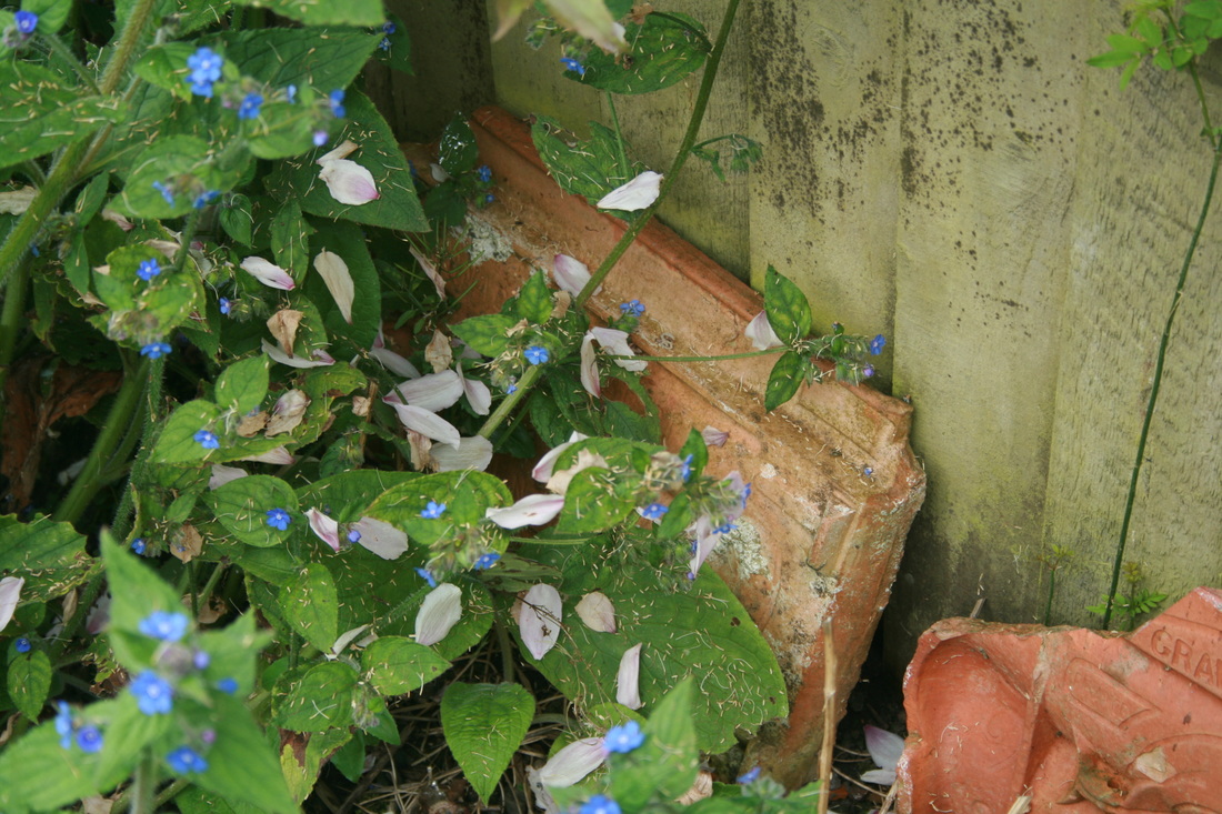
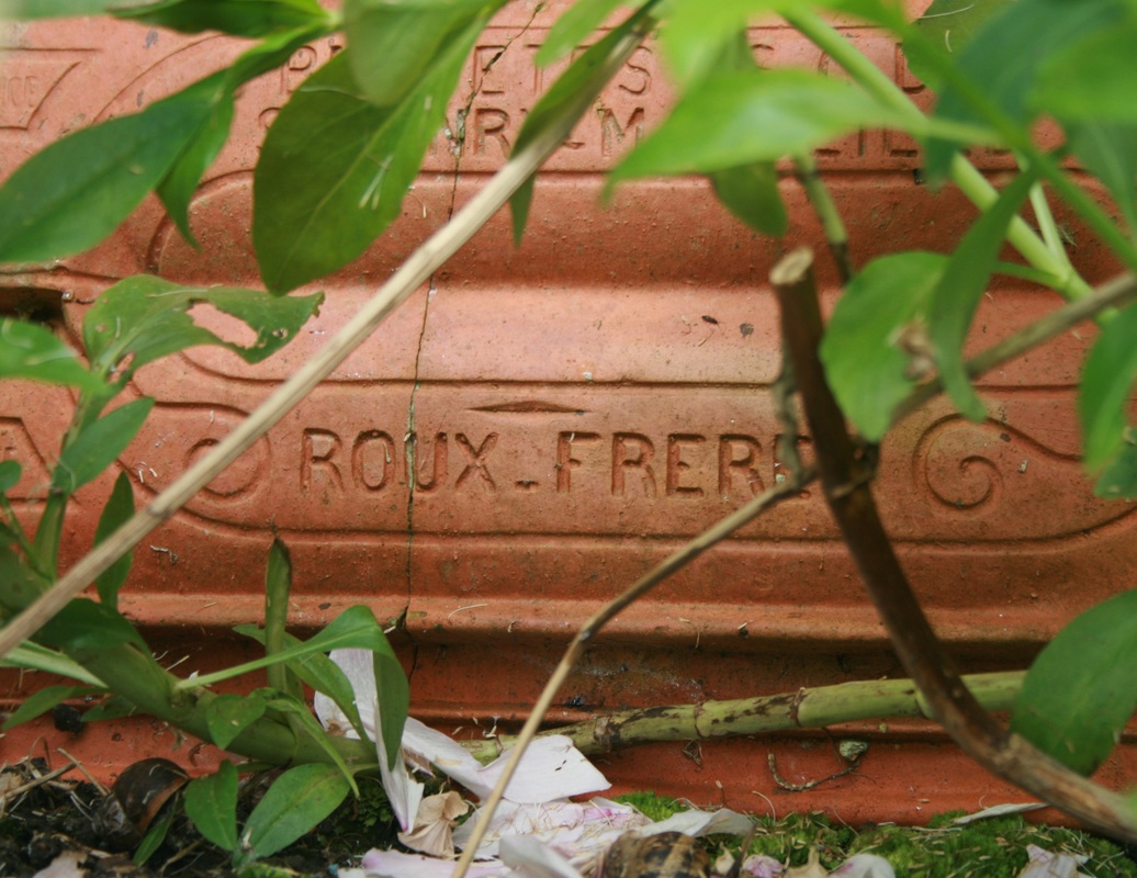
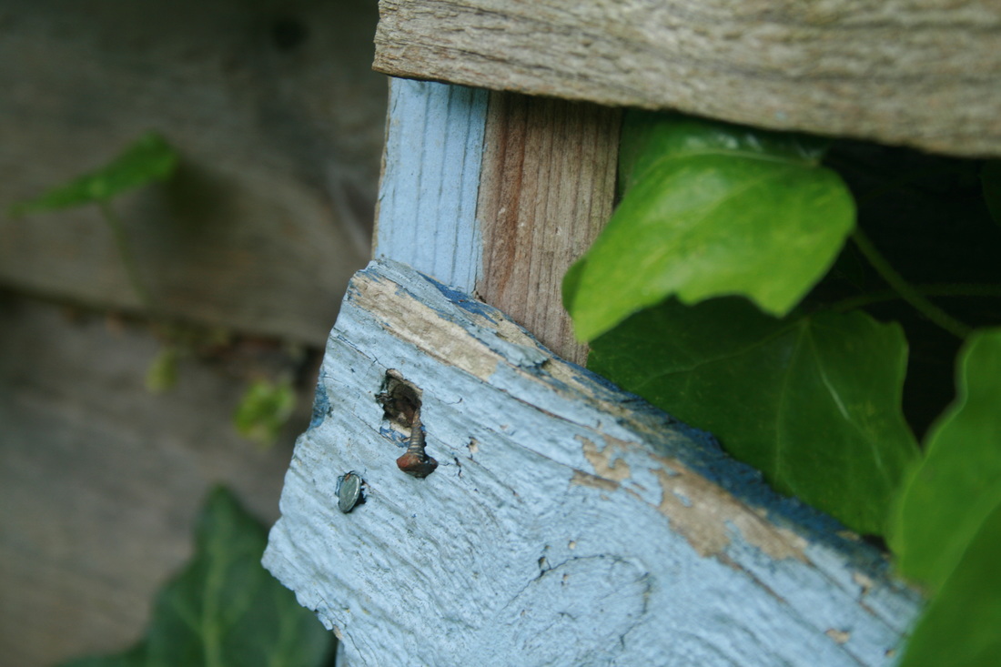
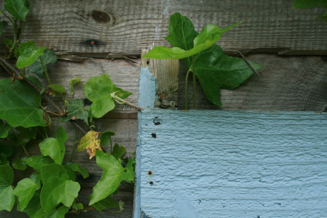
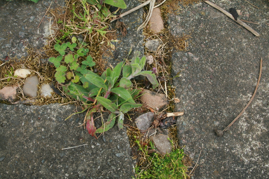
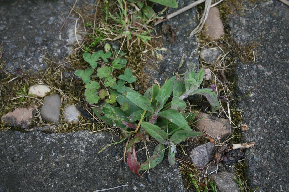
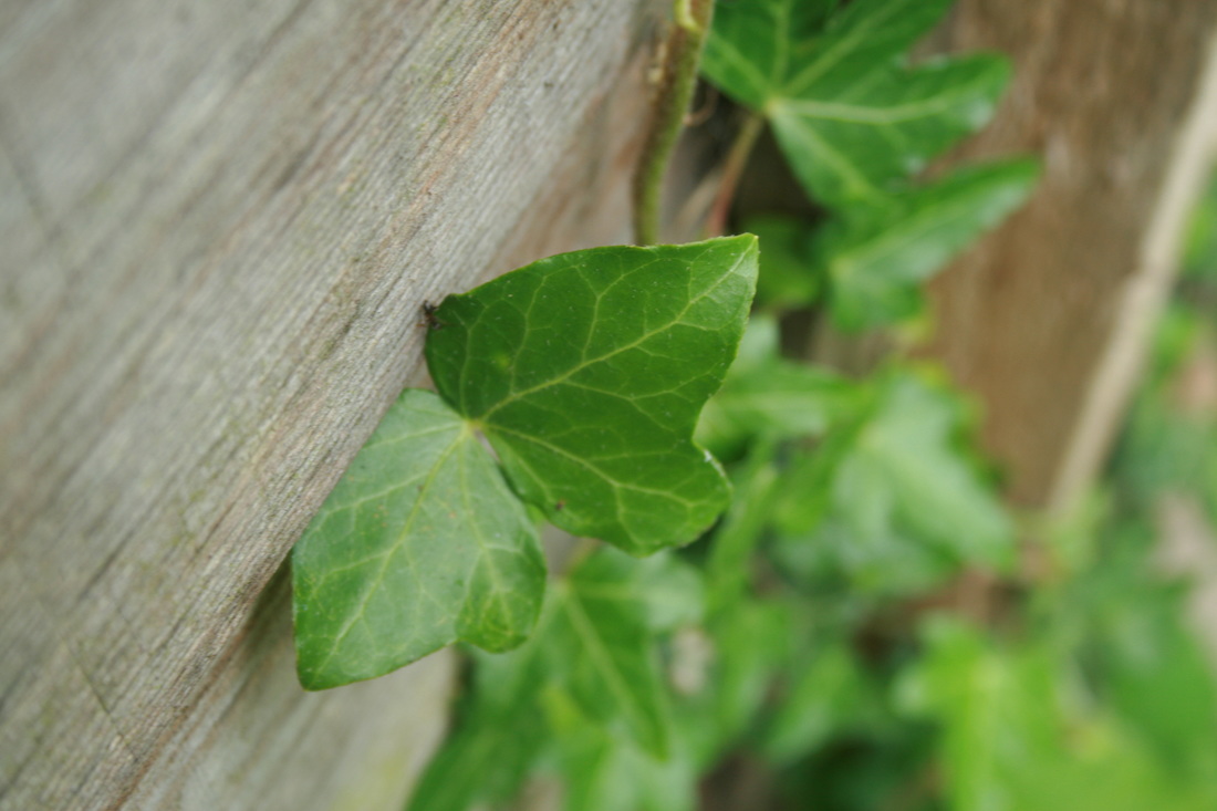
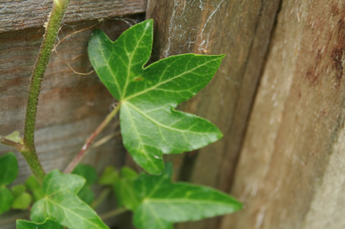
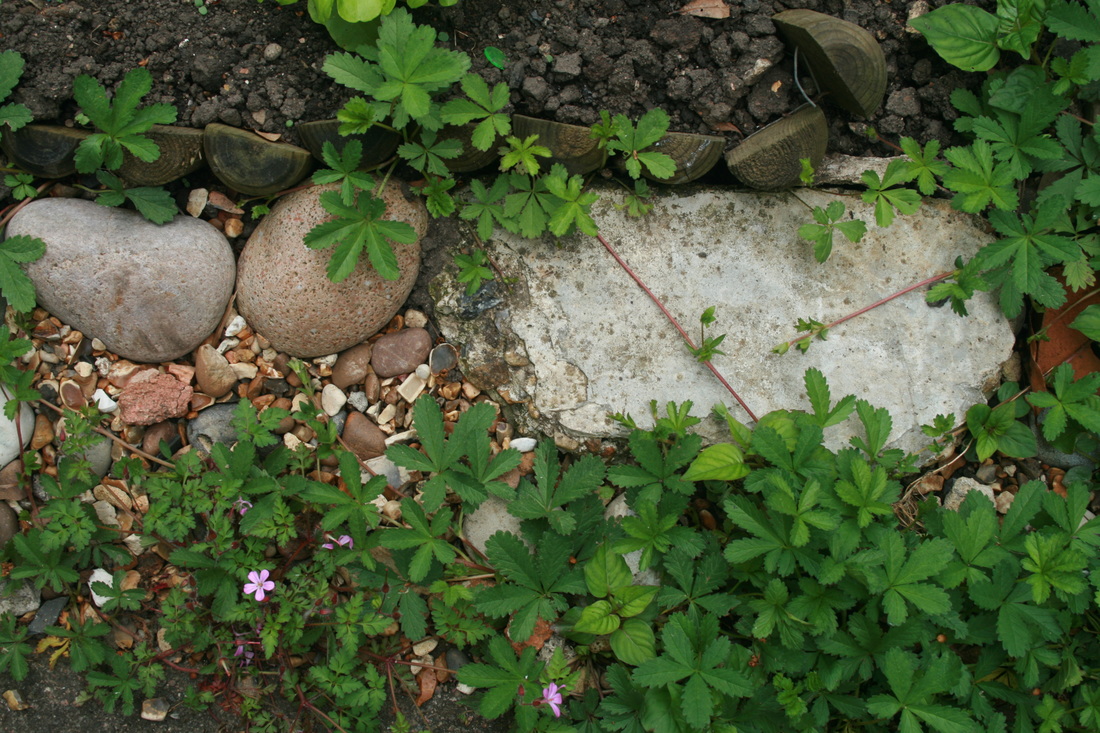
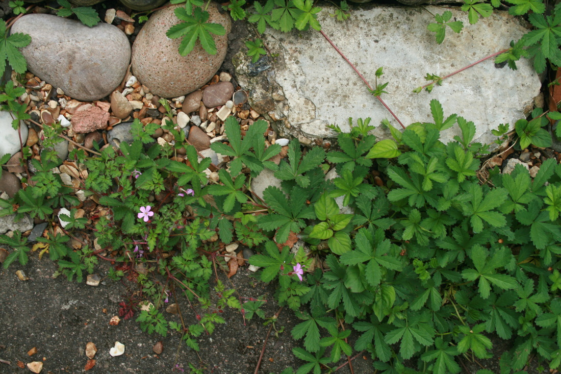
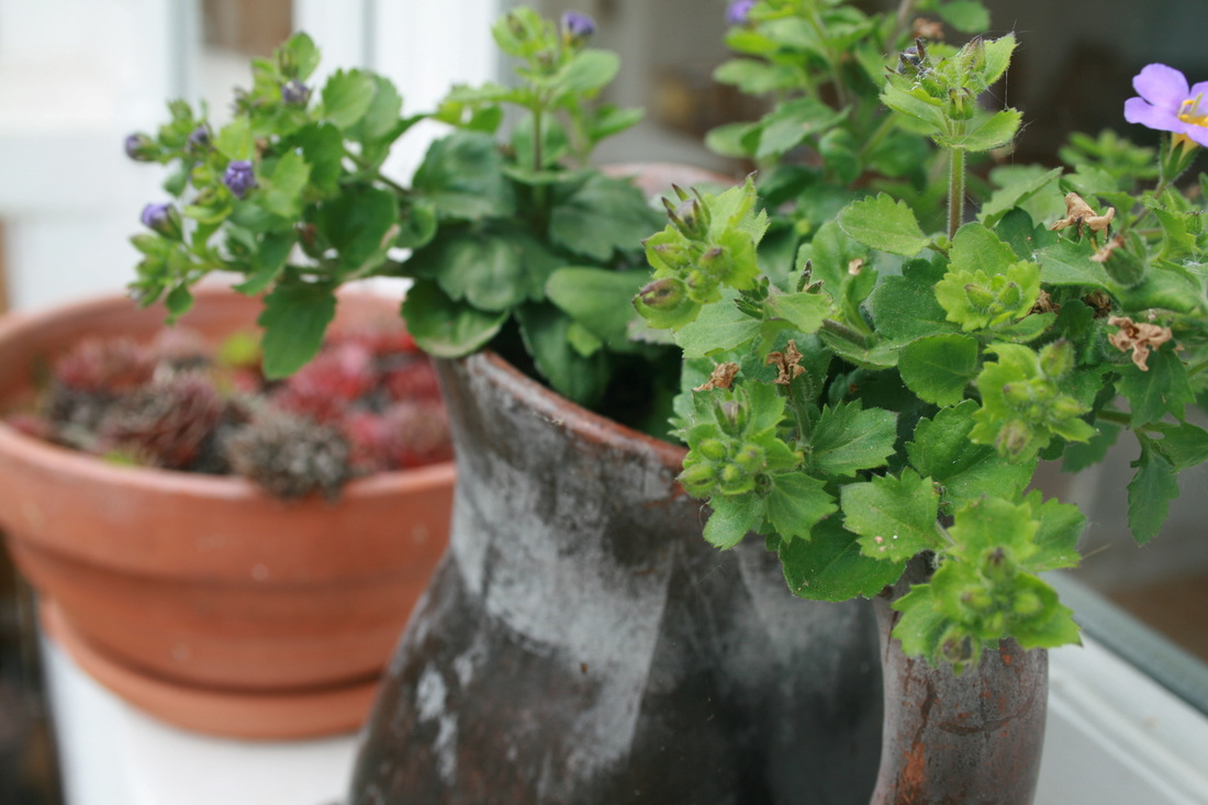
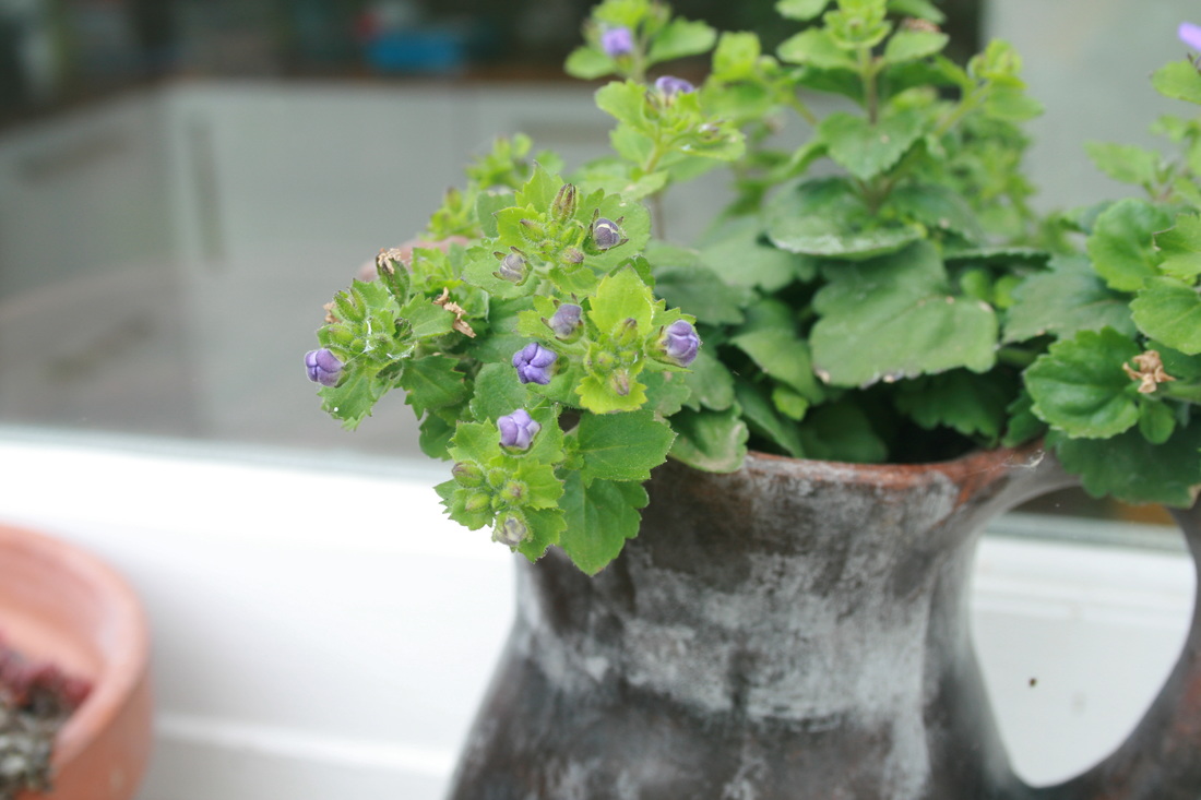
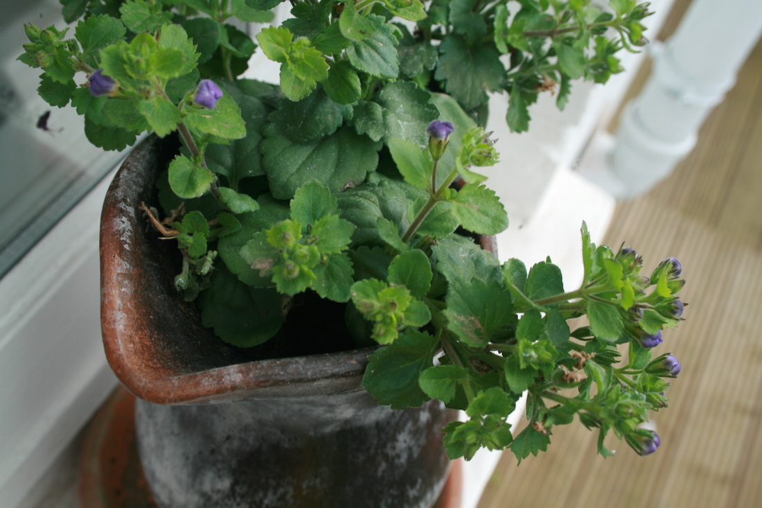
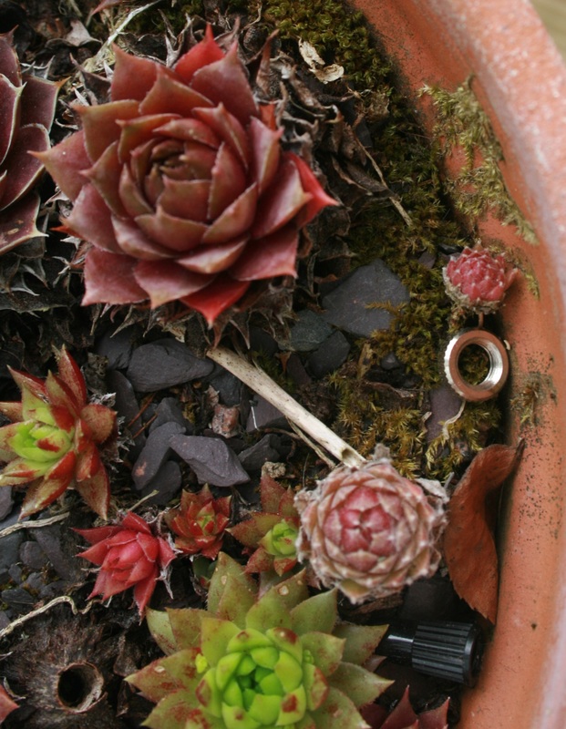
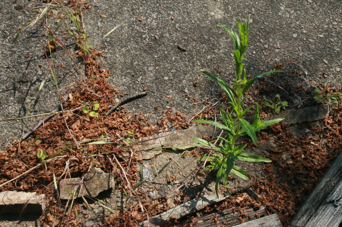
WWW: Some of the images are very close up. I used the 'macro' setting on my camera to help me focus on the objects that were close to the camera lens (e.g. the lock in the middle enlargement and the snail in the image on the fourth row, fourth across. This meant that I could explore how nature acts as a force at a level we wouldn't normally notice in normal life.
EBI: In some of the images, the focus is lacking (e.g. flower in the 8th row, 2nd across/ flower in 8th row, 5th across). Ideally, the focus would be really sharp around the flowers which would draw your eye to them. They are the source of colour and contrast in vibrancy in the images and they should be the most important thing. However, the lack of focus means that the images are a bit bland and don't have as much life.
EBI: In some of the images, the focus is lacking (e.g. flower in the 8th row, 2nd across/ flower in 8th row, 5th across). Ideally, the focus would be really sharp around the flowers which would draw your eye to them. They are the source of colour and contrast in vibrancy in the images and they should be the most important thing. However, the lack of focus means that the images are a bit bland and don't have as much life.
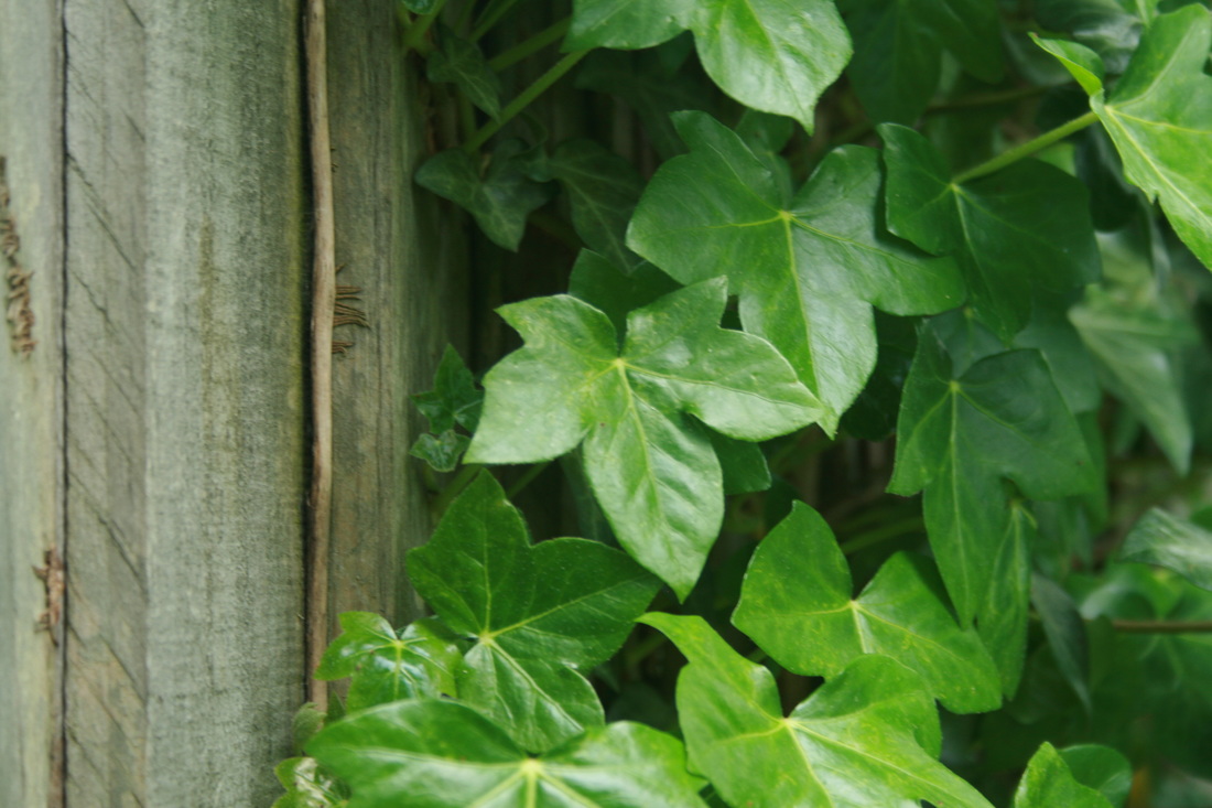
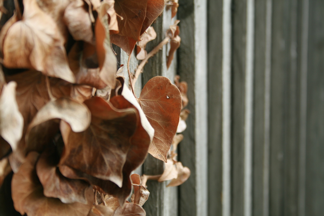
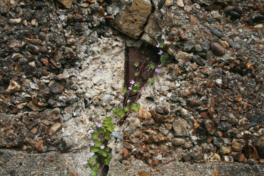
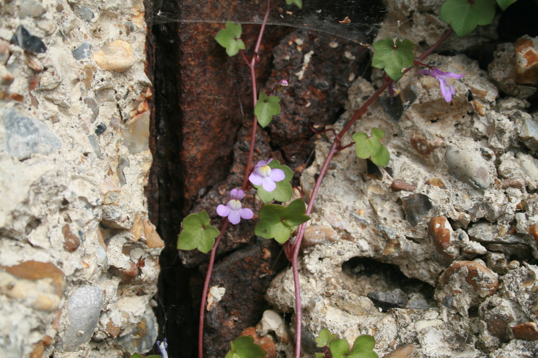
Second response
|
|

|
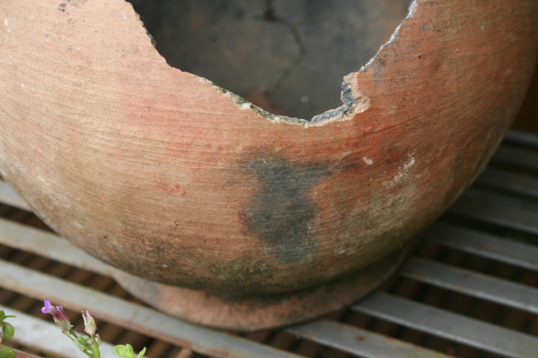
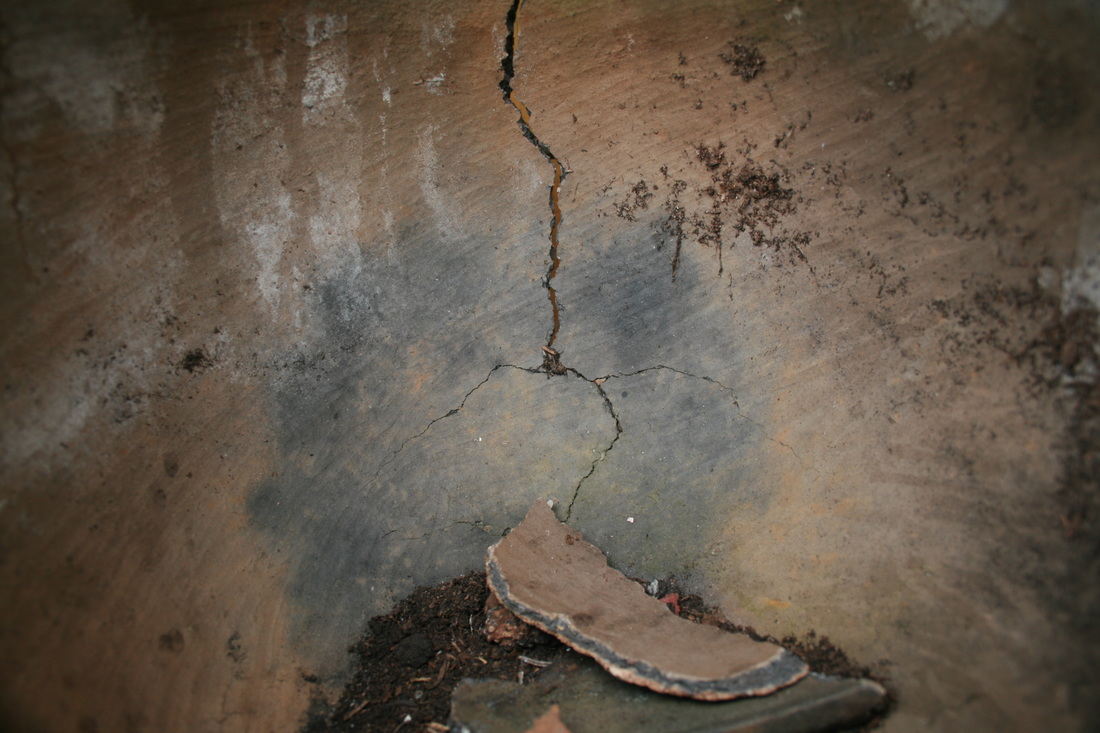

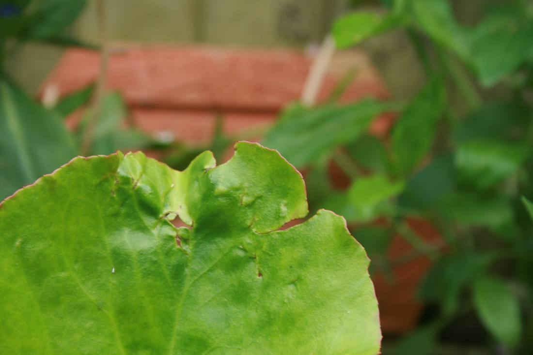
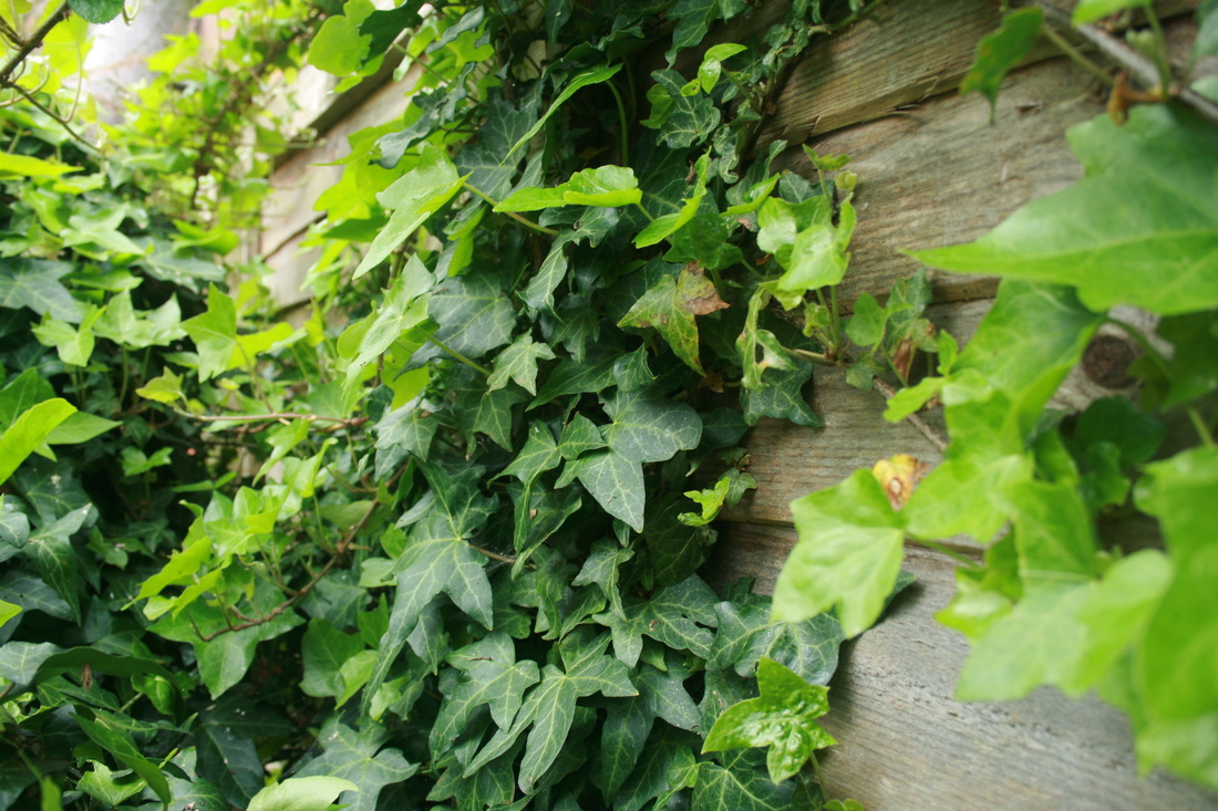
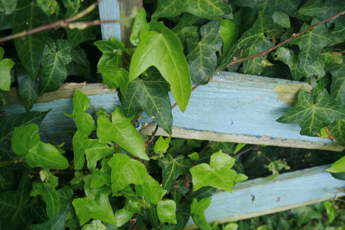

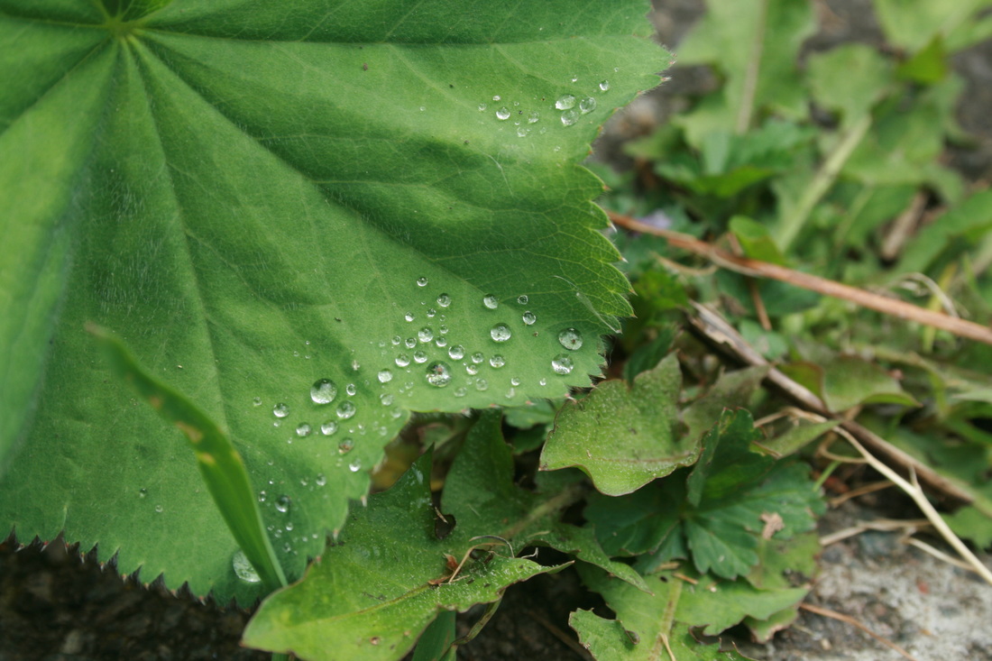
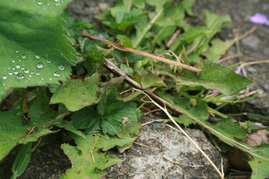
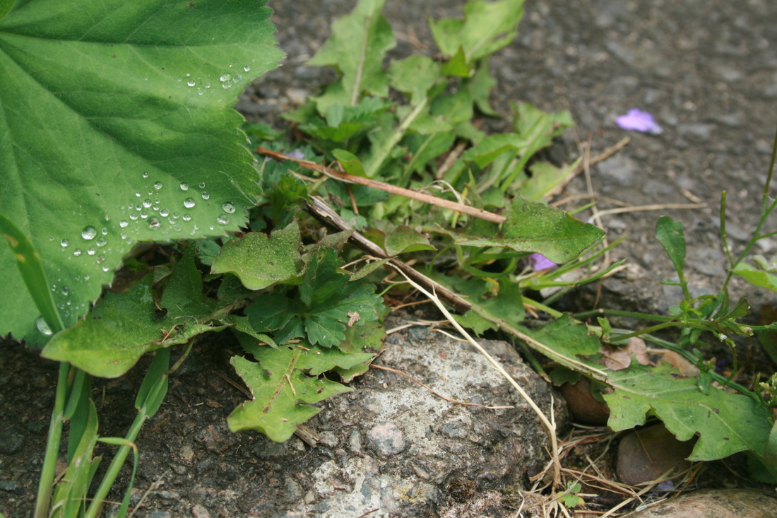


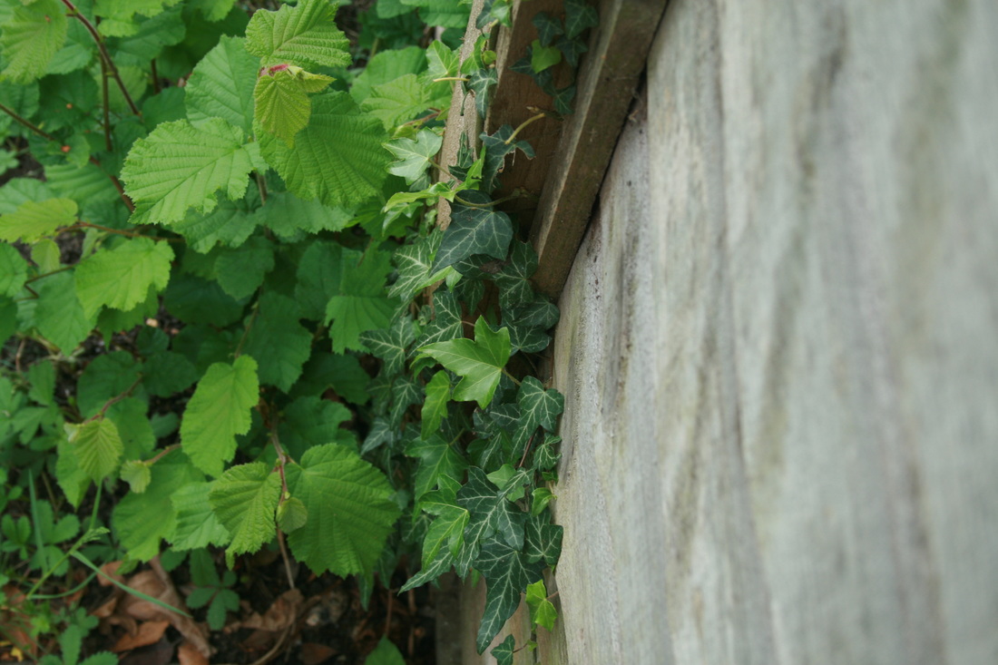
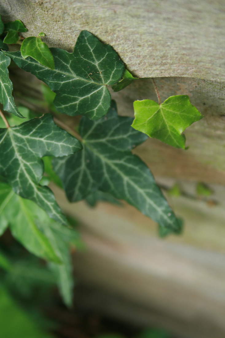
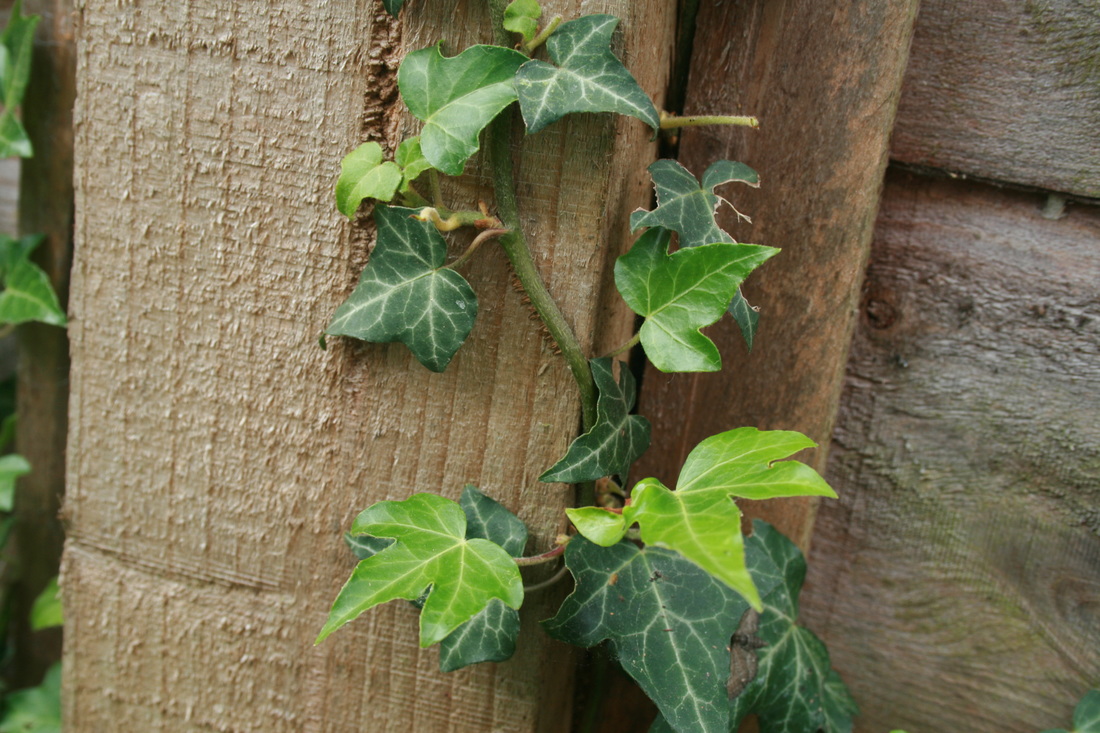


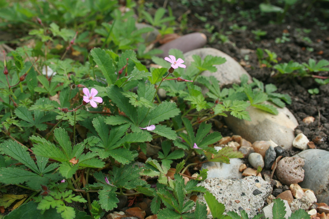
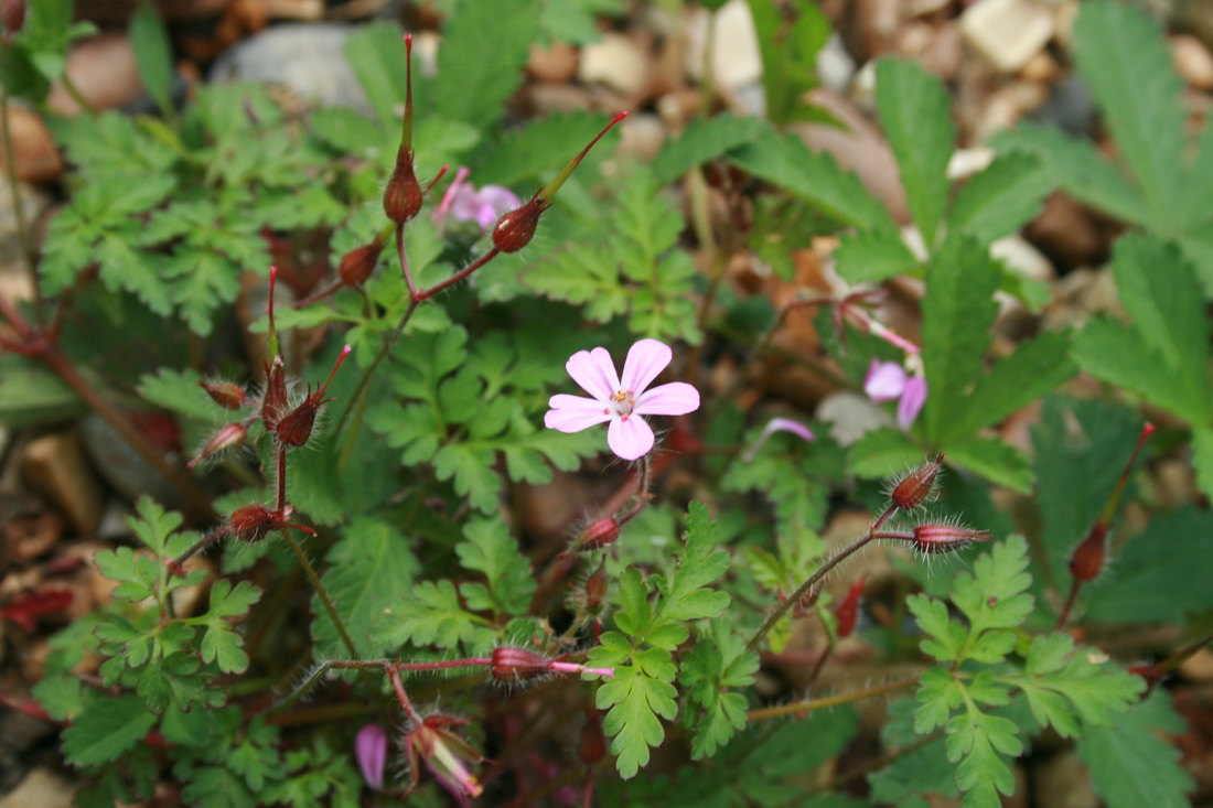
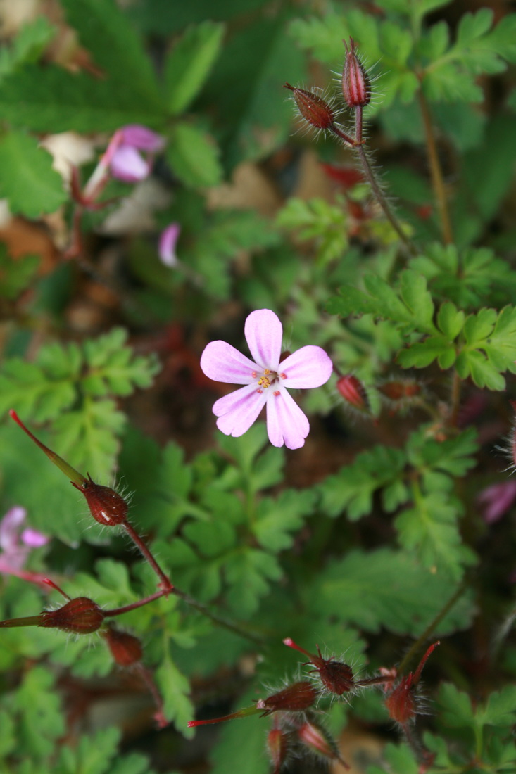

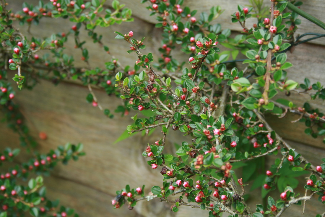
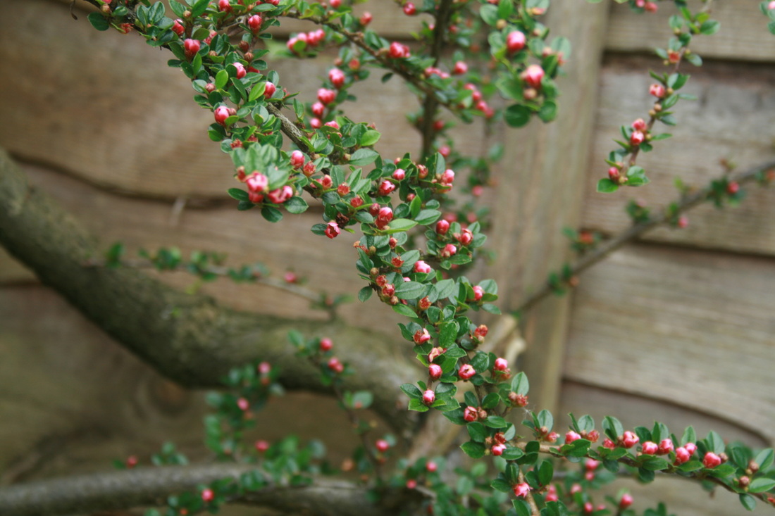
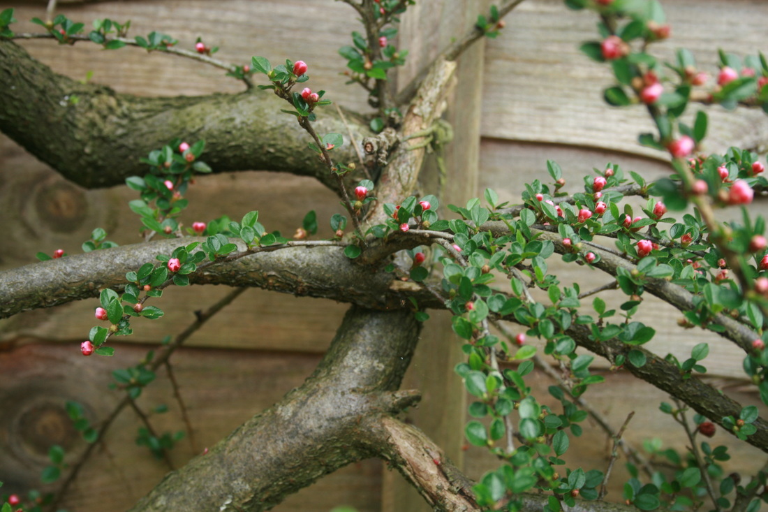

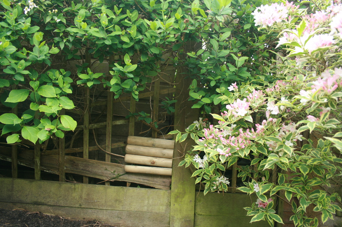
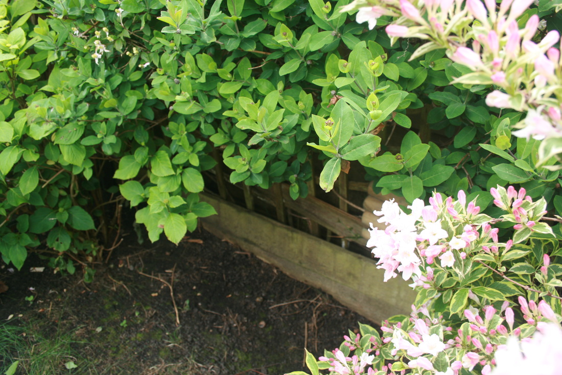

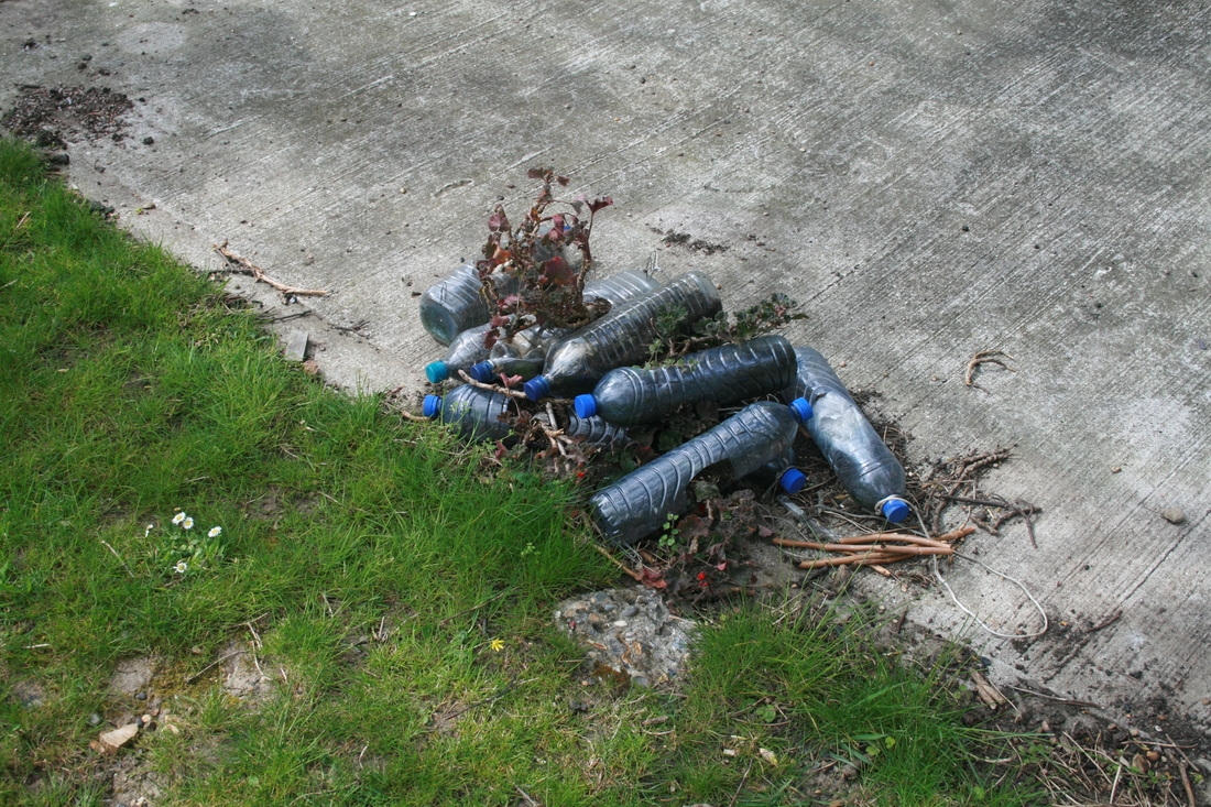
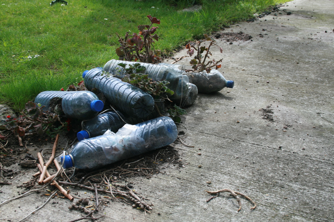
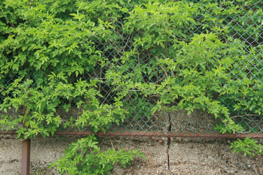
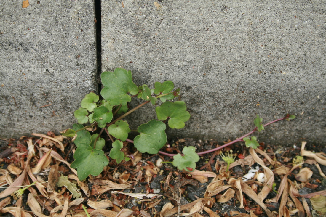
WWW: Nearly all the images are so sharp and with great focus. This gives an effect of precision and detail and makes the images so eye-catching. For example, in the 8th row, first image the little hairs on the stems make the flower seem like a multi-headed alien rearing up with the flower the brain. Or, in the second enlargement, the water droplets are so delicate with the pink petal lying in the fold of the leaf; these really contrast against the rough, hard concrete ground.
EBI: A few of the images are overexposed. (9th row, 6th across/10th row, 1st image/ 6th row, 6th across). Too much light has been let in as the shutter closes; this means that they are too bright and quite painful to look at. In the third example, the sunlight creates a glare in the corner image and distracts the viewer to it (away from the leaves in the centre of the frame). The corner of the image is anywhere but where I want the viewer to be looking at and we are left with a pool of light with bits of a tree.
EBI: A few of the images are overexposed. (9th row, 6th across/10th row, 1st image/ 6th row, 6th across). Too much light has been let in as the shutter closes; this means that they are too bright and quite painful to look at. In the third example, the sunlight creates a glare in the corner image and distracts the viewer to it (away from the leaves in the centre of the frame). The corner of the image is anywhere but where I want the viewer to be looking at and we are left with a pool of light with bits of a tree.
Nadav kander - 'half life'
As part of his 'half life' project, Kander visited the town of Pripyat in Ukraine, the home of the Chernobyl nuclear power plant which infamously exploded on the 26th April 1986. Kander went back to the (still radioactive) area to see and photograph the deserted ghost town, where buildings are crumbling and nature is retaking the environment.
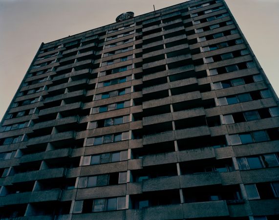
At first impression, this image appears a bit bland and unrefined. However, I love this photograph because of the sense of scale and imposing power that it brings across. This effect is created by Kander standing below the building, with his camera facing up to it, and the apartment block filling the frame. This technique is used especially in film, where characters who hold the power in the scene are not only bigger but shot from below (e.g. the camera is looking up at them, level with their waist). The tones are very limited, and the dark greys and blacks that we see are moody and brooding, which set the ambiance of the whole picture. These flats were property of people, who lived in them, cared for them, and owned them. While Soviet buildings were identical and monononous, they were still homes. Kander is really powerfully expressing the building as the empty shell of a community.Furthermore, if you look at the image carefully it is clear that a lot of thought has been put in in terms of detail. Kander has noticed the empty windows which dot the face of the building in no apparent pattern. Probably shattered from the explosion, they show a legacy that the disaster has left.
Artist comparison
Kander |
me |
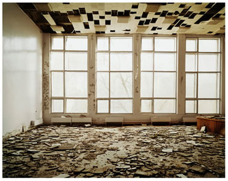
|
|
Nadav Kander uses four sides of the room he is in to really good effect. Through the long windows, we can see the faint outline of the tree shrouded in mist. The white wall, on the left, has a strangely perfect sheen and we can even see a reflection of the window panes. The ceiling has this interesting pattern of rectangular black gaps, square ridged tiles and white bricks. It appears as if the shattered debris on the floor has fallen from these gaps, and yet they remain in such perfect shape, it feels impossible that that could be the case. Maximising four out of (probably) five of the walls means there is no real focal point and there is so much detail packed into the frame. We have a source of the light, we have debris reflecting the chaos of the the explosion from the reactor and the escape, and yet we have these almost immaculately formed left wall and ceiling.
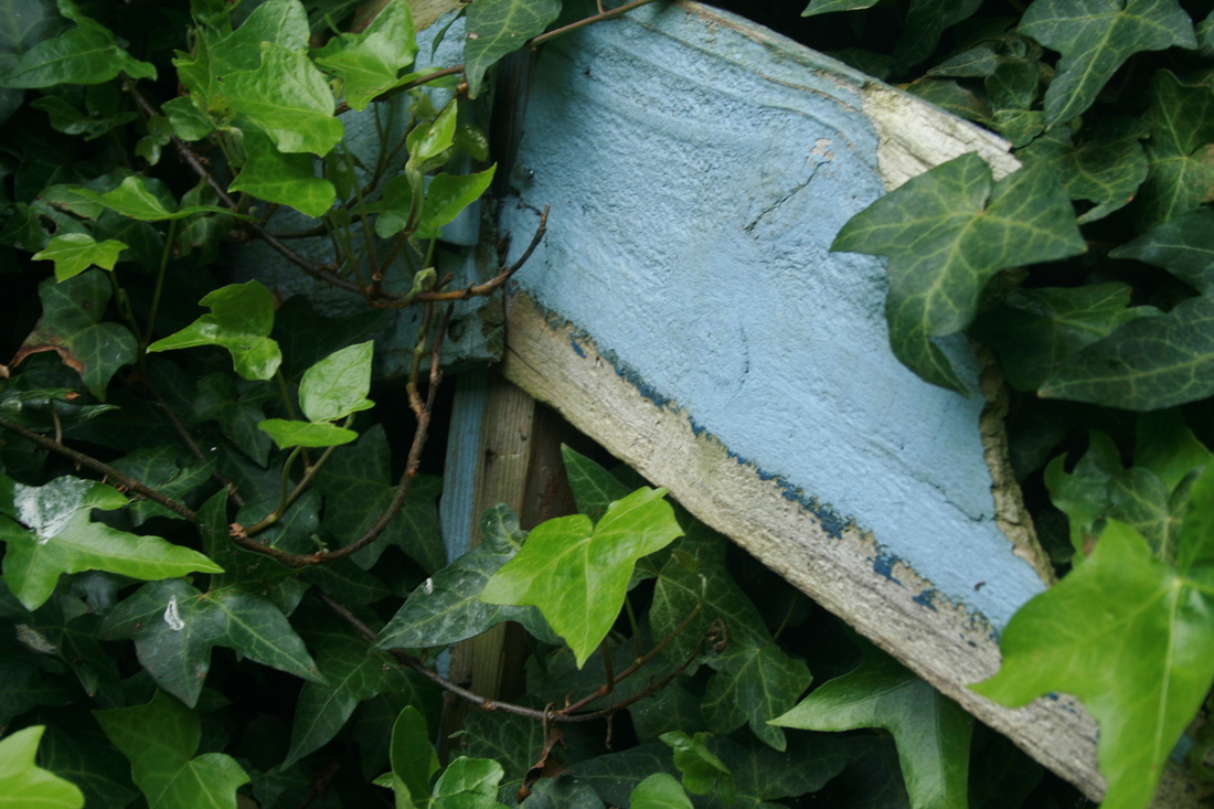
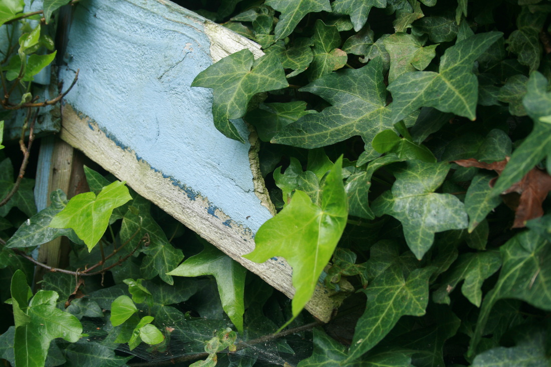
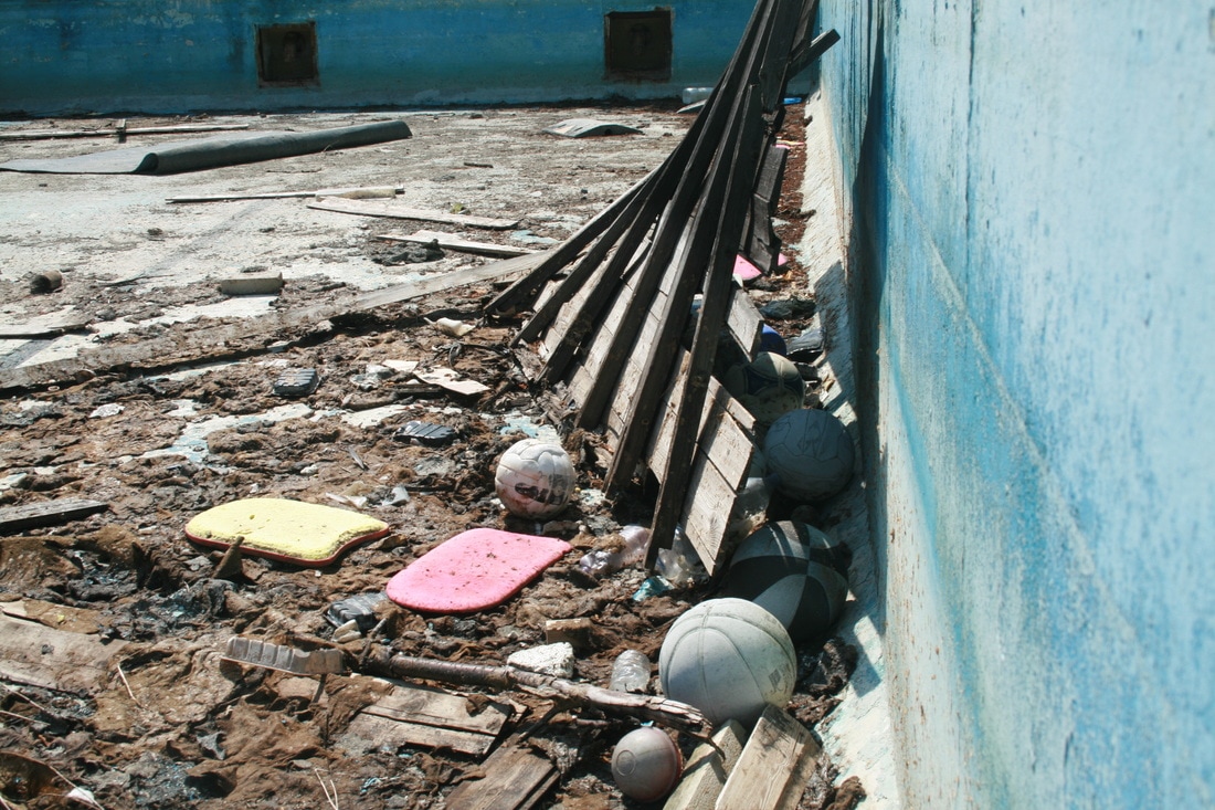
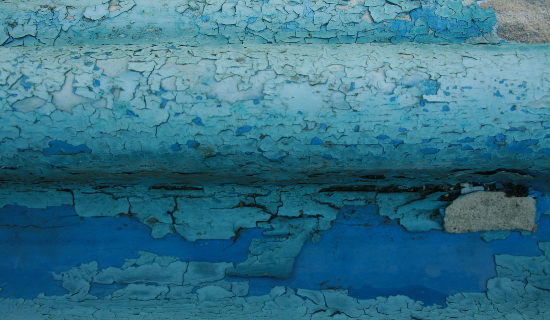
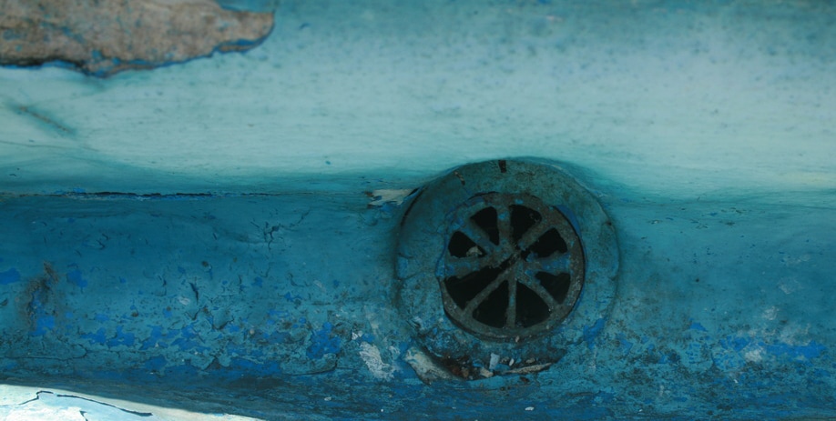
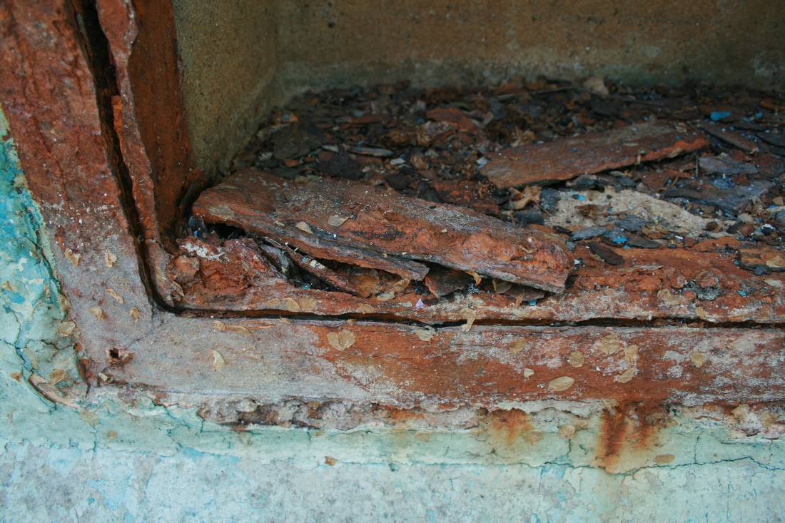
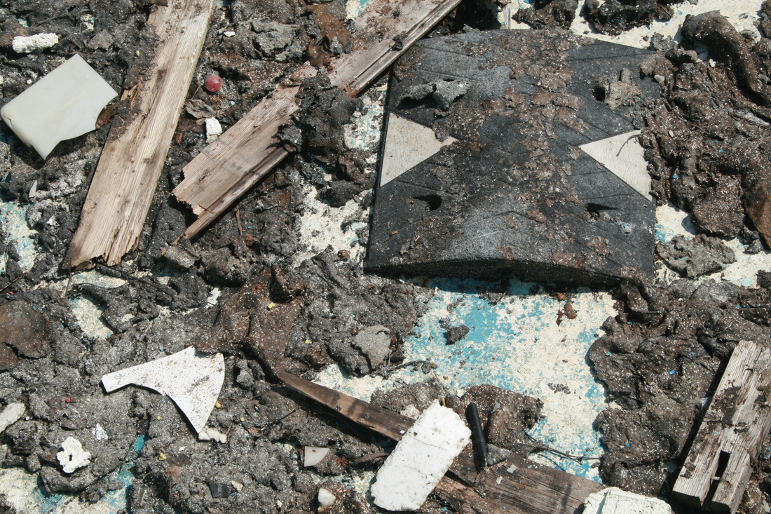
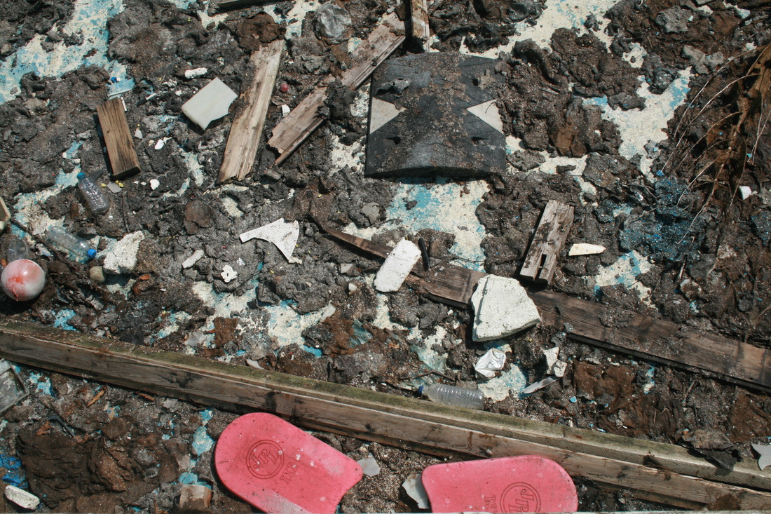
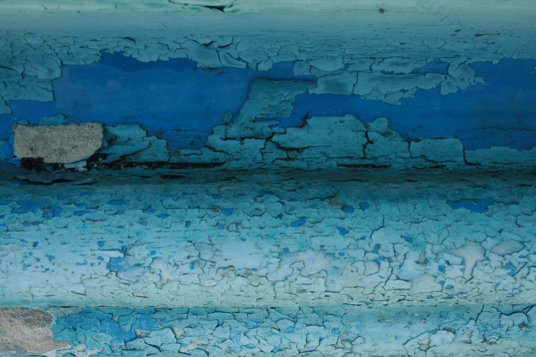
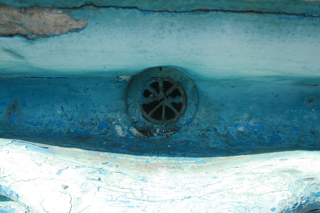
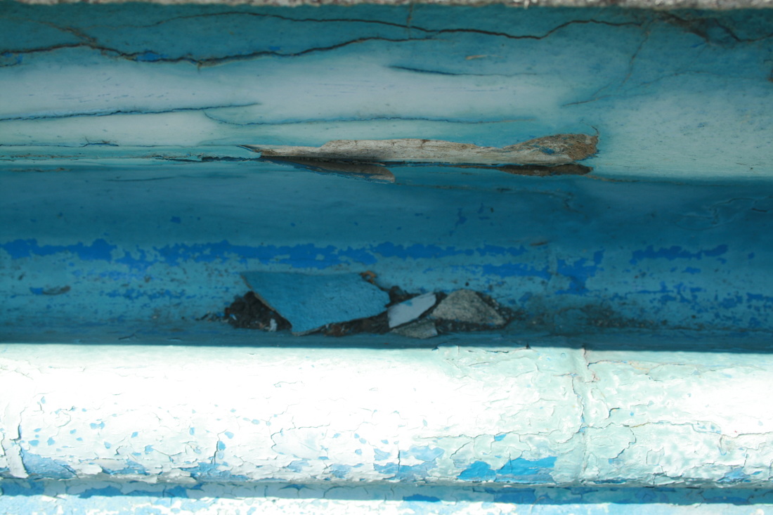
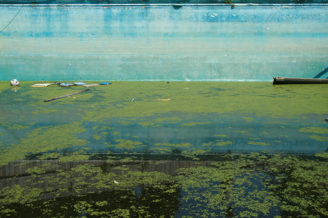
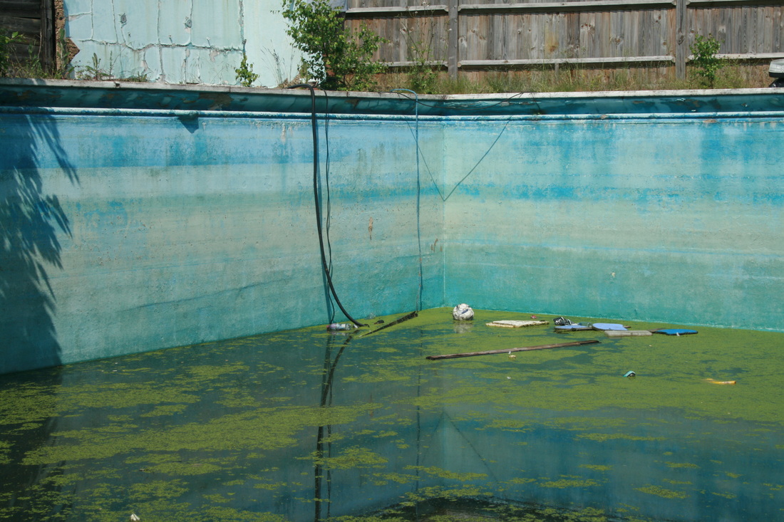
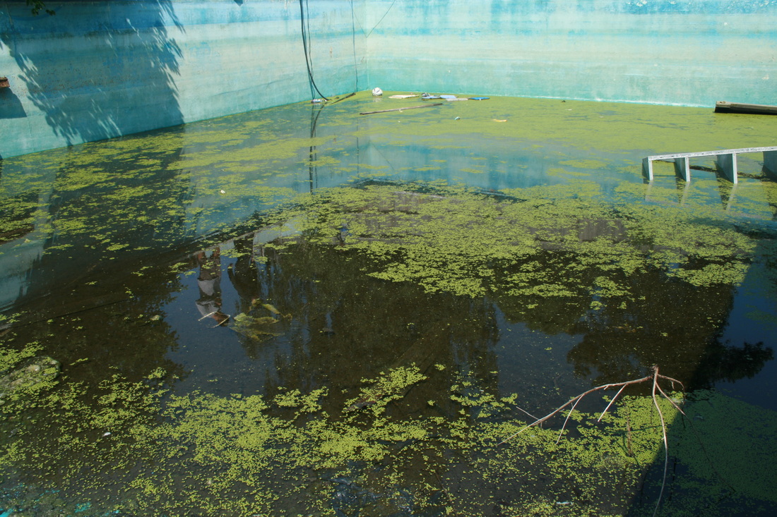
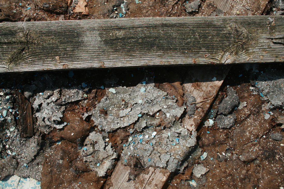
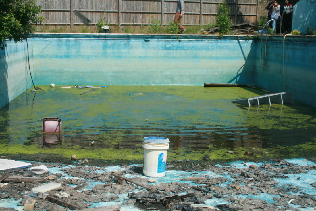
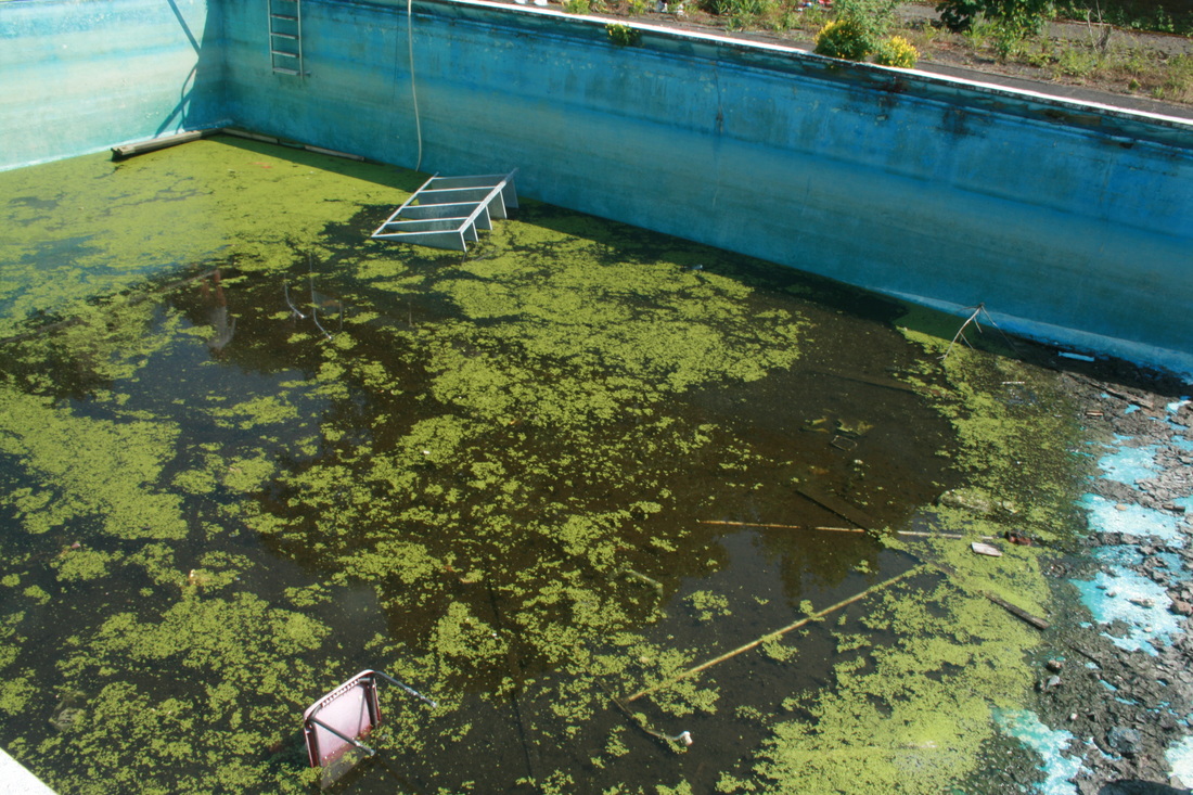
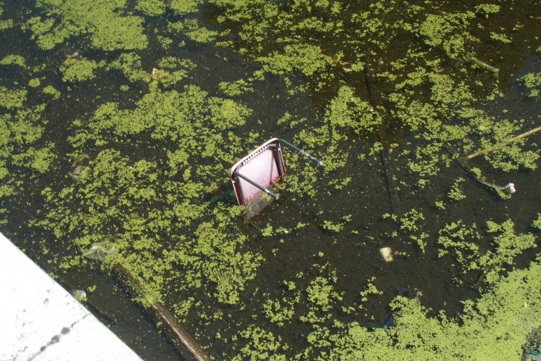
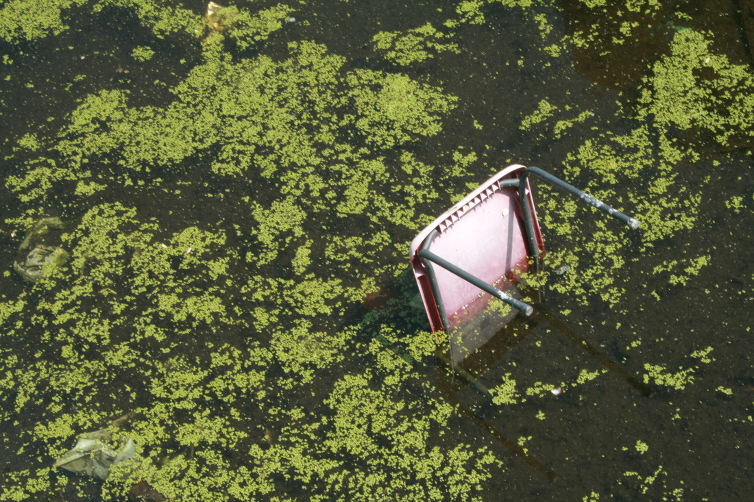
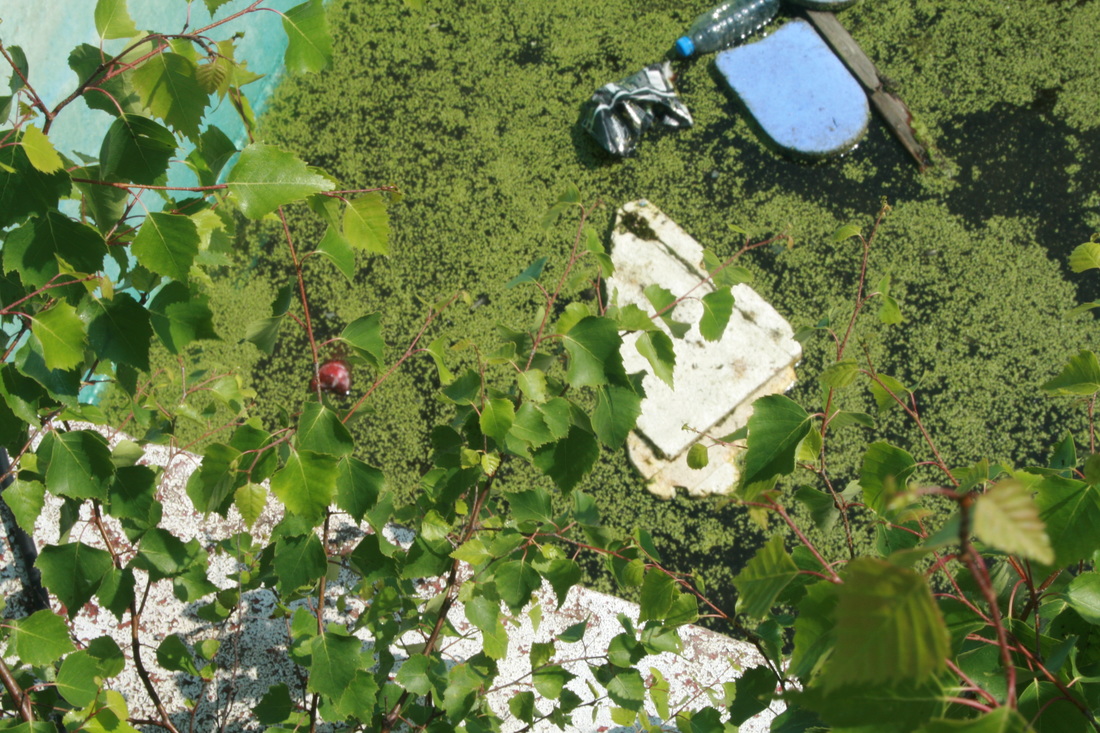
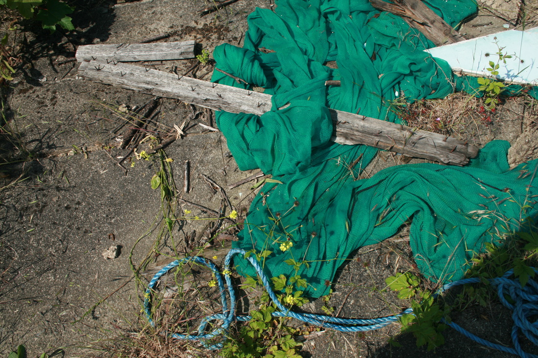
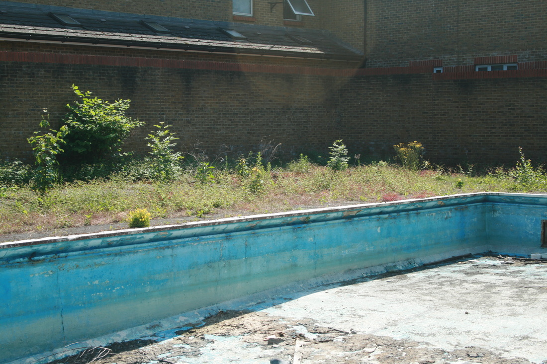
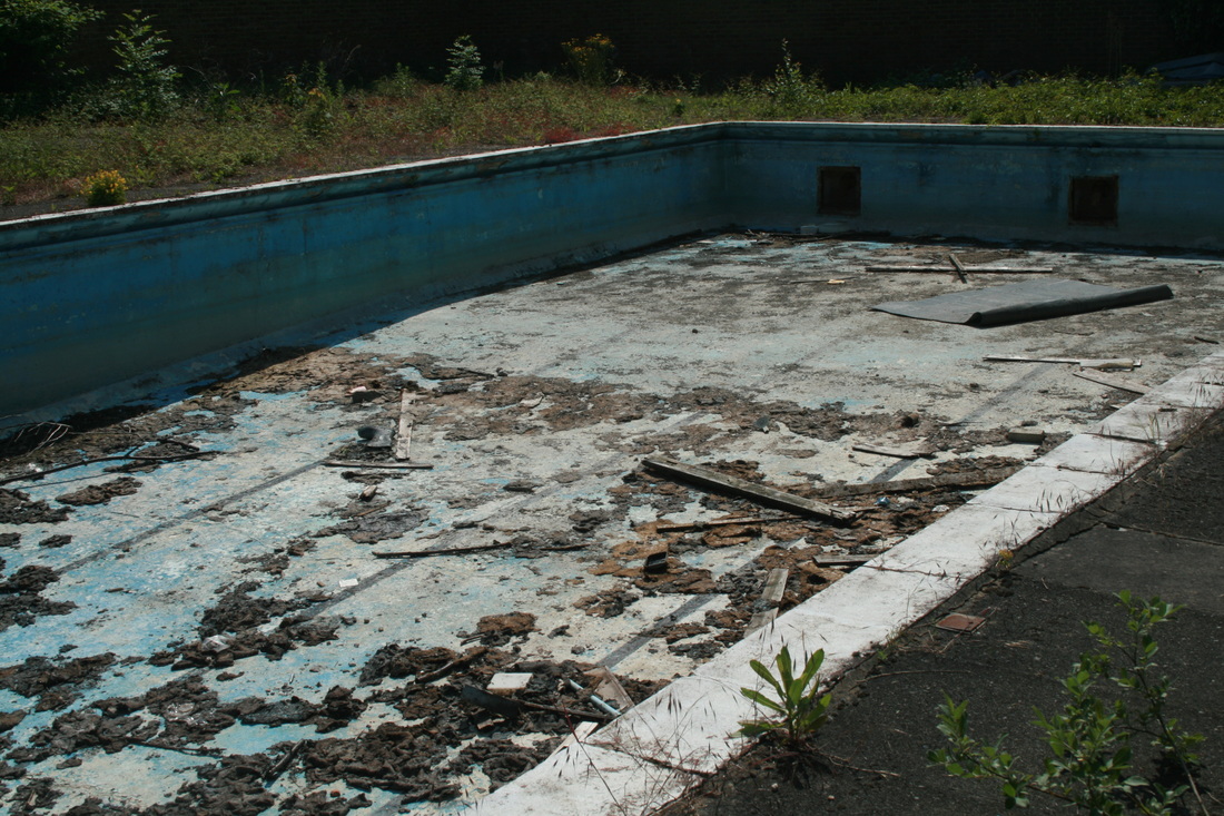
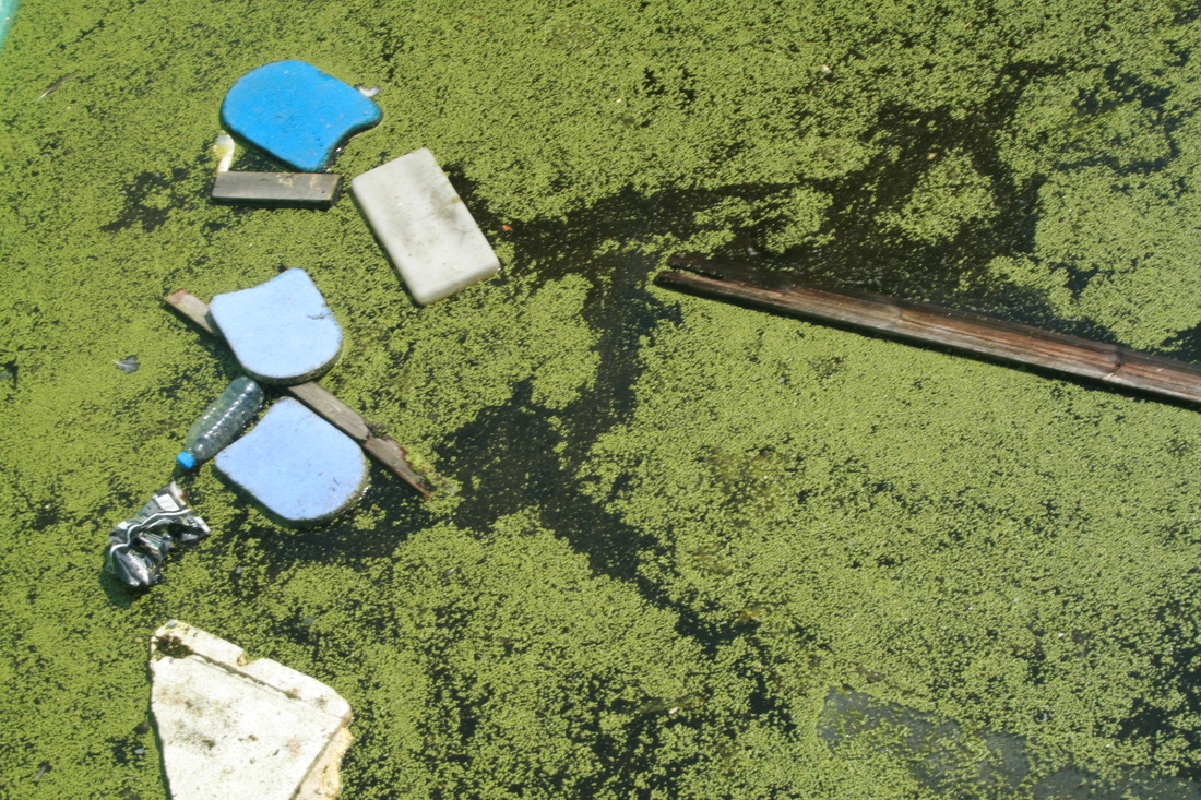
However, in my response, I feel like my image isn't so well framed. The picture was taken at too low of a height, meaning that not enough of the walls and surroundings are in the image. Nevertheless, I like that I had more variety in the debris; the balls, surfboards, fence (along with the wooden debris) give the base of the image substance and texture. Also, my image is a lot more colourful and vibrant and I like the way the light blue paint reminds us of the water that was once there.
However, in my response, I feel like my image isn't so well framed. The picture was taken at too low of a height, meaning that not enough of the walls and surroundings are in the image. Nevertheless, I like that I had more variety in the debris; the balls, surfboards, fence (along with the wooden debris) give the base of the image substance and texture. Also, my image is a lot more colourful and vibrant and I like the way the light blue paint reminds us of the water that was once there.
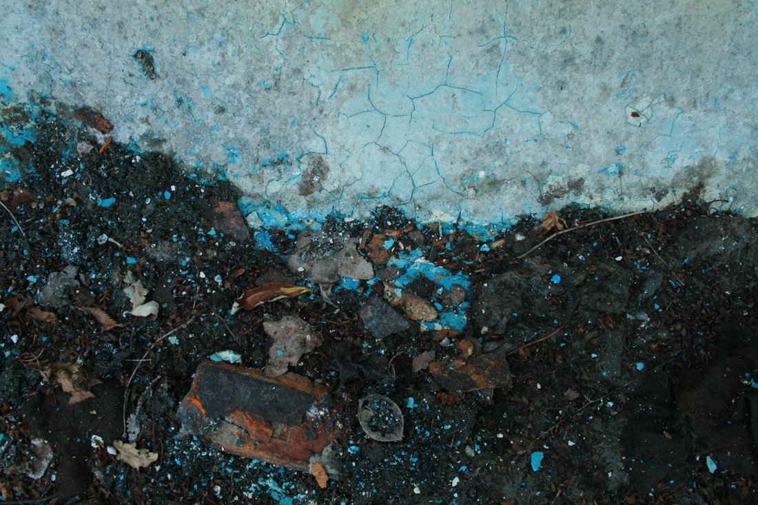
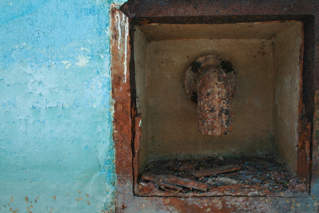
my response
|
|
|
|
|

|


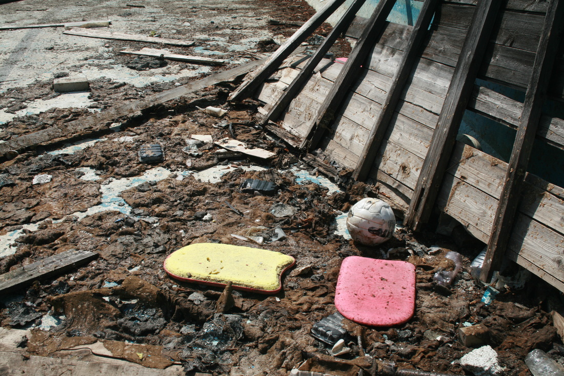


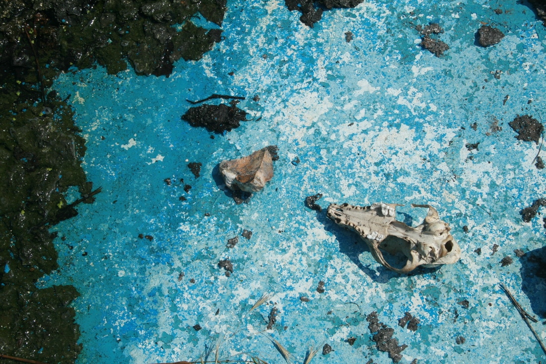
WWW: A lot of the objects I took photos of are quirky and unusual, which would capture the viewer's attention. For example, the skull in the 3rd row, 6th across. It is mysterious and idiosyncratic and raises so many questions. How did it get there? What is it from? How did it die? Are there more of those animals nearby?
EBI: A few of the photos came out quite blurry when I uploaded them, which is frustrating as it can be hard to spot when you view the image on your camera, especially when it's a bright day (as it was). As a result, the 6th row, 6th across image and the one directly above are a bit blurry. This could have been because the shutter speed was too low or I didn't have a steady hand when I took the photo (a tripod would fix this).
EBI: A few of the photos came out quite blurry when I uploaded them, which is frustrating as it can be hard to spot when you view the image on your camera, especially when it's a bright day (as it was). As a result, the 6th row, 6th across image and the one directly above are a bit blurry. This could have been because the shutter speed was too low or I didn't have a steady hand when I took the photo (a tripod would fix this).
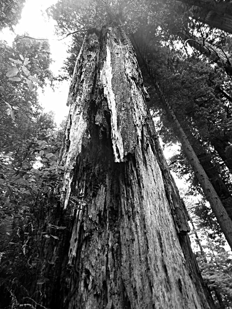
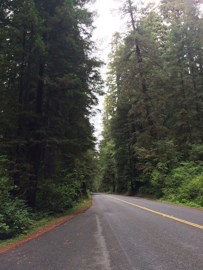
force final project: imposing trees
In my final piece, I continued the theme of 'imposing' from an earlier strand. This time I looked at trees and I how they can appear powerful, towering and forceful. Luckily my setting was the Redwood Forest in California, which has some of the tallest trees in the world.

|

|
|
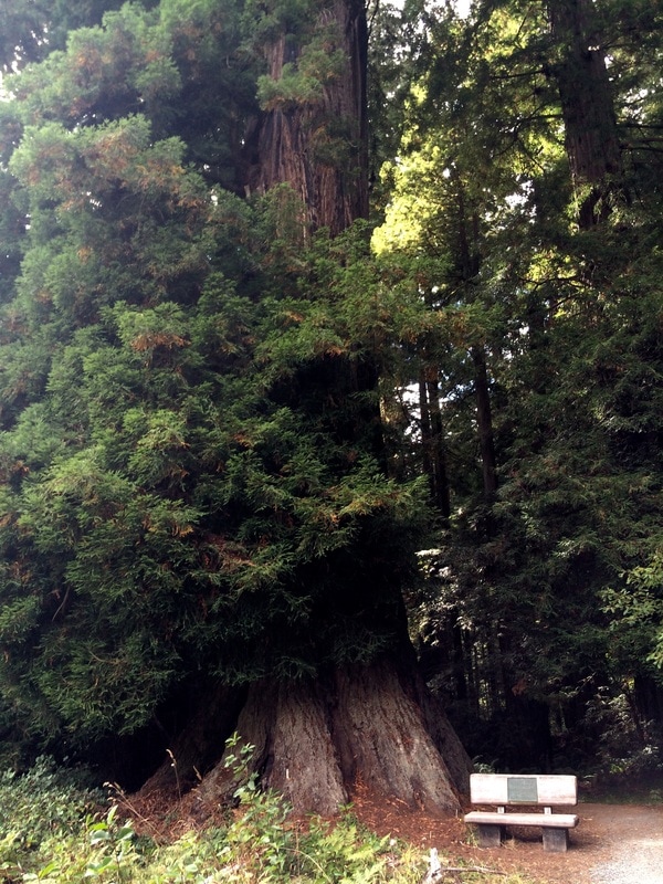
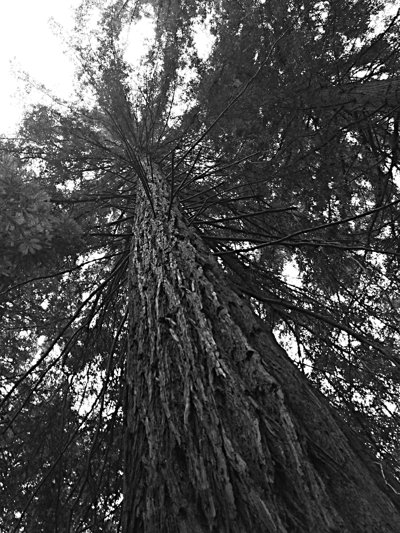
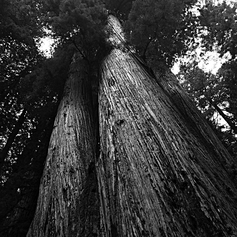
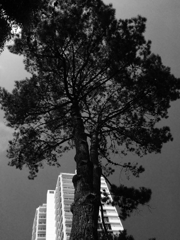
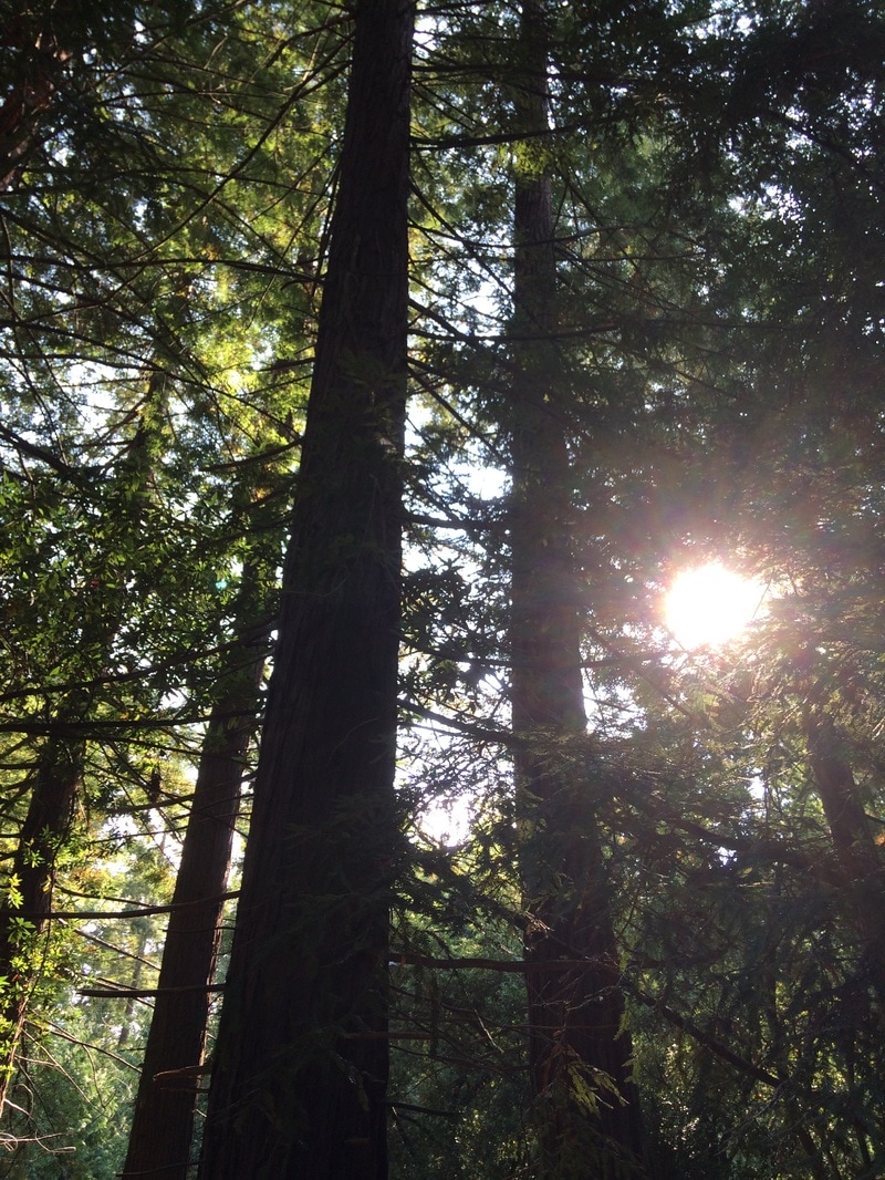

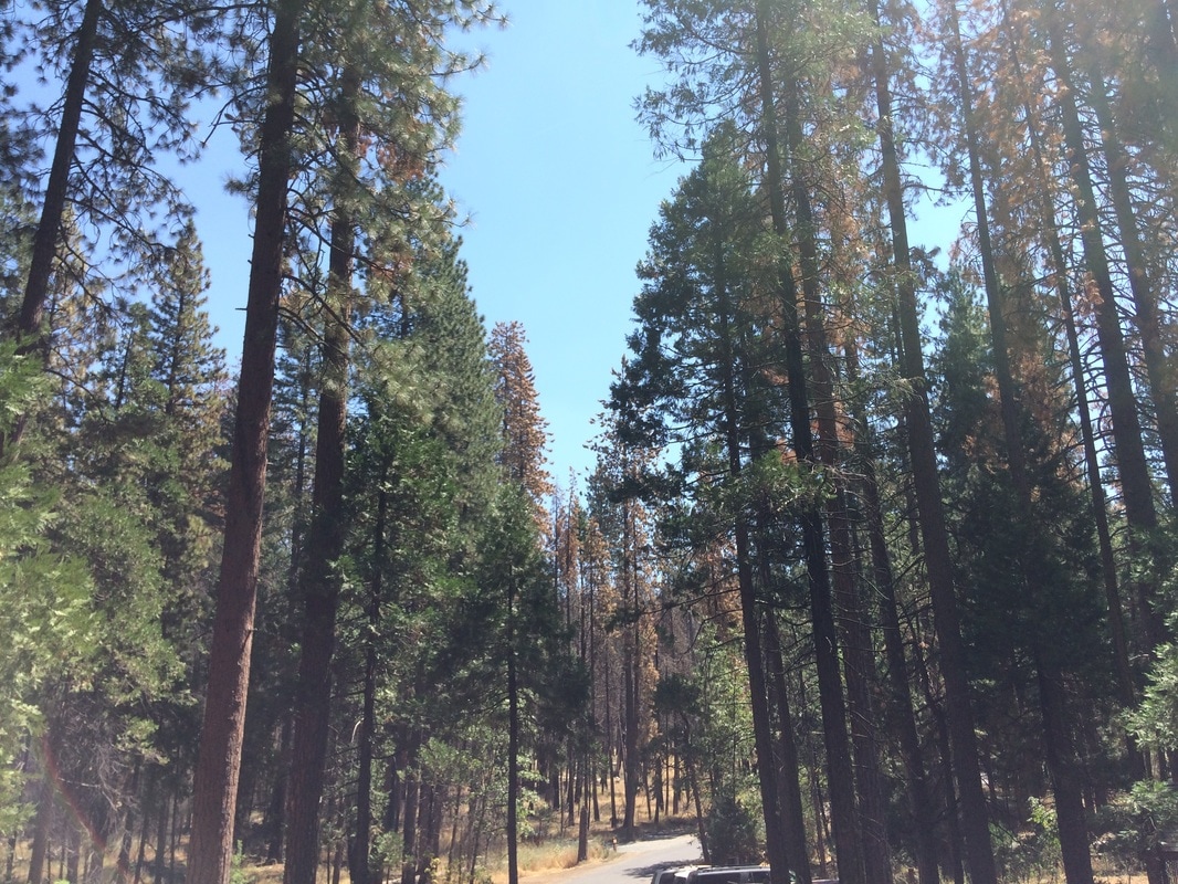
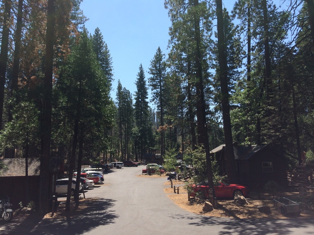
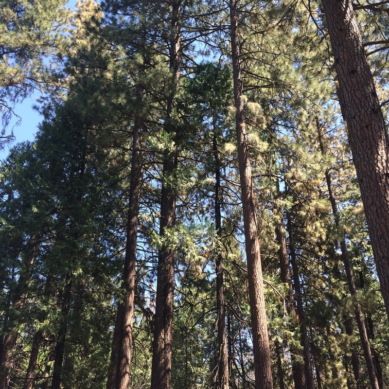
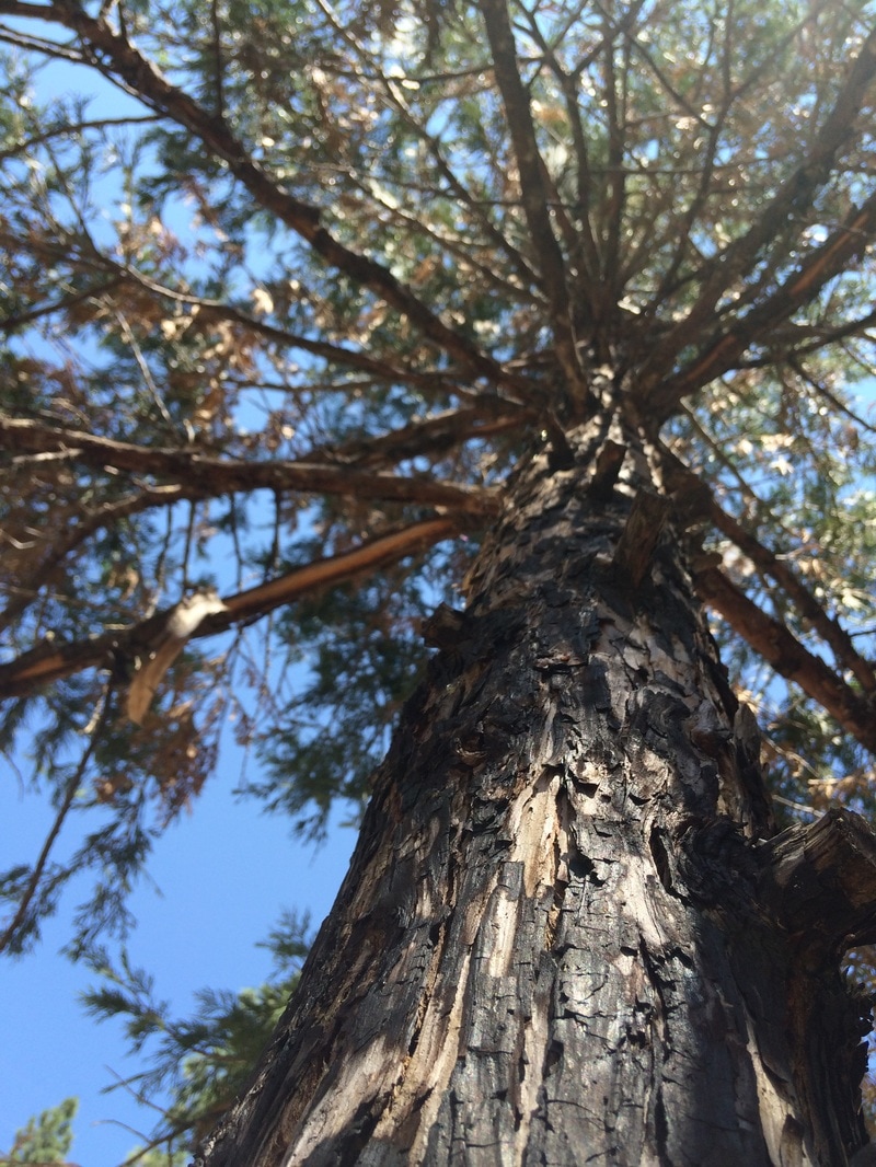
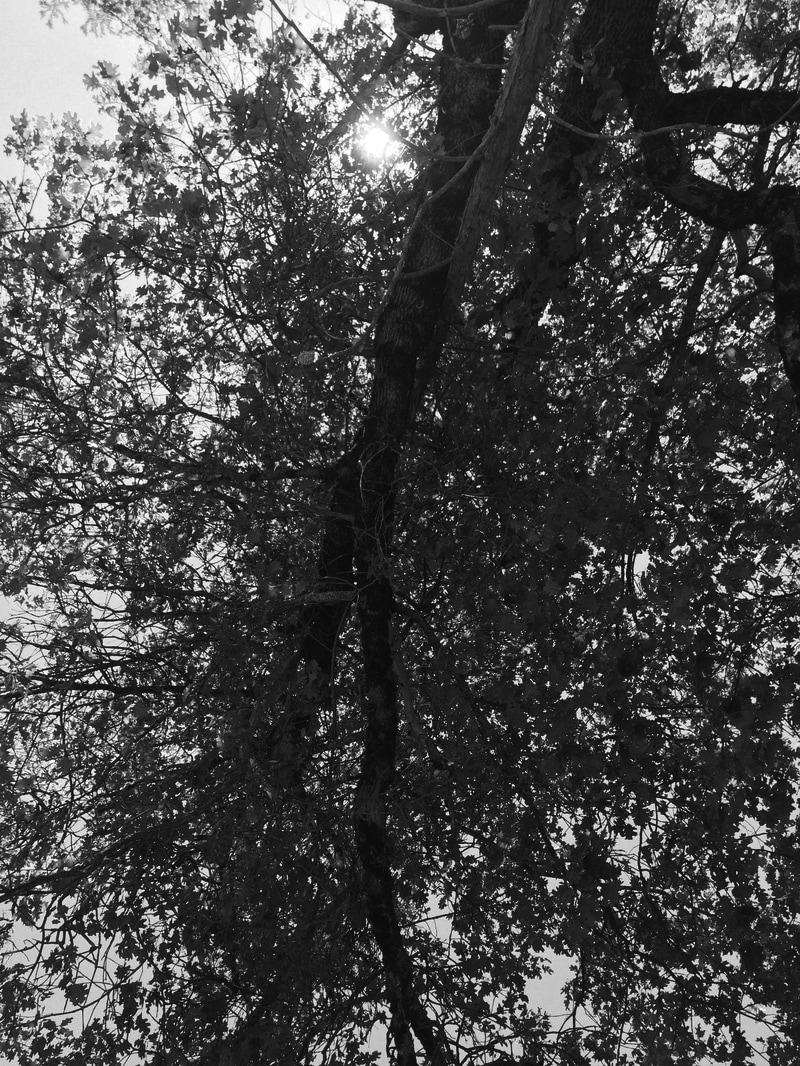
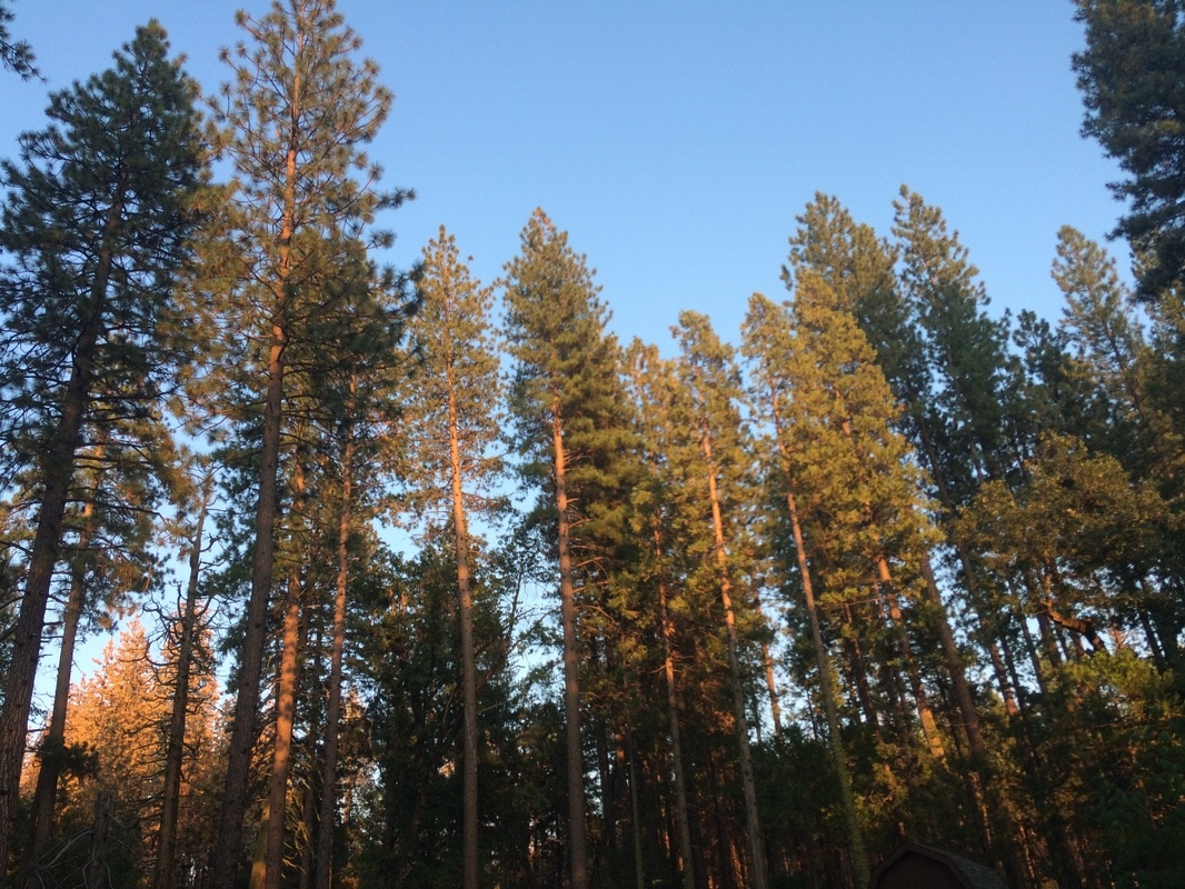
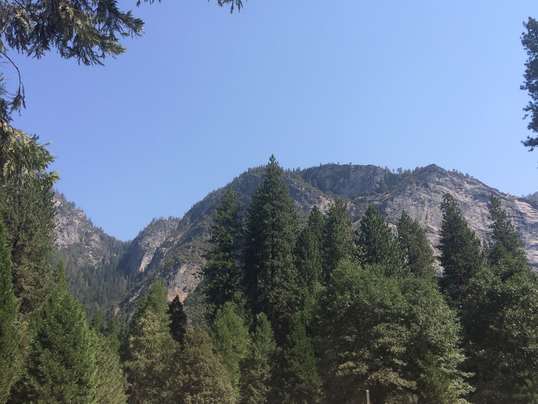
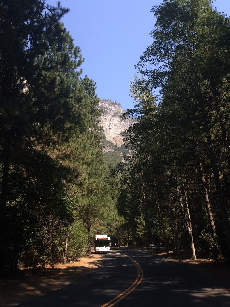
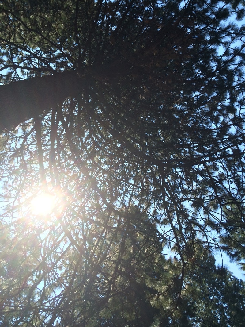
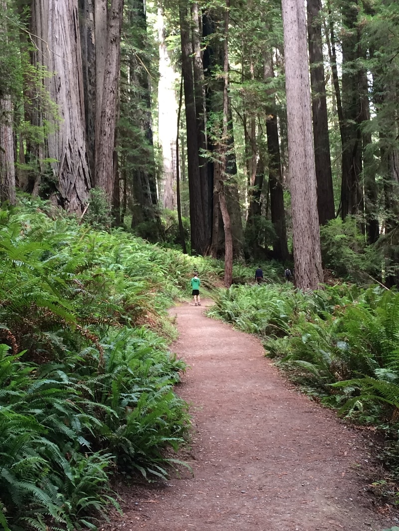
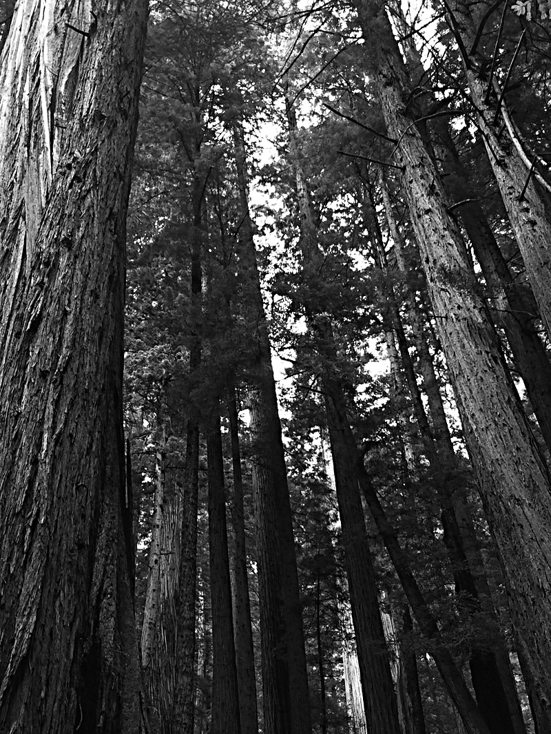
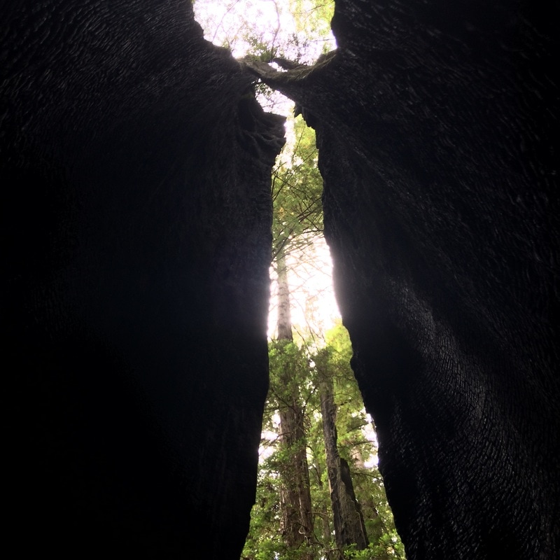

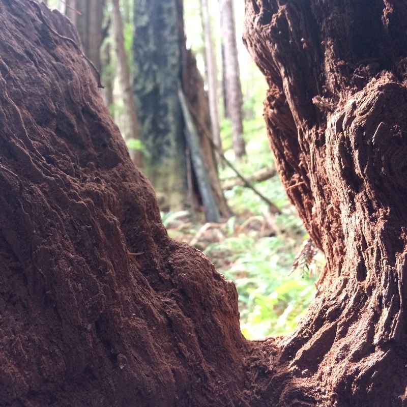
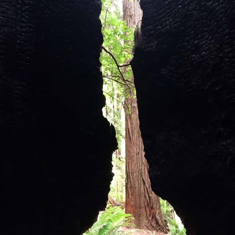
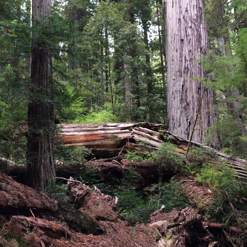

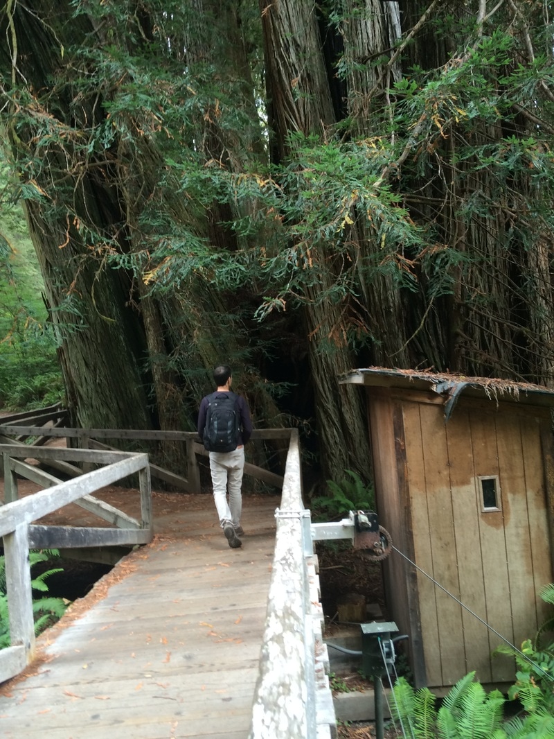
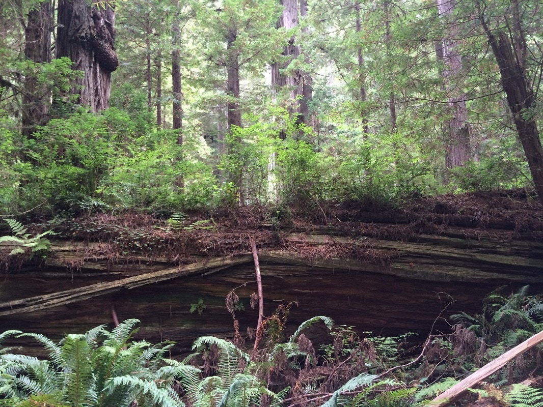
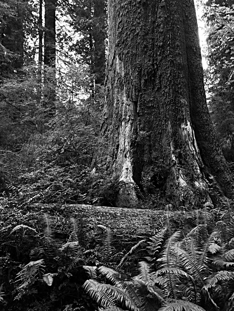
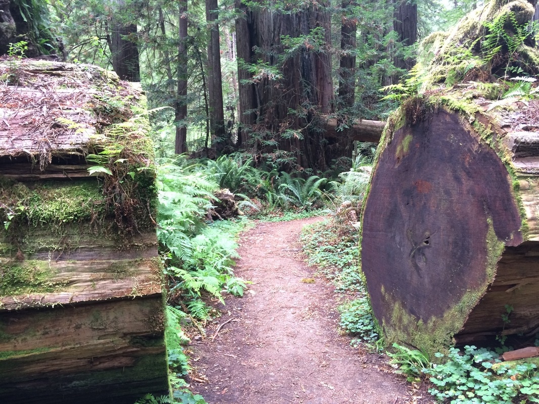
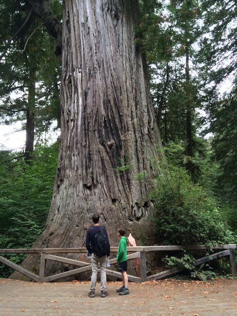
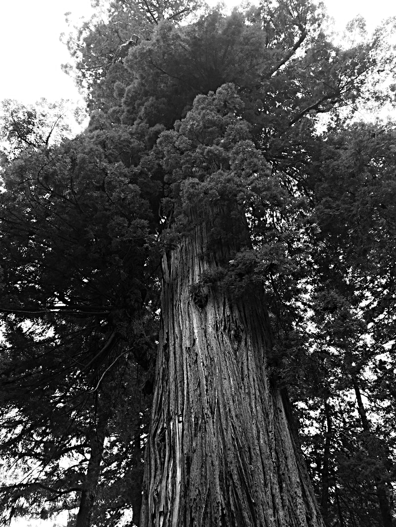
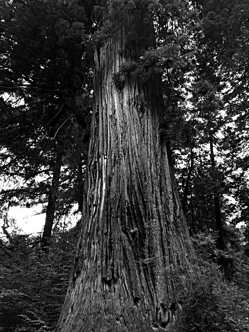
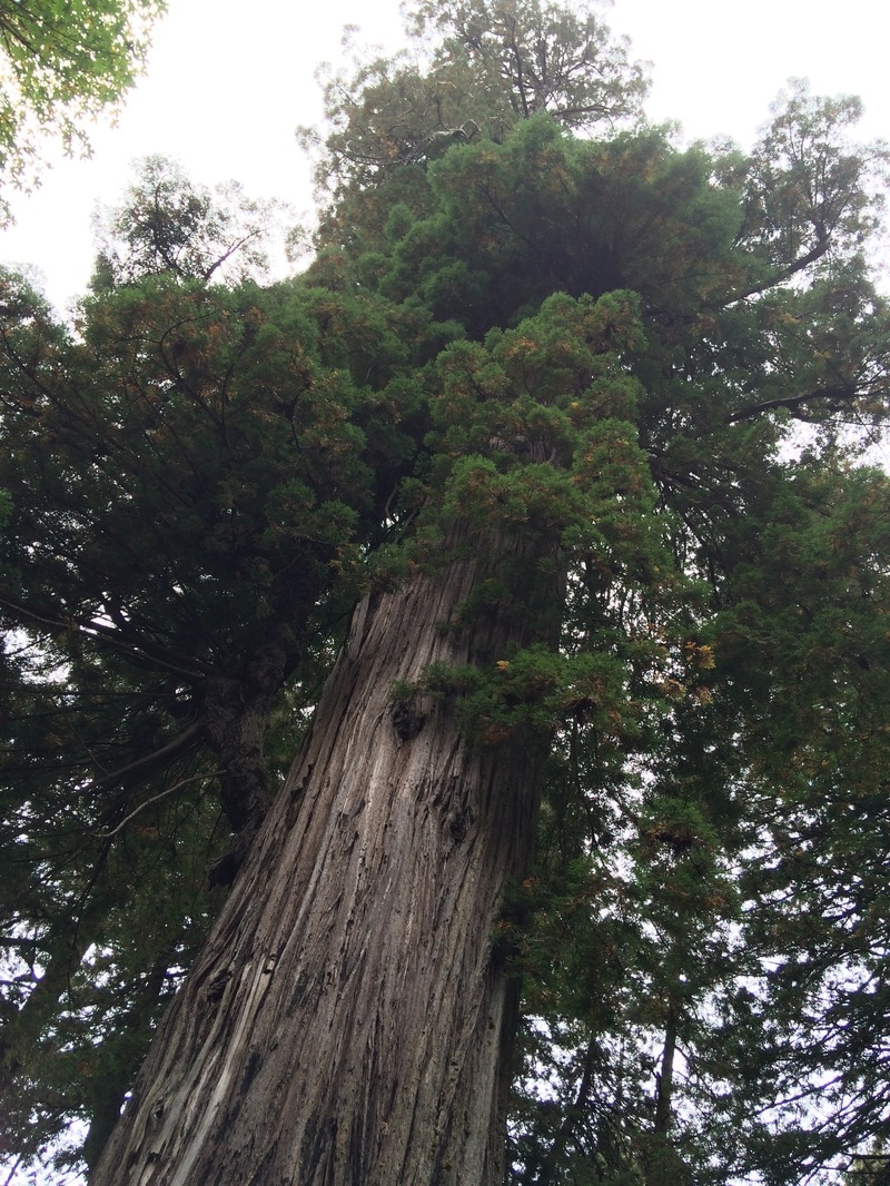
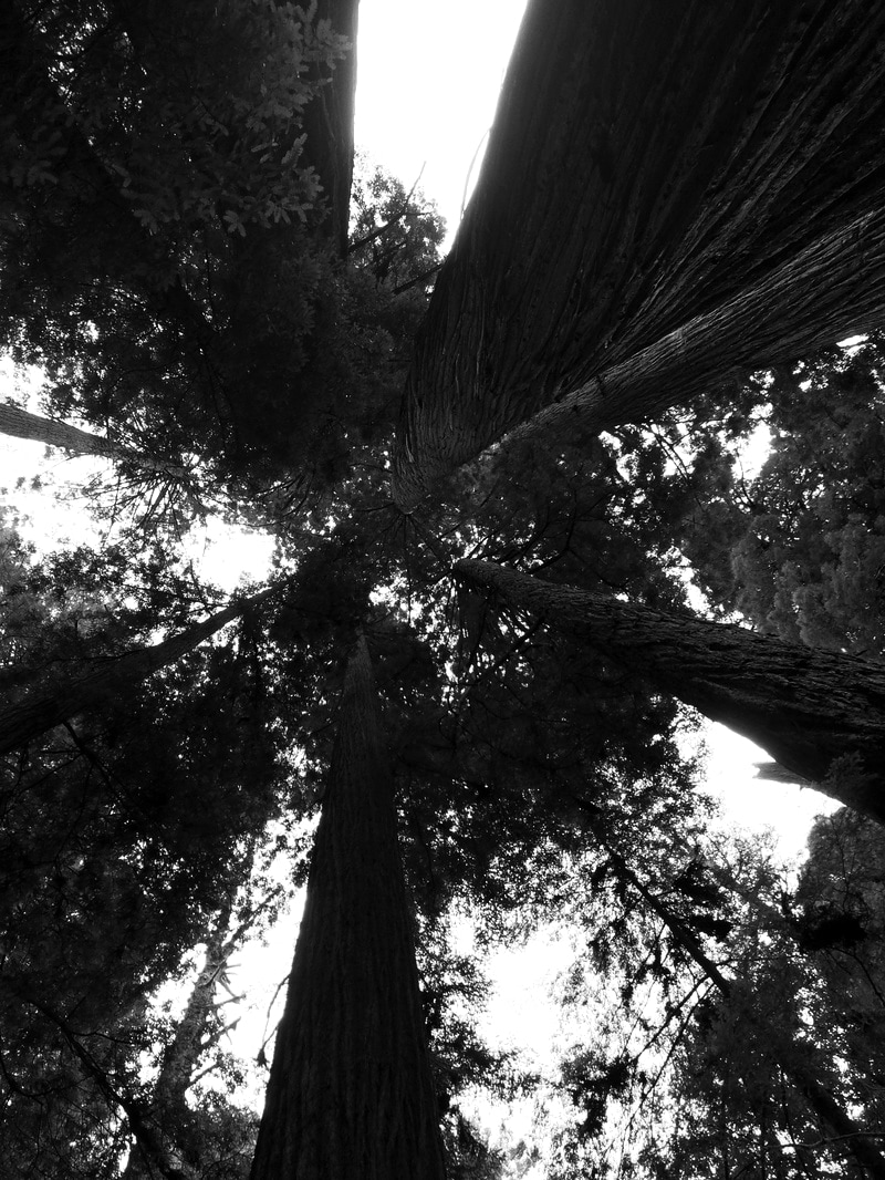
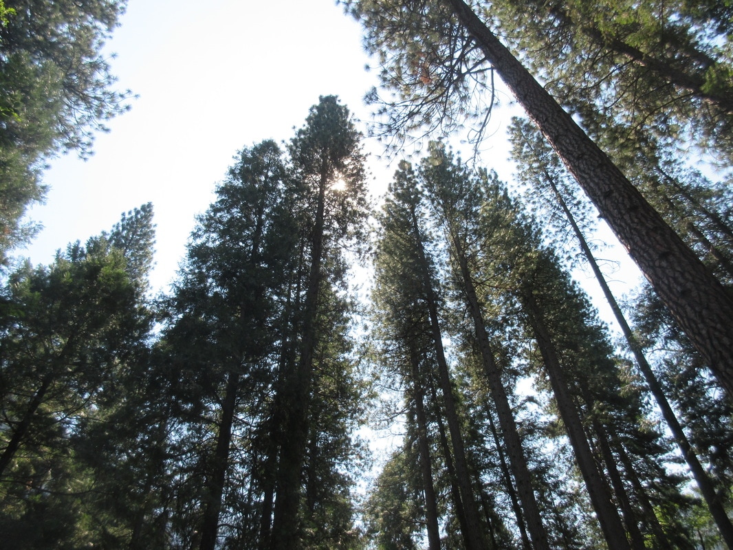
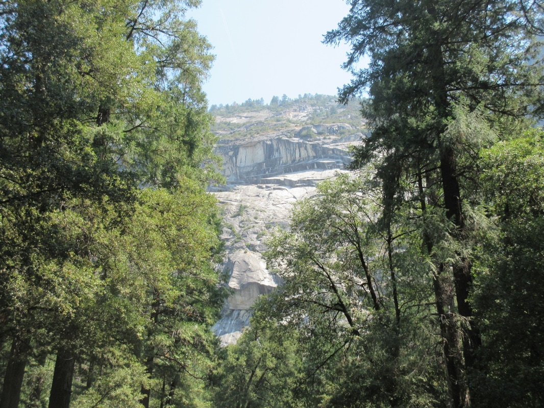

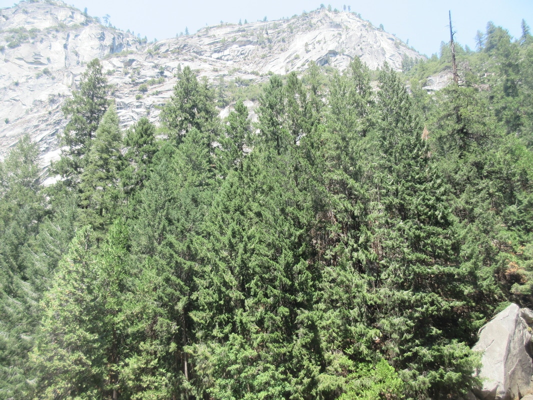


WWW: I used lots of varied and interesting angles and perspectives, especially in how I looked at the theme of 'force' and 'imposing'. However, for my enlargements, I kept in series as all the images are looking up which enforces the idea of power and imposing.
EBI: The quality of some of the images is frustratingly pixelated.
EBI: The quality of some of the images is frustratingly pixelated.
